Effective Calls to Action: How to Get Your Customers Clicking
Looking to turn more of your clicks into conversions? Read on to learn Swanky’s top tips for designing effective calls to action, positioning them perfectly and writing engaging CTA copy – along with some expert insights from Swanky’s Head of Optimisation, Sean Clanchy!
Written By
Esther Lowde

When it comes to effective ecommerce design, persuading customers to convert is the aim of the game.
One of the most effective ways you can guide your visitors along the path to purchase is by laying out the stepping stones for them – in the form of obvious, clickable, engaging calls to action (CTAs).
But the way you design these CTAs is critical in determining whether or not your customers actually seal the deal.
Today, we’ll be giving you all our top tips for designing effective calls to action, positioning them perfectly and writing engaging CTA copy – along with some expert insights from Swanky’s Head of Optimisation, Sean Clanchy.
What is a call to action?
A call to action is essentially a clickable phrase that tells your customers what to do next. CTAs are like signposts which help your customers to quickly complete a desired action – whether that be buying a product, subscribing to a service or signing up to a newsletter.
Some of the most obvious examples of CTAs are ‘Add to Cart’ and ‘Buy Now’, but the exact wording and design you use for your CTAs will depend on your unique products and brand.
Like all aspects of ecommerce design, the way your CTAs are presented can have a big impact on your conversion rate.
Let’s dive into how to get it right.
How to design your CTAs
Want to nail the perfect CTA design?
Here are a few things to keep in mind:
Simplicity
When it comes to strong CTA design, forget the frills.
To get more clicks, your CTAs should always be basic and clear – delivering a simple statement that’s easy for your customers to understand.
Recently, Midas Media found that after testing 90 different high-conversion CTA buttons, the simplest designs got more clicks than the more elaborate buttons.
With this in mind, we’d recommend sticking to using one solid colour, one font and one shape when designing your calls to action.
But this doesn’t mean your CTAs have to be boring! You can always spice them up with some excellent copy (which we’ll get to later) or add a touch of innovation to your design.
Buttons
Presenting your CTAs as clickable buttons – rather than just words on the page – encourages users to click on them, as it differentiates them from the rest of the copy on your page.
Just make sure your buttons look ‘clickable’ by giving them a clearly defined border, surrounding them with space and making them a conventional button shape (like a circle or a rectangle).
Colour
The colours you use for your CTA buttons should always be among the boldest on the page.
To make your colours pop, you could contrast them heavily with other colours on the screen – or simply keep all of the copy around your CTAs completely monochrome.
That said, don’t go plastering random neon shades all over your website. You still need to keep your colours on brand so that your store is enjoyable to look at and use.
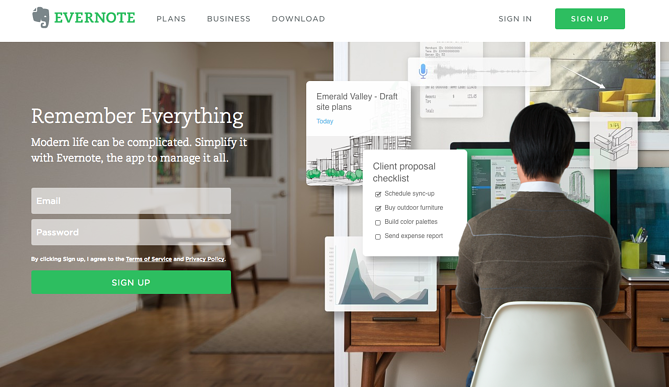
One popular note-taking app company, Evernote, have found the perfect balance between bold and branded on their site. The bold green colour of their core CTA ‘Sign Up’ jumps off the page – while tying in with the colour of their logo and the green in their main image perfectly.
Size
According to Swanky’s CRO expert Sean Clanchy:
“Although a lot of people think bigger is better, if you make your CTA too large it can actually look like a section or a segment on the page – putting many users off from clicking on it. Because of this, slightly narrower CTA buttons often generate higher click rates.”
How to position your CTAs
With the stand-out design of your CTAs all sorted, you want to make sure you’re placing your buttons right where your customers will see them.
Here’s how:
Consider the rest of the content on your page
According to Sean:
“Often, we find that it’s not about improving the button itself – it’s about reducing the noise and clutter that surrounds it. This doesn’t mean you should get rid of all the validation next to your CTA. But you do need to make it less dominating.”
So how do you go about doing this?
Instead of getting rid of the content around your CTA, we’d recommend making it smaller, shorter or less visible.
This could mean using a finer font for the copy around your CTA, cutting down the word count or even just keeping things monochrome around a colourful button.
This way, the information on your page will point customers towards your CTA – rather than distract them from it.
One example of a brand who has done this well is one of our CRO clients, nutrition company Huel. They have shaded out the colours of the ‘As Seen On’ brand logos on their product page in order to draw more attention to the CTA above them (‘Subscribe’).
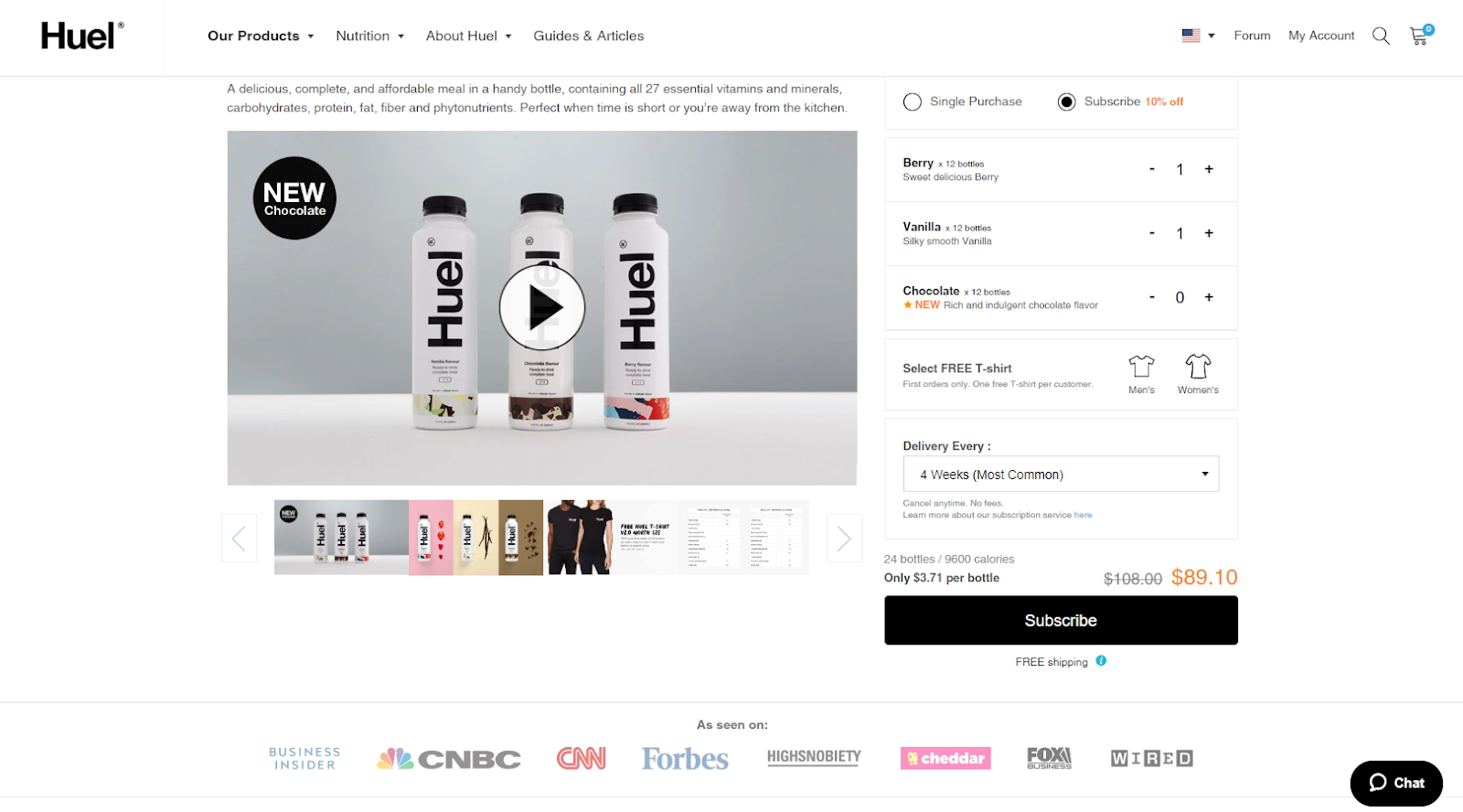
Huel have made their ‘Subscribe’ button pop by using a lighter grey font for the copy around it and fading out the brand logos at the bottom of the page.
Top tip: To quickly test how well your CTAs are standing out on the page, apply a 10-15% blur to it. If your eyes are naturally drawn to the CTA even when the page is blurred, you’re probably onto a winner.
Whitespace
On a similar note, one of the most effective ways of drawing attention to your CTA is by setting it against a backdrop of clean, uncluttered space.
This is because clutter breeds ambiguity, while having a clean, white background draws attention to bolder aspects of the page.
What not to do: In this image, you’ll notice that because of the lack of whitespace, there is no clear, central focal point on the page. This could leave users unsure of where to look or what to click. (Image source: shopify.com)
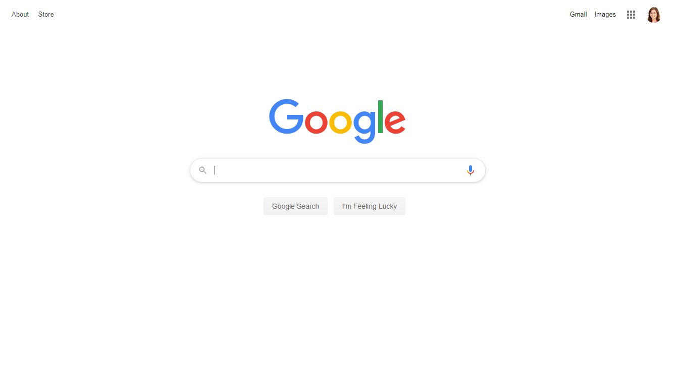 On the other hand, Google’s iconic homepage is a classic example of whitespace being used to draw the user’s attention to one focal point on the page; the search bar.
Only feature one core CTA per screen
To keep each of your CTAs as the focal point of your page, try to stay away from featuring more than one core call on each screen.
Even when you’re including multiple CTAs on one page, make sure that your most important one is the only one above the fold, while the rest are spaced out below it – and each with a screen to themselves.
Consider how users will look at the page
Research has shown that users generally read webpages in a Z pattern; meaning they start by scanning the top of the page from left to right, before looking diagonally down to the bottom left and then looking across to the bottom right of the page.
So what does this mean when we’re placing our CTAs?
According to Sean, it means “the top of the page should contain the essentials of every page – such as your search bar – while the central area should contain any validating information that you want your buyer to know about a product before they reach the CTA you’ve positioned at the bottom of the screen.”
To help visualise this, here’s an example of a brand who’ve got it right:
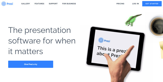
Presentation software company Prezi present their core CTAs in a way that complements the user’s natural Z-shaped way of reading the page. They’ve also nailed it with their use of whitespace around their CTAs – and their bold but well-branded colour pops.
That said, if you’ve just got one key CTA on a landing page which you’d like to draw attention to, it’s a good idea to make it central – as this is the most dominant position and will keep your CTA the focus of your page.
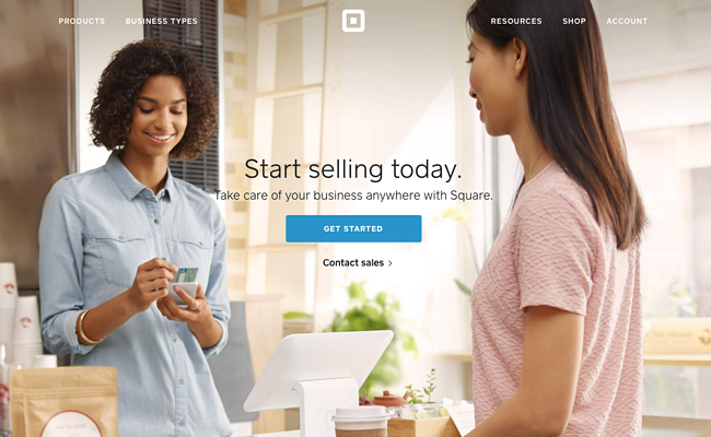
Popular mobile payment app Square draw attention to their core CTA – ‘Get Started’ – by placing it directly in the middle of the screen.
How to write CTA copy
Before you start writing your CTA copy, think about what you really want your customer to do.
Then follow these rules to persuade them to take action:
Keep it short
When your customers glance at your CTA, you want them to take in its message instantly.
Making people read multiple sentences as part of your CTA could reduce the impact of the command. Instead, pack a punch with just a few carefully chosen words.
Keep it positive
To keep your customers engaged and ready to make their next move, keep the tone of your CTA positive and upbeat.
This means using words with positive associations – like ‘Yes’, ‘Love’ or even ‘Hooray!’ – in your copy.
If it works with your brand voice, adding an exclamation mark to the end of your CTA is the simplest example of giving it a positive tone.
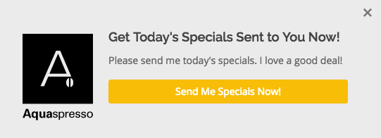
The pop up on Aquaspresso’s main blog page contains an exclamation point to excite the customer – along with validating copy that uses positive phrases like ‘I love a good deal!’
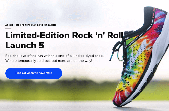
Online shoe store Brooks Running still acts positive when they’ve run out of stock – keeping customers engaged with a ‘Find out when we have more’ CTA instead of simply deleting their ‘Buy now’ button.
Keep it personal by using the first and second person
If you really want to keep your visitors engaged, remember to talk to, not at your customers.
You’d be surprised by how much you can engage your users – and build a positive rapport with them – by addressing them directly from the start.
Even a subtle change of wording – from ‘a’ to ‘your’, or even the first person ‘my’ – can add that personal touch you need to get your customers clicking.
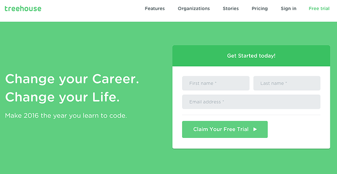
By writing ‘Claim Your Free Trial’ instead of ‘Start A Free Trial’, Treehouse address their users more directly – making potential customers feel like the deal is already theirs to take.

When the team over at Copyblogger tested these two different versions of the same CTA, they found that Treatment B – which is written in the first person – led to a 24% increase in conversion rate! This is likely because it felt more personal to customers – and also introduced more benefits-focused language.
Top tip: You could even take this a step further by using a personalisation tool such as Dynamic Yield to include your customer’s name in your CTA copy. Talk about getting their attention!
Use strong command verbs
Rather than using technical words like ‘Download’ and ‘Subscribe’, why not try words like ‘Get’, ‘Claim’ and ‘See’?
Not only are these words shorter – giving your visitors just one syllable to read – they also suggest action and movement, so are more likely to convince your customers to make moves on your site.
Communicate urgency
Generally speaking, using time-related words such as ‘Now’ or ‘Today’ helps motivate your customers to act quickly.
In fact, ConversionXL found that when they used words that communicated urgency on their store, their conversion rate increased by an incredible 332%!
Words like ‘Hurry!’ or phrases such as ‘Get it while it lasts!’ will inspire your customers to act fast, so consider including them in the copy around your CTAs.
Keep it branded
Make sure, as with all of the copy on your site, that the tone you’re using is right for your brand.
For example, if you’re running an ultra-professional business wear store, ‘Quick! Grab yours now!’ might sound too informal, so you might want to stick with traditional, strong phrases such as ‘Buy Now’ and ‘Subscribe’.
On the other hand, if your brand’s site is a little quirky and sells products that are fun and unique, take the opportunity to inject a little personality and humour into your CTAs.
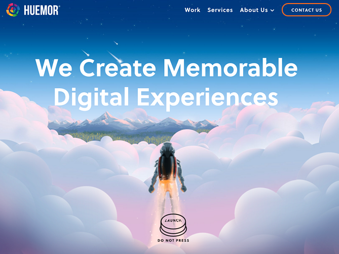
Here, Huemor have used a bit of playful reverse psychology in placing the phrase ‘Do not press’ under their core CTA button. This fun, light-hearted tone is in-keeping with their brand voice – and keeps customers engaged from the get-go.
Tailor your copy to your products
Just as it’s important to keep your CTA copy on brand, you need to adjust it based on the kinds of products you’re selling.
For example, if you’re selling relatively inexpensive pieces of clothing, a simple ‘Buy Now’ will generally do the trick.
But if you’re selling something a lot more pricey and complex, such as a laptop or a kitchen unit, you’ll need to provide shoppers with more information before they buy, making something like ‘Find Out More’ a much more appropriate choice.
For more advice when it comes to writing web copy that sells, check out our seven quick tricks that are super-easy to implement on your ecommerce store right away.
A/B testing your CTAs
You’re almost finished creating the perfect CTA – but there’s one last important step to go!
After you’ve tweaked your CTA copy, positioning and design, it’s time to put these changes to the test.
A/B testing is the most effective way of finding out and measuring exactly what kind of impact your CTA designs are having on your sales.
Testing your CTAs in this way will give you tangible data to let you know what changes are driving your customers to take action – and which might be stopping them from clicking where you want them to.
As for which pages you should prioritise testing, our CRO expert Sean says:
“Without a doubt that should be your product pages and landing pages (the pages most of your customers arrive on from your ads and search engine listings). This is especially relevant if you’re paying for traffic, as you want to make sure your customers go where you’re sending them.”
For more information on how to A/B test your CTAs effectively, check out our recent articles on what A/B testing is – and the best testing tools for your ecommerce store.
Time to start upping your CTA game!
After reading our top tips, you’ll have probably realised that they’re means to the same end – making your CTAs jump right out at your customers.
So, however you choose to write, design and position your brand’s unique CTAs, always make sure they’re impossible to miss.
Let’s quickly summarise the top 5 ways to create the most effective calls to action:
- Keep the design of your CTAs bold and simple.
- Position your CTAs where customers will see them.
- Reduce the noise around your buttons.
- Choose your copy carefully.
- Test and repeat!
It’s a process that may take some time, but it’s one of the biggest favours you can do for your conversion rate.
With the right CTA buttons in the right place on your site, you’ll find your customers clicking and converting more than ever!
Let’s talk
Interested in finding out more about how Swanky design stunning ecommerce stores that are built to convert?
Get in touch with our team of friendly ecommerce experts today. We’d love to hear from you!