A/B Testing for Shopify Stores: What Is It and How Can It Help You?
Every visit to your website is an opportunity to grow your business. But how can you make sure you’re getting the most revenue out of your traffic? Let’s take a closer look at how A/B testing could help your Shopify store.
Written By
Esther Lowde

A/B testing – commonly referred to as split testing – is the process of comparing different versions of a webpage to see which one performs better.
Rather than simply relying on your intuition – or on others’ ‘best practice’ advice – A/B testing helps you gain valuable insight into what makes your unique pool of customers want to click and convert.
This knowledge can then be used to make data-informed decisions about your web design, content and ongoing digital marketing strategy, helping you generate more revenue from your existing customer base.
For this reason, A/B testing is a fundamental part of any good CRO (conversion rate optimisation) strategy.
However, as important as A/B tests may be for growing businesses, making sure that each experiment is as accurate and reliable as possible is just as crucial.
Let’s take a look at how to go about running an A/B experiment which delivers results you know you can trust.
How does A/B testing work?
Before you can start A/B testing, you need to decide which element of your website you’re looking to change. This could be anything from replacing a font that customers are struggling to read, to adjusting the size of your photos on product pages so that visitors can see them more clearly.
Next, you need to write the hypothesis that you will be testing. This should be made up of the problem you want to address, the proposed change, the way you will measure this change and the expected outcome of the experiment.
For instance, you could say “Currently, users are struggling to find our search bar. By making our search bar more prominent in our website header, we will see more search use as measured by the number of users landing on search results pages.”
You’ll also need to set your primary goal – such as a higher CTR (click-through rate) – along with the secondary goals – such as an increased RPU (revenue per user) – that you’re looking to achieve.
You can then use a testing tool (we’ll be covering our favourites later) to modify your website and present one half of your traffic with the original version of your website (which becomes your ‘control’ or baseline) and the rest with the modified version (your ‘variant’). In more advanced A/B testing experiments, you can even display multiple different variants to traffic groups of equal sizes.
Using a web analytics program, you can then measure your store’s change in conversion rate for numerous goals pertaining to your hypothesis and determine whether your customers respond better or worse to the newer version of your website – or which of your variants is generating the best results.
However, before making any concrete changes to your store, you need to ensure that you can trust your findings. In technical terms, this means you need to have a high level of statistical confidence in your results.
This statistical confidence is gained by testing enough traffic to feel certain that your results accurately reflect the majority of your customers’ preferences.
For example, if you run a test 10 times per variant with A scoring 7/10 and B 8/10, you can’t be too confident that the improvement in B isn’t just a statistical anomaly. If you run the experiment 10,000 times and the difference is 7000 versus 8000, you can have a far higher percentage of statistical confidence in the change you are making, as it has proven to boost revenue on far more occasions.
Once you’re confident that you’ve identified your best performing variant, you’re ready to start implementing the changes into your website. And voila! You now have a better performing, better converting Shopify store.
Why is A/B testing important?
In a digital world so full of distraction and competition, it’s never been more crucial to build an ecommerce store which not only looks good but provides an impeccable customer experience and is essentially built to convert.
Every change you make to your website – no matter how drastic or minor – should be geared towards sending your customers straight through to the checkout page.
A/B testing is the key to making this happen, as it lets you test (rather than guess) which words, phrases, images, videos and other elements work best to lead your unique customer base straight down your store’s conversion funnel to purchase.
It’s the most effective way to generate a high ROI (return on investment) on your existing traffic, marketing investment and web design investments – and will also enable you to make smart, confident business decisions about the future of your brand’s digital strategy.
Just remember not to underestimate the effect of fine-tuning basic elements on your Shopify store’s pages, as even the smallest changes can have a big impact on your revenue growth.
For example, one A/B test on HubSpot’s website revealed that when a newsletter sign-up form was embedded into the bottom of each of their blog posts – rather than simply linked to in a paragraph at the end – customer sign-ups were increased by 71%. For a seemingly small site adjustment, that’s a pretty big difference in customer engagement!
Which aspects of your store do you think could be tweaked to encourage more of your customers to purchase? You might be surprised by the results your A/B tests reveal.
A/B testing for Shopify: Swanky’s success stories
At Swanky, our team of Shopify Plus experts are focussed on creating ecommerce stores that marry form and function; making sure that each client’s website not only looks great but performs in a way that encourages users to engage with and buy from each store.
Saltrock
One of our CRO clients, popular surf and adventure apparel company Saltrock, were in a period of significant expansion at the time they approached our team for help with migrating to Shopify and revamping their store’s design.
After their hugely successful Shopify migration – which saw a 26% increase in Saltrock’s organic mobile traffic year-over-year – the Saltrock team wanted to get the most out of the new influx of visitors to their store.
However, their new customers were struggling with the fact that the navigational menu on the mobile version of Saltrock’s site was relatively hard to use due to its compact, list-based format.
Our team’s proposed solution was to switch to a button-based navigation menu (similar to the style of a smartphone app). By providing Saltrock’s customers with larger navigational buttons, Swanky predicted they would be able to find and purchase the items they were interested in more easily – without being distracted from their purchase process.
To ensure this change was really the ‘right thing’ for Saltrock’s customers, Swanky carried out an A/B test to determine whether this new button-based menu would increase customer menu use, click-through rates and ultimately sales.
In this case, our team’s hypothesis was that users would be able to click on menu items more easily, improving the UX of the mobile website significantly and therefore leading to an increase in collection page landings (and hopefully sales).
This meant that the primary goal to be measured in this experiment was an increase in menu use, while our secondary goals were an increase in collection page landings, product page landings, conversions and RPU (revenue per user).
Our CRO team then set to work creating various new potential mobile menu designs. The three menu variants all shared the fact that they were button-based (unlike the control) and had a clearly defined search field. However, they differed in their use of colour, photos and iconography.
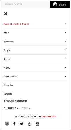
The control: Saltrock’s original list-based mobile menu.
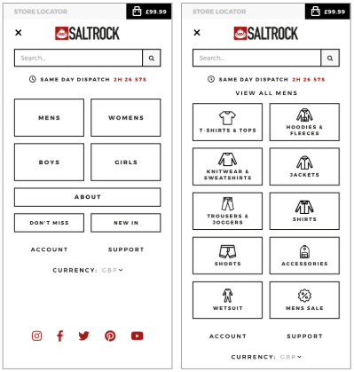
Variant B: A button-based mobile menu featuring clothing iconography in its secondary layers.
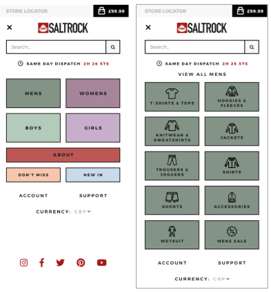
Variant C: A button-based mobile menu featuring coloured buttons and clothing iconography in its secondary layers.
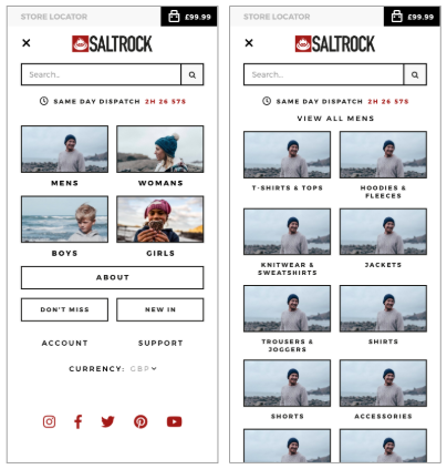
Variant D: A button-based mobile menu featuring clothing photography in its primary and secondary layers.
Over a period of three weeks, data was collected as users were shown these menu variants while browsing the store on mobile.
And what did the results reveal?
Variant D was found to be the clear winner as it outperformed the control for conversions at 76% statistical confidence and also resulted in the highest RPU of all of the mobile menus tested.
A high RPU is one of the most universally important indicators that a change is worth making to your website. Over time, a high RPU can also lead to an increased average order value as customers become more familiar with a website and the business begins cross-selling and upselling to them.
After analysing these results, Swanky set to work integrating the winning mobile menu variant into Saltrock’s store, creating a significantly better user experience for Saltrock’s new and existing customers alike.
Shopify organic medicinal brand
Another of our clients, an organic medicinal brand, encountered a similar problem with the overly compact list-based design of their store menu on mobile.
For this experiment, the Swanky team used the same hypothesis and created three similar button-based menus. However, this time the variants differed in size, prioritisation and the uniformity of the collection page buttons.
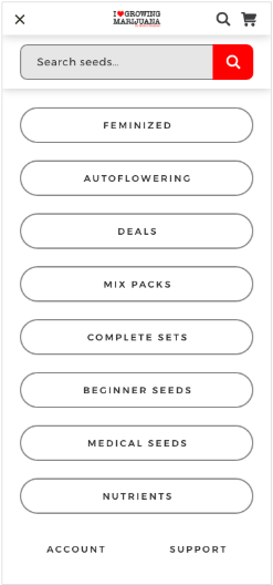
Variant B: A button-based mobile menu displaying uniform full-width buttons for every product collection.
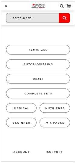
Variant C: A button-based mobile menu prioritising the core navigational collections with full-width buttons and reducing the prominence of other product collections.
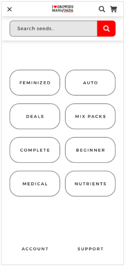
Variant D: A button-based mobile menu with a two-column layout, making the buttons thicker and even easier to select.
This time, the experiment went on for a period of six days. Once more, variant D was found to be the clear winner based on its higher RPU and higher average order values for all of the user groups.
But why are these results so significant?
Based on the above findings, our team found that an RPU change of 12% across all mobile traffic would lead to a major revenue increase over the following 12 months. This one seemingly simple website adjustment was therefore set to contribute significantly to the brand’s subsequent growth.
Moving forward, the team at Swanky have plans to experiment further with the winning variant in order to continue improving UX for this client’s customers and drive even more revenue for the brand.
Shopify Plus footwear retailer
Although these experiments were focussed on improving the UX of our clients’ store designs, A/B testing is not just limited to the layout of your website. It can also help fine-tune your marketing campaigns and almost any other element of your digital strategy.
For example, for one Shopify Plus footwear retailer, we used A/B testing to revamp their store’s loyalty program, boosting their revenue by 226% and increasing their loyalty program subscriber total by over 100% within 2 months of beginning the testing.
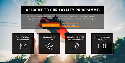
The winning variant of this Shopify Plus retailer’s new loyalty program, which boosted the business’ revenue by 226% in its first 2 months post-launch.
After seeing results like these, our Swanky team have been even more motivated to help our clients optimise their websites and boost their sales dramatically.
How should you be A/B testing your Shopify store?
As Shopify handles all of your website hosting for you, there’s nothing about being on Shopify that will make your A/B testing any more complex than it would be on any other platform.
In fact, Shopify was created as a flexible platform which both caters for and encourages businesses’ drive for continued improvement and growth.
Shopify have even produced plenty of their own guides to A/B testing to help businesses on their way to enhancing their UX and increasing sales.
With all of this is mind, the only thing you need to worry about when handling your store’s A/B testing is the tool you use to do it.
As Shopify Plus Experts, we’ve always tested exclusively on Shopify stores, and our top picks for testing are Convert and Dynamic Yield.
Mixing affordability with the most advanced testing and personalisation features on the market, both of these tools are now our technology partners – with the one we choose to use for each CRO project depending completely on our client’s budget.
Keep an eye on the Swanky blog for a detailed breakdown of these tools, coming soon!
Will A/B testing affect your SEO?
Don’t worry! Setting up multiple variations of your website might sound like it could impact your position on SERPs, but Google have actually come out and said that they both allow and encourage this form of CRO when it’s geared towards improving UX.
All you need to do is make sure that you:
- Only run your experiments for as long as is necessary.
- Don’t exclude Google’s bot from your A/B tests (as this will be interpreted by Google as content cloaking).
- Use 302 redirects rather than 301s for your experiments’ variants (to let search engines know that the redirect is only temporary).
For more information, check out Google’s official guidelines on how to A/B test without affecting your store’s search rank.
Time to get started!
Ultimately, when it comes to creating a web layout and marketing strategy that will boost your conversion rate and help grow your business, there’s no need to take any shots in the dark.
A/B testing is the science behind your website’s design which will have your sales skyrocketing.
Simply choose the right testing tool and the right CRO agency and we’re certain you’ll never look back.
If you’d like help running A/B tests on your Shopify store or are looking for expert advice on boosting your business’ conversion rate, get in touch with one of our friendly ecommerce experts today and get started on the path to ecommerce success.

