The 7 Biggest Consumer Barriers to Purchase – and How to Fix Them
Getting far more clicks than conversions on your ecommerce store? Read on to find out how you can overcome your customers’ biggest barriers to purchase and boost your sales more than ever.
Written By
Esther Lowde

Wondering why your ecommerce store isn’t fulfilling its sales potential?
At Swanky, we find that there are 7 main reasons why customers choose not to purchase from ecommerce stores.
These barriers are usually the result of seemingly small mistakes that ecommerce managers unknowingly make on their websites. Chances are you’re guilty of at least a couple of them!
But there’s good news too: the fixes to these common ecommerce errors are all pretty straightforward. You simply need to understand the basics of how your customers think.
Visitors to your website want a clear, quick and easy path to purchase – and they’ll only buy from websites they feel they can trust.
Let’s take a look at the 7 biggest barriers stopping your browsers from becoming buyers – and how just a few simple tweaks to your store could completely transform your sales.
#1 Slow site speed
Did you know that 40% of customers say they will abandon a website if they have to wait more than just 3 seconds for a page to load?
Even more surprisingly, nearly 80% of these potential customers say they would never return to a store which had made them wait that extra couple of seconds!
This means that if your pages aren’t loading quickly enough, you’ll have lost nearly half of your customers (forever!) before they even arrive on your store.
If you’re hosting your store on Shopify, speedy page loads won’t be a big issue, as Shopify’s global CDN means that your store is already optimised with a superfast 80 millisecond page response time.
However, it’s still worth considering some of the steps you can take to be sure that your page load time is as snappy as possible, such as:
- Compressing your files with a tool such as Gzip
- Reducing your image sizes
- Choosing a fast theme for your store
- Removing excessive amounts of redirects
#2 Poor website design
In the world of ecommerce, first impressions definitely count.
In fact, one survey carried out by Smart Insights revealed that an incredible 92.6% of customers listed the visuals of a website as the top influencing factor affecting their purchase decision.
This means you need to keep the design of your website on-brand, uncluttered, professional and easy to navigate.
Your customers will notice your use of colours, typeface, font size and images on your store – so make sure all of your design choices are deliberate and reflect what your brand is all about.
If you’re looking for a good place to start, check out our articles on some of the best free and paid Shopify themes for fashion stores and food and drink stores.
Brooklyn, one of our favourite free Shopify themes for fashion stores (via GIPHY)
#3 Lack of trust in your website
A lack of trust in an unfamiliar ecommerce store is often cited by customers as one of the biggest reasons for looking to buy elsewhere.
In addition to perfecting the overall ‘look’ of your website, you can increase potential customers’ trust in your brand by:
- Adding clear information to your store regarding your brand’s mission, FAQs, refunds policy and delivery details
- Including multiple accurate images and videos of your products from a variety of different angles
- Featuring user-generated content on your store
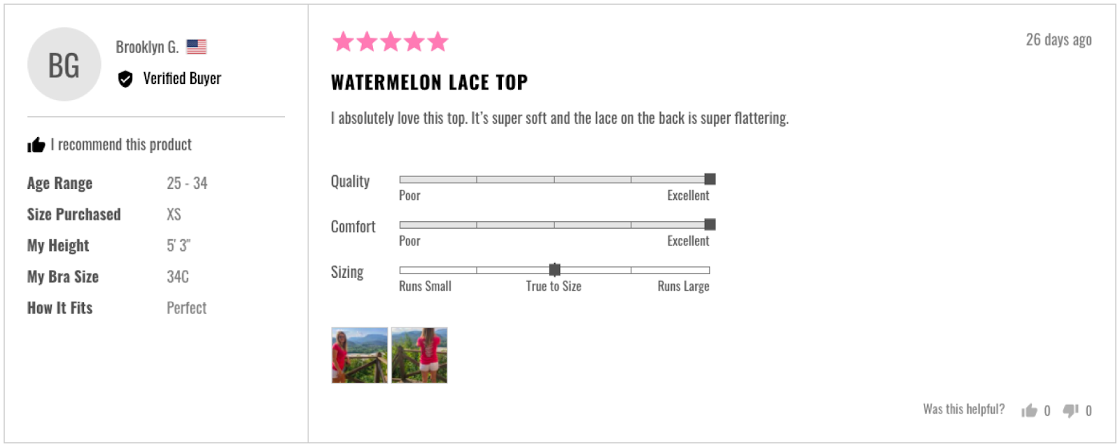
In particular, adding customer reviews to your product pages can make your customers significantly more inclined to go through with a purchase. Publishing authentic feedback from real-life shoppers helps to establish emotional connections with your customers, thereby building trust in your brand.

Swanky client The Pulse Boutique display detailed layered reviews on their product pages, complete with user photos for added effect.
According to BrightLocal, 85% of customers trust online reviews as much as personal recommendations. Featuring reviews on ecommerce websites has also been shown to produce an astounding 18% uplift in sales on average.
#4 Lack of shipping options
We’ve covered the importance of good website visuals, usability and speedy page loads. But even after your customers have been encouraged to add products to their basket, they can still be put off from their purchase during the checkout process.
Make sure you don’t lose your buyers at the final hurdle!
During checkout, a high number of customers report being put off by a lack of shipping options and information. To combat this, try offering 3 to 5 different shipping options to your shoppers (along with their estimated delivery dates).
The cost of your shipping also matters, as 59% of online shoppers say they consider shipping costs when buying online. If you can’t offer free shipping, be upfront about shipping costs from the get-go to avoid customers being put off by hidden extra costs on the checkout page.
#5 Lack of payment currencies and methods
With recent studies demonstrating that 66% of consumers now shop cross-border and that 1 in 4 customers will leave a website if their currency is not listed at checkout, it’s become more important than ever to introduce multiple major global currencies to your checkout page.
Thanks to Shopify’s new internationalisation features and multi-currency functionality, taking your ecommerce store global has also never been easier – so there’s really no excuse not to be doing it!
Offering multiple methods of payment to your customers is equally important, as Smart Insights recently found that 59% of customers would abandon a transaction if their preferred payment method was not in place.
Be sure to include multiple popular payment gateway options on your checkout page – such as PayPal, Authorize.net and USA ePay – to keep your customers happy and ready to purchase.
Top tip: Display trustworthy card logos prominently on your checkout page to increase customer trust in your store.
#6 Difficult navigation menus
Another major culprit when it comes to putting customers off their purchases is having a complicated, excessively small or hard-to-access navigation menu on your desktop or mobile store.
To make your customers’ journey to checkout as simple and easy as possible, you want to:
- Keep your navigation menus at the top or left-hand side of your webpages (where your customers would expect to find them)
- List main categories before sub-categories
- Feature a prominent search bar at the top of every page
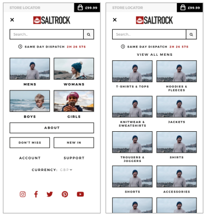
To illustrate the importance of a usable navigation menu, during one CRO (conversion rate optimisation) project Swanky carried out for leading surf fashion brand Saltrock, our team found that the store’s conversion rate was lifted by 12% after the store’s list-based mobile menus were replaced with button-based menus.

This button-based mobile menu facilitated more conversions than a list-based menu.
This was likely because Saltrock’s new button-based mobile menu was easier for customers to press; a small detail that made a big difference when it came to maximising usability and sales.
Why not try switching up your own navigation menus on desktop and mobile? You may be surprised by the results!
#7 Mandatory registration
Lastly, making your customers sign up to your website before they are able to place an order may be causing you to lose out on sales.
One study showed that 29% of people who had chosen to abandon an online purchase recently had done so after being asked to register to the site first.
Again, this comes down to the fact that customers want a speedy, simple checkout experience.
To keep buyers from getting fed up and abandoning their carts, we believe a good checkout process should have no more than 5 steps maximum. So although encouraging customers to sign up to your loyalty program or subscribe to your newsletters may be a great marketing tactic, your checkout page is not the place to push them.
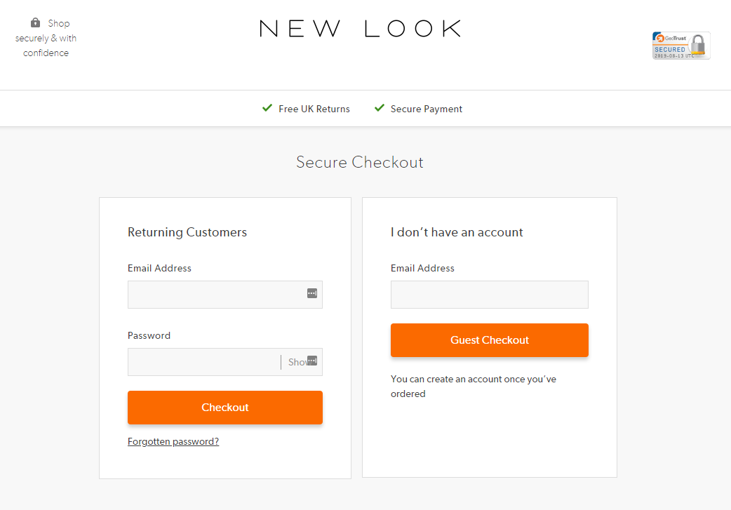
It’s now commonplace for ecommerce retailers to offer ‘guest checkout’ options. Leading online fashion retailer ASOS halved their checkout abandonment rate by introducing a ‘guest checkout’ option – and you should too!

New Look is another fashion retailer offering a ‘guest checkout’ option to avoid pushing customers away at the final hurdle.
Top tip: To make things even simpler for potential buyers, you could also include a checkout progress bar so your customers know how far into their order they are.
Time to get started!
As you can see, most of the problems stopping your browsers becoming buyers can be rectified within a matter of hours.
It all comes down to gaining your customers’ trust and then providing them with a quick, simple and seamless journey towards (and throughout) checkout.
With these obstacles fully understood and overcome, you’ll be well on your way to more sales – and a higher customer satisfaction rate – than ever. Happy converting!
If you’re looking for more helpful advice regarding conversion rate optimisation, web design, ecommerce marketing or digital strategy, please get in touch with our Swanky team today. We’d love to hear from you!

