Case Study: Enterprise Garden Brand Mr. Fothergill’s Migrates from SuiteCommerce to Shopify Plus to Unlock Growth
Leading horticulture supplier Mr. Fothergill’s engaged Swanky to support its ecommerce migration from SuiteCommerce to Shopify Plus. This replatforming process included optimising UX, upgrading search functionality, and consulting on the store’s enterprise tech stack. Read on to learn how our Shopify Plus experts navigated this project.
Written By
Mia Willmott

TL;DR
- Swanky supported Mr. Fothergill’s migration from SuiteCommerce to Shopify Plus, enabling increased agility and scalability.
- We implemented a new navigation, upgraded search functionality and elevated product pages with visual elements to help improve UX.
- Our design team modernised the look and feel of the store to provide a richer, more sophisticated brand experience.
- We also consulted on and implemented a new Shopify tech stack.
- Conversion rate has increased by an impressive 44% since launch.
- Other brands in the brand group will soon transition to Shopify, creating a unified and easy to manage approach to ecommerce.
Mr. Fothergill’s: A global brand looking to grow DTC ecommerce
Having begun as a family business in 1978, British-born brand Mr. Fothergill’s has grown into a leading name in the global gardening industry, trading in over 30 countries. In 2022, the group underwent a PE-backed £100M+ management buyout. The company’s success stems from a commitment to excellence, both in product quality and customer service.
For more than 40 years, Mr. Fothergill’s has been supplying shops and gardening centres with seeds and plants. The brand has seen great success in catalogue marketing, but in more recent years its direct-to-consumer (DTC) focus has pivoted towards ecommerce.
Constrained by their existing ecommerce platform and eager to drive more value from online retail, the Mr. Fothergill’s team enlisted Swanky to help. Our aim was to lay the ‘groundworks for growth’, by creating a future-proofed website architecture which could underpin ambitious expansion plans for each of the brands in the group.
We provided consultation and implementation across several key areas:
- Migration of the Mr. Fothergill’s site from Netsuite SuiteCommerce to Shopify Plus.
- Improvements to UX – including an evolution of the site’s navigation and better communication of product information.
- Changes to the site’s look and feel – such as modernising the design and creating a richer brand experience.
- Tech stack consultation and implementation.
This case study will explore each of these areas in more detail.
Migration from Netsuite SuiteCommerce to Shopify Plus
The previous Mr. Fothergill’s store was hosted on SuiteCommerce, Netsuite’s cloud-based ecommerce offering. Common friction points for SuiteCommerce users include increasing costs, complex and ongoing maintenance, and a limited app ecosystem. In this instance it had become an inflexible, resource-intensive platform that slows growth and hampers innovation.
For these reasons, many brands are choosing to migrate from SuiteCommerce to Shopify; an ecommerce solution with a lower total cost of ownership and market-leading flexibility. Built for agility and innovation, Shopify enables brands to respond to changing business needs and evolving market trends at pace, often deploying new functionality without the need for costly technical support.
Improving UX
1. Helping customers navigate a vast product catalogue
Upon entering the initial discovery phase of this project, we knew that the site’s navigation would require careful consideration. A store selling a handful of products can easily provide a smooth navigation experience for customers, but Mr. Fothergill’s sells thousands of products.
A product catalogue of this size will always be a challenge to organise into a UX-friendly navigation, but it is possible with the right approach.
Before: A text-heavy navigation that increased cognitive load
Before engaging Swanky, the navigation on the Mr. Fothergill’s SuiteCommerce store resembled a USP bar and, as such, users weren’t interacting with it. When a user did engage with it, they were confronted with a large list of text – different product categories – that was difficult to filter through and caused decision fatigue. This culminated in a poor experience for users and low conversion rates because customers couldn’t easily find their desired product.
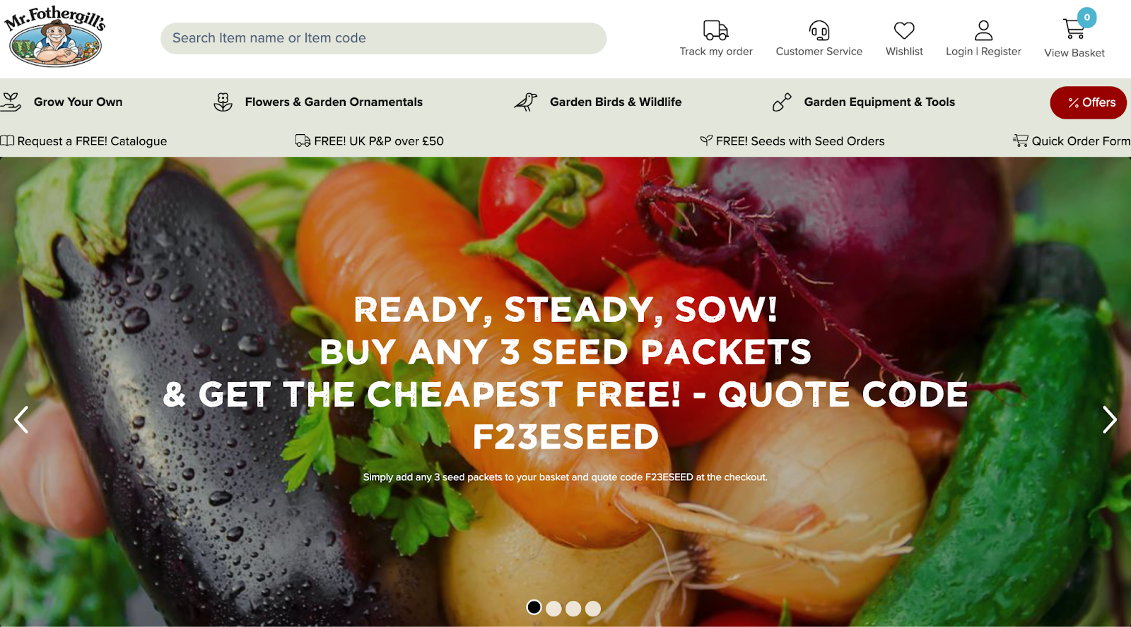
Screenshot of Mr. Fothergill’s previous homepage. Here you can see how the navigation bar looks like a USP banner.
In addition, the site had a high click depth, indicating that product pages (PDPs) were hard for users to reach.
All in all, the navigation had been historically underutilised and was in need of a complete overhaul.
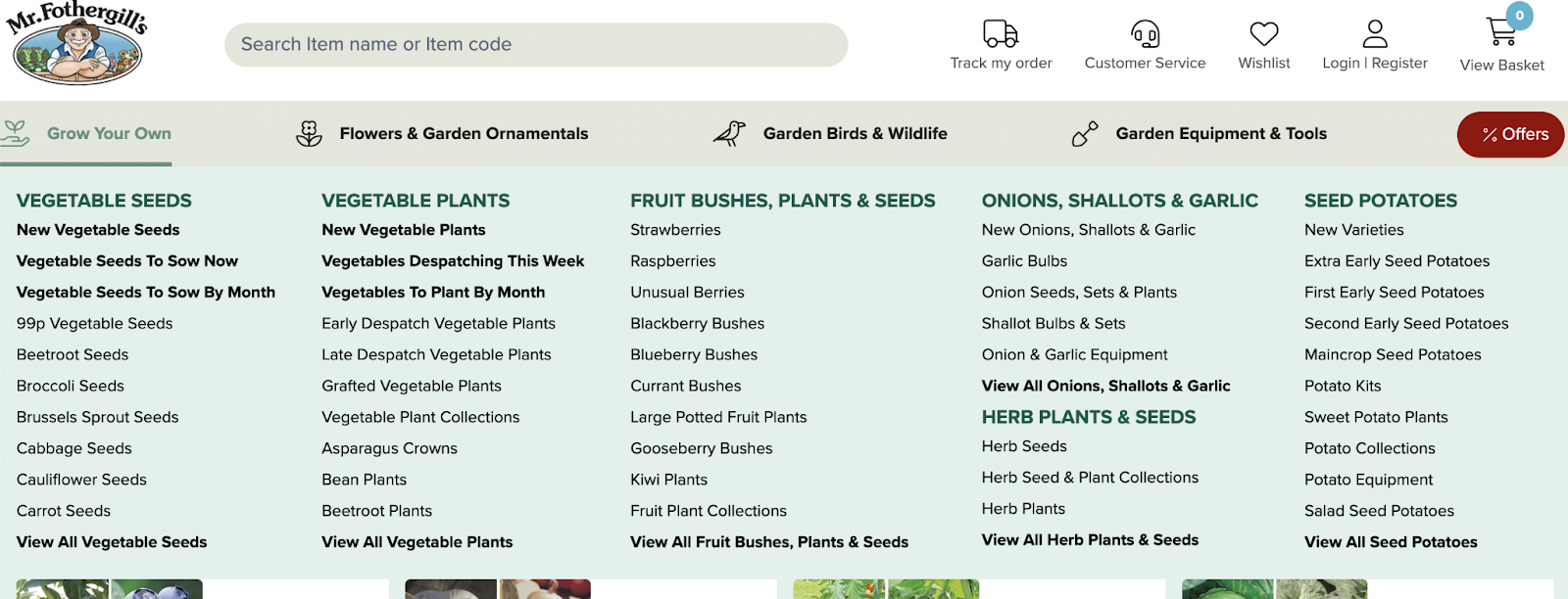
Screenshot showing legacy navigation menu for desktop.
Our solution
Good navigation allows users to efficiently explore an extensive product catalogue, whilst also inspiring purchases.
Our approach to achieving this was multifaceted, but first required that we deepen our understanding of the store’s audience. A common technique to accomplish this is through the creation and application of personas; fictional profiles that represent a group of people within a brand’s target audience.
Using the various personas Mr. Fothergill’s had created, our team focused on designing a navigation to cater primarily to the ‘Traditional gardener’ and ‘Urban grower’. These two groups formed the majority of the site’s traffic, meaning we could be confident most people visiting the store had a foundational knowledge of plants and gardening.
The navigation needed to better serve these audiences, capture their attention and help them find suitable products in an efficient manner.
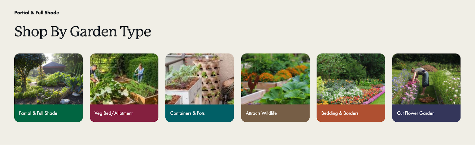
a) Shopping by action
Our team decided to encourage shopping by action rather than shopping by product name or type. This is a common technique across ecommerce websites. For fashion stores, it might look like shopping by occasion, allowing brands to inspire purchases rather than users having to know exactly what they’re looking for.
In the case of Mr. Fothergill’s, this looks like shopping by garden type. As seen in the image below, users can shop according to the space they are planting in.
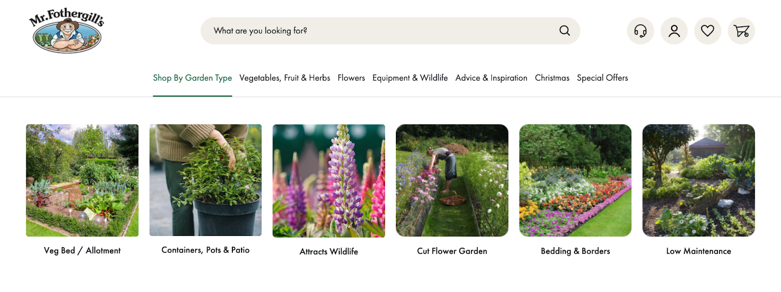
Example of how the new navigation allows users to shop according to their garden type.
The aim of this is to inspire and captivate users. It demonstrates the exhaustive range of products available without overwhelming customers.
b) Visual navigation
Another technique we harnessed to reduce decision fatigue was to deploy strong visuals throughout the navigation, rather than rely on the text-only approach used in the legacy navigation.
Images are used in tandem with bespoke iconography, created by our design team, to establish a comprehensive navigation that would engage customers, reduce click-depth and quickly direct users to collection pages.
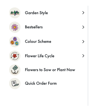
Image of icons in use on navigation.
The importance of a test and learn approach
Importantly, this navigation is neither fixed nor permanent. It can – and should – be adapted based on data, insights and season. The next step in optimising the navigation UX is to test how exactly it is being used and how it can better accommodate all personas within the target audience.
2. Using visuals to communicate key information on PDPs
Bespoke iconography
Illustrations and imagery were integral in the launch of this flagship gardening ecommerce store. The illustrated icons were created by one of our in-house designers and used throughout the store to ease decision making and provide visual continuity.
Given that plants and seeds are products with a vast amount of information that needs to be communicated to consumers, we needed to find a way of displaying this accurately and efficiently – all whilst keeping the customer experience in mind. Taking an image-first approach on PDPs would help users find and synthesise the information they need.
For example, we leveraged bespoke iconography to communicate key features, such as whether a plant is attractive to birds or suitable for full sun. Below are some snapshots:
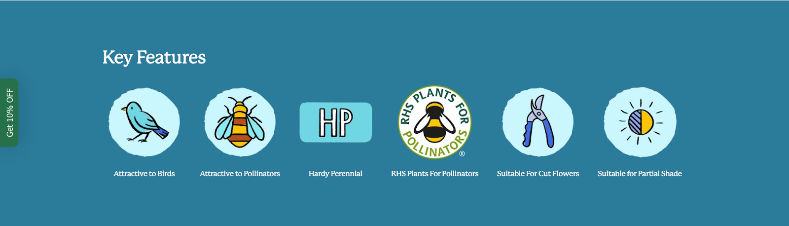
Example from Echinops Ritro Veitchs page.

Example from Cherry Tomato page.
Designing and building a custom planting calendar
Additionally, we designed a custom planting calendar, displayed on relevant PDPs, that visualises a product’s planting and harvesting cycle.
This is another example of how we used visual components to aid the customer journey by reducing friction points and the possibility of decision fatigue.
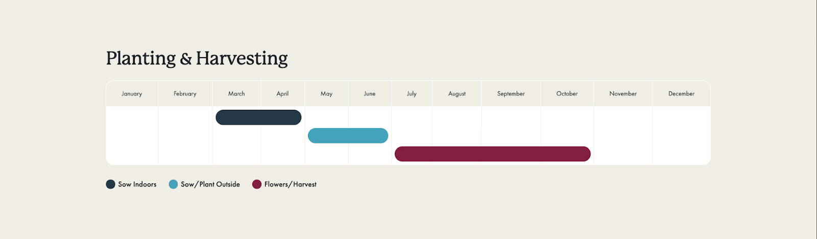
Example of planting calendar from Cherry Tomato page.
Updating the look and feel of the customer experience
1. Modernising the site’s design
Mr. Fothergill’s draws a multi-generational audience, all of whom would benefit from a modern site design for improved navigation and accessibility. Updating the look and feel of the store was a high priority and included:
- striking a balance between modernising the website and not alienating current customers;
- implementing refreshed typography that steers away from all-caps and gently embraces modern trends, while retaining a heritage feel;
- larger, more mobile friendly sections with clear CTAs, reducing cognitive load and increasing consumer focus as users land on site;
- heavier use of bolder colours to break up and highlight content for easily digestible information and a sense of progression through pages;
- curved corners to reflect the friendly and accessible approach this brand takes;
- subtle, clear and intelligent communication of USPs; and
- a mobile-first approach.
2. Providing a richer brand experience
The friendly face of the Mr. Fothergill’s character is widely recognised by consumers. For many gardeners, it represents an established and trustworthy brand with a great reputation. We decided to bring the logo and Mr. Fothergill’s character to the forefront of the store – elements that were previously featured little on the site.
One example of this is the inclusion of the character illustration on section dividers, as seen below.

Screenshot of Mr. Fothergill’s character between sections on homepage.
On top of this we incorporated the brand’s full colour palette throughout the store, where previously certain colours were used disproportionately. Now, colours are used to distinguish different category pages.
Example of colours being used to visually differentiate categories.
Design additions such as these bring greater cohesion to brand identity across the store. They can also bridge the gap between the on- and off-site experience. This is especially pertinent in the case of Mr. Fothergill’s where customers are familiar with the brand’s logo from garden centres and retail outlets.
Consulting on an enterprise Shopify tech stack
A strong, consolidated ecommerce tech stack is the foundation of a good frontend experience, and has the potential to enable sustainable long-term growth by seamlessly connecting backend processes with frontend user experience. It’s also important to identify user-friendly and intuitive solutions which an ecommerce team enjoys using day-to-day.
Assembling the tech stack for Mr. Fothergill’s required extensive understanding of:
- the customer journey and user experience;
- the backend requirements of the team at Mr. Fothergill’s; and
- Shopify’s app ecosystem.
Alongside Shopify Plus, the chosen tech stack includes:
- Gorgias to build an excellent customer service experience – something that, through voice of customer analysis, we identified as a previous friction point;
- Klaviyo to power the store’s email marketing;
- Plytix PIM to centralise product information; and
- Jitterbit to integrate the various frontend and backend systems and ensure seamless data flow throughout the stack.
A particularly important element of the chosen tech stack is the use of Searchspring, a leading search and filtering app designed especially for ecommerce.
Searchspring consultancy and integration
The core aim of the new and improved site navigation was to move users to collection pages quickly, and from here users would be able to narrow their search using appropriate filters.
However, the Mr. Fothergill’s large product catalogue posed a key challenge; different product categories required different filters (i.e. the filters required for potatoes would be redundant for spring bulbs).
We needed a search and filtering application that could accommodate the store’s requirements. Searchspring, which excels at creating a user-friendly search and filtering interface, was the app of choice for the Fothergill’s team.
Connecting Shopify to Searchspring’s server and algorithm enables enhanced search and filtering capabilities. This is possible through the use of product tags which allows for filters to dynamically change according to what a user searches.
Below are screenshots demonstrating this in practice. If a user searches for ‘compost’, the filters available are very different to those for the query ‘peas’ or ‘berries’ . This nuance is possible because the Mr. Fothergill’s store is connected to Searchspring’s server algorithm.
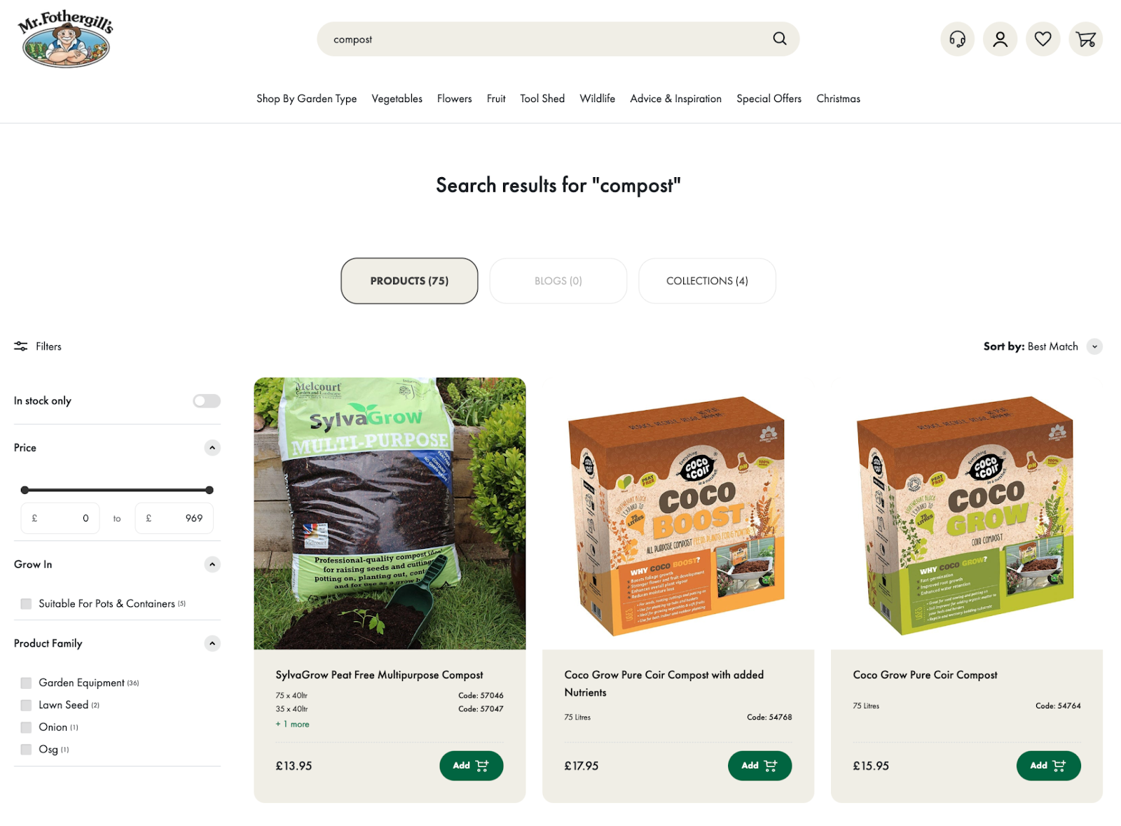
Screenshot of search results and filters for query ‘compost’.
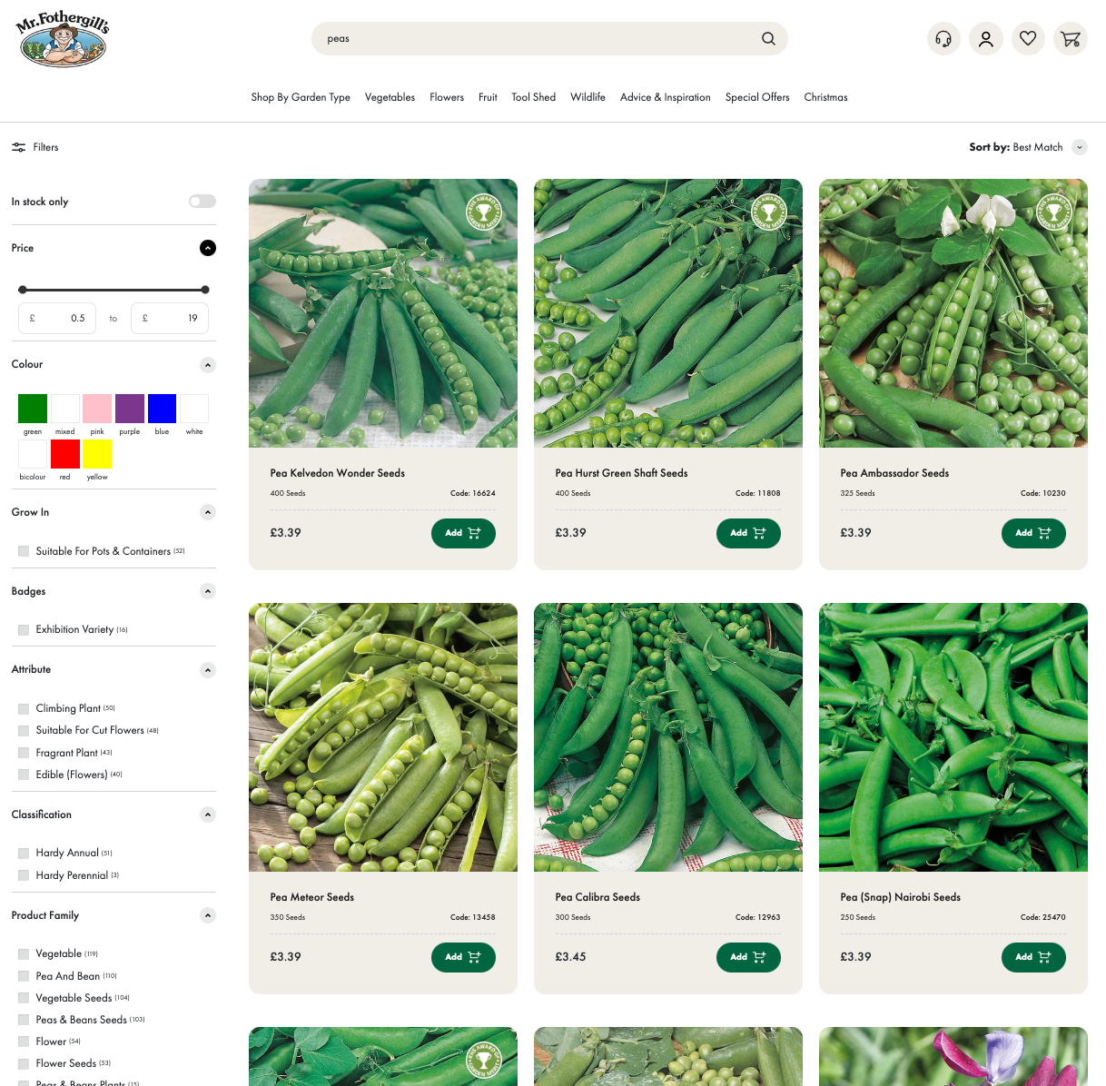
Screenshot of search results and filters for query ‘peas’.
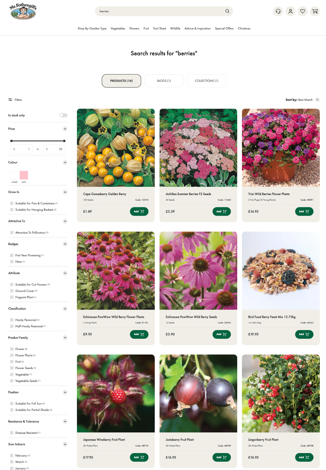
Screenshot of search results and filters for query ‘berries’.
There are various other nuances to the way that Searchspring was deployed here. We developed stylised badges that appear on product cards, indicating to customers whether a product has a RHS Award of Garden Merit certified, is sold out, or has a special offer.
Our team built these with logic, and this was then replicated by the Searchspring team in Preact and applied to their integration. The result is that product cards display these badges on Collection pages, reinforcing the visual-focused user experience of this store.
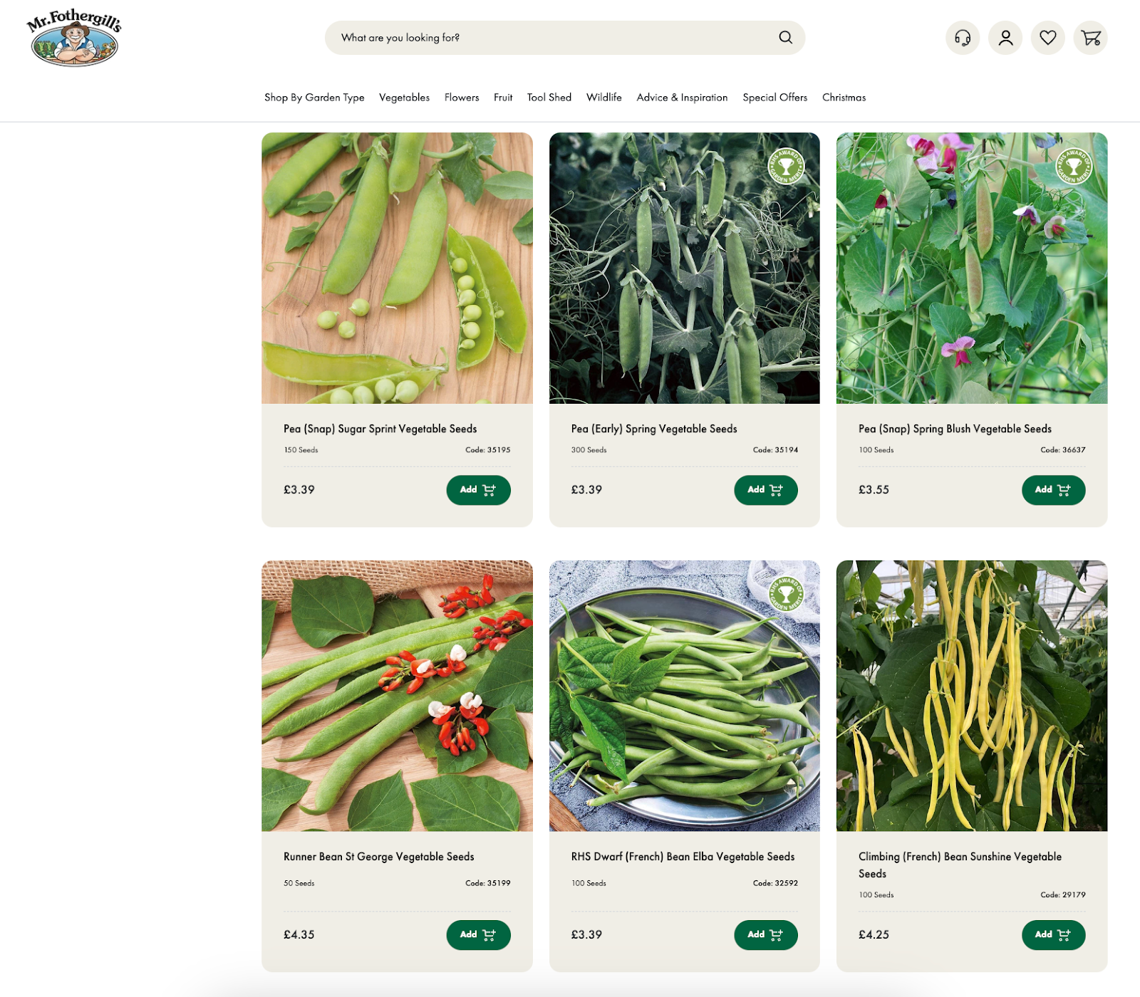
Screenshot of peas and beans collection page showing RHS Certified badge on multiple product cards.
Post-migration results
A core aim of this project was to improve UX for Mr Fothergill’s customers.
Post-migration data confirms that this has been overwhelmingly achieved. The average post-launch conversion rate has increased by 44% compared to the previous 18 month average (and continues to rise).
The usage of search has increased 332% YoY, with around 21% of users utilising the search functionality. Moreover, those who engage with the search are four times more likely to convert. Results such as these verify the extensive time our team invested in optimising the search and navigation functionality on the store, given its large product catalogue.
Another statistic that points to an improved UX is that average engagement time has seen an uptick of 7.6% YoY. This indicates that users are having a more positive experience on the site and staying engaged with the content.
A unified approach to help the Mr. Fothergill’s group thrive
The team at Mr. Fothergill’s chose to migrate not only the flagship store from SuiteCommerce to Shopify Plus, but also other stores within the brand group; with new sites for Woolmans and DT Brown following shortly thereafter, deploying much of the site architecture developed for the initial flagship store.
Having a unified approach to ecommerce across the group will provide a solid foundation for each of the individual brands to flourish, whilst streamlining backend functions for the various brand teams.
Grow your home and garden ecommerce store with Swanky
Home and garden ecommerce is an industry Swanky is well-versed in. We’ve helped multiple brands in this sector navigate the challenges of selling online, including the likes of British mattress B Corp Naturalmat, innovative German furniture retailer Aeris, and Australian window dressing brand Veneta Blinds.
If you want to migrate your store to Shopify Plus, elevate your site’s design, or upgrade your ecommerce tech stack, get in touch today.