Creative Ways to Collect UX Feedback From Your Customers
A strong user experience is the key to boosting your store’s conversion rate. But how can you find out what your customers really love – and hate – about browsing your site? Today, we want to help you gain new insight into your customers’ behaviour – and unlock real ecommerce success.
Written By
Esther Lowde

Providing your customers with an impeccable, streamlined user experience (UX) has never been more important.
Matt Giles, Swanky’s Creative Director, has this to say about user experience:
“A good user experience enables the customer to undergo and complete a journey effectively and efficiently, in the fastest and least complicated way possible. The whole interaction with a brand is user experience. Every step of the journey and every touchpoint should be uncomplicated. If a brand has a particularly complex product, service or journey, it should be simply explained, designed and constructed.”
In fact, studies show that almost 40% of customers will instantly stop engaging with an ecommerce store they find ‘messy’, nearly half of all shoppers will leave a website that takes more than 3 seconds to load, and an incredible 70% of customers have abandoned their shopping carts due to a poor overall UX.
But don’t panic! You can keep your customers happy and engaged by identifying which aspects of your website may be dampening your customer experience – and then ironing out these creases one by one.
The most effective way to begin this process is by gathering both positive and negative UX feedback from your customers.
Essentially, you want to find out:
- What’s stopping your visitors from purchasing from your store?
- What’s making them want to buy from you?
To encourage customers to give you their answers, we recommend engaging them with attention-grabbing phrases, humour, creative designs or frequent reminders of what’s in it for them.
Here are some of our favourite ways to get to the bottom of what your customers really think:
‘Humanise’ your brand
Before you start asking your customers for feedback, make sure you’ve given them a reason to want to help you out – and we’re not just talking about prizes and discounts here (although we’ll get into that soon)!
Ideally, you want customers to root for your business and want to help you succeed.
There are dozens of changes you can make to help build this kind of positive relationship with your customers. For example:
- Including an ‘About Us’ section on your website can help customers connect with you on a more personal level – especially if you use pictures of your founders and staff members.
- 46% of customers say they won’t trust a company whose mission statement is unclear, so highlight your company’s ethos as much as possible to build trust in your brand.
- Including photos of people looking happy on your webpages will make visitors more likely to respond positively to feedback requests. Imagery that depicts people and customers smiling has been shown to boost sales significantly – and will also increase the chances of buyers leaving you valuable feedback about their browsing experiences.

One of our clients, leading accessory brand Knomo, include fun, personality-filled photos of their team on their ‘About Us’ page.
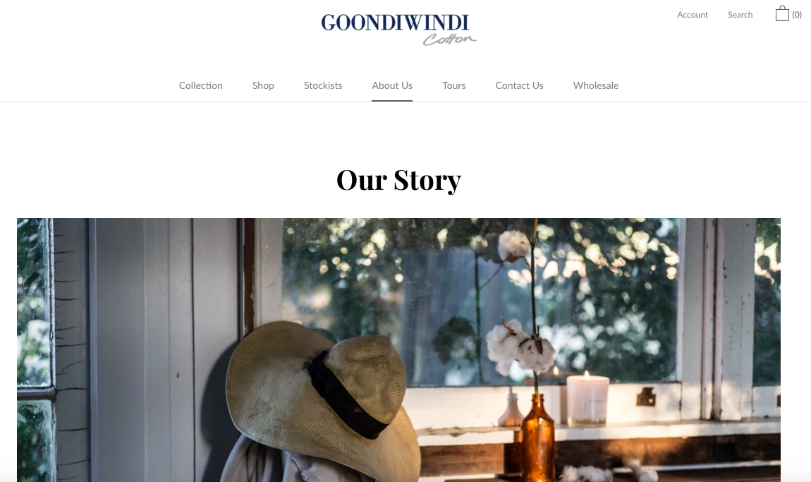
Another of our clients, premium cotton brand Goondiwindi Cotton, have dedicated a full page to telling the story of their homegrown, family-owned Aussie brand.
By weaving personal touches like this into your store’s design, you’re developing an intimacy with your customers which ultimately makes you seem more ‘real’ – and thereby more worthy of their time and trust.
As a result, they’ll be more likely to respond when they see that “Please help us improve!” message pop up on screen.
Pick the right moment to ask for feedback
Just as it’s important to approach your customers for feedback in the right way, it’s equally crucial to ensure you’re asking them at the right time.
Don’t just provide a link to a UX survey at the footer of all your pages. Proactively engage with your customers with attention-grabbing pop ups and personalised emails.
Why not install a survey tool, such as Hotjar, that can present a survey in a pop-up on your store? This is a better option than using external surveys, as it lowers the risk of a customer leaving your site and forgetting to buy the products they added to cart.
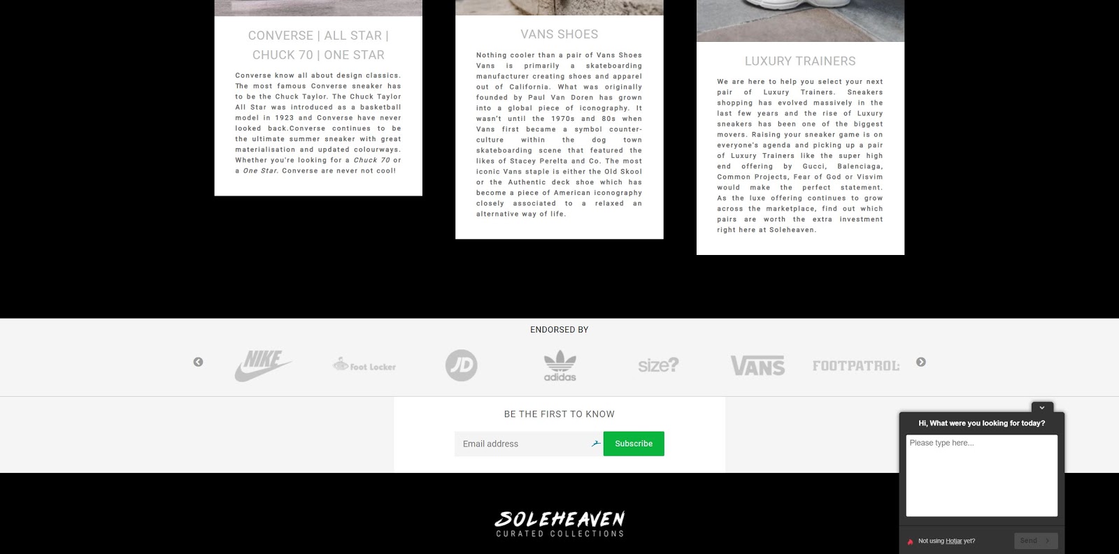
This Shopify Plus store uses Hotjar to power customer surveys.
We’d recommend reaching out to customers when their shopping experience is still fresh in their mind, either through a follow-up email or on-site. For example, post-checkout, you may want to embed a customer survey into your thank you page (or have it appear as a pop up) to ask your customers how easy they find navigating your website.
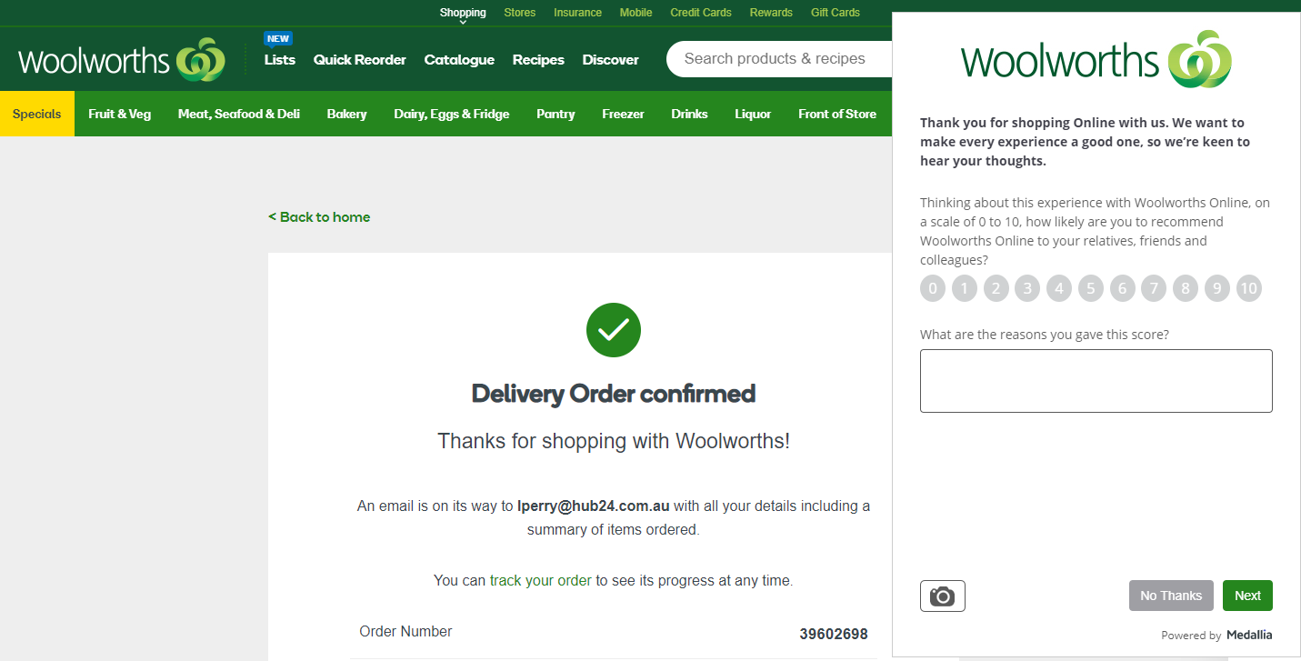
Aussie grocery giant Woolworths has embedded a quick feedback form pop up into its thank-you page.
If you’ve got a loyalty program, this can be a great opportunity to motivate people to leave survey responses in exchange for loyalty points.
Even if your customer chooses to abandon their cart, you can still find out valuable information about their UX by presenting them with a pop up to ask them why they’re leaving.
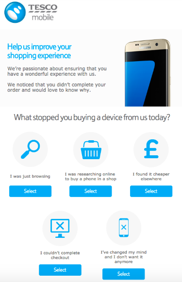
Tesco’s mobile app encourages customers abandoning their carts to give them their reason why.
Top tip: Keep your pop-up messages short and sweet! Often, just two or three multiple choice questions at a time will suffice – and will stop your visitors getting bored and leaving the page. If you do want to link out to a longer survey, show your consideration for your customers by letting them know how long it will take to complete.
Incentivise your customers with rewards and product giveaways
Another highly effective way of persuading customers to leave their feedback is to offer them a deal they can’t refuse – or the chance to win big in a competition or product giveaway.
Be sure to emphasise that you’re looking for users’ honest feedback as part of a genuine effort to improve customer experience.
Here are some examples of brands handing their customers exclusive discounts and freebies in exchange for honest feedback about their browsing and buying experience:
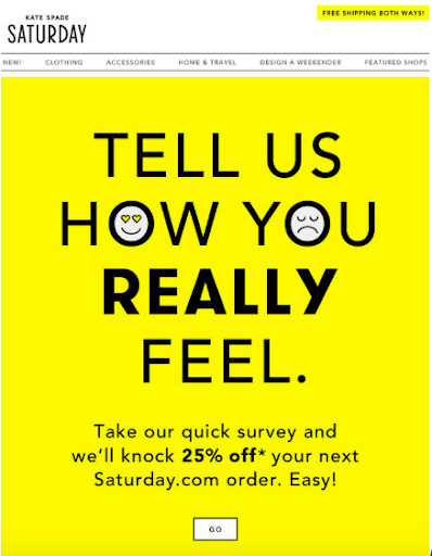
Kate Spade clearly understand the importance of quality UX feedback, as they offer their customers a full 25% off their next order just for sharing their thoughts with the brand.
Image source: marketingland.com
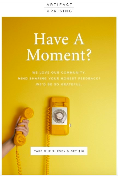
Artifact Uprising have taken the phrase ‘penny for your thoughts’ to the next level, as they offer their customers a $10 discount in exchange for their opinions.
Image source: essenceofemail.com
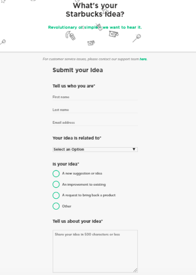
Starbucks have received over 190,000 creative suggestions from their customers since launching their ‘My Starbucks Idea’ campaign back in 2008.
Image source: myfeelback.com
Make use of your social platforms
Social media platforms like Instagram, Twitter and Facebook are fantastic tools for collecting feedback from your customers in a way that’s fun, dynamic and original.
One effective way of doing this is through the poll and sliding poll features on your social platforms, which allow users to quickly give their opinion on questions like “How quickly do you find what you’re looking for on our site?” or “Which colour scheme do you prefer for our homepage’s new look?”
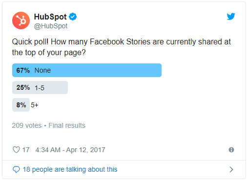
HubSpot used this quick Twitter poll to find out how many of their followers were making use of a new social media update.
Image source: HubSpot.com
Facebook also now lets your followers ‘react’ to your posts, so don’t miss your chance to get creative with this feature!

Full Sail University have made the most of Facebook’s recent update by assigning each Mario character its own reaction. How about using it to get to the bottom of your customers’ online shopping preferences?
Image source: optimonk.com
Plus, with all of the social media analysis tools on the market today, identifying common questions, complaints, compliments and recommendations in your comments feed has never been easier.
One of our favourite social media analysis tools is Meltwater; a tool which sifts through your comments section automatically and organises your customers’ opinions into multiple groups.
‘Listening’ to your followers in this way will open up a wealth of UX feedback you didn’t even realise you had, giving you a clear idea about what your customers love – and aren’t so fond of – when it comes to browsing your ecommerce store.
Create a discussion forum on your store
Another creative way of gathering UX feedback is to set up a dedicated space on your website where customers can come together to discuss their ideas, concerns and general experiences on your site.
For example, you could set up a forum in which customers are primarily encouraged to share their thoughts on your products, but then include subforums where users can comment solely on your website’s UX.
By creating a community within your ecommerce store, you’ll not only increase the depth and quality of the UX feedback you receive from your website’s visitors – your customer retention and loyalty may also see a boost!
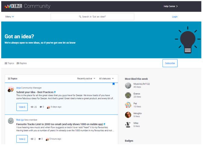
Music streaming brand Deezer recently introduced a forum called the Deezer Community to their website, encouraging users to share their feedback with each other and the Deezer team.
Carry out A/B tests
Another method of determining what kind of layout your customers respond to best – without asking anything of them directly – is to begin A/B testing; comparing two or more different versions of a webpage to see which results in more conversions.
A/B testing allows you to experiment with virtually any aspect of your ecommerce store – from the images you use on your product pages to your website’s colour scheme.
One of its key advantages is that it allows you to find out how your customers are handling different elements of your store without giving them any hassle at all.
A/B testing complements surveys as a solid source of quantitative data, too. Get the numbers you need to understand your customers and supercharge your UX.
Analyse your customer reviews and customer service tickets
Just as you can learn by ‘listening’ to your followers’ comments on social media, you can also find valuable feedback hidden in your customers’ reviews and service complaints.
For example, using an analysis tool like Yotpo, you can quickly compile all the recurring UX-related themes in your buyers’ reviews to find out exactly what’s working for your customers – and what isn’t.
Top tip: If you give your customers the opportunity to write multi-layered reviews using review tools like Okendo, your buyers will be able to rate and comment on different aspects of their buying experience (from the quality of the product to how long it took to arrive). Listing one of these options as ‘UX experience’ will allow you to easily gather UX-specific feedback from even more of your customers.
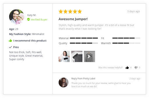
An example of a review left by an Okendo user, demonstrating customers’ ability to rate different aspects of a product or service.
Similarly, you can use analysis tools such as Gorgias or Klaviyo to take your customer service tickets – in which your customers will lay out exactly what they’re struggling with on your store – and turn them into an opportunity to improve. Use these tools to identify any recurring problems with your site and find creative solutions to your buyers’ problems.
What should you do with all this feedback?
After following these tips, you should be left with a pool of in-depth feedback from customers who have had both positive and negative experiences while surfing your store.
Now it’s time to turn this data into real results for your business.
Once you’ve finished categorising your feedback (either manually or by using our recommended tools), create a list of the changes you think your customers would most like to see.
Next, it’s time to implement these changes on your website; creating a version of your store that not only looks and works better, but ultimately sells more products. And as mentioned, make sure you A/B test any changes on your store in order to realise which changes actually increase sales and improve the experience for all your users.
And don’t stop there!
Keep collecting feedback from your customers – and find creative ways to do it. Gathering feedback should be an ongoing process; a continuous loop that lets you build on your success year after year.
Before you know it, you’ll have a steadily improving ecommerce store, increasingly happier customers and an ever-growing conversion rate to show for it.
Find out more
To find out more about how Swanky create beautiful websites that are built to convert, please get in touch with our friendly team of ecommerce experts today. We’d love to hear from you!

