Web Design for Ecommerce: Using Micro-Interactions Successfully
Web design for ecommerce is all in the details. This is exemplified by micro-interactions. These are small moments of design that give feedback to a user when navigating your ecommerce store. If you get this design wrong, you can overwhelm and confuse customers. But get it right, and your conversion rate will increase. Matt Giles, Swanky’s Chief Creative Officer, explains more below.
Written By
Matt Giles

What are micro-interactions?
When talking about web design for ecommerce, micro-interactions are any kind of user interface (UI) moment where a user receives feedback. This feedback is to show a user that something has happened on a webpage.
This might be something as simple as a button changing colour when clicked, or something indicating an item has been added to cart. This could happen in multiple places around the page. It might happen just in the top corner with a small ‘1’ appearing on the cart icon, or it might happen on the button itself.
These micro-interactions create helpful UX and UI moments. When executed successfully they add value to the customer journey. However, they can also cause barriers in this journey.
Why are micro-interactions important in ecommerce?
It is well understood that effective employment of micro-interactions can increase customer attention and engagement.1 These can consequently lead to increased conversion rates. This is caused by a few different factors, some of which are a longer dwell time and reduced bounce rate on a page. Visitors are less likely to leave a site whose content is interesting and winsome; web design for ecommerce can achieve this through utilising micro-interactions.
Moreover, micro-interactions can be used to improve the navigation of a store. When navigation is smoother and easier for a user, that user is more likely to stay on your site, make a purchase and return in the future.
So, successful micro-interactions will engage users, increase dwell time and provide a smooth customer journey through your site. When these attributes come together, conversion rates increase.
What makes a successful micro-interaction?
If good micro-interactions increase conversion, what makes it good?
These are called micro-interactions for a reason: they’re micro. Less is more. The best micro-interactions are seamless and go nearly unnoticed. They add value to the customer journey by being intuitive and giving relevant information to a user as they navigate a site. If these interactions are too big, they provide a barrier to conversion rather than being an aid.
A great example of a successful micro-interaction is the ‘cha-ching’ sound merchants hear when a sale is made on their Shopify store. This has been such a success that Shopify released a limited-run of physical buttons that make the same noise. They marketed this as ‘your very own serotonin boost’ and sold out within minutes.
Few micro-interactions can go on to create such a high-demand product. This isn’t because they’re unsuccessful, it’s because they are micro. The only way of truly knowing whether what you’ve designed is successful is by testing it. This is something we’ll return to shortly.
When should you use micro-interactions in web design for ecommerce?
As we’ve noted, micro-interactions can ease and improve the user experience. For this reason, when and where you use them is worth careful consideration.
If these interactions are used too much you risk overloading a user with information and feedback. If you use them too little, you risk missing opportunities to give customers feedback on their journey through your site.
Given this, there must be a sweet spot you can find when designing micro-interactions for ecommerce…
Using data to improve micro-interactions on your ecommerce store
To find this sweet spot you can’t rely on your design intuition. Of course, this plays a part in creating great UI moments, but to really understand how a micro-interaction is landing with customers, you need to test it. It is only by testing that you can know if your micro-interaction is successful.
This could be an A/B test or a multivariate test to determine how a micro-interaction affects conversion rate. You need to know whether the UI moments you’re creating are overwhelming or distracting for customers, and/or impacting conversion rates.
Or have you hit that sweet spot of appropriately sharing information with customers during their navigation through micro-interactions? You know if you’ve found this point, because it’s the design that yields the highest conversion rate.
Read our article about testing on Shopify to learn more about this topic and see how Swanky have used it to optimise numerous clients’ sites.
What are some good examples of micro-interactions in ecommerce web design?
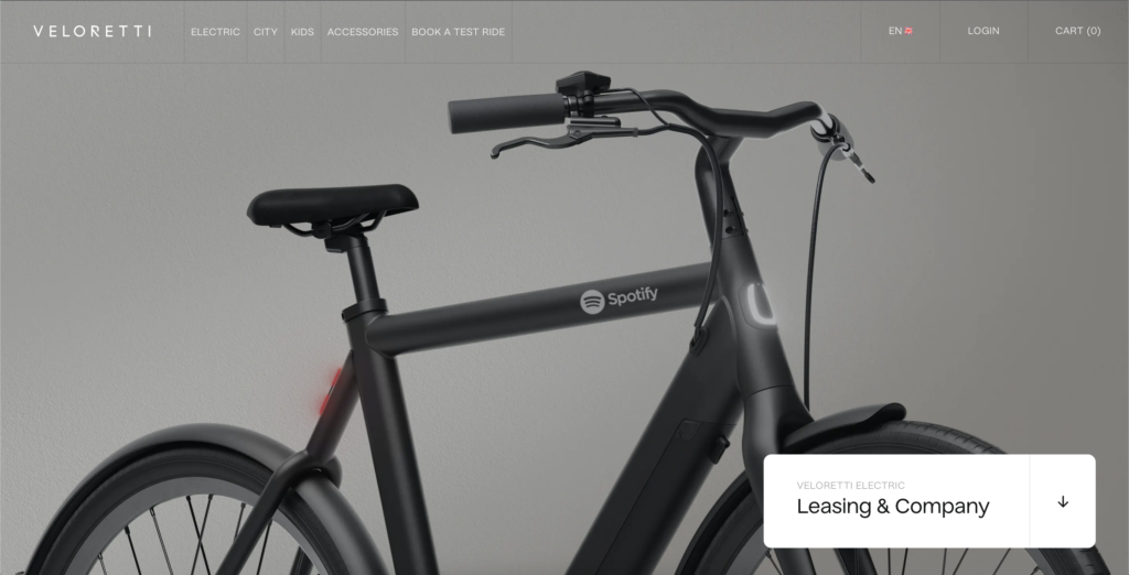
Veloretti
An e-bike company with a slick website. The smoothness of this site is largely due to the micro-interactions that enhance the user’s experience. They give a high-gloss effect and work to increase the perceived sense of brand value. Here are some of those features:
- Subtle highlights, scroll suggestions, great configurators – even down to the small details.
- Gradual revelation of section titles to draw attention to written content on scroll.
- The site’s desktop navigation is clever and unique, expanding horizontally with a bounce effect.
Rollie
Rollie is an international fashion brand using Shopify to host their ecommerce store. They use micro-interactions throughout their site to improve customer experience and brand awareness. Here are a few prime examples:
- Within ‘Collection’ the rollover image shows a full model shot for inspiration and also reveals ‘Quick add’.
- When you click ‘Quick add’, a clear UI appears to select your size. This is a great example of not initially overwhelming the user with options, but allowing the product image to provide the immediate inspiration for purchase.
- Clicking ‘Filter’ at the top left draws your focus into the task at hand by blurring out the product listing.
- When you add a product to cart from quick add, the Cart Drawer pulls out with a smooth animation and the product page behind is blurred. This again focuses the user on the task at hand.
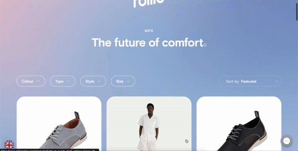
If you want to learn more about going global on Shopify, just like Rollie have done, take a peek at our recently updated internationalisation ebook.
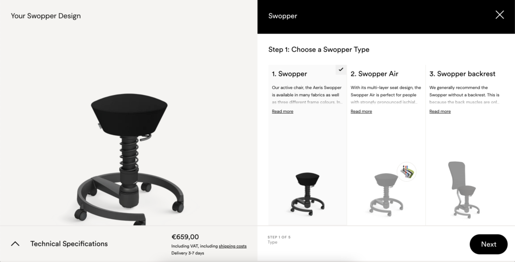
Aeris
As a previous Swanky client, Aeris too use micro-interactions to engage customers and increase conversion rate.
A key example of this is the Aeris Swopper configurator we built. As users interact with it, the image and price change to reflect users’ choices. Without micro-interactions on such a complex but high value product, customers could disengage; they may be discouraged in their selection and unable to commit. In this case, micro-interactions encourage feedback and purchase.
Johnny Cupcakes
This is a unique brand with a fun load page. The micro-interaction on this loading page is entertaining and informative; it gives feedback to the customer that something is coming.

These small moments of interaction can go a long way to catch the customer’s attention. They can also increase retention as a customer remembers a site or brand because of a micro-interaction. In this case, it can even mean that customers reload the page to see the interaction again.
How micro-interactions build brand identity and perceived brand value
A universal trait to all the above examples is that their use of micro-interactions builds brand identity. Look at Veloretti, the smoothness of their site mirrors the smoothness of riding a Veloretti bike. And they achieve this largely through micro-interactions.
Remember that micro-interactions are touch points for a user to experience your site and your brand. The small moments bring a brand to life; especially a brand that only has an online presence. This idea of connection with your brand is another layer to examine when designing for ecommerce.
For instance, the antithesis of Veloretti’s store would be Pa’lante Packs’ store. This is a brand whose product – ultralight hiking packs – is about simplicity. They’ve chosen to reflect this simplicity in their ecommerce web design by minimising the number of micro-interactions.
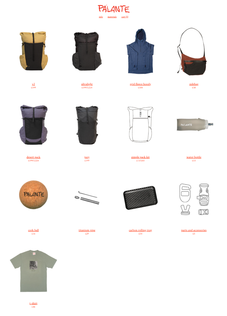
This demonstrates how it’s not always about optimising the use of micro-interactions to enhance conversion rates.
It’s more of a balancing act. You need to find the point where micro-interactions best animate and reflect your brand identity, and where they optimise conversion rate. Sometimes there may be compromise in this decision. If there is, let data help you determine where and when to compromise when designing for ecommerce stores.
Micro-interactions and data-led ecommerce web design
One of the best pieces of advice when considering micro-interactions and web design for ecommerce is to look at examples. What makes a store’s design engaging? Is it these small interaction moments? Or is it the brand identity? Is the navigation enhanced or hindered by micro-interactions?
More than anything, test your designs. As mentioned, it is only through testing that you can know whether your design is improving conversion or not.
Here at Swanky we use testing to inform our Shopify Plus design and increase conversion exponentially for our clients. If you want to learn more about how we could do this for your ecommerce business, get in touch today.
For reference:
[1] https://www.shopify.com/uk/partners/blog/microinteractions