A Guide to Mobile Responsive Web Design for Your Shopify Plus Ecommerce Website
Swanky web designer Mark Halliwell shares a step-by-step approach to mobile responsive web design for your Shopify store in this practical guide.
Written By
Mark Halliwell
With mobile ecommerce sales representing 60% of all ecommerce sales globally1, responsive web design is no longer a luxury—it’s a necessity. This guide, tailored for Shopify store owners, takes you through nine practical steps to creating a responsive, mobile friendly Shopify store design.
A responsive ecommerce website can deliver a seamless experience across devices and screen sizes to create a highly effective online store. Hear top tips from one of Swanky’s Shopify Plus designers on how we ensure every store we design is appealing and accessible to all customers, no matter how they access the site.
9 steps to designing a responsive ecommerce website
Step 1: Start by making your branding mobile friendly
Creating a highly-effective, mobile friendly store begins before design. It’s important to review your brand colours, brand assets and typography, to ensure they are accessible to all potential customers across all devices.
An online store with poorly considered content and brand assets will be less effective on a mobile device. Once you have defined the global elements such as typography, colour, button styles and image ratios, they can then be used across your online store to create a consistent customer experience.
When it comes to responsive web design, Swanky advises following best practices for web accessibility (WCAG). There are numerous important factors within WCAG guidelines which Swanky follow as standard, but if you’re just starting out, here are two factors which have a big impact whilst requiring minimal time investment:
- Colour contrast – Ensure the colour combinations in your main brand colours meet AA, as a minimum, and ideally aim for AAA standards. AA colour contrast on your store will mean your content is easy to read, even in poor lighting.
- Text sizing and spacing – Font legibility and the scaling of font sizes are key to mobile friendly web design, as the reduced device size makes readability more challenging on smaller screens. Consider line-spacing, line-height, and contrast to enhance readability. We recommend:
-
- a minimum of 16px/14pt font size; and
- line-height of x1.5 font size.
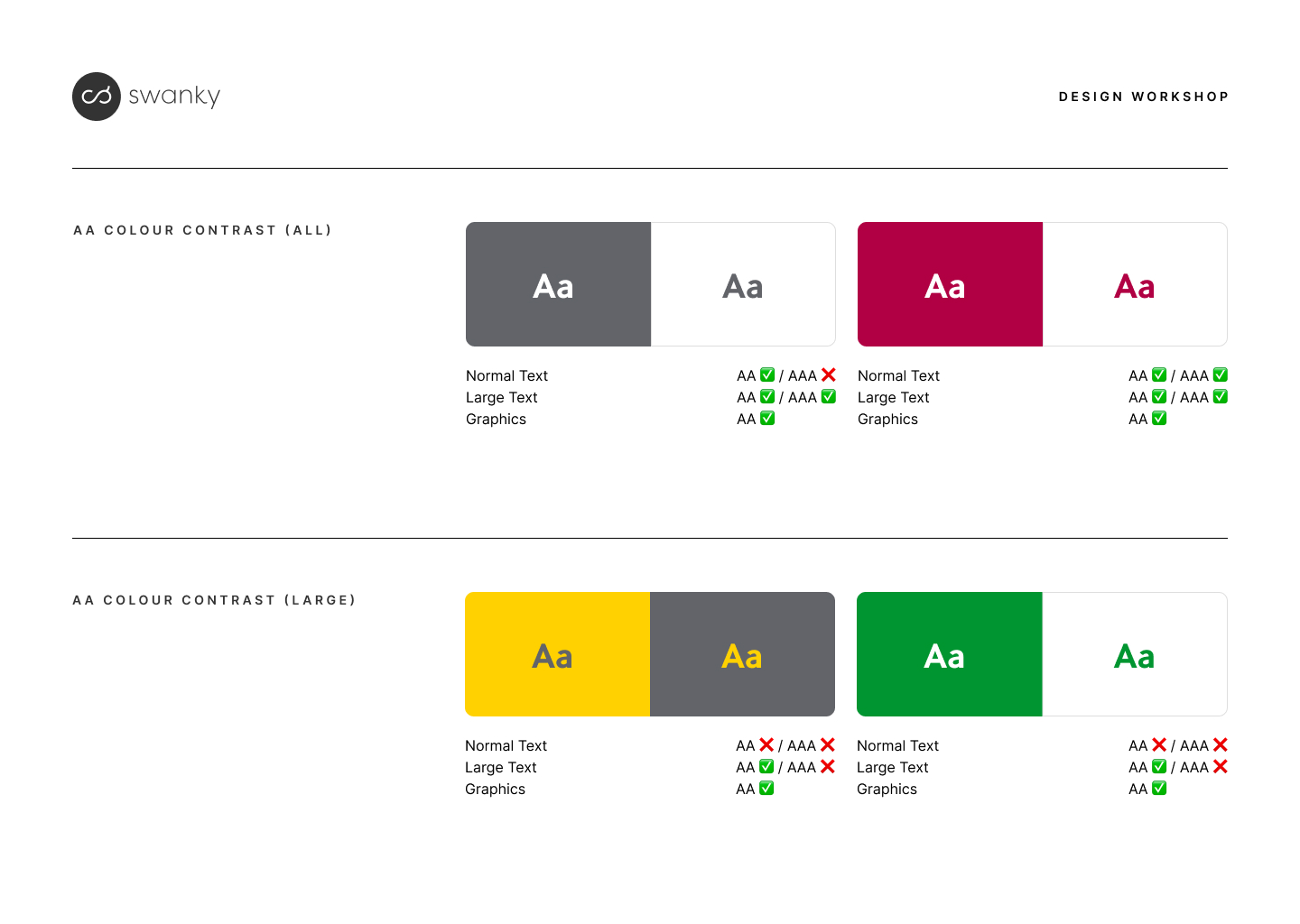
Below is an example of a brand audit we carried out for a French technology brand, ahead of a website design. You’ll see that some contrasts work for large text (24px and above, or 19px and above for bold font) or graphics (such as borders or icons), but are not clear enough to be used for normal text (less than 24px). It’s important to consider this impact when choosing your brand colours.
To get more ecommerce accessibility tips, check out our article on how to make your website more accessible.
Step 2: Streamline the content of your store before beginning the web design process
Once you have figured out your key brand assets, you’ll next need to review your content. By prioritising key content before starting on web design, you can greatly simplify the design process and create a more effective starting point for your responsive store design.
On mobile, too much content will increase scrolling and can cause user fatigue. Equally, too many options can lead to choice paralysis, whilst a lack of clarity on how to proceed can increase the chance of customer drop-off.
Start by identifying the key pages, content and features that are essential for your customers on mobile devices. These will be the main pages in your conversion flow, which, for the majority of brands, are likely to be your homepage, collection pages, product pages and cart. Or, if you have a non-standard user journey, like some of Swanky’s clients who use quizzes or landing pages to help users find the right product, your key pages may look a little different.
Focus on delivering the most important content upfront and at the top of the page, including sections with clear call-to-action buttons.
How much content you include will depend on where customers enter the store, and what content will help those customers take the next step to find the product or service that is right for them.
By considering content first, the design begins with a higher-value starting point that can lead to a more effective, mobile friendly website with greater optimisation overall.
For UK mattress brand Naturalmat, Swanky’s designers worked with the ecommerce team to help identify key USPs and reduce content to focus on clear, eye-catching messaging. Pairing these USPs with illustrations helped make them stand out further. You can read more about this project in this case study about upgrading Naturalmat’s ecommerce UX.

Step 3: Make your store imagery responsive
As well as text, it’s important to adapt your imagery across the site to make sure it is mobile optimised.
When you design your website sections, make sure they allow for different image settings for desktop and mobile view. This way you can adapt images to suit the different screen resolutions and sizes, to ensure they look crisp and load quickly on all devices. For example, you may want a 16:9 ratio on desktop but a 3:2 ratio on mobile in order for the image to display clearly, and retain key information above the fold.
Swanky’s development frameworks are designed for maximum flexibility and adapt to any image ratio. This means instead of being cropped or stretched, the image is fit within the container and the user still sees the full image.
When you come to choosing imagery, opt for photos that are sized to match the chosen image ratio so they clearly display your product. This can be made easier during the shooting and editing of your product photos, by giving studio shots plenty of white space around the product so that it will look good in any sized frame.
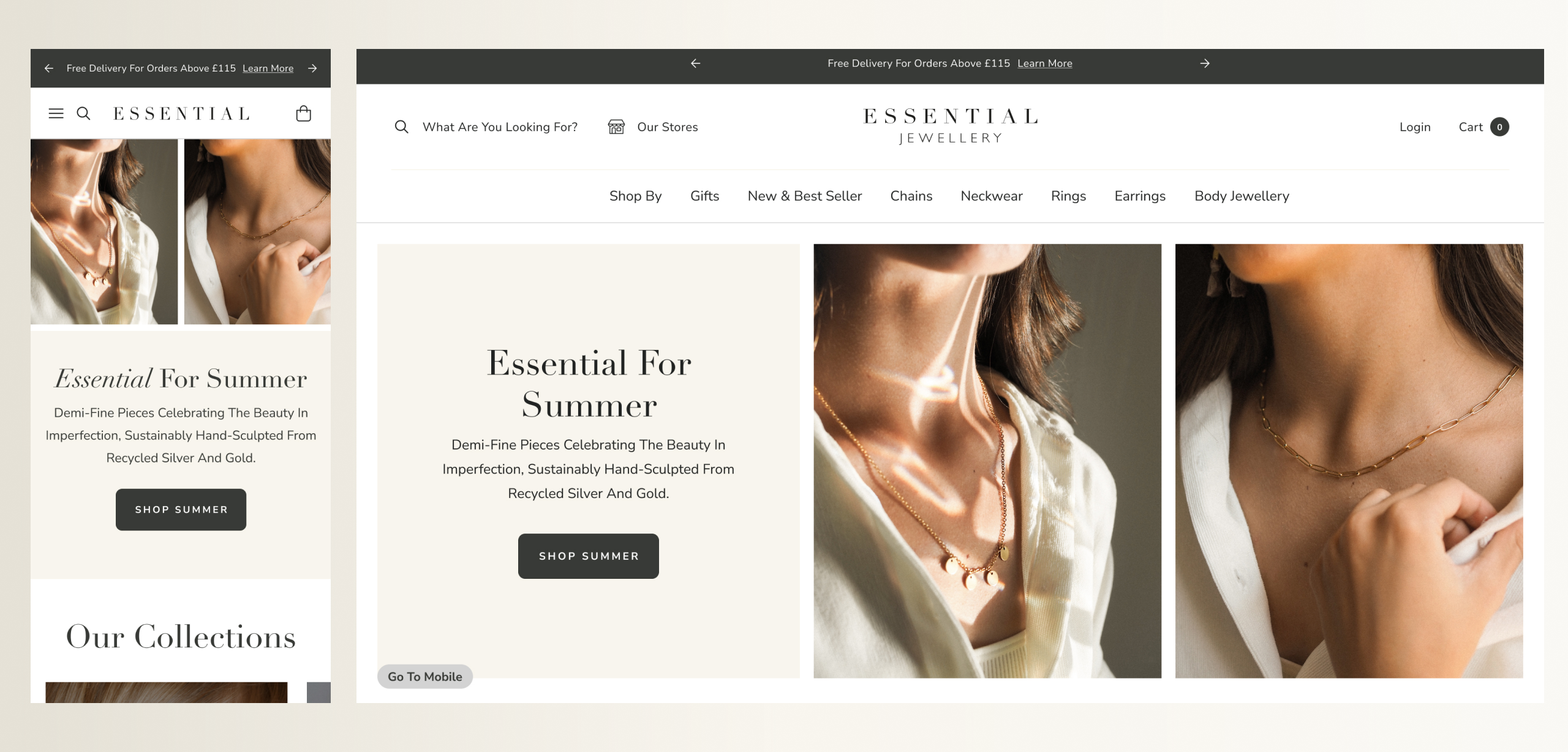
When working with Essential Jewellery, our designers examined the client’s existing image collection to identify the most common image ratios used. We then fitted the design of the store around these ratios, to reduce the workload for the client and avoid the need to retake product photos. This meant we were able to launch the new store in a quicker timeframe, so the client could start generating increased revenue. You can find out more about the work we did for Essential Jewellery in this Magento to Shopify case study.
Step 4: Use wireframing to create a mobile optimised store
It’s tempting to want to jump straight into high-fidelity design at this point and focus on how your end store will look. However, an important next step is to wireframe the store before diving into the detail of design.
Wireframing strips back the design to focus on the structure and layout of page elements and content, before moving into finer details. This is especially useful for complex or non-standard elements of your store that may need careful consideration or discussion.
Wireframing is an effective way to prioritise layout of content and page structure on a responsive or mobile first store, because it provides clarity on your user flow and what content they will view as they navigate through.
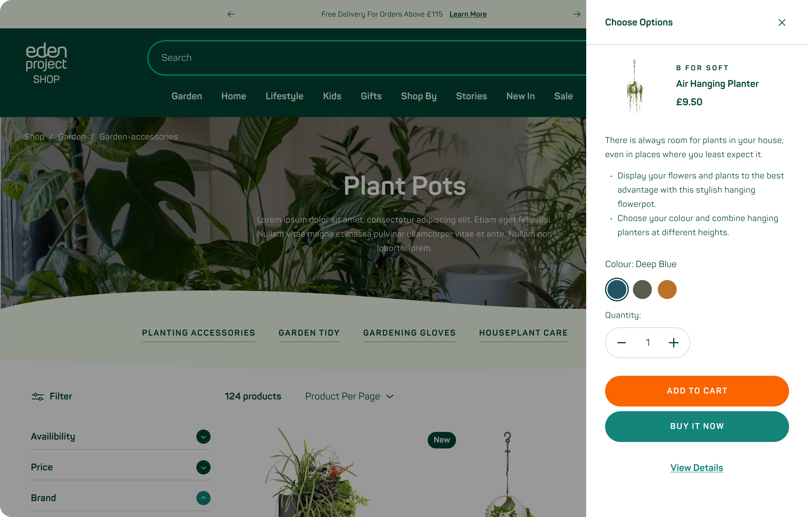
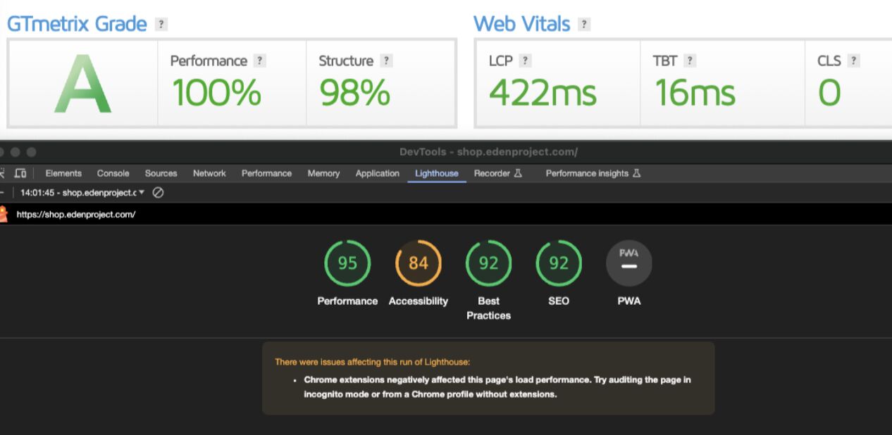
Take a look below at some of the wireframing we did for the Eden Project. Having already delivered a creative pitch, which addressed the look and feel of the store, we wanted Eden’s team to be able to focus solely on the layout of content and inclusion of elements, on both mobile and desktop, that would promote the story behind the charity. Rather than simply being “mobile first”, we wanted to ensure the key elements of the purchase journey were delivered effectively across all device types.

We talk more about our work with this iconic charity in our case study about creating a scalable ecommerce store.
Step 5: Design a responsive layout for your Shopify store
Once you have a good idea of the content and main structure of your store, you can start to work out the UI design. During the design process, the content will need to be fine-tuned to make sure it works with the design across all devices.
You’ll want to prioritise elements that will streamline the customer experience to help them find what they are looking for. Start by focusing on the building blocks of your online store – already defined in your wireframes – and creating a clear visual hierarchy of information presented on each page.
Opt for a responsive design that uses a flexible grid system to seamlessly adapt across various screen sizes and orientations. This will require input from your developers to ensure the site is built around the grid system.
An important aspect of streamlining the purchase journey is in reducing the cognitive load for your customer. Find creative ways to make additional information optional to view, so that users can see this if they want to, but are not bombarded with unnecessary details.
On mobile especially, design elements such as collapsible menus, accordions, tabs, and Ajax drawers can organise content efficiently and lead to a better user experience overall.
Standardised layout or something new?
When it comes to deciding if you should follow a standardised layout for your store, or opt for something a little different, there are a few considerations to take into account.
Choosing a standardised layout can help reduce the cognitive load by providing a familiar experience. This can aid customers to move through the store experience more efficiently.
On the other hand, if you want a customer to notice and remember something, try to make it ‘different’. Making an entire ecommerce store unique can increase cognitive load, but when used sparingly it is a technique that can aid customer decision-making and create an overall more effective customer experience. A good rule of thumb is that if you make your store different in layout, keep how it functions familiar. It’s a careful balance, but if done effectively this can help to smooth the customer journey.
Ultimately, your choice here requires a strong understanding of your customer base.
Step 6: Prioritise mobile friendly navigation on your store
Store navigation on mobile is important because mobile customers will be expecting a fast, hassle-free experience. You therefore need to direct them as quickly as possible to the product they want.
Consider the primary methods through which customers navigate your store. Maintaining consistent navigation structure across different screen sizes can help cross-device customers easily navigate through the website.
Sticky navigation bars or off-canvas menus are a good choice for efficient navigation on smaller screens.
You’ll need to decide how to structure your menu on mobile to allow easy navigation. The burger menu icon is common on mobile and is therefore an expected feature that your customers will be looking for. Alternatively, you may prefer to include the “menu” text, since iconography and imagery doesn’t always translate effectively for international stores.
The best approach is to A/B test different options and see which works best.
When it comes to menu structure on mobile, there are two common approaches:
- Drill through: This approach uses a list at the top level – Shop/Blog/About etc. – which, when clicked on, displays a second layer of category links separately. This is a good option if you have a large product range with a lot of different categories, as it helps users to focus.
- Accordion: When the user clicks on the top level items, this opens up the second level. This approach can be effective if you have a smaller list of contents because you can focus more on individual categories. It can also aid the discoverability of product ranges by allowing new customers to easily click between collections.
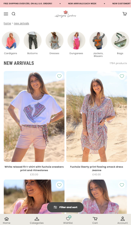
Swanky client Horizons Lointains has opted for an approach that reflects the user experience of a mobile app for their mobile web users. Swanky built them a sticky bottom navigation menu, which allows users to intuitively toggle between pages via the bottom of their screen, closer to where their thumb will naturally be.
You can find out more about this mobile navigation approach in our case study about how we helped Horizon Lointains switch from WooCommerce to Shopify.
Step 7: Streamline the customer journey for mobile users
It’s important to consider the way mobile users interact with their devices and with webpages, to optimise their customer journey in a way which will be different to desktop users.
You’ll want to consider interactive elements such as buttons, links, and form fields which are even more important on mobile devices. These need to be large enough and spaced adequately to accommodate touch inputs, avoid accidental taps and prevent frustration. The minimum clickable area on mobile should be 48 pixels, for example.
Another way to optimise mobile user experience is to simplify form fields and inputs to minimise clicks on mobile devices, to make it easier to navigate without a mouse and keyboard.
You can utilise input types and attributes (e.g. email, tel, number) to trigger the appropriate keyboard layout – either number or letters, depending on the attribute. This speeds up the process of completing forms and checking out.
One of the advantages of Shopify is that it has the highest converting checkout globally, and has tested optimisations on millions of mobile users. Therefore, as a Shopify brand, you’ll have little to worry about when it comes to making checkout mobile friendly.
Step 8: Ensure fast loading speed for mobile devices
Mobile users expect quick loading times. If your customers can’t load your site quickly, they’re likely to abandon it before making a purchase. Yet, a ToolTester analysis on four million websites found that average website loads increased by 70.9% from 2.5 seconds on desktop to 8.6 seconds on a mobile device.2
To ensure loading times are optimal for your mobile customers, you’ll need to optimise images, code, and other assets.. Consider lazy loading techniques to prioritise content that’s visible on the screen.
Swanky advises using Crushpics to automatically resize images on your store. This app will then adjust the image size according to device to optimise loading speed, and will load the correct sized image responsively for mobile or desktop users. This can save you the time and trouble of resizing your images yourself.
Step 9: Optimise your responsive Shopify store
Once you’ve done all of this and launched your mobile friendly, responsive ecommerce website, you’ll have a solid foundation to build on and continue to improve key metrics.
Now is the time to A/B test your store to further optimise the customer experience.
Continuously monitor the performance of your website, including server response times, caching strategies, and resource usage.
Gather feedback from users through usability testing, analytics, and surveys. This data will allow you to identify areas for improvement. You can then iterate on your responsive web design, to continually enhance the user experience across all devices.
Experts in responsive web design for Shopify
Are you looking for help to optimise your Shopify store for your mobile customers? With most customers now shopping via mobile devices, it’s essential to have a fully responsive Shopify store, with a customer experience that delivers the same quality across all devices.
Swanky has over a decade of experience designing responsive ecommerce websites on Shopify Plus. From branding, to web design, to custom Shopify Plus development, as well as ongoing conversion rate optimisation, our teams can help you deliver an exceptional digital experience to all your customers.
Get in touch to tell us about the improvements you want to see on your Shopify Plus store.
For reference:
[1] https://www.statista.com/chart/13139/estimated-worldwide-mobile-e-commerce-sales
[2] https://www.linkedin.com/pulse/17-cool-website-load-time-speed-statistics-2024-mehnav-qksdf/