Case Study: How We Developed a New Brand Identity for Australian Petcare Retailer Farrell’s
Developing a new brand identity for any retailer takes time and expertise. Read on to learn how we leveraged our knowledge of audiences, marketing and user experience in the petcare industry to create a new visual identity and brand strategy for Australian dog food brand, Farrell’s.
Written By
Mia Willmott
Farrell’s launched in the early 1960s and soon established itself as a leading brand for greyhound nutrition in Australia after pioneering the first line of 4×2 dog biscuits.
By 1977, Farrell’s was an enviable brand and was acquired by Arnott’s Spiller Group. Since then, the Farrell’s brand has seen subsequent acquisitions and a period of dormancy. All this has culminated in the exciting decision by Samantha Salamon and Craig Chappelow, both ex-racing officials and current greyhound trainers, to relaunch the brand with the Farrell’s family’s support.
This is where Swanky came in.
We were tasked with creating a new visual identity and brand strategy for Farrell’s. This needed to be something that embraced both the brand’s heritage and its enthusiasm to build something new. This case study will explore how we balanced a variety of values and brought them together as one cohesive and adaptable brand identity.
Branding strategy
Matt Giles, Chief Creative Officer at Swanky, explains, “When we start developing a new brand identity, we don’t start with the visuals. Instead, we look at how a brand will distinguish itself at multiple touch points. These touch points could be visual or physical interactions, community or content interactions. These are all important and their look and feel should be guided by design principles that give clarity and uniformity to a brand’s identity”.
Branding strategy can therefore be described as the process of considering how to consistently communicate a brand’s personality and motivations at all touch points with its audience.
Branding strategy helps brands consider, and clearly communicate, the ‘why’ that drives their business.
Samantha Salmon at Farrell’s shared, “It was such an easy process working with Swanky. From our initial Zoom call we knew we were in the right hands to take the Farrell’s brand to market and reestablish ourselves as the premium pet food brand that people remembered from the 1960’s.
“The initial concepts Matt and Georgia brought to the table were brilliant and exceeded our expectations. Over the following months, the concepts evolved into what is now the recreated Farrell’s brand.”
What is the ‘why’ behind Farrell’s?
In the first instance of this product in the 60s, the motivation was quality. This was a best-in-class product for greyhound trainers who wanted their dogs to be performing at the highest level. The Farrell’s biscuit therefore used high-quality ingredients to provide top level nutrition and dental benefits for greyhounds.
Consequently, premium quality is the backbone of this product and continues to drive the ‘why’ behind this brand.
However, the brand’s motivations have shifted with the recent relaunch. The ‘why’ has expanded to include providing nutritious food for a wider range of dogs and catering to a broader audience. This is because the owners of the brand care about dogs, not just greyhounds, getting the best nutrition they can.
Developing customer personas to inform new brand identity
Understanding how a brand’s ‘why’ statements interplay with different target audiences is a key part of branding strategy. To unpack this, our team worked with Farrell’s to create customer personas, outlining some main traits pertaining to different customers.
These personas will be useful on an ongoing basis to consider how the brand’s USPs and ‘whys’ are communicated to a range of people, whose priorities will undoubtedly differ.
How does branding reflect Farrell’s personality?
Another feature of brand strategy to be balanced amongst this is the personality of Farrell’s. Through conversation and discussion we found that the brand’s personality held certain things in tension.
For example, this is a friendly brand, but is more serious than playful; it’s more traditional than progressive, but still accessible. It’s bold rather than elegant, but more matter of fact than enthusiastic.
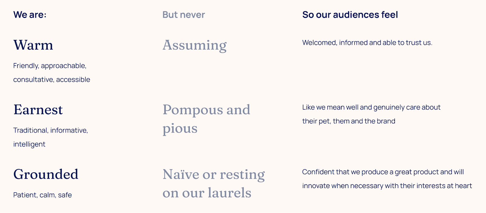
This task of unpicking the components of a brand’s personality aids the branding process because it makes tangible what is otherwise relatively intangible. That being said, although it sheds light on the makeup of a brand, it also presents the challenge of holding these things in balance and communicating them clearly.
Samantha at Farrell’s shares her take on the brand strategy work, “The rebrand brings out the values of quality and integrity which, for us, is the gold standard of what we want to bring to our customers. The colours, branding and feel really highlight the credibility of this company, who we are and how we manufacture. Farrell’s is a premium brand in every sense of the word and this is what has been reflected in our new logo and branding.”
How does competitor research affect branding strategy?
Defining these audiences and the Farrell’s personality was key, but comparing to other brands in the market was also an important part of the brand strategy conversation. To do this we outlined a number of relevant matrices for the market. Examples include observing:
- how Price (low to high) intersects with Quality (low to high);
- how Function (multifunction vs. single function) crosses over with Culture (culture of community vs. a self-serving culture); and
- how Target Market (broad vs. niche), interacts with Product Approach (tried and true vs. innovative).
Matt Giles comments, “We looked at where Farrell’s is currently positioned on these matrices in comparison to its competitors and where it wants to be positioned in the future. This opens up the exciting conversation of how to move from position X to position Y; the answers to which assist brand strategy insomuch as they help steer the direction this strategy takes”.
Translating brand strategy into a visual identity
Turning the brand strategy and design principles into a visual identity was the next part of the journey.
Georgia Thomson, Designer at Swanky, explains how, “We looked at each customer persona that had been created and explored how they could be represented visually.”
For example, legacy and tradition were repeating themes and so we looked at how other traditional brands used colour, font, and iconography. In addition to visuals, we thought about the language they chose and what this communicated.
Another factor was that Farrell’s wanted to hold a consultative position within the industry; to be seen as a source of expertise to both new and old customers. For this element, we explored how medical products communicate this type of position. They do this through plain language, laid out simply and clearly.
As is evident with these examples, decisions around visual content are often informed by observing what other brands are doing and exploring how Farrell’s can use these examples to remain familiar and also to stand out from the crowd.
We also took time to consider the priorities of each customer persona. For example, dog breeders are primarily concerned with the health of their dogs. Consequently, we communicated health and vitality through warm colours and health-focused iconography.
In contrast, a dog owner person we named ‘oodle’-owners are likely more concerned with the holistic wellbeing of their dog. This we communicated with a sun icon and our choice of active dogs in the imagery we used.
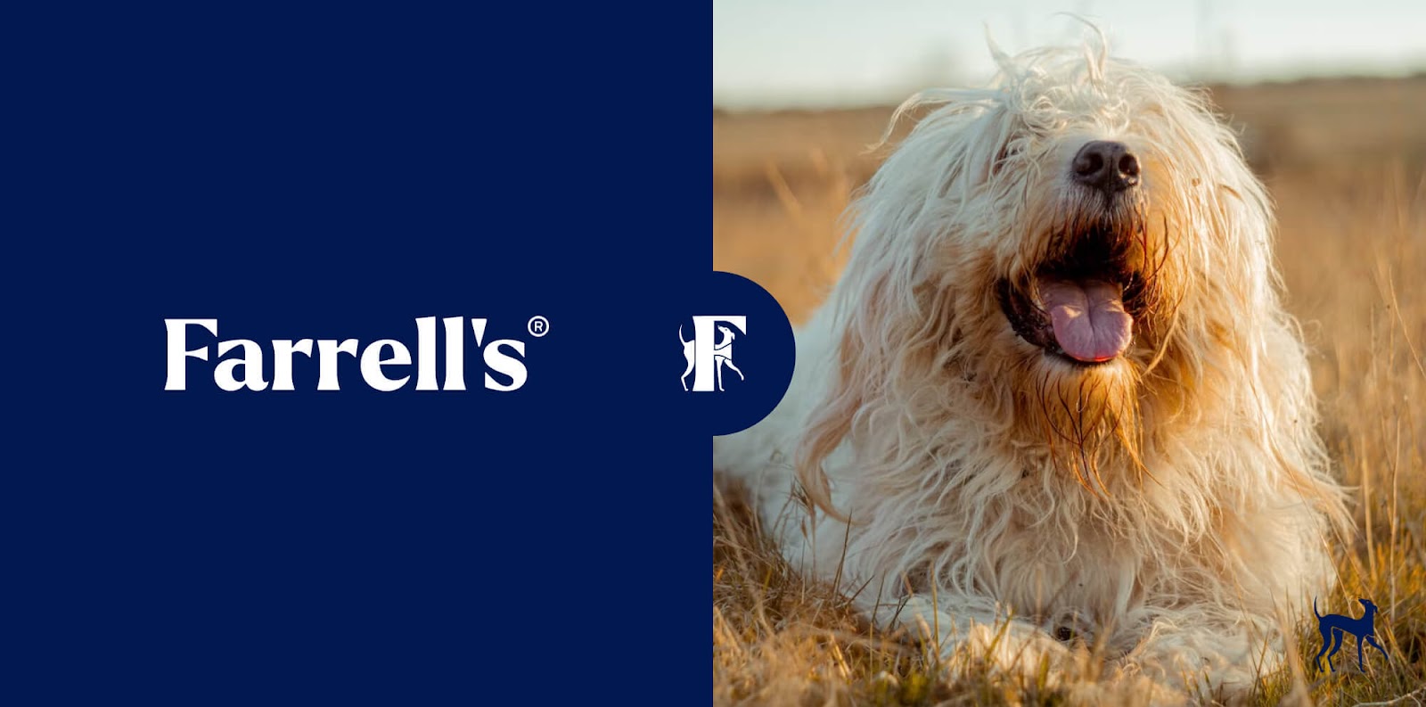
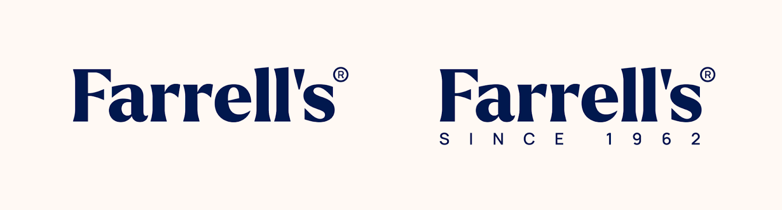
Logo
Farrell’s is a brand and family name with plenty of heritage and distinction. As a result, we needed to take the brand in a direction where the family name is instantly recognisable. In practice, this means crafting a logotype that has immediate impact, harking at heritage whilst carrying a degree of warmth, approachability and style.
Matt Giles notes, “Choosing a bold, but elegant modern serif as the baseline catered to all of those needs, as well as incorporating a ‘since 1962’ in some of the available logo lockups to ensure that customers can immediately know and trust that this is the same brand that’s served Australian dog owners so well for generations”.
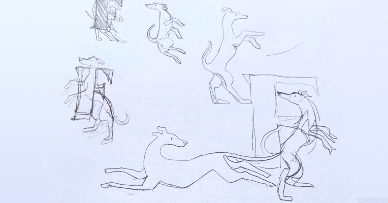
Matt continues, “Above and beyond that, the heritage and quality associated with the brand, lends itself to having a highly distinctive brand stamp. Georgia steered towards a mix of illustration alongside the high impact, capital F provided by the modern serif we opted for in the wordmark.
“A simple greyhound wrapping its body and head around to look back at the F brings intrigue and attention. Its elegance also captures the origins of the brand and the greyhound can be used in a standalone format.”
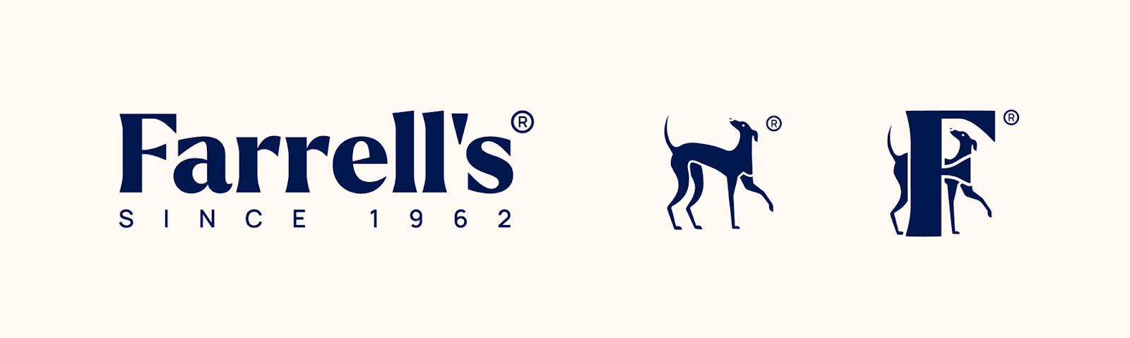
This logo was built with flexibility and impact in mind. It can operate in colour and monochrome, the greyhound can stand alone or behind the F. Ultimately, this logo should really stand the test of time – reflecting a business that has been an Australian favourite for decades.
Font choice
“The lead font we chose is a serif font, which is largely considered a more traditional and premium font choice. However, this is a thicker serif font, making it more modern and approachable,” – Matt Giles, CCO at Swanky.
This choice was informed by again observing how other brands use fonts, from food and drink brands to other petcare brands, and what this communicates to a target audience.
The heading font choice is a curved, friendly serif. Again, since it’s a serif it conveys a more traditional and informative brand. But it also has certain flourishes, making it more characterful and approachable. These types of details help bring balance between the friendly, but consultative personality Farrell’s wishes to portray.
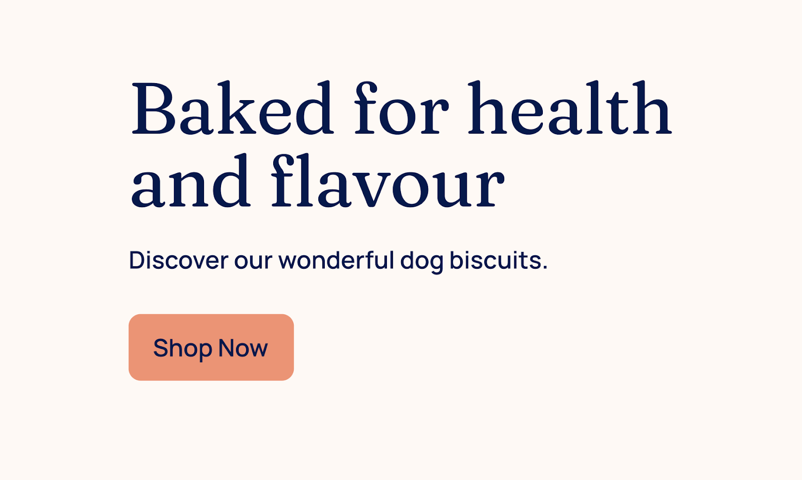
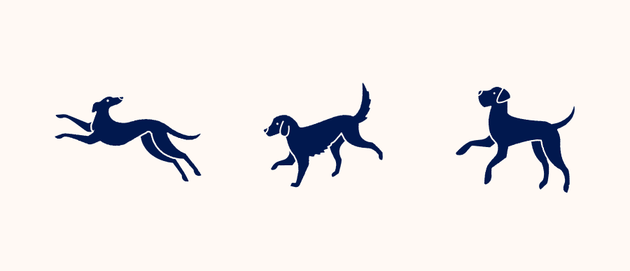
Illustration and iconography
High-quality iconography and illustration have the potential to make a brand iconic. They are the visual elements that are full of character and bring a brand to life.
When it came to Farrell’s, we were able to create characterful icons and illustrations that added value to the brand’s visual identity. Moreover, they allow us to further balance the multi-faceted nature of the brand and communicate this clearly to a variety of audiences.
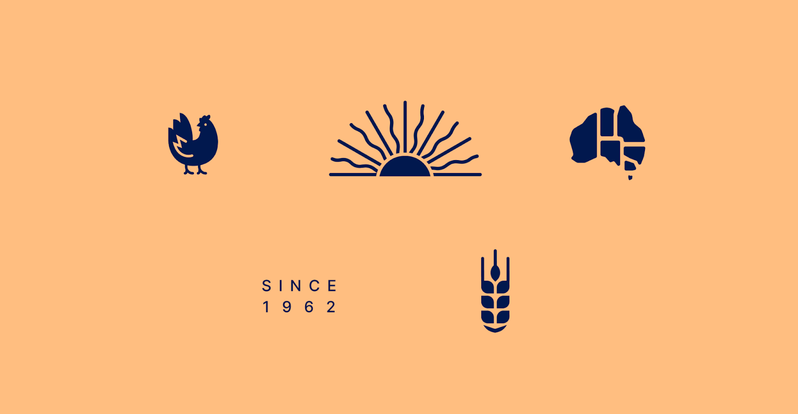
Colours
Navigating the ideas and influences surrounding colours came at the beginning of the visual design process.
“Getting the colour palette right took time and multiple iterations, but we are proud of where we ended,” explained Georgia Thompson, Designer at Swanky.

Primary colour palette
Georgia continues, “The colours work well together and apart, allowing for reusability, versatility and longevity. Most importantly, the colours accurately reflect Farrell’s personality and the target audiences. For example, the blue points to the traditional, whilst the warmer colours are softer and welcoming, and appeal to new customers.”
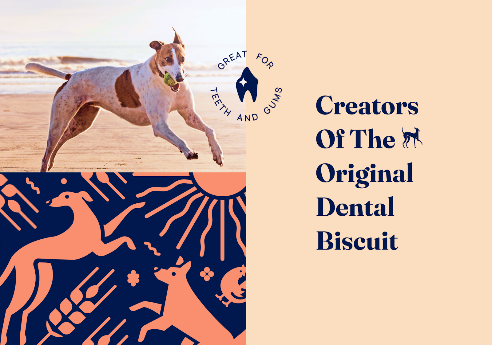
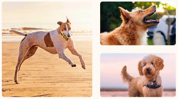
Imagery
Imagery is a foundational element for any ecommerce store. Etsy found that image quality was the most influential factor for shoppers when making a purchase.1 This translates to ecommerce more generally and it’s been found that websites which pair good design with good photography provide a more positive first impression. And a good first impression means users are more loyal to a site.2
With this in mind, the Swanky team thought carefully about the type of photography that should be used across Farrell’s online channels. Three takeaways from this decision are;
a) the imagery contains a warm colour palette to focus on the joy and wellness of the dog;
b) the photography is almost exclusively of dogs, with no other owners pictured. This choice was made to allow any prospective customer to relate with the dogs depicted; to imagine themselves with this dog; and
c) showing active dogs was also an important decision because it again reflects the animals’ health and vitality – a core theme in the branding strategy.
In addition to the above points, an aim of the imagery was to provide balance to the overall design. Given that a key focus of the branding strategy was to establish Farrell’s as a leading, consultative voice in the market, much of the branding was clean and informative. By providing imagery that is warm, active and engaging it balances out the informative tone of other branding elements. Thus presenting Farrell’s as a healthy and friendly brand.
Is this new brand identity functional?
Let us examine a final asset of this new brand identity: it’s reusability.
An essential principle that guided all our branding development on this project was that it must be reusable for all mediums, from packaging to social channels and web design. A great example of this is seen in the logo. The two elements (the F and the greyhound) can each be used alone or together, providing three versions of the logo – plus more if you were to change the colours.
Branding versatility is critical because it allows a company to be recognised across multiple touch points. This brings us back to branding strategy, where the aim is to provide consistent, clear brand identity at any touch point with customers – be that on supermarket shelves or on Instagram. Ultimately, branding that is reusable is functional.
The final product
“I loved working with Swanky! Craig and I are elated with the new logo, packaging and overall rebrand of Farrell’s. Working with Sean, Matt and Georgia has been a wonderful experience and they have really exceeded our expectations. The team at Swanky have reinvigorated the Farrell’s brand with confidence and brought out the imagery of our brand philosophy and core values.” – Samantha at Farrell’s.
Take a look at the final design for Farrell’s packaging. This is the culmination of truly understanding the brand’s aims and motivations, and using our design expertise to bring this to life.
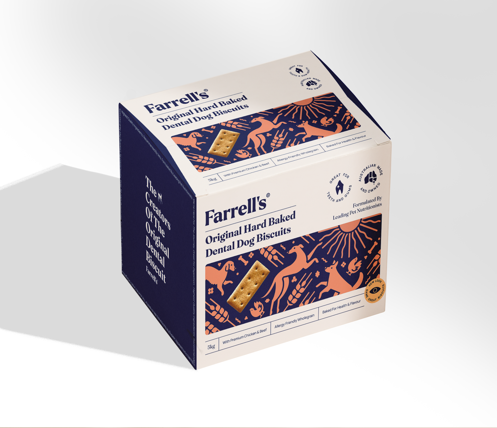
This is an ongoing project and we are excited to see how this new brand identity will be applied to Farrell’s current and future assets.
Need help creating an eye-catching new brand identity?
Here at Swanky we love working creatively. Whether it’s a complex development project, or creating a new brand identity, we continue to apply years of knowledge in new and innovative ways. This means our clients always have a competitive advantage.
Get in touch today to see how you can leverage this expertise for your brand.
For reference
[1] https://www.etsy.com/seller-handbook/article/why-product-photography-is-important/147451496051
[2] https://baymard.com/blog/ecommerce-homepage-ux#bespoke-imagery