How to Make Your Website More Accessible: Top Tips For Ecommerce Retailers
As an ecommerce retailer, you have a duty to ensure that all potential shoppers can access your online store. Join our Lead QA Engineer, Zoe Jarrett, as she explains how to make your website more accessible with some simple considerations.
Written By
Zoe Jarrett

Not all shoppers interact with ecommerce websites in the same way – something which is often forgotten when it comes to building an online store.
Ecommerce website accessibility is about ensuring there are no barriers for a customer whilst they’re shopping online. Is your website accessible for keyboard-only users who cannot use a mouse? What about for low vision users, or those with colour blindness?
You should be providing an inclusive shopping experience that allows everyone to access your website, regardless of factors like age, dexterity or disability.
Not only is this simply the ethical thing to do, but having an accessible ecommerce site will allow you to tap into a larger customer base, help reduce bounces and boost conversion rate. Plus, by going above and beyond with accessibility, you can improve customer satisfaction and therefore increase things like retention and advocacy.
In this article, I’ll be sharing six tips for how to make your website more accessible. With these simple steps, you can start to accommodate the differing needs of consumers and allow everyone to shop your brand confidently and conveniently.
Let’s get started.
6 ecommerce website accessibility best practices
#1 Include skip links
First up, skip links. These help keyboard-only users, or users of other assistive technology, to jump over repetitive content and immediately access the main content on a page, streamlining navigation for them.
For example, if a keyboard-only user has just navigated to a new page on a site, they don’t necessarily want to have to tab through the entire navigation (which often includes lots of nested links) to interact with the page content. This is where a skip link will allow them to go past the navigation, directly to the most pertinent content of the page. In this case, your skip link may have the text “Skip navigation” or “Skip to content” – or another phrase that clearly indicates what clicking on the skip link will do.
Other useful places to implement skip links might be image galleries on your product pages, so that users can skip directly to the product information and purchase buttons.
#2 Implement obvious focus states
Some people use keyboards or other devices to navigate through a web page by jumping from one interactive element to the next. Focus states let users know which element they’re currently interacting with.
You might be familiar with this example of a focus state, which is used throughout the GOV.UK website. Here, the yellow and black focus state indicates that the user is interacting with the “No” radio button.
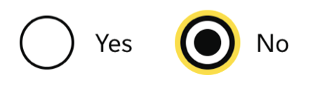
Focus states should be considered for all buttons and links across your ecommerce store, as well as input types such as text or dropdowns. Note, they should show on input elements for all users, as it’s best practice to make it clear to users what they’re interacting with as they type.
When choosing a design for your focus states, be sure to pick something that is very obvious to users, as they need to work for those with low vision or other vision difficulties. They should have high contrast against various backgrounds and stand out wherever they’re used. Without obvious focus states, users navigating by keyboard won’t be able to see what they’re interacting with and it could become difficult or impossible for them to use your site.
There are a lot of different types of sight conditions that make what everyone sees different, so you should consider trying to find a focus state that works across as many as possible.
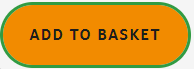
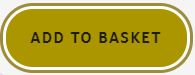
Here’s an orange “Add to basket” button that, when focused, has a green outline. For many users, this outline stands out quite well.
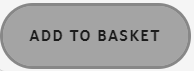
However, if we consider a low vision user, they might see something like this instead:
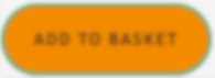
Immediately you can see this focus state is no longer obvious.
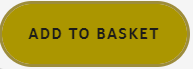
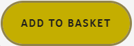
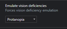
Now, if we think about a user with the most common form of colour blindness, protanopia, the focus state is almost entirely lost. This is what the user would see:
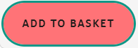
One way to make the focus state more visible could be as simple as adding a white border between the focus outline and the solid button. You can see here the outline is now a lot more obvious:
Some other forms of colour blindness, which are less common, should also be considered. For example, here are what users with three other types would see if they looked at the original orange button with green focus.
Chromatopsia:
Deuteranopia:
Tritanopia:
You can see that the button is very different for each user and the focus state is different degrees of useful or clear.
If you want to look at the buttons on your ecommerce website in each of these views, then Chrome DevTools offers a helpful emulator. When using the Chrome browser, navigate to the three dots in the top right of the window. Click on “More tools”, then “Rendering”. In the new pane, scroll to the bottom and you’ll see an option called “Emulate vision deficiencies”, with a dropdown to select what type of deficiency you want to view your site with.
#3 Have high colour contrast
Colour contrast is the difference in brightness between the foreground and the background. From an accessibility perspective, this is most important in relation to text or other readable content. If the contrast is low, then the text will usually be harder to read. A classic example would be yellow text on a white background.
The lowest standard you should be aiming to reach for accessibility is at least a ratio of 4.5:1. There are plenty of online resources, such as Coolors colour checker, that will tell you the contrast ratio between two colours.
As well as the colour of your text, it’s important to consider its size. As text gets smaller, it’s harder to read and so should have better contrast. There are different specifications based on the sizes of text within the accessibility guidelines. A site that will tell you the contrast ratio and the pass-fail for accessibility is WedAIM colour checker.
A common place where contrast is often poor is text on images. If an image has a varying set of colours behind the text, there’s rarely one text colour that will contrast all the image colours enough to maintain clear readability. A few ways to counter this are to have a solid background for just the text, an overlay that sits over the image to dampen the background, or just not to have text sitting on an image.
Let’s take a look at an example.

Here, where the text is sitting on the image, although it contrasts well with the majority of the background there are spots of white behind the white text, making some of the words difficult to read.
If we put an overlay on the image we can see the text better, but this has affected the clarity of the image.

If we put a background with a good contrast behind the text, it is immediately easier to see all of the text.

Whilst it’s common to see low contrast issues with text on images, this isn’t the only place these issues occur. Sometimes when colours are used to draw attention to text they can actually make it harder to see.
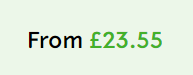
Here, the contrast ratio for the green text on the green background is 2.54:1 (below the recommended ratio). The green “£23.55” text is harder to see than the “From” text which precedes it. Although this font colour change was intended to draw attention to the price, it might well have the opposite effect.
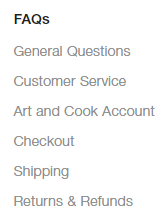
This next example shows a list of navigation items which have a contrast of 3.36:1 – again below the lowest recommended level of 4.5:1 – which means these items might be missed by some users. In an ideal situation, you would have all text contrasts above the ratio of 7.1:1 (for text less than 18 points when not bold or less than 14 points when bold).
I recommend checking out EXPERTE.com‘s Colour Contrast Checker, which can identify elements on your website that have insufficient colour contrast. It can crawl your website and check all visible elements according to the WCAG 2.1 guidelines, or you can submit a list of URLs to be checked. As well as checking for colour contrast, this tool can also check against 40 other accessibility criteria.
#4 Use alternative text for images and icons
Alternative text (also known as alt text) is a word or phrase that explains what an image or icon is showing for a user that cannot see the image, either because they are visually impaired or because the image has not loaded on the screen.
For decorative images that are not giving any useful content, this can be specified in the code and blind or low vision users will not be taken to view them, but for images that contain useful information, alt text should be provided.
On ecommerce sites, it’s common to see a magnifying glass icon to represent search functionality and a bag or basket to signify a user’s cart. Often, these icons show on their own with no visible text to explain their meaning:
If these also have no alt text defined, then a user coming to them with a screenreader will just hear something like “Button” or “Link” and nothing else. They’re not given any information about what the button or link might do if they choose to select it, so it’s unlikely that they’ll interact with it.
If we add accessible text either through the code or alt text, or with a visible label on the screen, the screenreader will announce that text to the user. They might hear something like “open search, button”, which is much more informative.
From a usability perspective, it’s often better to have visible labels near these icons that give users an idea of what they do, rather than assuming your entire customer base will intuitively understand.
For example, it’s entirely likely that older users of your site might not know what a magnifying glass icon will do, or they may not even consider trying to click on it as they might not realise it’s an interactive element on the page. By including a visible label, you take away the ambiguity and make the interaction easier for all users.
#5 Have headings in the correct order
Screenreader users will often start with headings when navigating the content of a page. Typically, they’ll pull up a list of the headings and see if there is a section that they want to read. Note, this is separate from the site navigation which should not contain heading elements, as if a screenreader user wants to use the navigation they can go to that directly.
If your site is built with unnecessary heading elements that are not titling sections of content, or with headings in the wrong order, this can quickly become confusing for the user.
Headings in the HTML code of a website are defined with <h1> to <h6> tags, where the number corresponds to the level or importance of the heading (h1 is the most important).
A page should only ever have one h1 heading and this should be the first heading on the page. Any headings that title content sections should then be h2 headings, and headings within those would be h3, and so on.
The heading order should never jump from h1 to h3, for example, or h3 to h6. Headings can jump in the other direction, as long as this makes sense to the flow of the page. For example, a h6 might be followed by a h2 which starts the next section of content.
Not only is having your headings in the correct order important for users with screenreaders, but this is also a key part of Search Engine Optimisation (SEO) so it will benefit your page ranking as well.
#6 Provide useful link content
Sometimes on a website, you’ll see links with text that says “Click here” or “Learn more”.
These may be fine for users who can see the context of the link based on the rest of the page content, but to a user who cannot see the surrounding content these “empty links” are not useful as they tell them nothing about why they might want to click it.
When creating buttons or links, it’s important to think about the text you use in isolation from the context of its position and check that it still makes sense. For example, “View collection” could be made more helpful by being amended to include the collection name, like “View dresses collection”. Meanwhile, if you’ve got a “Read more” link where your text cuts off, try changing this to “Extend description” which gives more context.
Find out more about how to make your website more accessible
There you have it, some starter tips for how to make your website more accessible. Remember, an inclusive shopping experience is important so that everyone can feel confident and comfortable browsing and purchasing from your store, with secondary benefits for metrics like conversion rate and bounce rate.
If you want to know all of the requirements for meeting the Web Content Accessibility Guidelines (WCAG), there’s a WCAG quick-reference guide here which outlines the criteria to meet the different levels of acceptance and tips on how to achieve them, or the official WCAG 2.1 document can be viewed here.
Plus, information on the requirements set by the UK government can be found here.
Your ecommerce development agency
Here at Swanky, we’ve been at the forefront of ecommerce solutioning for over a decade now, so we really know our stuff. If you’re looking for an ecommerce development agency to bring your ecommerce vision to life on Shopify Plus, then contact our friendly team today!