Ecommerce Site Search Best Practices: Your Go-To Guide
Site search is more than just a necessary function on your ecommerce store. When optimised, it can actually become one of the most powerful ways to drive revenue for your business.
Read on to discover Swanky’s site search best practices; your handy new guide for turning searches into sales.
Written By
Esther Lowde

Have you ever taken the time to evaluate, improve or optimise your internal site search?
If not, don’t miss this opportunity to boost your store’s user experience (UX), customer retention and revenue.
Today, we want to teach you why intuitive site search is so important, help you begin optimising your own store’s search functionality and introduce you to some of our favourite ecommerce search tools to help you grow your business day by day.
Why should you optimise your internal site search?
Simply put, because site search is a crucial part of your customer experience. It can be the reason your users either click buy or say bye.
To turn your browsers into buyers, you need to make your visitors’ journey-to-purchase as simple and enjoyable as possible. And for many online shoppers, this journey begins at the search bar.
In fact, research has shown that 43% of all ecommerce store visitors head immediately to the search bar while browsing – and that these users are generally 2 to 3 times more likely to convert (!) than regular users.
Optimising your site search is one of the most efficient ways of improving your store’s UX, and one of the most effective ways to encourage customers to convert when they come across your store looking for something in particular.
A strong site search function can even help you promote specific products in alignment with your merchandising strategy, or direct users to relevant collection or product pages to increase their average order value (AOV).
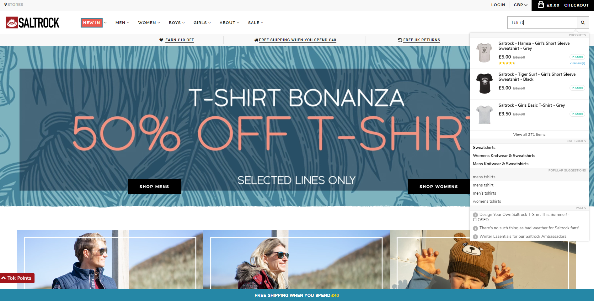
One of our CRO clients, surfwear brand Saltrock, use Searchanise to recommend products (and showcase reviews) before the user has even hit enter.
When you consider how much revenue these techniques can generate, optimising your site search becomes a complete no-brainer.
Anders Gullander, Head of Product at Findify, highlights the return on investment of a good site search solution: “It will increase your conversions to ensure you get more out of your marketing investments and automate processes, freeing up your time.”
Here’s how to get started:
Internal site search best practices
#1 Ensure your search bar is unmissable
In order to target customers who are arriving on your store in search of a specific product, help them along on their journey to checkout by making your search bar stand out to them immediately.
Ideally, you want your search bar to be larger than your other icons, and on the upper right hand side of every page – as this is where most users will naturally look for it.
To make your search bar even more prominent, use the magnifying glass icon – an internationally recognised symbol for site search. 🔍
We’d also suggest making your search bar a different colour than the background in order to maximise visibility.
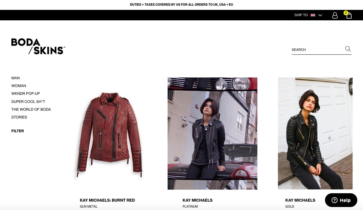
On every page of the Shopify Plus store we designed for Boda Skins, the search bar is clearly displayed on the upper right hand side – along with the iconic magnifying glass symbol.
#2 Keep your site search speedy
When it comes to keeping your users engaged and ready for purchase, fast-loading search results pages are key.
In fact, recent studies show that just a 1 second delay in page load time can cause a pretty scary 7% reduction in conversions.
One way to speed up page load-speed is by making sure you compress your product images using a tool like Minifier or Crush.pics to speed up your search results.
You’ll probably also want to consider how many search results should show up per page, as this affects how long each page takes to load. Do you want your results to be split between several pages, or for more results to appear as the user keeps scrolling (commonly known as a ‘lazy load’)?
Some stores also let the user choose the amount of results displayed per page, in order to cater for the wide variety of device types and WiFi speeds their visitors are working with.
#3 Use a predictive autocomplete tool
On the topic of speedy search results, you can also help your customers out by using a predictive autocomplete tool to guess what they’re going to type in before they’ve finished.
For example, if your store sells furniture, simply typing ‘ch’ should bring up a prompt for ‘chair’, along with other popular or related searches such as ‘office chair’ or ‘dining chair’.
These prompts will make your customer’s path to purchase as quick and easy as possible – the key to a high conversion rate!
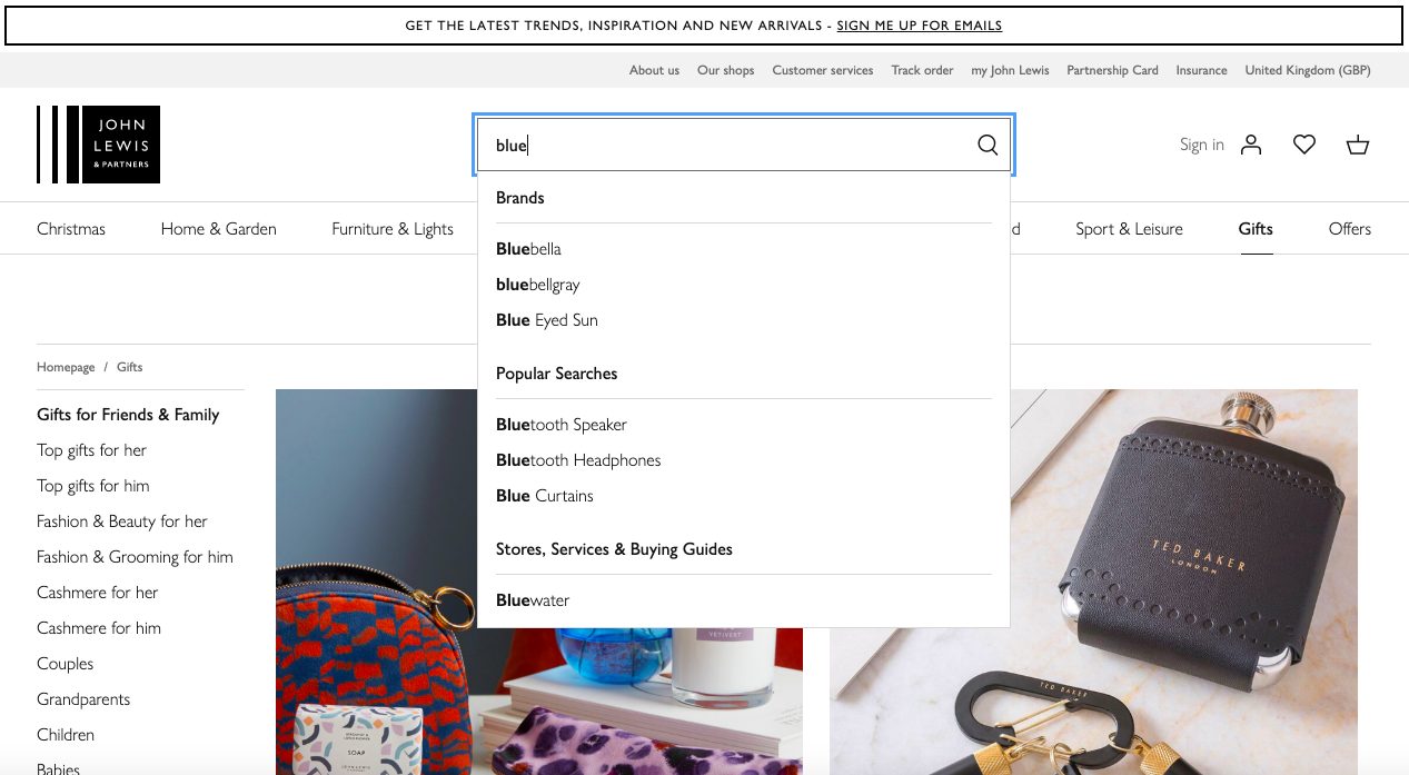
John Lewis’ search function autocompletes users’ searches based on popular products, brands and even nearby brick-and-mortar stores.
Take this a step further by tailoring search suggestions depending on the individual shopper and their habits. According to Anders Gullander, Head of Product at Findify:
“First level personalisation can increase conversions, but also that individual personalisation can capitalise on this even more, maximising sales.
Let’s use a customer called Jane as an example. Jane goes to website A and searches for t-shirts. Website A doesn’t have any levels of personalisation, so her query returns 200 pages of results, sorted according to linguistic relevance. She looks at the first page, doesn’t see anything she likes, and leaves.
Jane visits website B, a site with first level personalisation. She again searches for t-shirts, and again gets 200 pages of results. This time there are sorted in order of what is most popular with others – plain black and white t-shirts for men and women in various sizes. She looks at the first page, sees a t-shirt she likes, and adds it to her cart.
Jane then visits website C, one of her favourite sites, and one that uses Artificial Intelligence to enable individual personalisation. She searches for t-shirts, gets 200 pages of results, and her first few hits are t-shirts for women, in her general size, in her favourite colours and patterns. She adds three t-shirts to her cart.
But how did this happen? The AI running in the background is, in real time, curating Jane’s experience based on her individual actions. So, while she searches for women’s clothing in a certain size range and looks at vibrant colours and patterns, this is what she gets more of.
Going one step further, the AI then decides to show Jane additional items that it thinks would go well with the t-shirts in her cart. Jane agrees, and buys a cardigan and a dark pair of jeans.”
#4 Ensure your site search can handle misspellings
How many times have you missed out a letter while looking something up in a hurry?
We’re guessing a lot.
Typos are very common, and you’ll definitely want to set your site search up to handle them well.
An ecommerce store that is pedantic about spelling will likely frustrate its customers and miss out on sales.
On the other hand, a search bar with a strong error tolerance keeps everyone happy, as customers will find the product they’re looking for (whether they spelt it right first time or not) and your conversion rate will increase.
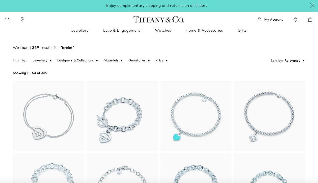
Even with a seriously misspelled search term – ‘brclet’ – Tiffany’s website still displays its full collection of bracelets to the user.
#5 Avoid zero results pages
When you hit your visitors with that “No results found, sorry!” message, it will basically translate to “Try a different store!” in their minds.
As we’ve established, your customers are going to expect results quickly – and if they don’t find what they’re looking for immediately, they’re likely going to jump ship and look somewhere else.
To avoid this happening, make sure that you’re always displaying relevant products on your results pages – even if they’re not an exact match for what your visitors were initially searching for.
For example, if a user is searching for ‘white Havaianas flip flops’ on your shoe store, but you don’t have that product in stock, you could still bring up similar products on your results page – such as white flip flops from different brands, or various other colours of Havaianas shoes.
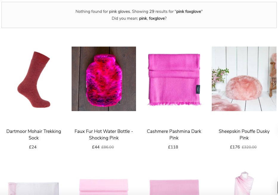
One of our clients, The Wool Company, has no direct product matches for the search term ‘pink gloves’. However, when the term is searched, their search results still show 29 related cold-weather products, including scarves, socks and a pink hot water bottle.
A top tip from Findify‘s Anders Gullander, when it comes to zero results pages:
“It’s important that a zero results search leads to other relevant products so customers can see similar items they might possibly want to buy. It’s also important that analytics captures the term which lead to the zero results search so the merchant can either order more items if something is out of stock, or consider buying a new product if a lot of their customers are searching for it.”
#6 Align your site search with your merchandising strategy
Using a tool like Klevu , Findify or Searchanise, make sure the products at the top of your search results pages are the ones you’re most looking to sell – either because they’re the most profitable or simply because you have surplus stock.
This tip may sound like common sense, but it’s one that gets overlooked by thousands of businesses!
Few customers are going to take the time to look through multiple pages of search results, so make sure page one is filled with not only the most relevant results but the products you’re really pushing to sell.
#7 Offer advanced search filters
Allowing your users to filter their searches is a crucial part of creating a streamlined UX for your customers.
This is especially important if you have a larger ecommerce store, as you don’t want to lose your visitors’ attention by making them hunt through pages upon pages of search results just to find something that fits them and their budget.
You can tailor your filters to the kinds of products you sell on your store, but as a general rule you should always allow your users to at least filter your products by price range (as this is helpful to customers browsing any ecommerce store).
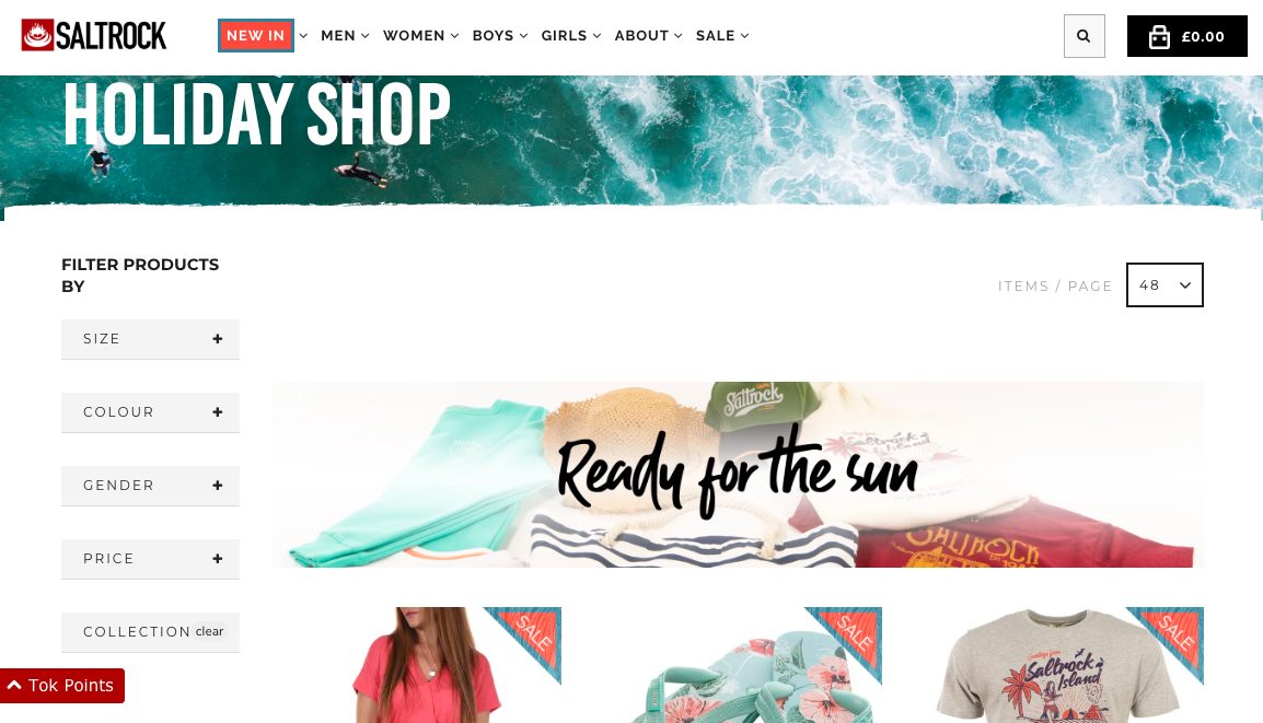
One of our clients, international surfwear brand Saltrock, give their customers the option to filter their initial search by size, colour, gender, collection and price. These advanced search filters are also presented as clickable drop-down menus, so they don’t clutter the page.
#8 Optimise your site search for mobile
With over 40% of online sales now being made on smartphones, having a site search that is optimised for mobile as well as for desktop is more than just advisable – it’s imperative.
So, it goes without saying that all of the tips on this list apply for your mobile site search just as much as your desktop bar.
As mobile screens are much smaller than their desktop counterparts, we’d also recommend you have a think about how you’re using the limited space on your screen to display your search bar and menu categories.
For example, on mobile, the search bar will be most prominent and easy to find when it’s placed directly at the top of every page.
In our experience, button-based mobile menus also tend to boost conversions significantly, as they allow users to click on different product categories more easily.
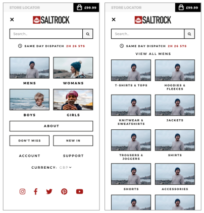
Mobile menu layout matters! When Swanky’s CRO team replaced Saltrock’s list-based mobile menu with this new button-based menu, the brand’s conversion rate increased by 12% in just 3 weeks!
Ecommerce site search tools
Of course, to implement all of these site search changes effectively on your ecommerce store, you’re going to need the right technical toolkit.
Luckily, there are a huge range of third party tools on the Shopify App market to help you get the job done.
For example, if you’re looking to create a fully customisable, typo-friendly search widget complete with predictive autocompletion, personalisation features and unlimited filters, try Searchanise. It’s one of our favourite go-to solutions for mid-level ecommerce stores who are looking for advanced site search functionality without breaking the bank.
If you’re managing a larger enterprise, we’d highly recommend looking into another one of our favourite tools: Klevu. It’s pricier than Searchanise, but it goes above and beyond in terms of its advanced search functionality – which includes natural language processing, machine learning and advanced personalisation features.
Third-party search solution Findify is another powerful option for enterprise ecommerce stores with larger product catalogues. Similarly to Klevu, this tool leverages artificial intelligence to deliver smart, personalised search results and advanced merchandising capabilities.
Interested in finding out more about our favourite site search solutions? Check out our recent blog post on our three favourite search tools for Shopify Plus to see their full feature lists and pricing information. From there, you can determine which is right for your business’ unique goals and budget.
Time to get started!
Equipped with these internal site search best practices, you should now be able to start creating a space where your customers can find what they need quickly, easily and intuitively.
With these changes in place, you can sit back and enjoy watching your customer happiness, conversions and revenue soar!
Contact us
Interested in finding out more about how Swanky design stunning ecommerce stores that are built to convert? Get in touch with our team of friendly ecommerce experts today. We’d love to hear from you!

