Case Study: How Swanky Improved YuMove’s Customer Experience Through A/B Testing
Find out how Swanky used A/B testing to improve the customer experience on YuMove’s campaign landing page, increasing awareness and accessibility of their subscription service.
Written By
Hannah Smiddy

Brand overview

Pet supplements brand YuMove are on a mission to make sure every dog, cat and horse lives a mobile and happy life. Thanks to their sustainably-sourced, all-natural ingredients and palpable passion for keeping the nation’s pets active, they have secured the title of the UK’s number one veterinary joint supplement brand.
YuMove’s pet products are available through their direct-to-consumer (DTC) ecommerce site, as well as through the Amazon Marketplace. Selected product lines are stocked exclusively by vet surgeries. Products are available as one-time purchases, or on a recurring basis as part of a commitment-free subscription plan.
The challenge
YuMove offers direct shoppers a flexible ‘subscribe and save’ service. Subscribers receive their products on a regular, automatic basis, saving 35% on each shipment.
This subscription service is a key element of YuMove’s DTC offering. Its benefits are promoted heavily across the brand’s paid ads. Despite this, their dedicated campaign page, which their ads were leading to, was almost solely geared up for one-time purchase transactions.

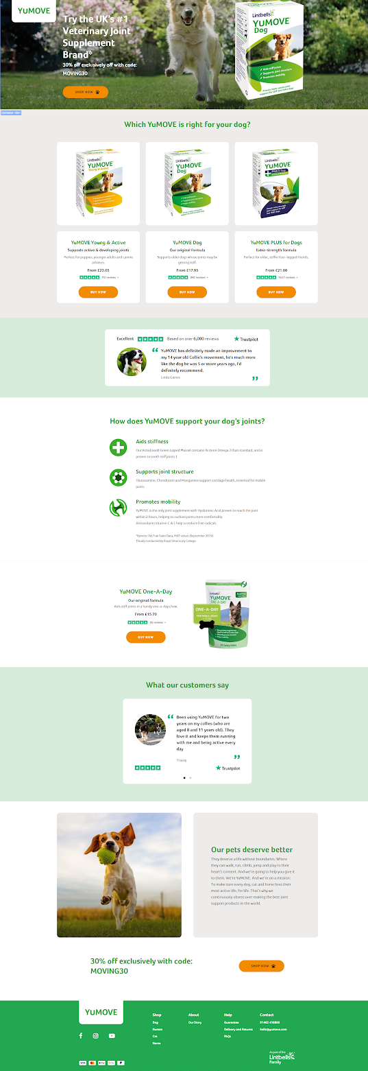
YuMove’s original landing page.
The ‘subscribe and save’ service was not being promoted anywhere on the page, possibly causing confusion amongst users landing on the page from the more subscription-focused ads. Moreover, all CTA buttons linked users to single-purchase product pages where there was no option to subscribe, making for a frustrating customer experience.
Having identified these issues, the team at YuMove knew they had to implement changes to make their subscription offering more visible and accessible on their landing page, ultimately improving user experience.
The approach
First of all, in order to align the focus of YuMove’s ad copy and their corresponding landing page, we decided it was important to feature the benefits of the ‘subscribe and save’ service on the page. Through a combination of reviews and surveying, we identified the main subscription selling points for users.
Next, we conducted a careful analysis of customers’ behaviour on the landing page using the heat-mapping tool HotJar. We found that users were generally staying on the top of the landing page and not scrolling down to interact with elements further down. This would inform our design choices in the next stage of the project.
The solution
With this knowledge to hand, along with insights from previous tests showing the benefits for conversion when moving product information higher up the page, our UX team designed an alternative landing page, ‘Challenger 1’.
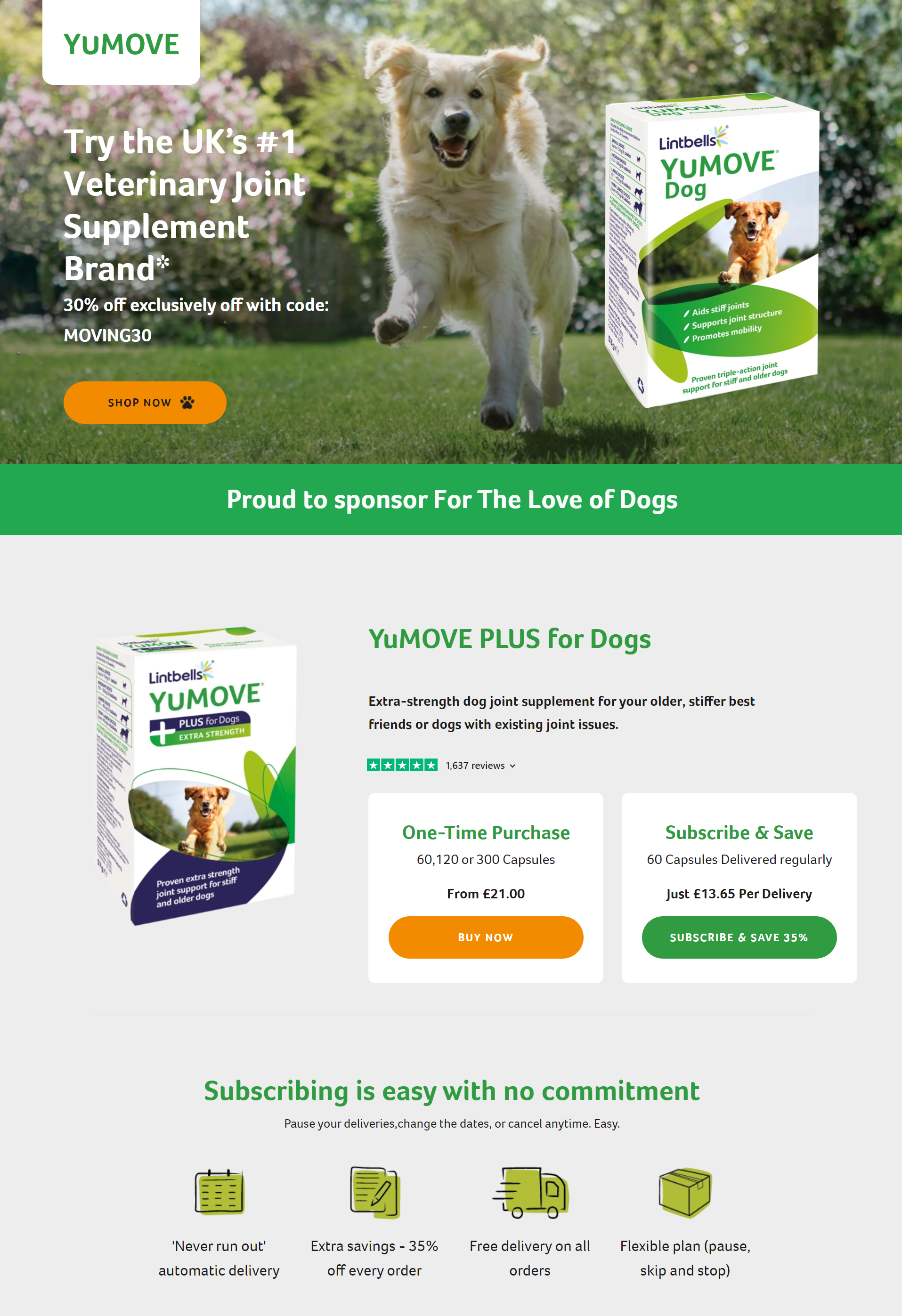
The main distinction of this challenger was a new subscription module placed relatively high up the page:

The new subscription block that was featured in the ‘Challenger 1’ test variant.
This block focused on the brand’s most popular supplement – which isn’t available through its other selling channels – YuMOVE PLUS for Dogs.
Two options were promoted to users: making a one-time purchase or choosing to subscribe and save. The main benefits of a YuMove subscription were positioned directly underneath.
We hoped this new module would increase awareness and accessibility of the brand’s ‘subscribe and save’ offering, and ultimately improve the user journey from initial interaction with an ad through to the subscription sign-up process.
As is best practice whenever making changes to a website, we tested the performance of Challenger 1 in an A/B split test against the control version (the original landing page).
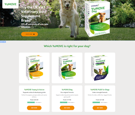
To recap, the control was very product-focused, with CTA buttons that linked to one-time purchase product pages. Users were not presented with the option to subscribe and save.
Site traffic was then set to split evenly between the two variants, and the test began. We measured subscription purchase rate as an indicator of improved customer experience.

The control variant in our A/B test.
The results
Our analysis indicated that Challenger 1 helped more customers to sign up to YuMove’s ‘subscribe and save’ service than the control. Specifically, the challenger had a subscription conversion rate of 2.73%, which was 33.17% higher than the previous landing page.
This suggests that users of Challenger 1 were more aware of YuMove’s subscription service and its benefits, and better able to navigate the route to a subscription.
Discussing the success of the test, Matt Abbott, Swanky’s UK Head of Growth, said:
“It’s great to be able to use A/B testing to help our clients address the issues their customers face online.
YuMove identified that customers landing on the site from ads could face a frustrating user experience due to the lack of information about the subscription service. We came up with a solution, A/B tested it to mitigate any implementation risk, and it worked.
They can now provide a much better experience for their customers, and they’ve increased sign-ups along the way!”
Your Shopify Plus growth agency
Looking to take your Shopify Plus store to the next level? We leverage our decade of industry experience to create and execute tailored growth strategies that drive awareness, conversion and revenue at velocity.
Get in touch with our friendly team of experts to find out about our Growth Accelerator Program and how it could poise your brand for sustainable scalability!

