Case Study: Upgrading Naturalmat’s Ecommerce UX to Reflect the Brand’s In-Store Customer Experience
This project with sustainable mattress brand Naturalmat combined Swanky’s expertise in UX design, replatforming and Shopify development. Find out why Naturalmat wanted to migrate from Magento to Shopify and how we leveraged customer insights to design a stylish and intuitive ecommerce site – one that reflects the inviting, calm and supportive in-store experience of the brand’s brick-and-mortar showrooms.
Written By
Cat Partridge

TL;DR
- B Corp mattress and bed brand Naturalmat was struggling with a slow and unreliable Magento website.
- Swanky was tasked with migrating the site to Shopify Plus and revamping Naturalmat’s online presence to better reflect the brand’s in-store experience.
- We designed an ecommerce UX that prioritises product information and supports product differentiation – helping shoppers to make an informed purchasing decision.
- The site also uses design techniques to mirror the ambience of a Naturalmat showroom.
- Six months after launching on Shopify, website revenue increased by over 56.4% and conversion rate improved by 37.5%.
Naturalmat: A pioneering brand with customer experience at its heart
When Naturalmat began making mattresses in 1999, the brand wanted to take a different approach to the rest of the trade. As the first B Corp certified bed and mattress company in the UK, Naturalmat has pioneered the use of organic and natural materials across its product range. All of its mattresses are made by hand in a solar-powered workshop in Devon, with materials sourced sustainably and, wherever possible, locally.
Naturalmat sells direct to consumers on its own website or in its showrooms, where customers can go to try out the brand’s beds in a calm, quiet environment that replicates a natural bedroom experience. Naturalmat’s expert team is on hand to support customers with the decision-making process during a showroom visit, providing advice and guidance to help find the perfect mattress.
Alternatively, customers can try out Naturalmat mattresses in one of the many luxury hotels supplied by the brand.
This is a company clearly passionate about giving its customers the best possible experience – and the best night’s sleep. This is demonstrated through its exquisite products carefully crafted from the finest materials, as well as the brand’s thoughtful approach to product discovery and customer support.
The challenge: A website that didn’t match the in-store experience
The Naturalmat team approached Swanky looking to revamp the brand’s online presence. At the time, they were struggling with server issues, down time and long page load on their Magento store, and they wanted a fresh new start on Shopify Plus. Their previous website was not designed to be mobile-first, with many features proving difficult to navigate on small screens.
The brief for Swanky’s New Builds team was to create a first-class customer experience that offers detailed information about Naturalmat’s products, as well as building trust and communicating the brand’s USPs clearly.
Whilst Naturalmat was keen to increase online sales, it also recognised that the decision-making period for its customers can be particularly lengthy. The brand wanted to help customers make informed and supported buying decisions, and avoid pushing customers to make rushed purchases that could result in costly and un-environmentally-friendly returns.
One particular issue the brand faced was customers having difficulty differentiating between its products online. On a website, all mattresses look very similar. How can you help a customer choose a mattress when they can’t sit on them and test them out in-person? In its brick-and-mortar stores, Naturalmat has a ‘mattress wall’ with cut throughs showing the interior structure of each product – helping customers understand the differences between mattresses at a glance. It was proving challenging to replicate this online.
Another important element of the build was to create separate storefronts for Naturalmat’s two product ranges – one for adult beds and mattresses, the second for nursery mattresses and furniture. This required two different brand styles and user journeys within the same site, but administered from one place.
Finally, having honed such an exceptional in-store experience for customers visiting their showrooms, the Naturalmat team wanted the brand’s online store to recreate that brick-and-mortar experience as closely as possible – both in terms of ambience and product support.
The solution: An informed approach to ecommerce UX
A thorough discovery process
Every Swanky website build begins with a detailed discovery process. This is where Swanky deep dives into brand and customer requirements to understand the fabric of our client’s business.
The outcome is a data-led and concept-proven set of functionality and UX look and feel concepts which significantly reduces risk in the main design and build phases. Since Naturalmat wanted to ensure its new online experience aligned with its in-store customer experience, the team agreed to an enhanced customer research process.
As part of this process, members of the Swanky team visited Naturalmat’s showrooms to interview customers, to understand how they typically interact with the brand and website.
We also set up a prototype of our proposed on-site navigation – a pain point of Naturalmat’s existing ecommerce store – and asked customers in-store to search for the product of their choice, observing what they clicked on to navigate towards certain products.
We discussed with customers what language they would expect to find around certain products, to make the on-site navigation as intuitive as possible. This provided confidence that our suggested navigation overhaul was the right direction for Naturalmat and that it would improve the customer experience in terms of helping shoppers find the right product.
Finally, we interviewed staff members to understand the sort of questions they would typically ask customers when they arrived in store, so we could reflect this consultative approach online.
Migration from Magento to Shopify Plus
We migrated Naturalmat’s store from Magento to Shopify Plus, keeping in mind the brand’s functional and business requirements throughout the process.
Shopify represents a faster, more reliable and scalable ecommerce solution for Naturalmat, with better uptime and enhanced user experience. Using a robust platform that can keep up with the business’ evolving needs will be vital as Naturalmat looks to grow, allowing the team to invest more time and money into revenue-driving activities such as bespoke functionality and strategic optimisation campaigns.
We talk more about the differences between these two popular ecommerce solutions in our Magento vs Shopify platform comparison.
Distinct storefronts and user journeys for adult vs nursery
Using Shopify Store 2.0, we designed two different UX/UI experiences within the same website, with separate storefronts for Naturalmat’s two product ranges – adult and nursery. Each storefront has its own look and feel to appeal to slightly different audiences, and the customer journey is personalised for each storefront.
Users are given the choice between which store they wish to browse when they first arrive on the site. For future visits, the website remembers whether a customer has visited the adult or nursery store and directs them to the relevant version of the homepage.
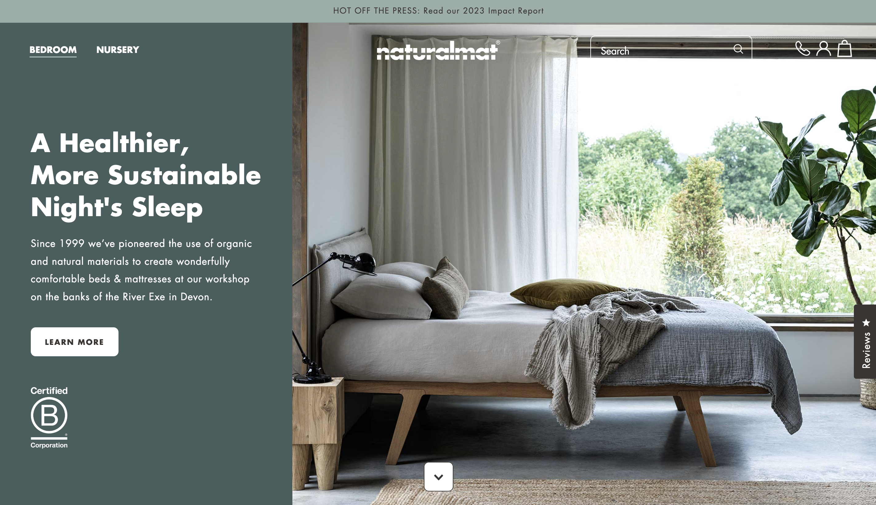
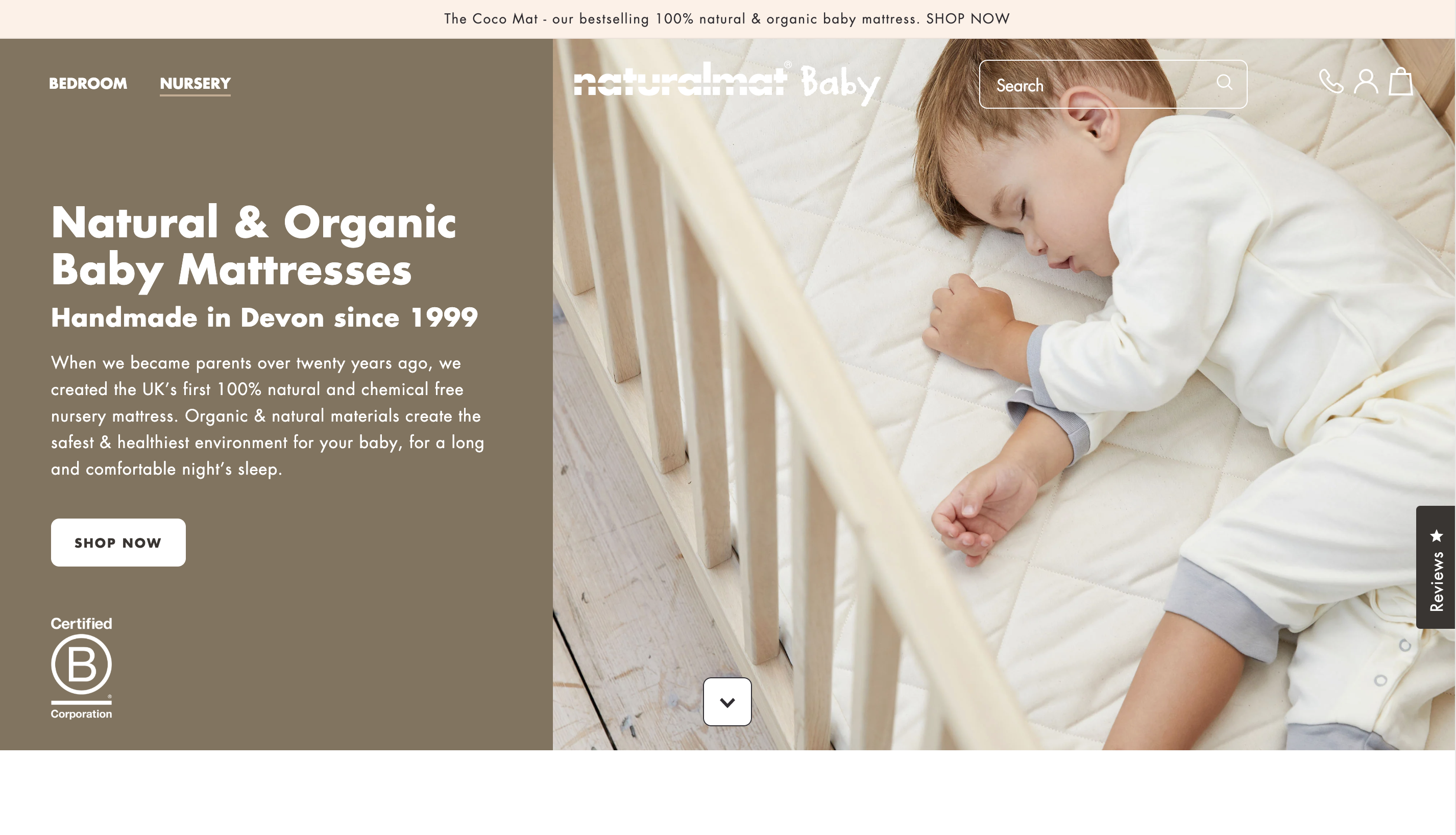
Discussing some of the differences between each storefront’s UX and how they are set up behind the scenes for maximum flexibility, Mark Halliwell, Lead UX/UI Designer at Swanky, commented:
“Since the price point of nursery products is lower, the buying process is generally faster, so there are fewer steps to purchase. The checkout for the nursery experience is simplified to reflect this. Adult mattresses, on the other hand, require a more detailed customer journey to help the customer make an informed decision on their purchase.
“For every page template that we created, we built in flexibility so they could be repurposed for either of the storefronts. In the nursery store, for example, we added a multi-column section allowing for more products to be viewed at once, as well as carousels for scrolling through products. Each section has its own colours and styles coded in so, depending on which storefront it is used on, the correct style is automatically shown – code free.
“This allows Naturalmat’s in-house team to easily select whichever sections they want when creating a new page for each of the brands, to correspond with the different user journeys.”
Supporting informed decision making
An intuitive mega menu to support product differentiation
User behaviour research from our discovery phase showed that shoppers would often use the top menu to locate information, rather than always scrolling down the page. Therefore, we wanted to make sure we displayed key information in as many places as possible, including in the menu.
For collections with lots of products, we designed an innovative menu section that visually highlights differences between each product as the user hovers over items in the menu. In the example below, customers can easily see the difference between cross-sections of The Cashmere, The Lambswool and The Mohair mattresses.
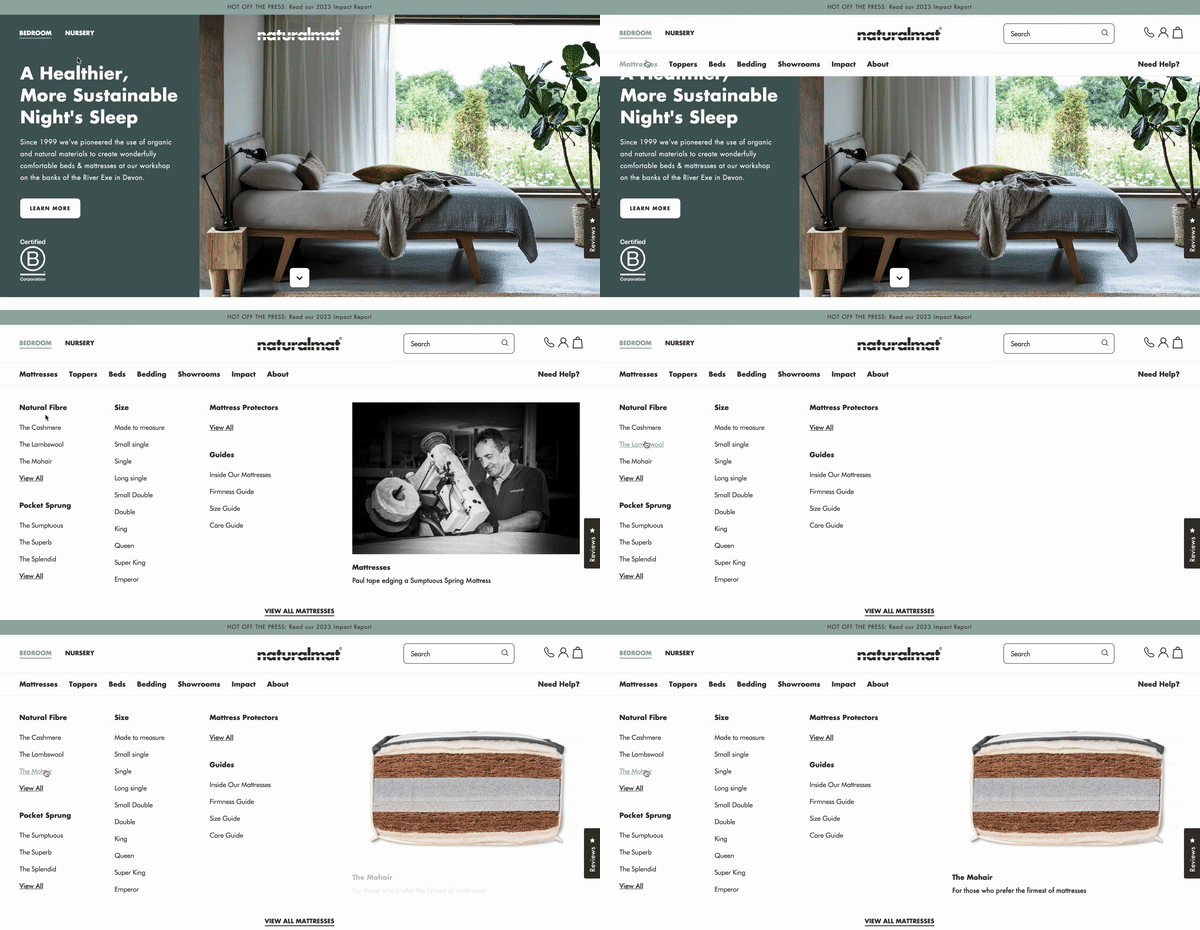
This reduces clicks and speeds up decision making, as customers no longer need to visit the individual mattress pages to understand the difference. A further text excerpt helps customers differentiate between products more effectively by providing supplementary information (e.g. “the ultimate in natural fibre luxury”).
Swanky often recommends the use of icons within menus to help customers navigate more easily. However, with products that are as complex as Naturalmat’s mattresses, it was important to display a larger image that contextualised the product for the customer, as well as allowing for upsells. By using imagery here, we can reduce cognitive load and help the customer choose based on a picture instead of an unfamiliar product name.
And we haven’t forgotten mobile either. Hover states are not available on mobile, but with more innovative design and development we translated the usefulness of hover on desktop, by giving Naturalmat the option to display these product images and cross-sections above each product in the mobile navigation drawer. With the ability to understand different products literally at the customer’s fingertips, they can make easier decisions faster, and with less cognitive overload.
Communicating key information on product pages
When designing Naturalmat’s product pages, our aims were to:
- simplify the existing user journey;
- reduce cognitive load; and
- avoid overwhelming customers with too much information.
In doing this, we still needed to provide customers with the right information to give them confidence in making a purchase.
Mark explains how we achieved this balance:
“Where whole sentences had previously been used to describe USPs, we reduced these to a few key words that would be easier for customers to digest. Where additional product information is needed, we added popouts and accordions, with links so customers know where to go for further information.
“Meanwhile, a simple bar displays brand USPs, using illustrations and single words to keep the message clear and eye-catching.

“In addition, our customer research found that online shoppers didn’t always understand the difference between the various types of mattresses available. To resolve this, we added badges to the collection page to highlight each product’s main USP (e.g. ‘most affordable’, ‘top of the range’).”

Reflecting an in-store interaction on product pages
Similarly to how customers can view cross-sections of mattresses on display in a Naturalmat showroom, we echoed this with product imagery on the brand’s Shopify store.
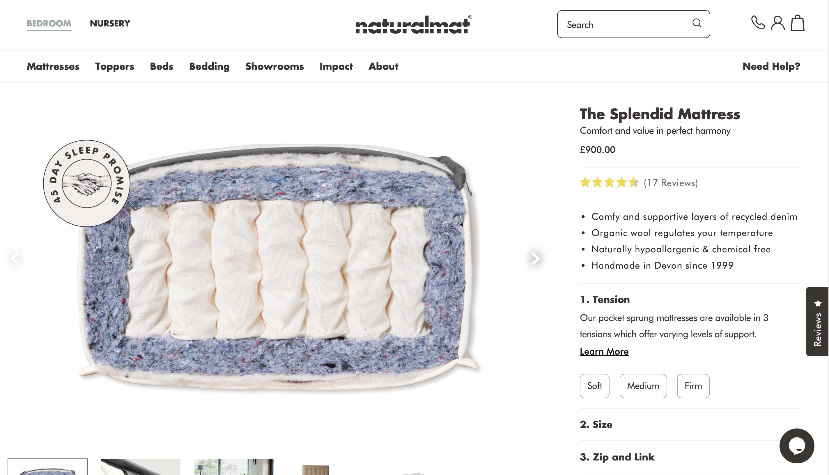
We broke the customer ordering journey down into multiple steps – following the logical steps of a customer interaction in-store. For example, in a showroom, the first question a new customer is asked is about the tension they prefer in a mattress. Next, they would be asked about size. These same steps are followed in the product page user journey, as you can see in the website snapshot above.
To account for different product types, flexibility was built into the page design, allowing for between one and four steps per product. This presented Swanky with an interesting technical challenge, as natively in Shopify you can only have a maximum of three steps. Custom development by the experienced Swanky team ensured this in-store user journey could still be translated online and with minimal effort for Naturalmat’s ecommerce team to manage.
Finally, once the main product – the mattress – has been purchased, users are presented with an opportunity to add on complimentary items such as sheets and pillows, just like they would be during a showroom visit. These suggestions are kept till the next step in the online checkout process, to avoid distracting from the primary purchase.
Facilitating online showroom consultations
Further demonstrating Naturalmat’s commitment to supporting customers and guiding them through the decision making process, the brand offers online showroom consultations in which customers can virtually meet with a member of the sales team to discuss their needs.
To facilitate this, the site has an inbuilt scheduling feature, powered by Calendly.
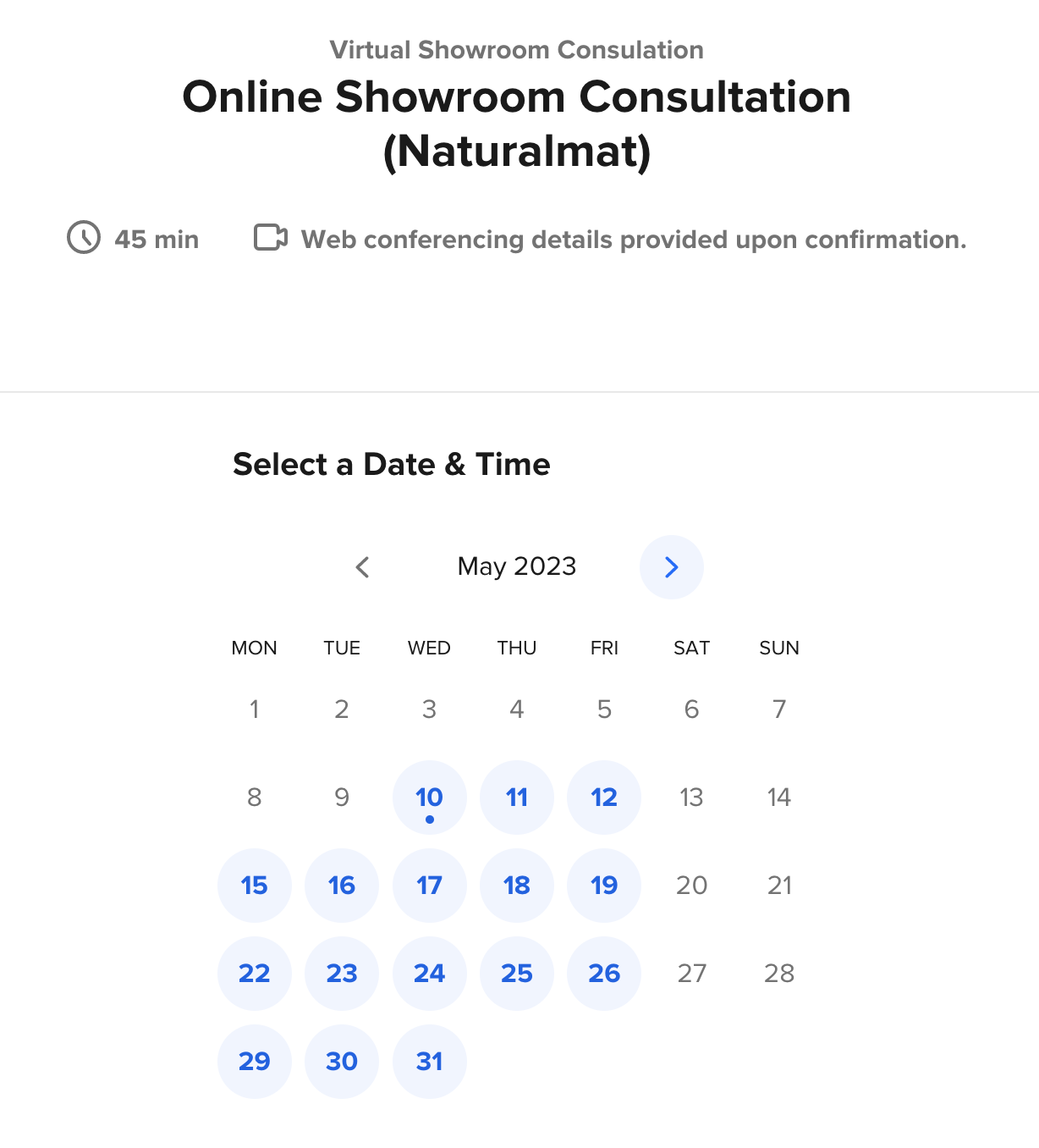
This allows for a more personalised and consultative approach to sales via the online site, which is in-keeping with the preferred sales style of the brand.
Leveraging UI design to mirror the in-store ambience
The UI design of the store is inspired by the soft, calm ambience of Naturalmat’s showrooms, with dimmed lights to recreate a bedroom setting.
“Naturalmat’s previous site design used a lot of pure white and high contrast. By softening this colour slightly and muting the black text to a charcoal black, we have reduced the contrast to create a softer palette. We also pulled in the soft green from Naturalmat’s other branding materials to create a more calming experience,” explains Lead Designer, Mark.
“We designed images and text to fade in subtly as you navigate the site, which gives it a soft feel, and built-in animations and transitions to draw customers into the site.
“As you scroll down the page, sections change from 0 to 100% opacity, mimicking the effect of dimming lights. They also move upwards slightly, to reflect the feeling of lying on a comfortable mattress.”
The results
Not only does Naturalmat now have a more reliable and scalable ecommerce solution to power its digital growth, it has a website that recreates the exceptional showroom experience that the brand is known for – both in terms of ‘look and feel’ and product support.
By leveraging our expertise in ecommerce UX design, migration and Shopify development, we have created an online store that encapsulates the essence of Naturalmat whilst delivering on the brand’s promise to provide the best possible experience.
Since the launch of Naturalmat’s new Shopify Plus store, the site saw a 56.4% increase in revenue across six months, with conversion rate improving by 37.5%.
The customer segment that saw the biggest change was those already familiar with the brand, coming to the site via direct searches. The conversion rate for these customers increased by 112%, perhaps due to the more clearly defined USPs and product details.
Following migration and launch of its new website, Naturalmat has been working with Swanky’s Growth Accelerator team to continue improving its online performance. Our Growth Accelerator program is a ‘made to measure’ service that helps brands optimise the digital experience for their customers and boost key metrics, through on-site optimisation and experimentation, personalisation, paid advertising, social media management and more.
Improve your ecommerce UX with Swanky
If you’d like to know more about any of Swanky’s services, including how we can migrate your store to Shopify and help upgrade your ecommerce UX, get in touch with our team and we’d be happy to chat about your business goals.

