Case Study: How This Shopify Plus Store Increased Sales With Swanky’s Growth Accelerator
Find out how Swanky helped this fun and fresh fashion store to ramp up their revenue with a multifaceted Growth Accelerator campaign.
Written By
Hannah Smiddy

In this Shopify Plus success story
You can navigate to each section using the links below:
- About the client
- The challenges
- Step 1: Understanding their data
- Step 2: Increasing traffic
- Step 3: Retaining traffic
- Step 4: A/B testing for optimised results
- Step 5: Automating business processes
- In summary
- What’s next for The Pulse Boutique?
About the client
Iowa-based women’s fashion brand The Pulse Boutique are a small business with big dreams. They have quickly grown from a humble basement warehouse to a fully fledged online boutique with a devoted fan base of customers. From spending their evenings packing orders in their parents’ garage, sisters Mal and Mack have transformed their start-up enterprise into a successful ecommerce business in just five years.

The Pulse Boutique pride themselves on providing ‘easy, effortless style for everyday life’. Their bright and bold collections are curated with the busy, modern woman in mind, complete with an affordable price tag. They are passionate about ‘cute, comfy, casual clothing’ and only curate outfits with these core values in mind.
As their boutique has grown, the Pulse team have built a fun and cheerful community of fashion-lovers where people are encouraged to get involved in friendly conversation, engage on social media and share photos of their favourite Pulse purchases.
The challenges
A fashion ecommerce store in need of a tailor-made growth campaign
When The Pulse Boutique initially reached out to us, they were eager to make the most out of their online presence. They wanted to provide their loyal customers with a smoother, more appealing online experience, whilst optimising their site to boost conversions. The Pulse team had also recognised a need for streamlining their business processes. They were eager to explore Shopify’s advanced app offering, with the hope of automating repetitive admin tasks that were eating into their valuable time.
But, as a rapidly-growing business, days for the Pulse team are centred around sourcing new products, chasing delivery times, arranging photo shoots and conversing with their customers. They simply didn’t have the time to understand their data and set clear key performance indicators, let alone action the results such an enquiry might trigger.
This is where Swanky came in. By configuring and reviewing their store’s Google Analytics, Swanky gave The Pulse Boutique the insight they needed to take their business to the next level. After gathering and analysing the data, we worked together with the Pulse team to devise a multifaceted Growth Accelerator campaign which would turn their traffic into converted customers, automate behind-the-scenes admin processes and ultimately boost their revenue.
Read on to find out more about each stage in this exciting campaign with The Pulse Boutique.
Step 1: Understanding their data
At the start of any Swanky growth campaign comes an important period of analysis combining qualitative and quantitative data-gathering techniques.
To do this, we first needed to be confident in the analytics data we were receiving. After reviewing and refining their Google Analytics implementation, we assessed the front-end of The Pulse Boutique store on desktop and mobile, before completing competitor and traffic interaction analyses. We also wanted to hear directly from Pulse customers to understand their perception of the current store. This allowed us to grasp what customers like about the store, as well as to understand how its design functionality prevents them from finding and purchasing products.
All of this gave us an idea of the store’s current business performance, which allowed us to identify which elements of the store would benefit from improvement. Working with The Pulse Boutique team, we prioritised these opportunities based on their commercial value and then proceeded to build a testing roadmap.
Step 2: Increasing traffic
There are three key components required to run effective A/B testing: traffic, a goal and a hypothesis. Without high volumes of traffic, you have to run tests for a longer period of time in order to achieve statistical significance. Not only does this slow down your learning process, but it hinders the rate at which you can improve your site’s performance.
Having reviewed Pulse’s analytics, we identified paid social advertising as the best channel to drive additional traffic. Not only was this their top traffic source, but it had the lowest cost per acquisition for their store.
Step 3: Retaining traffic
With higher volumes of traffic visiting the store, it was important to convert and retain these visitors. If a user didn’t convert in their first session, we wanted to initiate a long-term interaction that would eventually lead to a sale – all without having to pay to reacquire the customer. We therefore set about creating an exciting new loyalty program for their customers alongside one of our trusted technology partners, LoyaltyLion. Soon, Pulse Perks was born.
We wanted to create an appealing loyalty scheme with obvious incentives for customers to sign up. Therefore, we prioritised the four main program perks throughout the design of the Pulse Perks landing page. The finished page encapsulates the fun, friendly feel of the store, with on-brand imagery and colours to create a consistent, professional look.
The results of Pulse Boutique’s new loyalty program were staggering. This alone has driven over $600,000 worth of orders in less than a year!
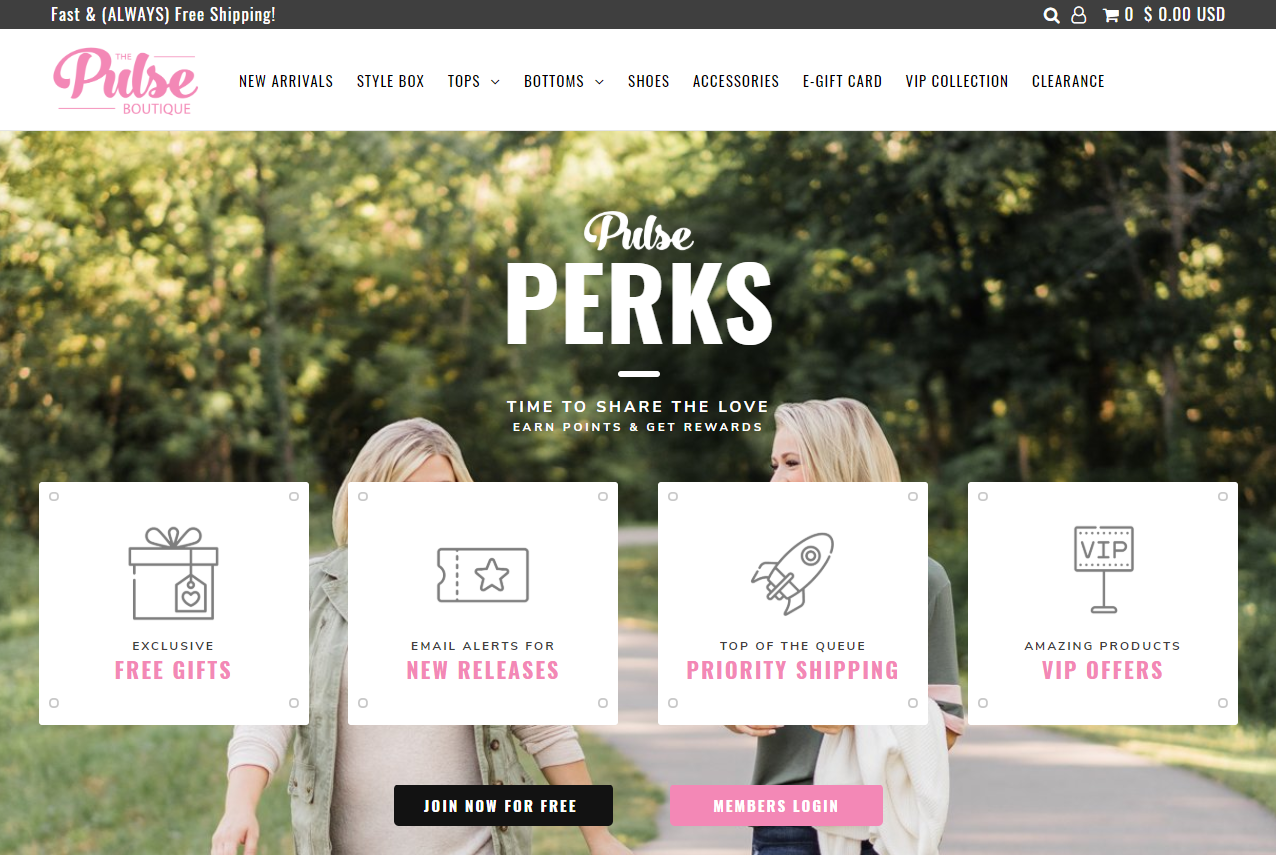
The Pulse Perks landing page.
Find out more about the thinking behind this new loyalty program, its implementation and results in this dedicated case study.
Step 4: A/B testing for optimised results
With sufficient traffic heading to the Pulse Boutique store, we were able to begin A/B testing using our technology partner Convert’s testing tool.
A/B testing is an important component of any quality growth campaign. A scientific, hypothesis-based method, this is a way of comparing two variations of a webpage to determine which one performs better for a given conversion goal. This type of testing allows brands to make carefully considered changes to their websites, collect data on the impact on users’ behaviour and then confidently implement long-term solutions. A/B testing can be used to answer one-off questions, or to continually improve a range of goals over time. It’s a great way to drive additional value from your existing traffic, learn more about your customers, mitigate risk, and ultimately grow your business faster.
Through our initial analysis, we identified two areas of Pulse’s store that would benefit from A/B testing. Let’s take a look at each of these in more detail.
#1 Collection size filtration – 13% increase in revenue per mobile user
The issue
The lack of filters on Pulse’s collection pages was reducing users’ ability to quickly find products they liked that were available in their size.
The hypothesis
We know that allowing users to narrow down products to just those that satisfy their size criteria helps to provide a better user experience. Nothing frustrates a user more than seeing an item they like, only to find out a step further down the funnel that it is actually out of stock.
With this in mind, our testing challenger allowed users to filter each collection view by size. This allowed users to find products available in their size much more quickly, thus streamlining the route to purchase. In turn, we hypothesised that this would result in increased purchase conversion rates.
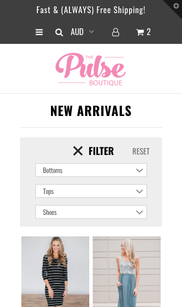
A mobile screenshot showing the proposed new collection filters on The Pulse Boutique’s store.
The results
We found that introducing size filtration increased revenue per user (RPU) for returning mobile users by 5.5%. For new mobile users, we saw a 13% increase in RPU. This was the biggest single increase in RPU across all the tests we conducted. It suggests that mobile users who were unfamiliar with The Pulse Boutique site found the filters helpful in finding products to suit them.
Interestingly, implementing this filtration on desktop did not have the same effect on RPU. It did impact conversion rate and average order value though, which is something worth exploring in our future A/B testing with The Pulse Boutique.
#2 Communicating product status – 8% increase in revenue per mobile user
The issue
Another area of improvement we identified during our analysis of Pulse’s store was their product merchandising. Things such as buying urgency or product status were not being communicated effectively across their collection pages, which are both things that help customers make more informed purchasing decisions. In particular, sales overlays were all configured in a single default colour.
The hypothesis
Our experts hypothesised that the use of colour coordinated sales overlays to highlight key information about products would increase click through rates from collection pages. We tested overlays that indicated new stock arrivals and final sale items, using different colour schemes per overlay type.
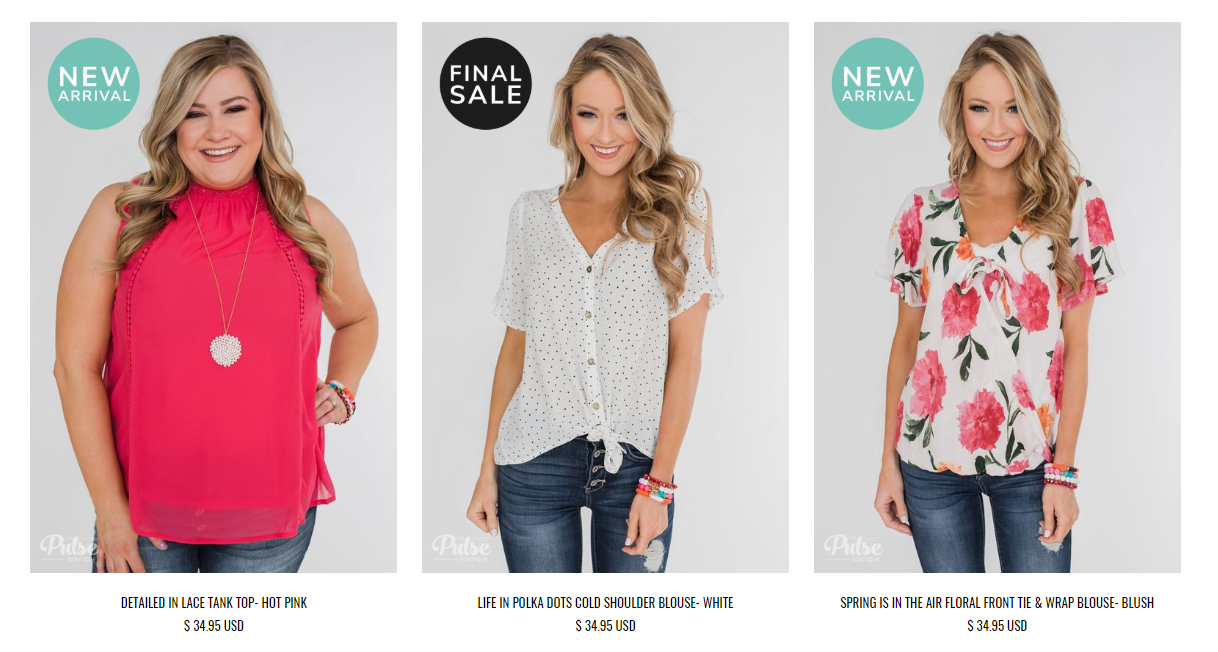
An example of the colour-coordinated sales overlays used on The Pulse Boutique’s collection pages.
The results
As predicted, we found that the use of colour coordinated overlays did affect user engagement on the collection pages. Specifically, we observed an 8.3% increase in RPU for all mobile users.
Step 5: Automating business processes
In any business, there are those small but necessary tasks that together devour productivity and stunt growth.
As part of our extensive project with The Pulse Boutique, we worked with their team to explore ways of automating their fast-growing ecommerce business. Our aim was to streamline their processes and consequently free up more of their time from repetitive and redundant admin tasks to focus on what matters most.
By offloading the demands, complexity and repetition that high-volume ecommerce trading inevitably creates, the Pulse team would be able to focus their time and energy on taking the brand to the next level.
#1 Automating business operations with Shopify Flow
Shopify Flow is an innovative ecommerce automation application, exclusive to Shopify Plus merchants. It uses a simple 3-step visual builder where merchants can specify triggers, conditions and actions which are stored and executed without any coding. The behind-the-scenes workflows that can be built and deployed on Flow help to eliminate repetitive manual processes.
For instance, merchants can create flows to manage inventory and re-ordering processes, unpublish products according to stock levels and cancel high risk orders.
Out of stock flow
For The Pulse Boutique, Shopify Flow is helping to accelerate their business outcomes. For example, we have implemented an intuitive inventory flow which notifies relevant members of the team when an item is out of stock. This automatic notification not only helps to manage inventory, but improves communication amongst the team.
Customer tagging
Our campaign also saw the implementation of a workflow that tags customers to track particular product purchases. This will allow the Pulse team to easily segment their audience and target particular customers with particular products, content and marketing messages. This reflects an increasing trend towards personalisation within the ecommerce industry.
#2 Marketing and email automation with Klaviyo
Klaviyo is a powerful marketing automation tool used for growing customer relationships. Amongst other features, it allows merchants to segment their audience and send targeted email campaigns, increase sales with pre-built winback emails, and quickly create signup forms to collect emails.
Back in stock flow
Back in stock emails are a simple, yet effective way to capitalise on purchase opportunities at scale. They have the power to divert considerable amounts of lost revenue back into a business, whilst keeping customers satisfied.
We worked with The Pulse Boutique to implement a Klaviyo back in stock flow, personalised for non-VIP and VIP members. VIP shoppers get exclusive access to restocked products two hours before regular customers. They receive an automatic restock alert when their item of interest is back in stock. This email is designed to really highlight the exclusive benefits of early access, whilst promoting the route to purchase.
The response to this personalised flow has been very encouraging. It is the best performing flow that Swanky have implemented for Pulse. The VIP restock emails have higher open and click rates compared to non-VIP emails, and have resulted in increased revenue. In fact, for an equivalent number of sends, VIPs contribute 10x the revenue than regular Pulse Boutique shoppers!
Birthday flow
Furthermore, a neat birthday rewards flow has boosted returning user rates and revenue for The Pulse Boutique. Offering customers a personalised reward like this really helps to increase customer engagement and strengthen customer loyalty, so it’s no surprise that Pulse have seen an uplift in revenue since implementing this Klaviyo flow.
Loyalty onboarding flow
Another Klaviyo flow that The Pulse Boutique are benefitting from focuses on loyalty onboarding. We know that returning users tend to convert better than new users, therefore we wanted to implement an automatic flow that would highlight the features of the Pulse Perks loyalty program and help to boost returning user rates.
The loyalty onboarding flow sends an automatic email to new Pulse Perks members when they join the program. Two days later, if no purchases have been made, these members will receive an email familiarising them with the core aspects of the loyalty program. This process repeats at scheduled intervals depending on the customer’s purchasing behaviour.
This workflow has notably boosted loyalty engagement, helping to continually bring users back to the Pulse website.
Custom pop up styling and implementation
Klaviyo also allows merchants to customise ‘back in stock’ pop up styles. The ‘notify me when available’ form is highly customisable, which means it can be configured to match other site elements.
Our design team customised Pulse’s Stylebox availability pop up to reflect their site-wide branding. We used Pulse’s signature pink colour alongside some pretty flowers to create a cute, feminine look reflective of the brand’s values and target market.
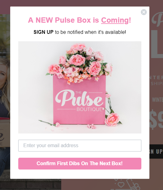
Klaviyo in action – The Pulse Boutique’s custom-branded Stylebox pop up.
#3 Automating store reviews with Okendo
Okendo is a customer marketing platform built specifically for high-performance Shopify retailers like The Pulse Boutique. It captures and showcases product ratings, layered reviews and user-submitted content. Okendo’s customer-facing aspects can be customised to ensure brand alignment.
Since we implemented Okendo on Pulse’s Shopify Plus store, it has captured over 15,000 layered reviews. Each review includes a customer profile, product star rating, written comment and feedback on product quality, comfort and sizing.
Reviews have been shown time and time again to increase trust by establishing brand credibility and product confidence. If shoppers can see social validation of a product they are interested in, they are more likely to convert this interest into a sale.
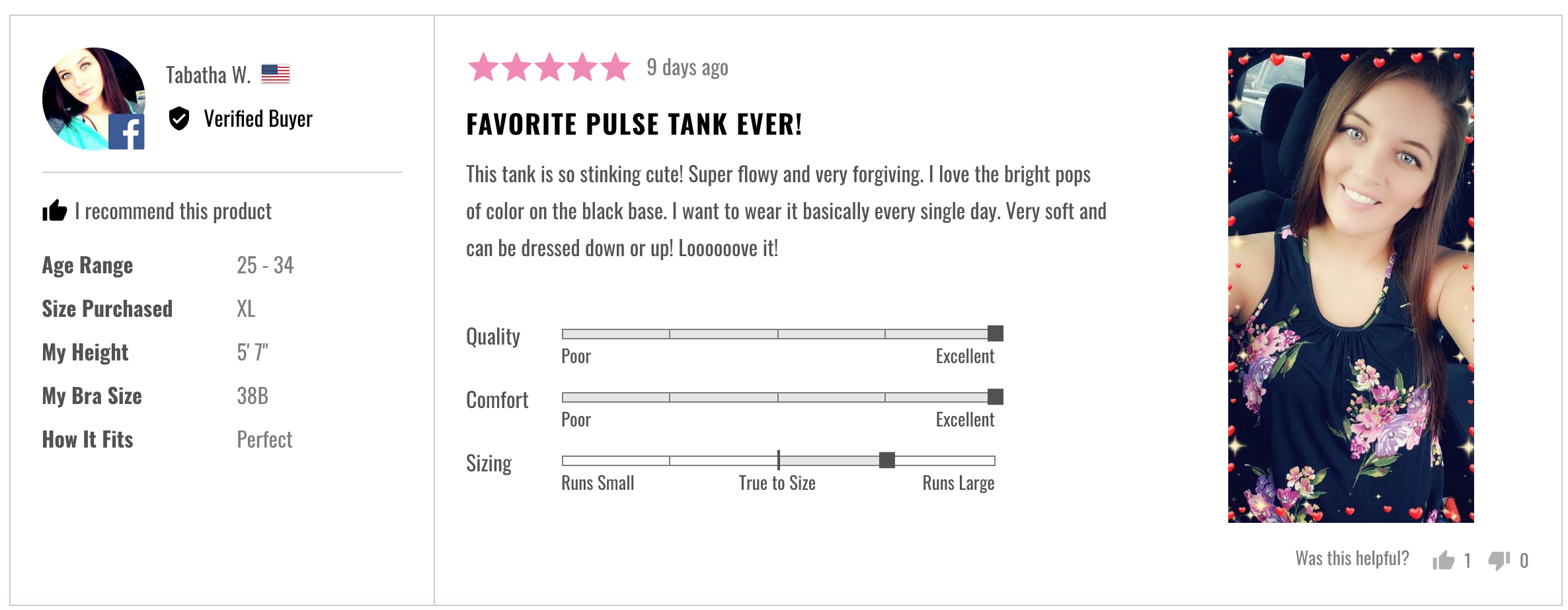

Two examples of Okendo customer review profiles on The Pulse Boutique online store.
In summary
Our comprehensive campaign with The Pulse Boutique has covered all corners of this successfully expanding business. This extensive project has seen the design, implementation and monitoring of various optimisation initiatives, a brand new loyalty program and exciting new automated workflows.
Putting our extensive knowledge of the industry into practice, we’ve helped this ambitious fashion brand both increase and retain traffic. We’ve also optimised their desktop and mobile sites to provide a smoother user experience for their valued customers. Their behind-the-scenes management processes have also been streamlined, freeing up more time for exciting business development projects.
These changes have contributed to increased customer engagement, more efficient business management and, at the heart of it all, a clear uplift in sales.
What’s next for The Pulse Boutique?
With these encouraging results behind them, The Pulse Boutique are continuing to dream big. 2019 is set to be an exciting year for this scaling fashion brand, as they set their sights on expansion into new international markets. This is something that Swanky are very excited to be supporting the Pulse team with over the coming months.
We caught up with Sean Clanchy, Swanky’s Head of Optimisation, to get his thoughts on The Pulse Boutique’s next steps.
“Personalising customer experiences is crucial when breaking new markets, so we are currently working hard analysing these new customers and locations to identify what makes these consumers buy. If we can address that, onwards and upwards for Mal, Mack and The Pulse Boutique.”
We look forward to seeing what the future holds for this Shopify Plus success story!
If, like The Pulse Boutique, you are looking to optimise your ecommerce store and really make the most out of your online presence, Swanky are here to help. Our team of Shopify Plus Experts are passionate about designing and optimising unique, beautiful, high-quality websites to help you unlock your full ecommerce potential. Please don’t hesitate to get in touch with us if you are interested in finding out more!

