15 Big Shopify Plus Fashion Stores
As the fastest growing enterprise ecommerce platform on the market, it’s no surprise that today Shopify Plus is powering some of the world’s largest, fastest growing brands. The flexibility and scalability that the platform offers is perfect for high-volume merchants experiencing rapid growth.
Written By
Hannah Smiddy

Some of the biggest names in fashion have turned to Shopify Plus to host their ecommerce stores, as well as some rapidly scaling brands with bags of potential. Thanks to the platform’s robust and reliable infrastructure, these brands are thriving in what is a hugely crowded market.
Want some examples? Let’s take a look at 15 huge Shopify Plus fashion stores for some inspiration. There’ll even be some helpful insights from our tech-savvy team of Shopify Plus Experts along the way.
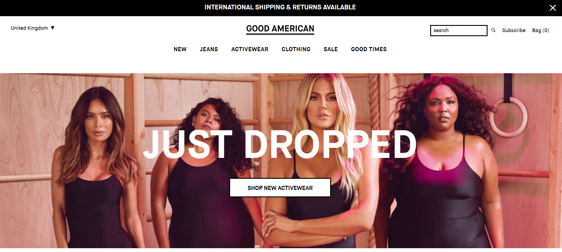
Good American
Spearheaded by global reality tv star Khloe Kardashian and celebrity branding expert Emma Grede, Good American celebrates body positivity and inclusivity. Their denim-focused fashion is created for women of all shapes, sizes, colours and backgrounds. Good American describes its launch as the biggest in denim history – it reached a staggering $1 million in sales in just its first day of trading!
Describing their use of automation tool Shopify Flow, Mehmet Dokumcu, Head of Digital & Ecommerce at Good American, said:
“We’re really excited about Shopify Flow not only because it saves us time and money but also because it allows us to focus on strategic initiatives that will move the needle instead of manual data entry tasks.”
Asking Dan McIvor, Shopify Plus Expert and Founder of Swanky:
“What is Good American gaining from being on Shopify Plus?”
“The huge first-day-sales that the Good American store saw on its launch day in 2016 would have been no issue for Shopify Plus. The platform is built for ambitious, high-volume enterprises just like this one. It has shown time and time again that it can handle huge spikes of traffic with ease. This is perfect for brands with highly publicised product drops like Good American.”
Asking Matt Giles, Creative Director at Swanky:
“What are the strongest aspects of this ecommerce store’s design?”
“The simple colour palette and use of whitespace allows this store’s product imagery to speak for itself. The eye is instantly drawn to the images. This is great for influencing click-throughs to the product pages.
In collection view, the product images reveal fit information upon mouseover. Everything speaks to how the product has been made so that the customer is making informed purchases.
Furthermore, the design of the Good American store includes great communication of product fit, size and fabric on product pages. This goes hand in hand with the brand’s unique selling point of being ‘made with your body in mind’, as does the use of different model sizes. It’s good to see a simple, fuss-free celebration of body-acceptance that doesn’t patronise users.”
Asking Sean Clanchy, Digital Strategy and Ecommerce expert:
“How could Good American boost their conversion rate further?”
“Good American sell to an international market and as such have made the effort to provide a local experience. Having said that, the fact you need to be prompted to select your correct store instead of using a GEO redirect to the relevant store begs the question ‘why isn’t this automatic?’.
The mega menu structure is entirely text based. While this is good for breaking down product segments, it’s poor for navigation. The plain black-on-white text and similar naming conventions for categories (‘Good XXX’ for everything) makes browsing a chore. Introducing an alternate naming convention, visual menu and reduced options could simplify the menu and therefore speed up the purchasing experience. Similar improvements could be made on their mobile site too.
Finally, Good American don’t appear to be using a predictive search app. We know that search users generally have higher intent than browsing customers. By not catering well to search users, this brand could be missing out on conversions. I’d recommend introducing a search tool such as Findify, Klevu, Algolia, or even at the lower price point, Searchanise.”
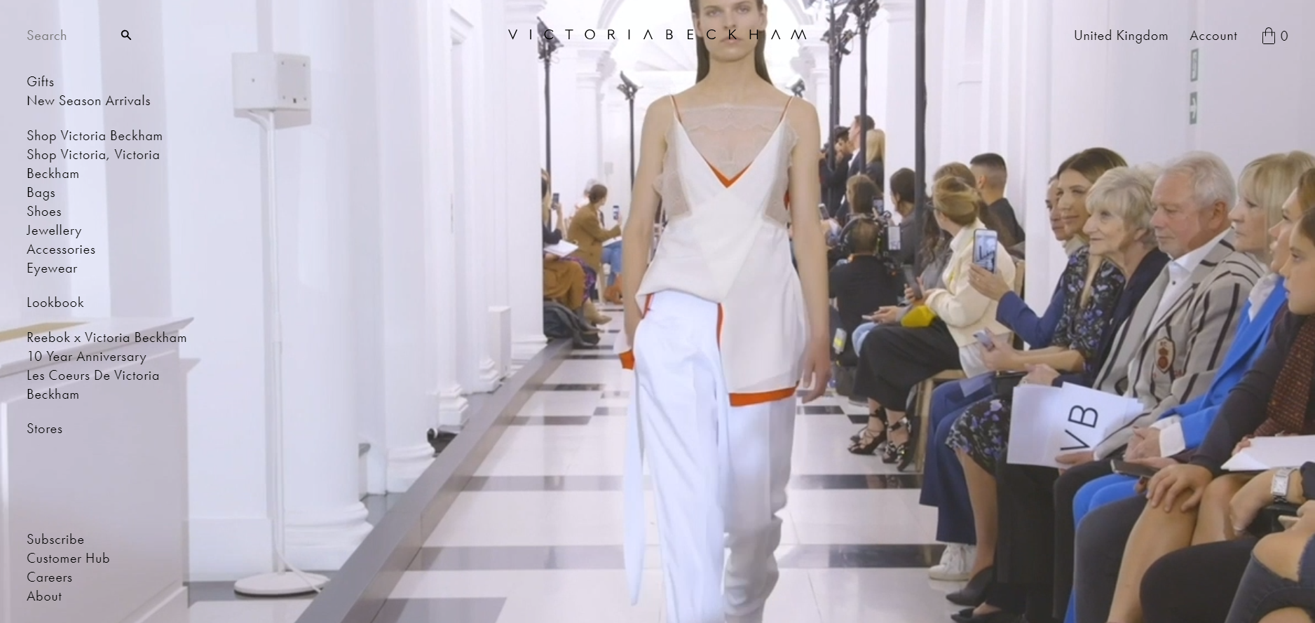
Victoria Beckham
Since Victoria Beckham’s fashion brand launched in 2008, it has become a global name in luxury designer fashion. The brand has spread across the world, with offices successfully established in London, New York and Hong Kong. Products from Victoria’s various collections are available in more than 400 stockists in over 50 countries, as well as via a Shopify Plus-powered ecommerce store. 2017 saw sales grow by 17% to a huge £42.5 million.
Asking Dan McIvor, Shopify Plus Expert and Founder of Swanky:
“What is Victoria Beckham gaining from being on Shopify Plus?”
“This store leads with dynamic videos and images, which is great for increasing brand engagement and conveying brand values. Shopify’s global content delivery network (a collection of web servers distributed across multiple locations around the world) provides the speed and functionality that’s essential for serving larger image and video files like these.
This type of technical infrastructure means that the Victoria Beckham store will load quickly around the globe. Content will be delivered efficiently to users wherever they are in the world. This is critical for a global store like this one that prides itself on providing a streamlined, luxury experience for its fashion followers.”
Asking Matt Giles, Creative Director at Swanky:
“What are the strongest aspects of this ecommerce store’s design?”
“This ecommerce store features elegant use of small fonts and whitespace to create a very premium feel. As a luxury designer fashion label, this is the overall aesthetic that consumers will expect.
As Dan pointed out, the use of dynamic imagery and videos is great for brand engagement. It creates an eye-catching sense of movement. I also really like the use of product imagery on the collection pages. The models are in subtly different poses, in front of the same background. This creates a sense of uniqueness and adds movement to each product, without acting as a distraction for shoppers.
The refined animation of the logo reduction upon scroll is a lovely feature. It shows that they have thought about every little detail. This is important for such an exclusive brand where attention to detail is key.”
Asking Sean Clanchy, Digital Strategy and Ecommerce expert:
“How could Victoria Beckham boost their conversion rate further?”
“I haven’t been able to spot any product reviews on the international site. Considering the price of the products, I think building trust through consumer reviews would have great value in driving additional purchases.
The filters on collection pages leave a bit to be desired. For instance, the colour filters have no swatches and therefore are quite bland.
The information displayed in the slidey cart could be slightly frustrating for customers. For instance, the size variant is named ‘title’, which may confuse buyers who are trying to confirm that they’re purchasing the right size.
When it comes to the Victoria Beckham mobile site, one thing they could do to boost their conversion rate further is improve the menu. The current categorisation is hard to understand. Also, list-based navigation makes for a congested menu navigation experience.”
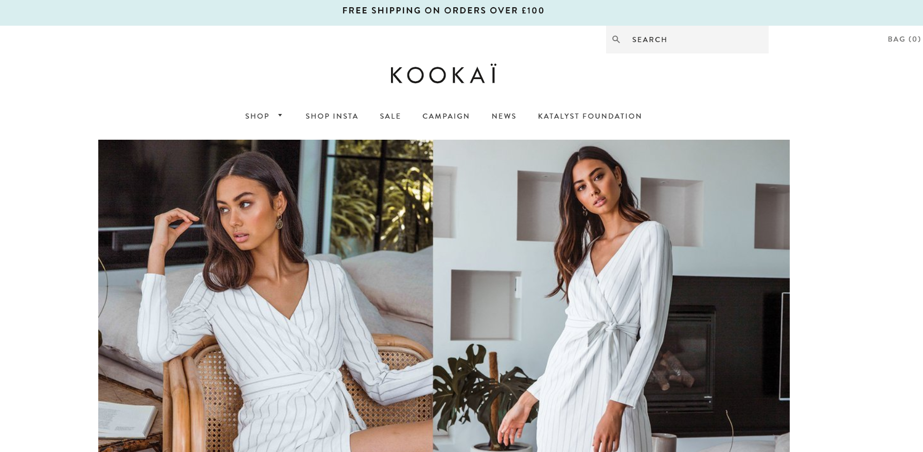
Kookai
Australian-owned fashion label Kookai are all about femininity, allure and independent style. Born in Paris in 1983, Kookai’s collections reflect their French heritage with clothing that’s infused with classic Parisian chic. Their philosophy? To supply women with fashion-forward apparel for their wardrobes at accessible prices. They are also passionate about encouraging women to express their individuality and create their own trends. Kookai’s annual turnover is nearly $70 million.
Asking Dan McIvor, Shopify Plus Expert and Founder of Swanky:
“What is Kookai gaining from being on Shopify Plus?”
“Kookai are benefitting from Shopify Plus’ advanced merchandising and search functionality. These elements of their store are really strong. They are using Findify on their search jump-down feature. Offering search suggestions helps create a smoother user experience by aiding navigation and inspiring product discovery.”
Asking Matt Giles, Creative Director at Swanky:
“What are the strongest aspects of this ecommerce store’s design?”
“Kookai’s store has a clean, editorial style with a clever mix of serif and sans-serif fonts. Key elements such as buttons, navigation, price and product titles are communicated through sans-serif fonts. Descriptions and body text use serif fonts, which communicates the refined side of the brand.
There’s lots of in-situ imagery used on the homepage to communicate the overall brand feel. The images are taken in classy settings to reflect the brand’s high-end nature.
On the product pages, the purchase flow is clean and simple. It appears above the fold on desktop and is prioritised above the product description.”
Asking Sean Clanchy, Digital Strategy and Ecommerce expert:
“How could Kookai boost their conversion rate further?”
“Kookai’s product pages could include reviews from other customers about the feel, fit, make and look of the products. Consumers want to hear from other customers. Social validation and trust-building through reviews is always a win!
On sale products, the value of the saving on offer could be more effectively communicated. In our tests, this has resulted in as much as a 26% increase in revenue per user over the life of the test.
Furthermore, the search bar could also be more defined on Kookai’s store. Search users regularly convert at as much as 3-4 times the rate of those browsing – they know what they want and are actively searching to purchase.”
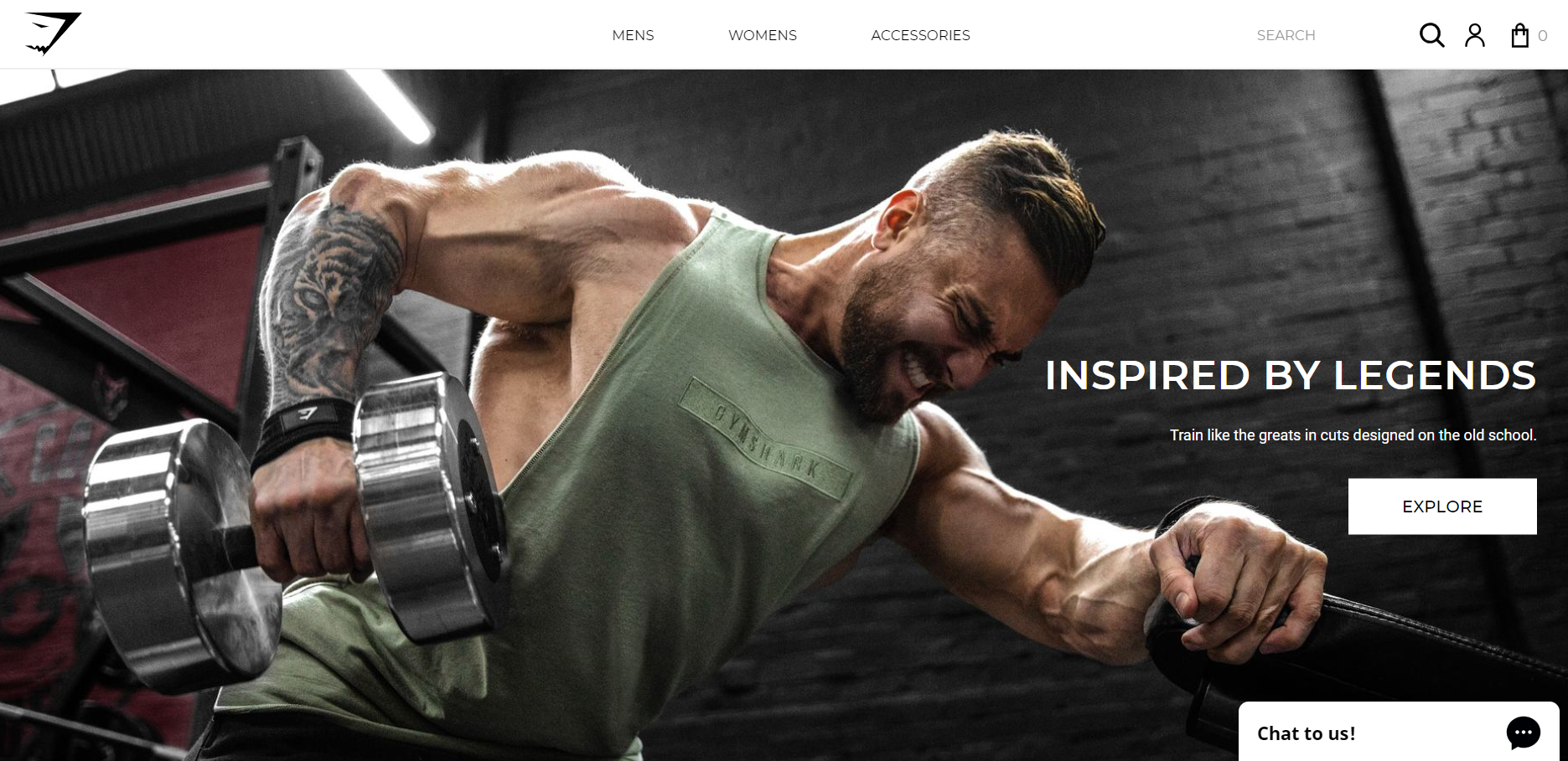
Gymshark
Recently profiled by the BBC’s ‘The Boss’ series, Ben Francis’ UK fitness apparel and accessories brand is set to reach £100 million turnover this year. Set up whilst Ben was juggling university studies with a part-time job at Pizza Hut, Gymshark now has ‘more than 1.2 million customers, and 215 employees at its Solihull Headquarters in the West Midlands’, according to the BBC News website. Gymshark has used social media to its advantage, using ‘influencers’ in the fitness and bodybuilding industries, and now boasts 2.9 million followers on Instagram, with over 1.5 million likes on Facebook.
Asking Dan McIvor, Shopify Plus Expert and Founder of Swanky:
“What is Gymshark gaining from being on Shopify Plus?”
“Today, Gymshark are thriving on Shopify Plus. The platform can easily handle their rapid growth, whilst also allowing their team to implement changes quickly and effectively whenever they please.
Furthermore, Gymshark are making the most of Shopify Plus’ built-in social feeds and social media integrations. With their enormous social media following, Gymshark have catered to their audience by including a shoppable Instagram feed on their homepage.”
Asking Matt Giles, Creative Director at Swanky:
“What are the strongest aspects of this ecommerce store’s design?”
“Gymshark’s store is great at encouraging users to reach the checkout page as quickly as possible. For example, the website gives customers the option to add and remove products to their cart before they even reach the checkout page. All you need to do is hover over an image and click on your size for that product to be added to your basket.
Another strong aspect of Gymshark’s store design is the way it leads with images. It has a clean and simple design, but with plenty of attitude.”
Asking Sean Clanchy, Digital Strategy and Ecommerce expert:
“How could Gymshark boost their conversion rate further?”
“Gymshark could think about adding filters to their search page, as people like to refine their searches by size and colour, for example. Adding filters can aid consumer navigation.
There is also the potential to insert reviews with customer profiles on product pages. Shopify recommend Okendo, a review app used to build shopper trust and excitement, showcase customer experiences and compel buying action.”
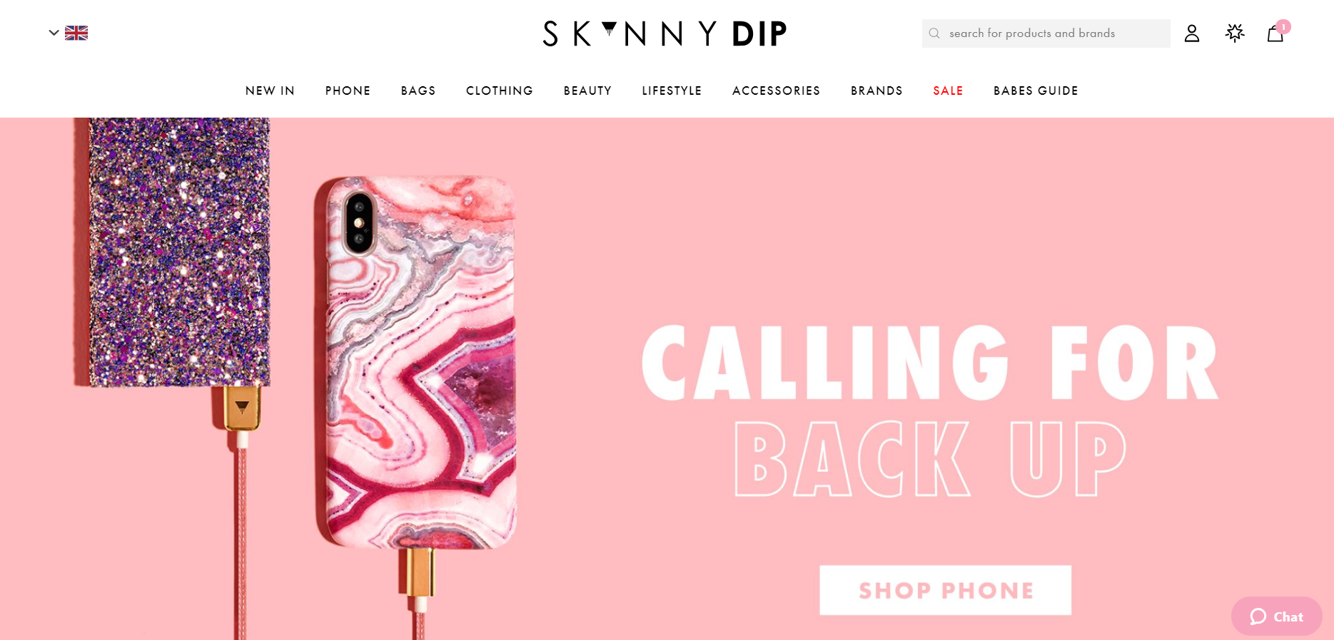
Skinnydip
Skinnydip is a London-based fashion brand creating stylish accessories for girls. Best known for its fun and creative phone cases, the brand has grown to trade in 30 countries with an annual turnover of £13.5 million. Alongside its successful Shopify Plus ecommerce store, this innovative fashion brand have built a fast-growing concession business with Topshop, Nordstrom and Urban Outfitters, among other highstreet giants.
Asking Dan McIvor, Shopify Plus Expert and Founder of Swanky:
“What is Skinnydip gaining from being on Shopify Plus?”
“The Skinnydip store makes use of a customised checkout flow. It has a simple but elegant configuration, which fits nicely with the rest of the site’s design. The progress indicators are a particularly neat feature. We know that creating a sense of positive progression towards an end goal is an effective way of helping to counter cart abandonment and increase conversions.
One thing I did notice is that Skinnydip have a dedicated page on their store all about becoming a member of ‘Nail Club’, however they don’t appear to offer a sign-up form anywhere on the site. They could use the ReCharge app to allow people to join online. This is the number one solution for recurring billing and subscriptions on ecommerce stores.”
Asking Matt Giles, Creative Director at Swanky:
“What are the strongest aspects of this ecommerce store’s design?”
“Skinnydip’s store combines a colourful and bold approach with clear, user-friendly navigation on both desktop and mobile.
Its search functionality is well-prioritised on mobile, with great routes into different categories above the fold. The bottom navigation bar on mobile provides access to key items like users’ accounts and wishlists. This should have a great impact on ease of use.
On desktop, the mega menu includes some nice imagery to aid navigation.”
Asking Sean Clanchy, Digital Strategy and Ecommerce expert:
“How could Skinnydip boost their conversion rate further?”
“Firstly, reiterating ‘new in’ for every product type under the ‘New In’ menu category is counter intuitive. It creates more effort during the browsing experience than it should.
Skinnydip could consider incorporating filtration on their search results page. This would make it easier for users to identify the specific item they’re seeking.
Also, to boost conversions on their Log in/Sign up page, there could be a clearer incentive or motivation for the user to sign up and create an account. There’s plenty of scope to list the benefits, perhaps with some on-brand iconography.”
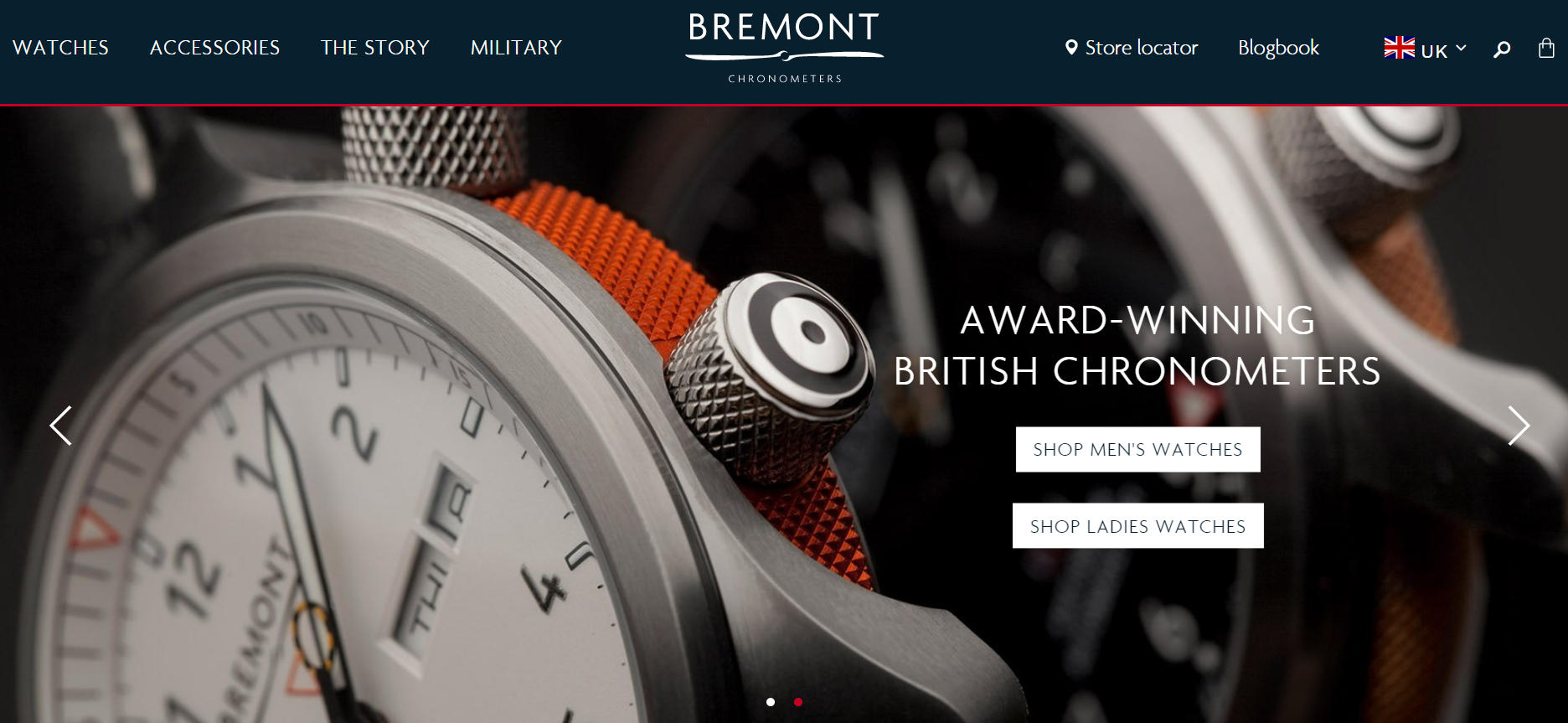
Bremont
Crafters of beautifully engineered pilot’s wrist-watches, Bremont are an award-winning company founded in 2002 by two brothers after the death of their father in an aviation accident. Securing a collaboration with the armed forces, they have designed an exclusive collection for the military, as well as enduring classics for everyday use. The new U-2/51-JET watch features in the blockbuster Spider-Man spin-off, Venom.
Asking Dan McIvor, Shopify Plus Expert and Founder of Swanky:
“What is Bremont gaining from being on Shopify Plus?”
“Bremont are making good use of video across their Shopify Plus store. Thanks to Shopify’s infrastructure, the site boasts fast page-loads despite the large video files. This reflects the brand’s commitment to quality and luxury.
It’s nice to see an extensive blog that fans of the brand can really take time to explore. We know that a well-curated blog full of useful, unique, relevant content is a great way to distinguish a site from the competition. I can see visitors to the Bremont store really engaging with the varied blog posts on offer. This is something that is great for creating lasting connections with consumers and increasing brand engagement.
It’s interesting to see that with their higher-priced products, Bremont offer consumers a chance to make enquiries and register their interest before committing to a purchase. They are drawing people through premium purchasing in a carefully considered manner, demonstrating their values as a trusted, quality retailer. This shows that Shopify Plus doesn’t need to be about selling something there and then online. Instead, this versatile platform can be used to host a product catalogue and facilitate enquiries.”
Asking Matt Giles, Creative Director at Swanky:
“What are the strongest aspects of this ecommerce store’s design?”
“Bremont’s Shopify Plus store is very masculine in its design, thanks to the use of large imagery, dark colours and refined, uppercase fonts. Their design choices have clearly been made with their target market of affluent males in mind.
The product pages lead with large images to communicate product and brand appeal above the fold on desktop. They are aware that their premium, high-price-tag watches are considered purchases, and so regular ‘above-the-fold rules’ don’t necessarily apply.
The quality and history of the product is consistently communicated in order to create a genuine connection with consumers. They are using clever design choices to appeal to how this new watch will affect the status and story of the eventual purchaser. This also creates stronger brand affinity, which has been proven to increase conversion rates, average order values and lifetime spend.”
Asking Sean Clanchy, Digital Strategy and Ecommerce expert:
“How could Bremont boost their conversion rate further?”
“By offering too many filtration options, Bremont are in danger of losing customers. Users need to have a balance of filtration options, not giving them too many decisions to make. A complex filter system can paralyse the customer, which in turn complicates and slows the browsing process.
Bremont could also improve their communication system. For example, they could consider including a stylish countdown timer to communicate any upcoming launches.”
Yeezy Supply
Apparently on its way to becoming a ‘decacorn’ (a Silicon Valley buzzword for a business valuing over $10 billion), Yeezy Supply is the apparel company of celebrity rapper, Kanye West. The most sought-after Yeezy items are trainers, which are rolled out in limited numbers, creating hype and selling-out quickly. Yeezy Supply’s Shopify Plus-based ecommerce store is visited by millions of users every month!
Asking Dan McIvor, Shopify Plus Expert and Founder of Swanky:
“What is Yeezy Supply gaining from being on Shopify Plus?”
“The Yeezy store has a really unique design, where you are immediately presented with the products on the homepage. This demonstrates the flexibility of Shopify Plus as an ecommerce platform. There is plenty of room for creativity, which is perfect for this brand in its quest to stand out from the crowd.
This fashion brand is also benefitting from Shopify Plus’ ability to handle large product drops. Yeezy are famous for their exclusive product launches that draw huge amounts of visitors to their online store. They need a robust and reliable platform that they can trust to scale with them – Shopify Plus is just that.”
Asking Matt Giles, Creative Director at Swanky:
“What are the strongest aspects of this ecommerce store’s design?”
“The Yeezy store certainly stands out from the crowd. It takes minimalism to a whole new level. The site communicates a very ‘nonchalant, can’t-be-bothered cool’ in its design, with one font, size and weight throughout. The calls to action are all the same across the store as well. Also, there’s no logo and no styling on the dropdowns.”
Asking Sean Clanchy, Digital Strategy and Ecommerce expert:
“How could Yeezy Supply boost their conversion rate further?”
“We know that this is a hugely successful store. Products tend to sell out extremely quickly on the Yeezy store thanks to immense social media publicity. However, for consumers who are perhaps new to the brand and browsing the store for the first time, the unusual positioning of navigational elements could detract from conversion rates purely because consumers are having to work harder to browse the site.
Not having an impactful add to cart call to action or strong pricing could also be reducing the conversion rates on the Yeezy product pages.”
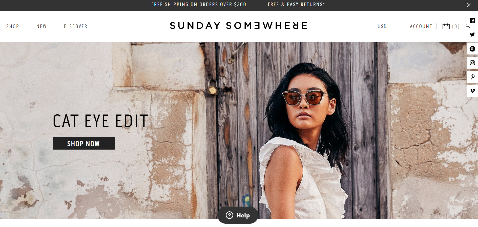
Sunday Somewhere
Sunday Somewhere is a premium sunglasses brand, worn by the likes of Beyonce, Kate Hudson, Jessica Alba and Halle Berry. This Australian fashion brand is inspired by ‘the richness in the people we meet and the places we explore’, targeting people who love adventures, travel and spontaneity. Sunday Somewhere have amassed over 92,000 followers on Instagram.
 Asking Dan McIvor, Shopify Plus Expert and Founder of Swanky:
“What is Sunday Somewhere gaining from being on Shopify Plus?”
“Sunday Somewhere are clearly making good use of promotion options such as the free shipping banner within their Shopify Plus theme. The platform makes it easy to add and manage things like this with its intuitive user interface. Merchants can make changes without the need for design and development work. With no need for development teams to make basic changes, merchants can save agency resources for larger, more exciting edits.
They could consider using an app like Foursixty to create a shoppable Instagram gallery. This is super-simple to plug in and configure on a Shopify store.”
Asking Matt Giles, Creative Director at Swanky:
“What are the strongest aspects of this ecommerce store’s design?”
“Sunday Somewhere’s store features beautiful product images on the collection pages, complete with a cool carousel to show product variants. Also, when you hover over images in this view, you’re presented with different profile angles. These design aspects provide an enhanced user experience by allowing users to make a more informed purchasing decision.
It’s worth noting that the key purchase flow is well prioritised on both desktop and mobile product pages. For instance, the add to cart button is positioned above the product description and inspiration sections.
Technical specifications of each product are shown in a cool blueprint format to communicate the considered design and fabrication of the products. This is a really unique feature that should make an impact with consumers.”
Asking Sean Clanchy, Digital Strategy and Ecommerce expert:
“How could Sunday Somewhere boost their conversion rate further?”
“With a $200+ asking price, adding a layered review tool like Okendo could play a big part in building new user trust and increasing new user conversion rates. They could curate a more useful review, talking about user specifics (fit, feel, comfort, quality) to answer buyer questions. This would, in turn, improve the conversion rate of the site across all users.
Sunday Somewhere could also implement additional filtration options when searching for products, such as ‘lens colour’ and ‘polarised’/ ‘non-polarised lenses’ to address sun-safe buyers or those worried about UV filters.”
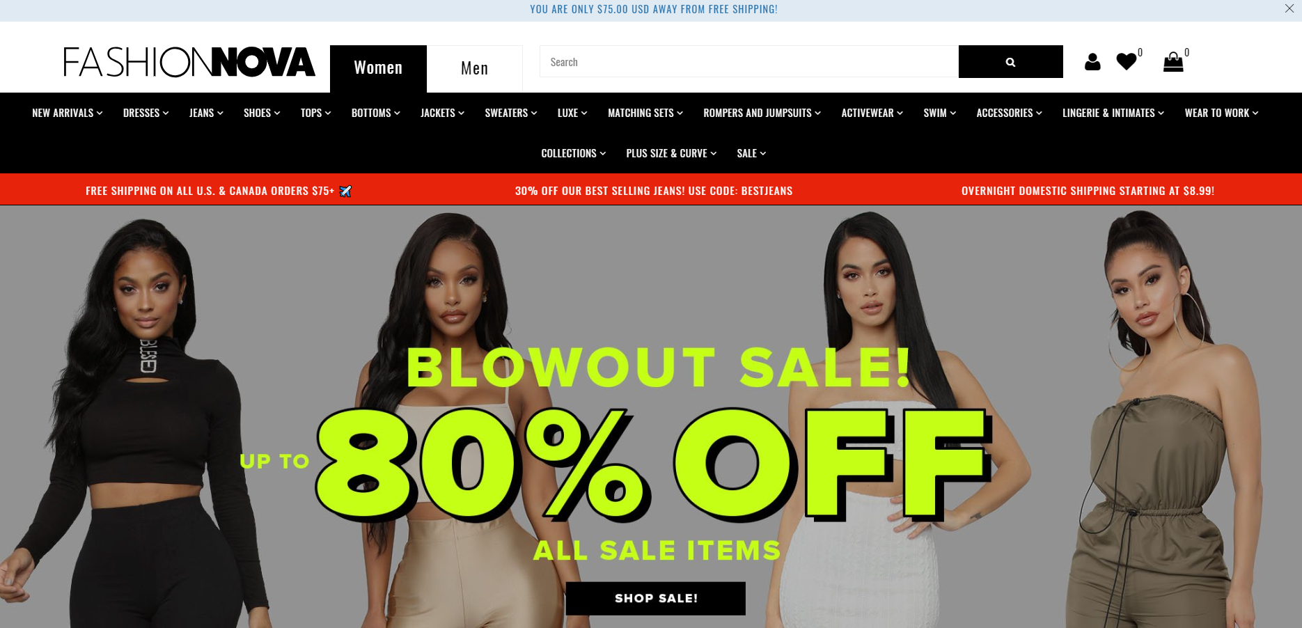
Fashion Nova
According to Google, in 2017 this global fashion powerhouse was one of the most searched fashion brands alongside Gucci, Louis Vuitton and Chanel. CEO Richard Saghian says the company grew by 600% in 2017! Its Shopify Plus ecommerce store attracts an average 15 million visitors per month – a truly staggering number. How does Fashion Nova do this? It’s partly through its work with a network of over 3,000 influencers, alongside their clever targeting of millennials via social media.
Asking Dan McIvor, Shopify Plus Expert and Founder of Swanky:
“What is Fashion Nova gaining from being on Shopify Plus?”
“Fashion Nova have a huge catalogue of products, with a lot of variants available. Luckily, Shopify Plus can easily handle complex product categorisations and quantities like theirs. The platform also provides much-needed stability and certainty for enterprises, meaning that merchants can add new brands and ranges to their store with confidence.
They have a rather cool countdown timer on their checkout page. I’d be curious to know whether they have A/B tested this feature and what sort of impact it has on conversion rate and cart value.”
Asking Matt Giles, Creative Director at Swanky:
“What are the strongest aspects of this ecommerce store’s design?”
“This huge ecommerce store is clearly geared towards the impulse buyer, with bold, aggressive messaging of offers and deals. There’s also lots of movement across the store to draw attention, as well as a sale countdown timer to drive sales.
There is a clear gender splitter in the site’s navigation, which streamlines the beginning of the customer journey.”
Asking Sean Clanchy, Digital Strategy and Ecommerce expert:
“How could Fashion Nova boost their conversion rate further?”
“Fashion Nova could boost their conversion rates by simplifying a very busy mobile and desktop menu. Too many filter options can be paralysing for a user and really slow down the browsing process.
They could also offer an incentive to create an account. Offering motivation for signing up to email updates can improve engagement with the brand and ensure an increase in returning customers.”
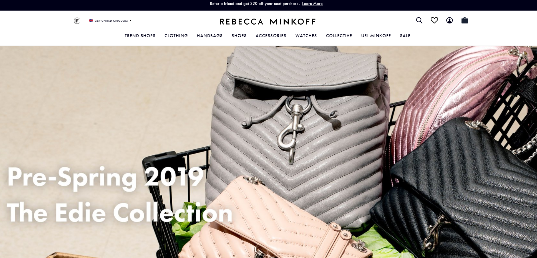
Rebecca Minkoff
An industry leader in accessible luxury handbags, accessories, footwear and apparel, fashion brand Rebecca Minkoff sells online via Shopify Plus to over 100 countries and in 70 currencies. This rapidly scaling business has recently reached $100 million in gross sales.
Asking Dan McIvor, Shopify Plus Expert and Founder of Swanky:
“What is Rebecca Minkoff gaining from being on Shopify Plus?”
“As a former Magento client, Rebecca Minkoff is a prime example of a modern fashion brand who are really taking advantage of Shopify Plus’ exciting range of front-end functionality.
Shopify Plus provides merchants with an almost unlimited pool of front-end customisation options to allow them to create a unique collection and product page experience. In Rebecca Minkoff’s case, this includes different-sized product blocks on their store’s collection pages, an attractive product page carousel and a completely customised shopping cart.
In terms of finding out which of these changes are best for boosting conversions on your store, Shopify Plus’ speed of deployment of new features and A/B testing makes it the fastest and easiest platform to run optimisation tests on.
This is especially key for ecommerce fashion stores as, in the words of Uri Minkoff, Co-Founder and CEO of Rebecca Minkoff, one of the keys to building a fashion brand for the millennial consumer is to get to know your customers and their preferences through A/B testing ‘all day long’!”
Asking Matt Giles, Creative Director at Swanky:
“What are the strongest aspects of this ecommerce store’s design?”
“Rebecca Minkoff’s website lets its images do the talking. For example, throughout the collection pages, product shots are interspersed with fun lifestyle images containing real people and vibrant landscape photographs. On the product pages, the product imagery is huge, whilst the product slider is automated to encourage users to view the items in detail and from multiple angles.
The homepage also features some conversion-boosting aesthetic touches, such as a shoppable Instagram feed and clear, unique calls to action like ‘Discover #IAMMANY’. These help to attract customers to their new products and campaigns.”
Asking Sean Clanchy, Digital Strategy and Ecommerce expert:
“How could Rebecca Minkoff boost their conversion rate further?”
“To increase their sales even further, the brand could consider communicating product size availability on the collection page listings (rather than making customers click on the product page first to find out this information).
The cheapest products are also the first to be displayed on the collection pages, so Rebecca Minkoff could potentially increase their average order values by arranging their products in a different order on collection pages. I’d be interested to see if putting best-selling products before lowest price items would make any impact on this store’s metrics.”
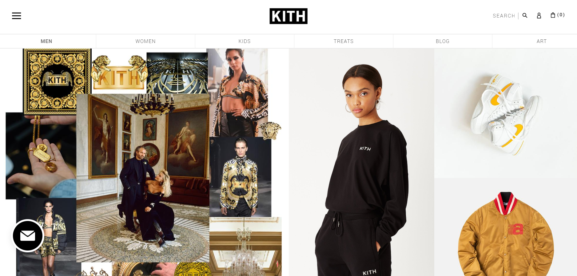
Kith
New York born fashion and lifestyle brand Kith offers a super-sleek online experience to its customers. Hailed as a game-changing Shopify Plus store, this fast-growing apparel and footwear boutique is leading the way in streetwear by collaborating with iconic brands such as Yeezy. As well as a hugely successful ecommerce store that attracts over a million users per month, they have multiple retail locations in the US.
Asking Dan McIvor, Shopify Plus Expert and Founder of Swanky:
“What is Kith gaining from being on Shopify Plus?”
“This trendy Shopify Plus fashion store is a reflection of how much creativity merchants have at their fingertips on this platform. There is room for brands to express their unique identity, which is really important for fashion brands competing in such a crowded market.
There are lots of really neat features on the Kith store. I like how you can swap between product images with radio buttons. This adds a more dynamic element to the site, whilst satisfying consumers’ need for multiple product images. They have also worked to streamline the user experience by featuring a ‘Quick Add’ function upon image rollover. This smooth experience represents the slick, modern image that Kith are known for.”
Asking Matt Giles, Creative Director at Swanky:
“What are the strongest aspects of this ecommerce store’s design?”
“The Kith online store is heavily image-led, with very little in the way of text on the surface. They have clearly made a conscious choice to let their slick, unique product imagery communicate as much as possible. When text is used, the fonts are small and fairly reserved in approach.
On mobile, there’s clever use of navigation highlights: men, women, kids, treats, blog. This cuts out a step of the route-to-purchase and means that the user doesn’t have to expand a menu to see navigation options.”
Asking Sean Clanchy, Digital Strategy and Ecommerce expert:
“How could Kith boost their conversion rate further?”
“Kith don’t show any reviews on their product pages. Reviews are crucial for building consumer confidence and can really help a brand stand out from the competition. In such a crowded marketplace, this is something that Kith should consider.
In my opinion, the add to cart button is too busy. It incorporates the text ‘add to cart’ as well as the product price in the same element. For reduced priced products, this call to action is even busier. This reduces the impact of this call to action, which could be hindering conversions.
Interestingly, Kith have opted for icon-based navigation, which Swanky have tested before and found to be an effective navigational improvement in some circumstances. However, Kith have attempted to do this using a combination of menu and custom page templates, which can lead to a disjointed navigation experience, particularly so on mobile devices. As we cannot identify an A/B testing platform installed on the site, we would hope they have A/B tested this change, as it has the potential to severely hinder navigation.”
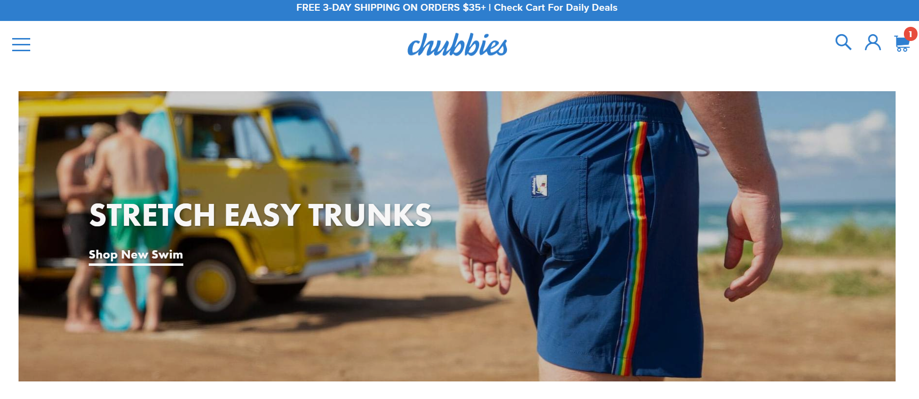
Chubbies
Premium vintage shorts brand Chubbies are on a mission to sell fun with every pair of shorts. As the brand has evolved, they have introduced sleepwear, shirts and accessories to their product offering. Since moving onto Shopify Plus, the brand has seen 50% year on year sales growth. San Francisco-based Chubbies bring their customers to the forefront and use user-generated content to help drive growth.
 Asking Dan McIvor, Shopify Plus Expert and Founder of Swanky:
“What is Chubbies gaining from being on Shopify Plus?”
“The Chubbies store has a fun and retro style that matches their products. This design is a demonstration that not all fashion ecommerce stores have to be minimalist and dry. Instead, they can be fun and lighthearted, with things like emojis and jokes weaved throughout. The brand are benefitting from the flexibility of Shopify Plus, and have been able to inject their own unique style into their theme.”
Asking Matt Giles, Creative Director at Swanky:
“What are the strongest aspects of this ecommerce store’s design?”
“As Dan said, the design of this store reflects the fun, colourful style of Chubbies’ products. For instance, they make good use of friendly but impactful typography. They use nicely rounded ‘chubby’ fonts, in fact! Furthermore, the colour used for the add to cart buttons and purchase flows is bright, fresh and engaging.
The simple left-hand menu gives a very useful navigation point that is always visible. This helps create a smooth user experience for shoppers and is part of an overall framework that conveys a brand story of simple, honest fun.
Finally, another strong design feature of the Chubbies store is the nice icon-based communication of product details. They use simple black and white icons to represent fabric, size and various USPs that should appeal to consumers.”
Asking Sean Clanchy, Digital Strategy and Ecommerce expert:
“How could Chubbies boost their conversion rate further?”
“Interestingly, Chubbies never take users to a search results page and never provide users with extended results to searches. Limiting search result options like this may be a great way to reduce cognitive load by providing browsing customers with less options, however it could also be extremely frustrating for users attempting to browse via search.
This store’s product pages have a great selector setup with miniature product images clearly denoting colour schemes. However, product reviews are very basic (simple text and star reviews). I would consider implementing a layered review structure similar to that provided out-of-the-box by the Okendo review platform. By curating reviews on product size, fit and feel, while also creating miniature reviewee profiles, potential customers can reference real-world feedback and identify with other, independent users. A great example of this in action can be found here on The Pulse Boutique store.
The Modal cart on the Chubbies store has a particularly cool feature, showing off a range of upsell ‘deals’. However, often having too many distractions in the purchase process can reduce checkout conversions and lower overarching revenue.”
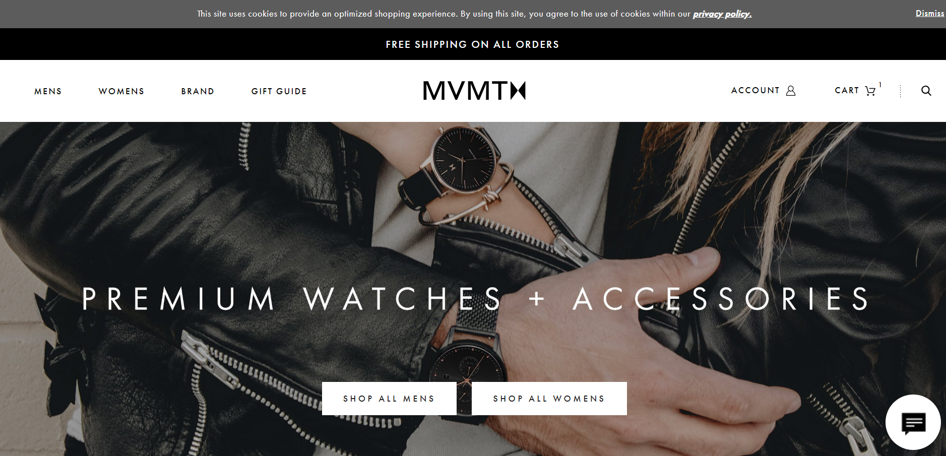
MVMT
Global watch empire MVMT deliver premium, on-trend designs at ‘radically fair prices’. These Los Angeles-based Shopify Plus merchants scaled to a huge $60 million within just three years, and were poised to exceed $100 million by the end of 2018! Their online store, which uses more than 30 Shopify Plus apps to help provide a first-rate customer experience, received 3.4 million visits in November 2018 alone!
Asking Dan McIvor, Shopify Plus Expert and Founder of Swanky:
“What is MVMT gaining from being on Shopify Plus?”
“MVMT are one of the biggest stores on Shopify Plus. The brand started out with watches and began adding other product lines as the business grew. Shopify Plus has been the perfect platform for this expanding fashion brand. Its flexibility has allowed their product offering to evolve over time, whilst its scalability means that the steady increase in traffic to their site has not been a problem.
Furthermore, MVMT are making the most of Shopify Plus’ built-in social feeds and social media integrations. They are catering to their young, tech-savvy audience by including a dynamic, shoppable Instagram feed on their homepage.”
Asking Matt Giles, Creative Director at Swanky:
“What are the strongest aspects of this ecommerce store’s design?”
“The MVMT store leads with large lifestyle imagery to really drive home brand appeal. The slick photographs communicate values of style, innovation and elegance, as does the refined use of fonts.
There’s nice use of movement upon mouseover when in the collection view. This engages the user and offers another profile angle of each product. The clear add to cart function from the collection page also benefits users by streamlining the route-to-purchase.”
Asking Sean Clanchy, Digital Strategy and Ecommerce expert:
“How could MVMT boost their conversion rate further?”
“This store’s core unique selling points are stashed at the base of the homepage. This means they’re not readily visible for new users visiting the site for the first time. MVMT should consider prioritising these above the fold.
Furthermore, there aren’t any trust-building elements featured on the homepage. Again, new users need to form a positive opinion of a brand in their first experience of the site. Whilst the MVMT site is very clean and stylish, in my opinion more could be done to convey trust to a user first landing on the homepage.
When it comes to the MVMT collection pages, merchandising that leaves an out of stock product in the top line of the collection view may provide a poor user experience. This delays users from browsing shoppable products.”
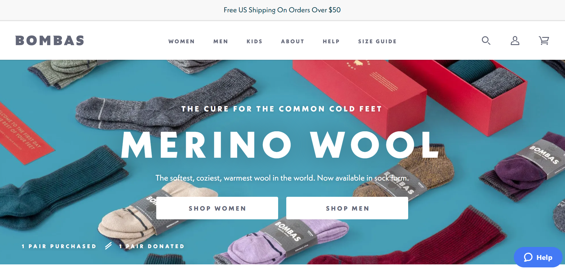
Bombas
Bombas are a fashion brand with a difference. For every pair of Bombas socks purchased, they donate a pair to someone in need, helping to support the homeless community in the US. So far, they have donated over 16.5 million pairs of socks! Bombas were catapulted to success when they landed a deal with hit US show Shark Tank. Unfortunately though, their Magento-based ecommerce store struggled to keep up. After replatforming with Shopify Plus, Bombas grew their revenue by 300% year on year, tallying $17.2 million in sales in 12 months alone!
Asking Dan McIvor, Shopify Plus Expert and Founder of Swanky:
“What is Bombas gaining from being on Shopify Plus?”
“Bombas’ Shopify Plus store won’t suffer in times of high traffic like their Magento site did. Thanks to the platform’s unlimited bandwidth and global network of servers, large and growing enterprises like Bombas are able to trade with confidence, even in busy periods.
For their neat sock donation counter, it looks like they might be using an app to track orders through Shopify API.”
Asking Matt Giles, Creative Director at Swanky:
“What are the strongest aspects of this ecommerce store’s design?”
“The Bombas store features a great combination of chunky, friendly font on top of colourful, vibrant imagery.
The lovely image-led mega menu is a great desktop feature. This really aids navigation, whilst also serving to highlight particular product lines. Variant and size selection is also very neat on desktop.
Navigation is super-clear on mobile too. Bombas are driving immediate segmentation above the fold on the homepage with separate calls to action for women, men and kids.”
Asking Sean Clanchy, Digital Strategy and Ecommerce expert:
“How could Bombas boost their conversion rate further?”
“Bombas have included a great brand proposition on the homepage. However, it could be losing immediate impact because the story is beginning too far below the fold.
This fashion store features some beautiful product pages. They could potentially benefit from a stronger call to action on these pages though. The add to cart button is the same colour as the majority of the font and other page highlights, thereby losing some of it’s impact.
Also on the product pages, the sticky header includes a ‘back to top’ button rather than a sticky ‘add to cart’ option. This could be reducing conversions by adding more time into the purchase journey before reaching checkout.
Bombas’ live chat/support function clashes quite heavily with the site branding with it’s bright blue icon. I wonder whether this could be styled to better suit the site, without distracting users from the purchase journey but still servicing it’s support function adequately. Considering a primary menu item is ‘Help’, could this support function not be triggered on Help pages as opposed to all pages?”
Obey Clothing (International)
An extension of artist and designer Shepard Fairey’s famous work, Obey Clothing was launched in 2001. It is now firmly positioned as one of the biggest streetwear brands in the world. Obey are well known for incorporating politically and socially provocative propaganda into the designs of their clothing. Their international ecommerce store is powered by Shopify Plus, which can handle the brand’s high demand with ease. 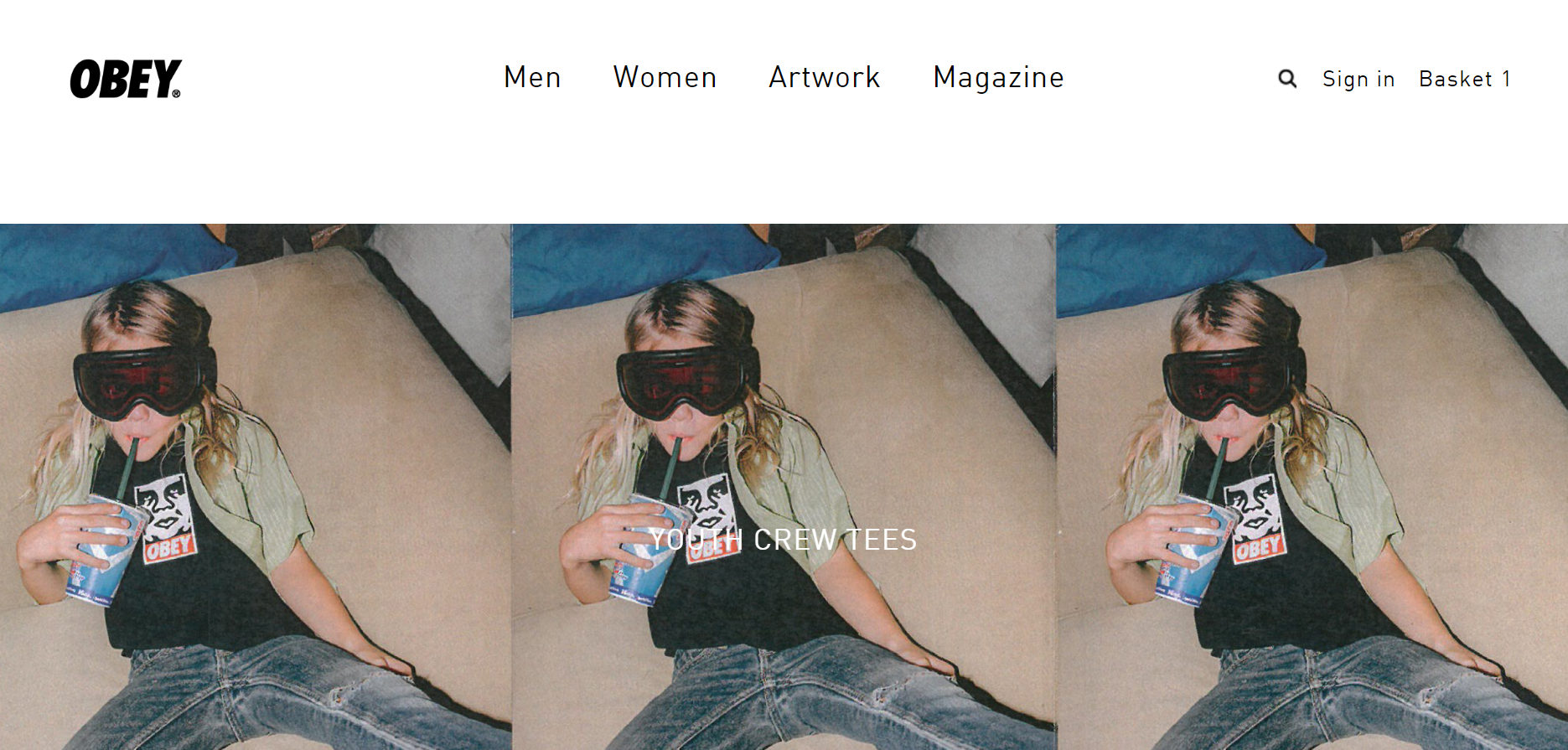
Asking Dan McIvor, Shopify Plus Expert and Founder of Swanky:
“What is Obey gaining from being on Shopify Plus?”
“The uber-trendy design of this store is geared perfectly towards its target market, and manages to convey Obey’s values as an edgy, forward-thinking fashion brand. Its unique style means it stands out from the crowd, whilst again demonstrating the flexibility of Shopify Plus as an ecommerce platform.
The store features a very customised checkout. In this case, they are using Sage Pay to process payments. It’s actually rather unusual to go off site from a Shopify store to pay. This isn’t usually recommended as it could reduce conversion rates, but it is possible where operational needs demand. Again, this shows what you can do with Shopify Plus that you can’t do with other ecommerce platforms.”
Asking Matt Giles, Creative Director at Swanky:
“What are the strongest aspects of this ecommerce store’s design?”
“This is another very minimalist Shopify Plus fashion store that heavily features images in an editorial style. There are lots of lifestyle image shots on the homepage and collection views to build brand affinity. This has been shown to increase key metrics like average order value and conversion rate.
Visitors to the Obey international store will enjoy super-simple navigation with a search-centric site on both desktop and mobile. The simple layout should lead to equally simple purchase routes.”
Asking Sean Clanchy, Digital Strategy and Ecommerce expert:
“How could Obey boost their conversion rate further?”
“From exploring the Obey homepage, I notice that they don’t communicate any kind of brand statement. This suggests that they are reliant on users already knowing their brand and products when they reach the site. They don’t provide strong calls to action on this page either. They’re not pushing users through their navigational elements, which could be hindering click-throughs to collection and product pages.
Obey’s product pages include a nice variant selector to show alternate colour options. However, they are missing product reviews, which could be reducing purchase conversions.
The colour of the ‘Proceed to Checkout’ button in the cart could be much more impactful. It’s important to have a strong call to action for order completion.
On mobile, the checkout is not particularly appealing to users. It is a rather extended form that could overwhelm some shoppers and even lead them to abandon their cart without making their purchase.”
Are these successful Shopify Plus fashion stores inspiring you to explore a Shopify migration in more detail? If so, check out the migration services that Swanky can offer. Our team of experts is one of the oldest and most knowledgeable on Shopify migrations, so if you’d like to find out more, please feel free to get in touch. We’d love to hear from you!
And, if you’re looking for more examples of big brands using Shopify Plus to conquer the ecommerce world, find our round-up for your industry here: