9 of the Best Non-Alcoholic Drinks Ecommerce Stores on Shopify
There’s no doubt that the world of non-alcoholic drinks ecommerce is full of spirit. But what truly stands out from the crowd and keeps customers sipping? In this article, we’ll look at nine brands in the non-alcoholic drinks market that are leveraging Shopify and Shopify Plus in exciting and engaging ways.
Written By
Mia Willmott

The alcohol-free market has seen tremendous change over the past decade and tapping into it requires hard work and originality1.
This change has been driven by a number of factors: the Covid-19 pandemic during which many people reduced their alcohol intake2,3, a more health-conscious audience, and a growing Gen Z population that are bucking the trend and drinking less than their Millennial counterparts4.
It is no wonder, then, that more companies are investing in this market as customers around the globe drive demand for a wider variety of alcohol-free drinks – both to enjoy at home and out with friends5.
The role of ecommerce for non-alcoholic drinks brands
As is evident in the list below, there are plenty of drinks brands using the Shopify platform to amplify their voice in this market. Having an ecommerce platform is fundamental to their success, because it reduces the need to compete for space on supermarket shelves and allows for more control over customer acquisition and sales.
This in turn leads to some really fun and creative sites, showing that the non-alcoholic drinks ecommerce space is full of soul and verve.
The following nine brands are based around the globe. Their product lines cover everything from more traditional wine and beer alternatives, to funky bottles of spirit and liqueur that provide a different kind of buzz.
This list could have been far longer; but these are some of the best.
As we researched the non-alcoholic drinks ecommerce space, it became evident that many brands are answering the same two questions from customers:
- Will I still have fun drinking this?
- Does it taste good?
As we progress through this list, bear in mind these two questions. Every brand answers these questions differently, but the way that they do this is what’s interesting. Some prioritise story and content, others focus on design and graphics, and others leverage the integrations available with Shopify and Shopify Plus.
More than anything, the variety of techniques these brands use demonstrates the competence of Shopify’s platform; the way it can adapt to best communicate a brand’s identity to customers, without compromising technical ability.
We’re sure you can learn something from this lively industry, so grab a drink and let’s dive in.
1. Pentire Drinks
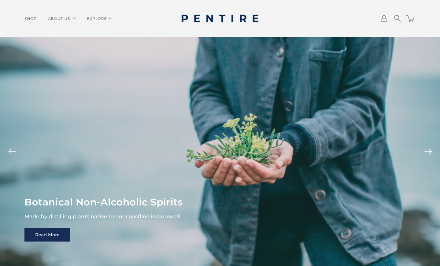
Pentire is a company based and brewed in Cornwall, England; “founded on a love for coastal living”. Their story began with a gin-alternative, inspired by botanicals grown on the Cornish coast and a life spent in the sea and standing on cliff tops. They continue to be steered by this inspiration as their product line expands.
This narrative of being outdoors and harnessing the power of nature permeates the brand. Their website is full of stories, both written and film, of other businesses in the South West of England who are drawing inspiration from nature. Through telling stories like these and showcasing local entrepreneurship, Pentire demonstrate their values of collaboration and sustainability.
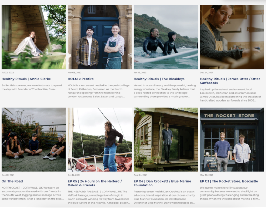
The way they choose to use their website to convey this story is notable; they use elegant imagery, thoughtful copy and negative space throughout the design. This simplicity lets the products shine. It also points customers towards their excellent content; short films, drinks recipes and journal space.
This thoughtfully curated content engages and inspires shoppers, enabling Pentire to build strong emotional connections with their audience. It’s these meaningful relationships that help to encourage conversions, build loyalty and increase retention. You can visit our blog to learn more about the benefits of content marketing in ecommerce.
2. Three Spirit Drinks
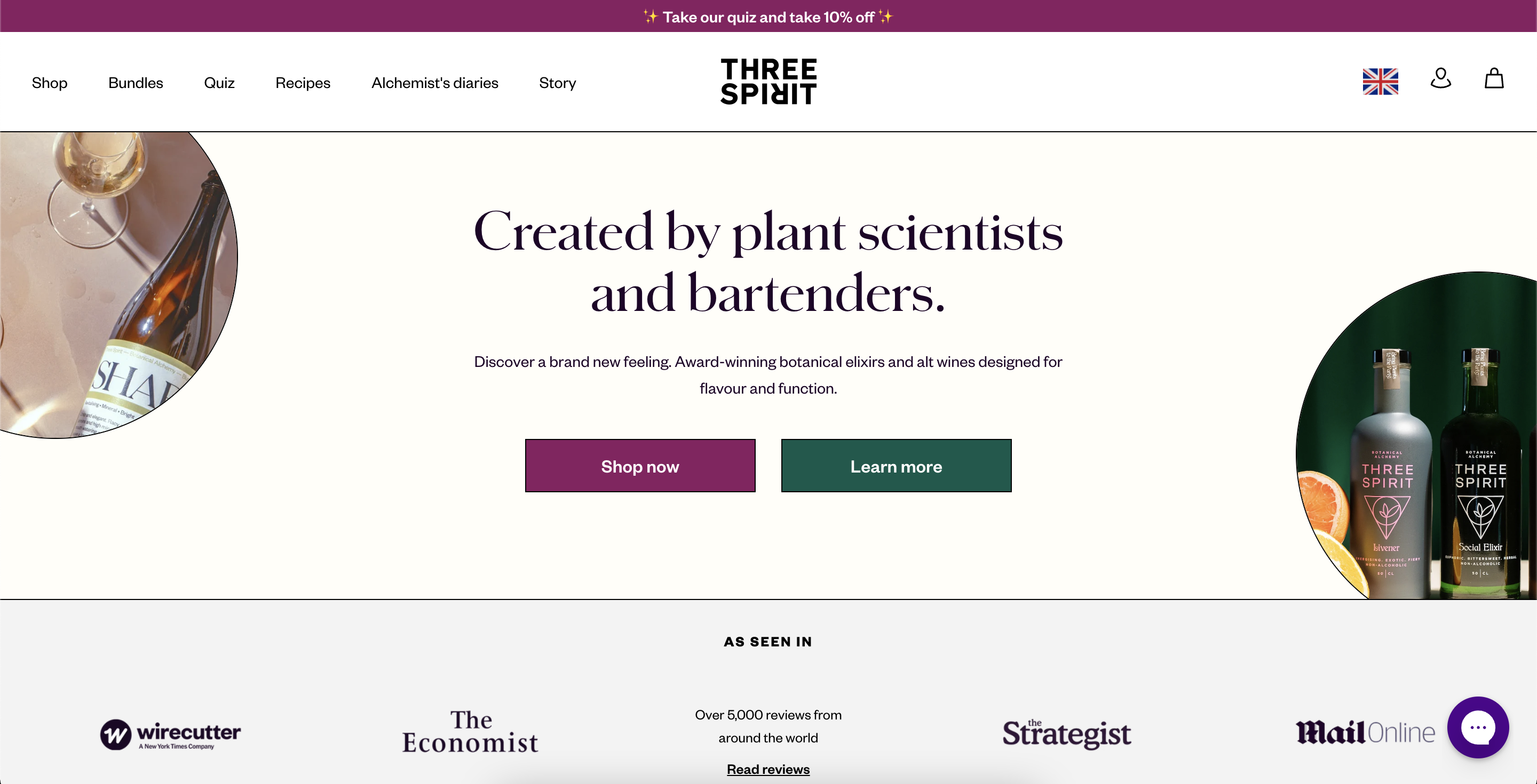
This non-alcoholic drinks company has a scientific approach to crafting complex and delicious drinks. Their Shopify site uses a number of different elements to optimise customer engagement and conversion.
Firstly, they use an Octane AI quiz to help customers decide which product best fits them. This is particularly useful for a customer who is new to the non-alcoholic drinks market and doesn’t yet know what they’re looking for. It also gives Three Spirit the chance to collect valuable zero-party data, personalise the customer experience and offer a 10% discount on your first purchase.
Customers are shown third party endorsements and reviews throughout the website, from the homepage to the product pages. These are further backed up by conversations with cocktail experts in their blog titled “Alchemist’s Diaries” and evidence of a range of awards they have won in recent years.
This type of high quality social proof is peppered throughout the site and assures customers that not only are these beverages super tasty, but that you can still feel good when you’re drinking them.
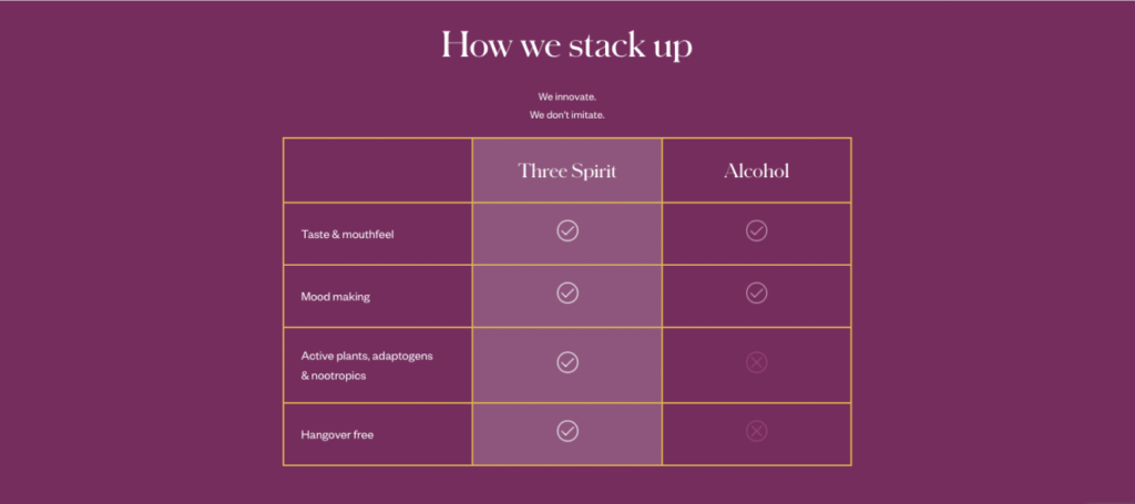
Plus, there is great clarity given on the ingredients found in these beverages – a key element of any successful online food or drinks store. This is achieved with images of ingredients, eye-catching graphics and details about the benefits they provide. This clarity is further supported with a chart that compares alcohol with a Three Spirit drink. This outlines the health benefits that can be enjoyed from these non-alcoholic drinks and the fact that they are not dissimilar to their alcoholic counterparts.
3. Non
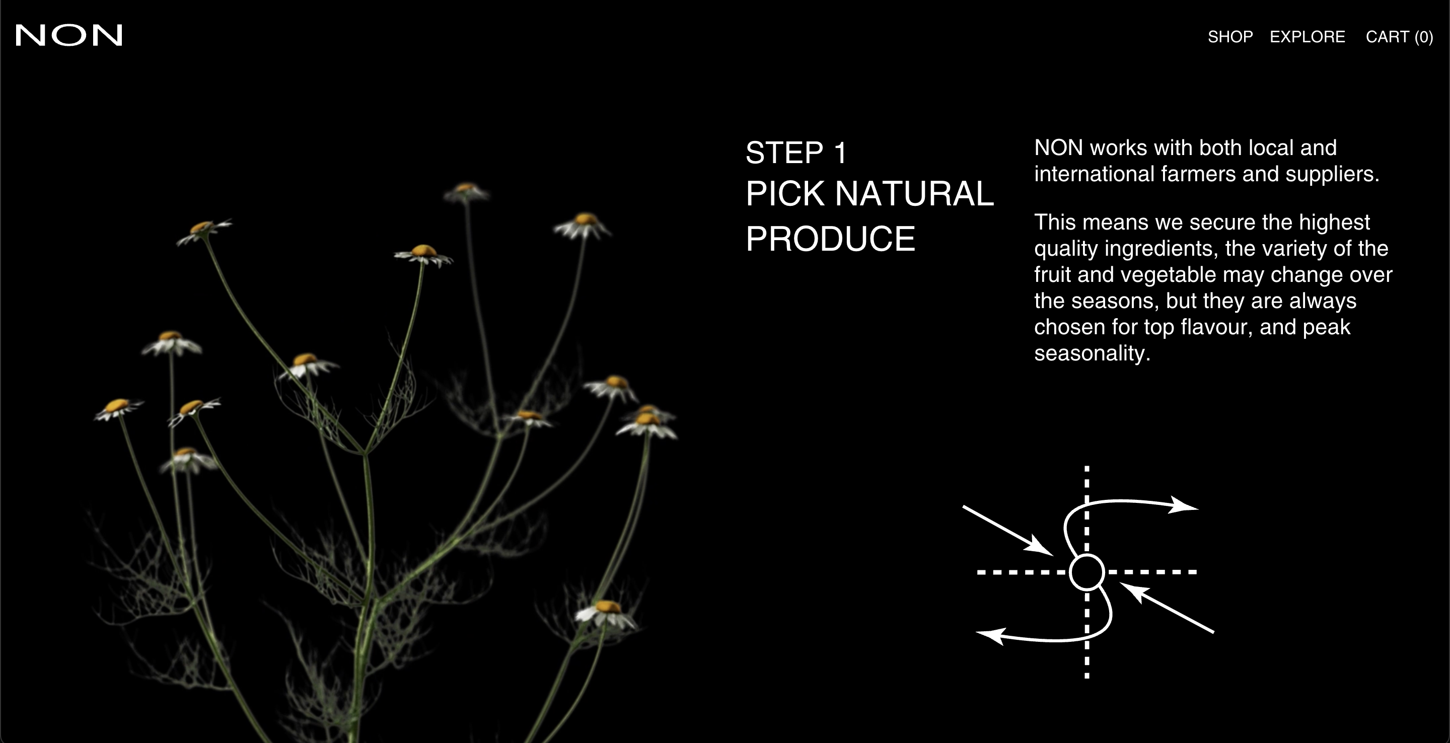
Non are an Australian brand selling wine alternatives internationally and using a minimal design to put their products centre stage.
Black and white dominates the colour palette, with neon green used as an accent colour, but it is their use of animation that catches your attention. This movement serves two main purposes: it keeps customers on the page and effectively communicates ideas, processes and ingredients.
Customers may be confused by how a non-alcoholic wine is made, but Non uses line animations to show the processes they’ve used to create their products. This all serves to provide transparency; something that customers are increasingly demanding from companies that position themselves as a sustainable and healthy alternative.
4. Kin Euphorics
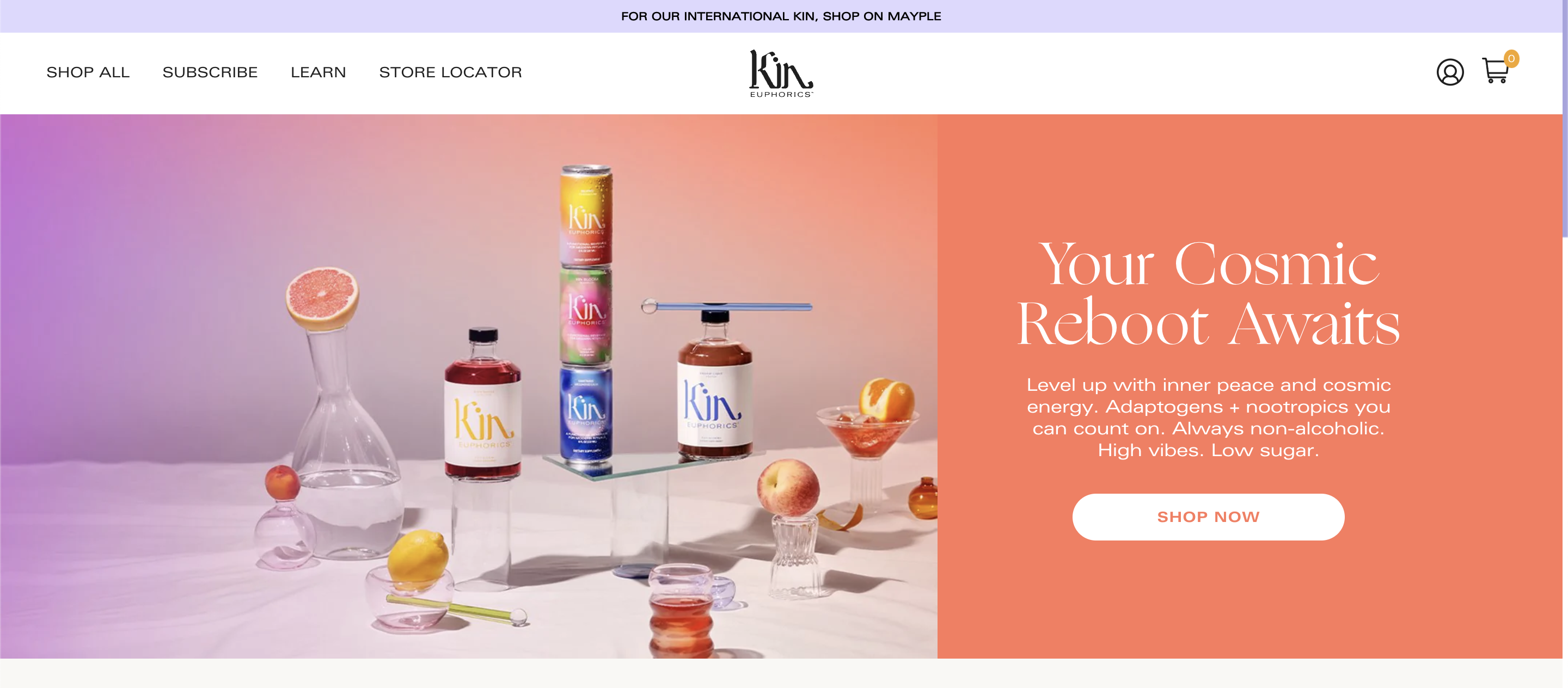
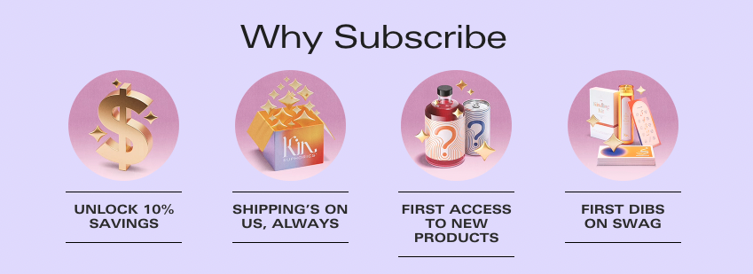
Kin’s Shopify site is brimming with tools that help them better understand and support their customers. They use a quiz, powered by Octane AI, to help their audience find a product that suits them (whilst gathering valuable zero-party data for use in future marketing initiatives). Plus, they use Recharge to offer a compelling subscription service, complete with discounts, free shipping and access to special offers.
Many of Kin’s products contain adaptogens and nootropics that boost your mood – without the hangover in the morning. Across this whole site, clear copy emphasises this and other health benefits these beverages can bring.
In order to build confidence with new and existing customers, they have a “Learn” menu in their main navigation. This is a section that answers FAQs in more detail, talks about the company more generally and offers recipe suggestions.
Also in this navigation is a subscription landing page. This page is in keeping with Kin’s aesthetic and copy; it extends the customer journey and answers questions you might have along the way. A carefully crafted landing page like this is important for highlighting the unique benefits of your subscription and showcasing your brand as a credible retailer.
5. Lucky Saint
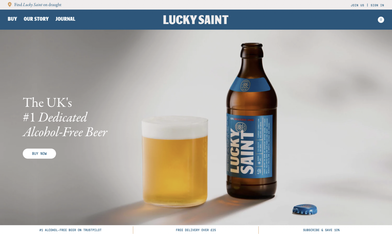
This ecommerce site overflows with witty copy and striking imagery. Lucky Saint share their “zero alcohol, zero compromise” message in a way that makes you smile. You quickly see their 5-star TrustPilot rating and customer reviews, and you want to know more; you want to know if it tastes good.
Something Lucky Saint do differently in this non-alcoholic drinks market is show where you can find their beer on draught. An interactive map helps achieve this, and demonstrates that they are a brand trusted by a great number of businesses, from your local pub to a high-end restaurant.
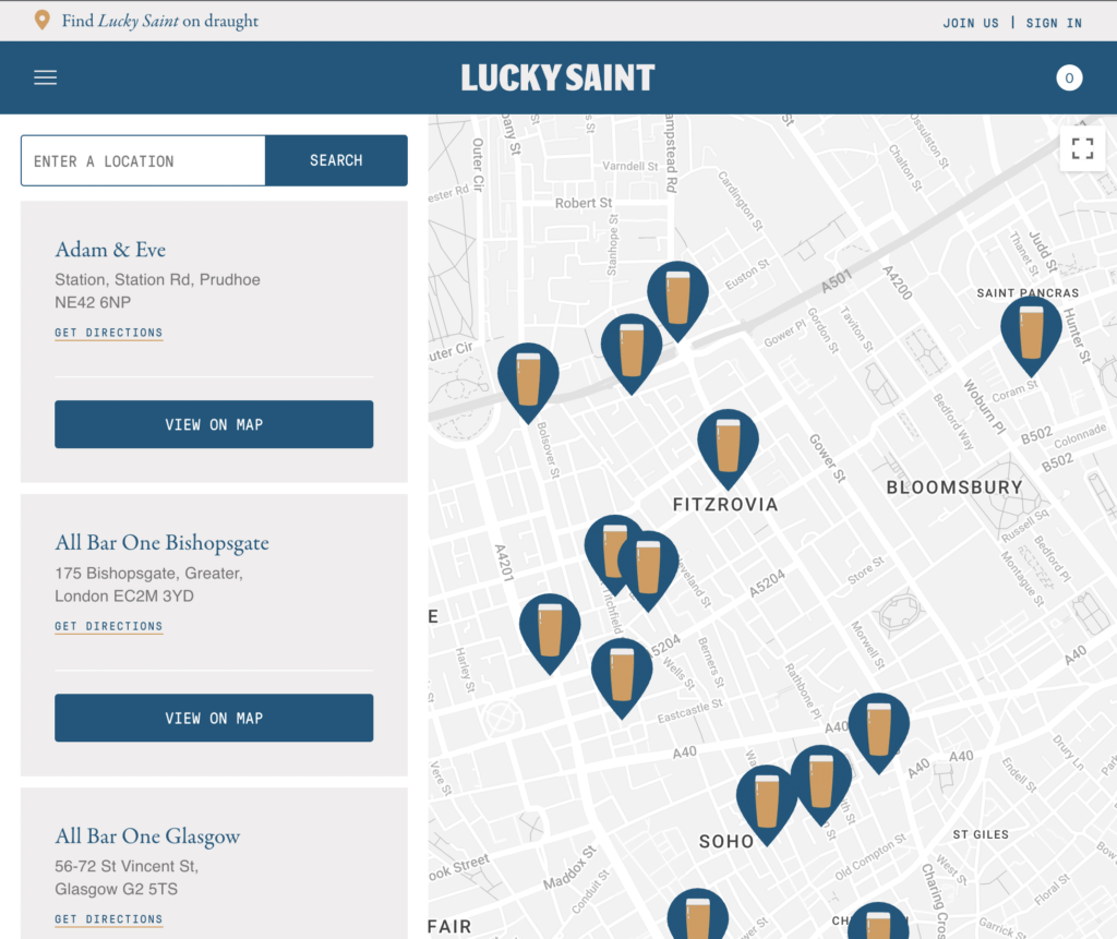
Moreover, this instils the idea that you can enjoy a top-end beverage from the comfort of your kitchen or sofa, with friends or when you shut your laptop and finish working from home for the day. This is a powerful piece of marketing, and something that Lucky Saint draw on again to promote their subscription offering.
6. Days Brewing
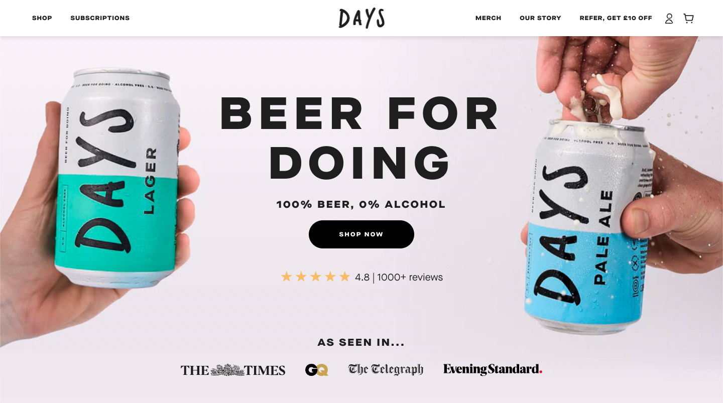
Days’ answer to the question “Why drink alcohol-free beer?” is answered up front on their homepage. They display a CTA to a compelling video that highlights this as a “beer for doing”, for the times it’s “more about the moment than the alcohol”.
This video, along with customer reviews and ratings, assures you that this beer tastes good. This is achieved through interviewing individuals who tell you what they think of Days’ beer and why they choose to enjoy non-alcoholic drinks. Shoppers can imagine themselves enjoying this beer, which encourages them to click that all important buy button.
Furthermore, Days use a referral process that grants £10 off yours and your friends’ orders. This incentivises word-of-mouth marketing – a tried-and-tested tactic when it comes to reducing customer acquisition costs. The referral process is clear, with FAQs and customer support easily accessible if required.
Days also offer customisable, flexible subscriptions, powered by Recharge, that include a 20% discount on recurring orders. This is another tool that further encourages customer loyalty – not to mention other subscription benefits such as lower retention spend and better financial forecasting.
7. Surely
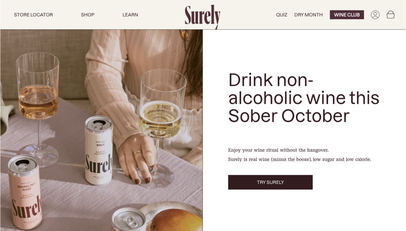
A US-based brand, with classy, Scandi aesthetic; Surely sells alcohol-free wine for any occasion. What you notice about Surely’s Shopify site is that they are immediately answering the questions: “Why non-alcoholic wine?” and “Why Surely?”.
They answer these questions with the use of simple line graphics and a comprehensive FAQ page. They also evidence reviews from verified buyers, third-party endorsements and awards they’ve received. This all contributes to a customer having more confidence in their purchase, as well as increased trust in the Surely brand.
Surely offer a subscription-based Wine Club with member-only discounts and benefits. Giving subscribers exclusive perks like this is an effective way to nurture long-term customer relationships and increase loyalty. It can also be a great tactic when it comes to attracting new customers, which is particularly helpful in the crowded non-alcoholic drinks ecommerce market where consumers aren’t short of tempting options.
A key part of this D2C brand’s customer acquisition strategy is the Surely affiliate programme, where affiliates earn 15% commission on online purchases that originate from their unique affiliate code or URL. As we discussed in our guide to reducing acquisition cost, affiliate marketing is an attractive model for ecommerce merchants. This easily scalable strategy is great for increasing brand awareness, providing third-party validation and delivering strong return on investment.
8. Bonbuz
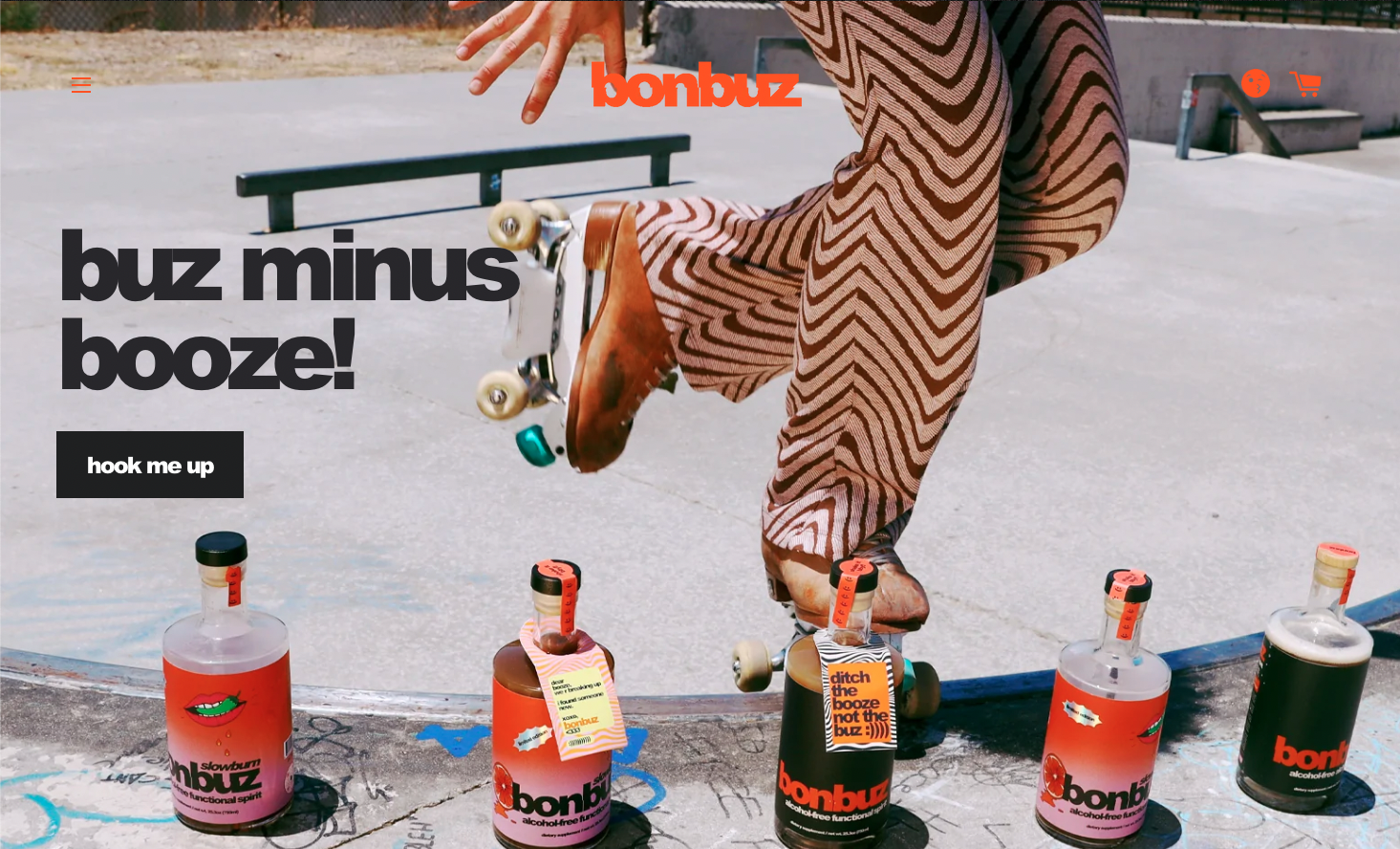
Bonbuz are a bold brand marketing themselves to the Gen Z audience. As we’ve already noted, Gen Z is a group that are bucking trends by drinking less alcohol. They are more health conscious than previous generations at their age and consequently don’t drink as much.
This brand knows their audience well; both in aesthetic and value. Their site oozes informality, from the lack of capital letters, to the use of emojis and bold graphics. There is no doubt this is a Gen Z vibe.
Regarding health benefits, Bonbuz position themselves as an alcohol alternative that still provides a “buz”. They clearly outline the ingredients used to give these effects and promote the fact their products are sugar free, gluten free, and low-calorie – all alongside the fact that they are alcohol free. Bonbuz also appeal to Gen Z’s value of sustainability: they offer discounts on product seconds and are transparent about their sustainable production and sourcing of ingredients.

To boost customer confidence in their product line they share third-party testimonials that back up “the buz”. This, together with the use of Klaviyo (a leading marketing automation platform for email and SMS), a well curated blog and a recipe page, allows Bonbuz to showcase their products with character to a variety of people throughout the US.
9. Sans Drinks
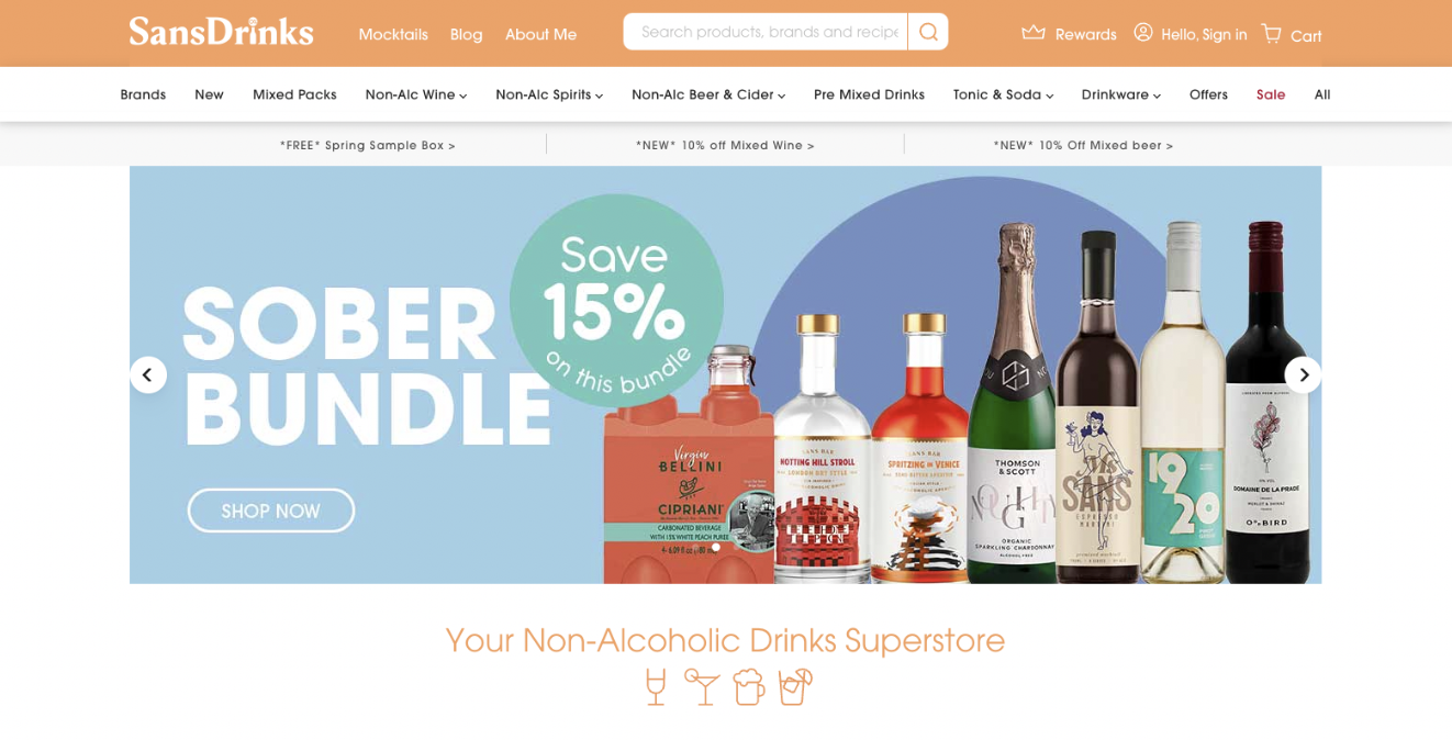
To round off this list we have a very different type of Shopify site. Sans Drinks is an online supermarket selling a huge range of non-alcoholic drinks to their Australian audience.
Sans leverages their blog to share suggestions on reducing alcohol consumption and exploring alternative beverage options. This is a regularly updated source of expertise on all things alcohol-free and it’s a great example of how to utilise your blog to its full potential.
In addition to their blog, Sans has a Rewards Club (powered by Smile IO) to incentivise customer loyalty and increase customer lifetime value.
They also offer product bundles that allow you to explore and enjoy new drinks – and in turn boost average order value (AOV). We talk more about the impact of product bundling on AOV and revenue on our blog.
To help high-intent users find what they want as quickly and easily as possible, Sans are leveraging Searchanise, a popular ecommerce search tool. This is particularly important for brands like Sans who have a vast product catalogue and want to streamline the path to purchase. For more information on the importance of an optimised search function, check out our guide to site search best practices.
This site shows how, once again, Shopify can be harnessed by all sorts of companies, whether you have one hero product or a vast catalogue of SKUs, to create an ecommerce store that not only functions well, but communicates a brand’s personality.
What’s next for the non-alcoholic drinks ecommerce space?
Trends will change. But there is a definite shift in customer behaviour that is here to last. With the industry set to increase 22% year on year6, the non-alcoholic drinks ecommerce world will certainly grow too, because as availability increases, so too does the popularity of these drinks5.
This is an opportunity that many of the brands above are spearheading. And they are doing it in playful and innovative ways, whilst using Shopify in a way that serves both them and their customers. It evidences the breadth of possibility that the platform offers.
At Swanky we are passionate about combining great design, excellent user experience, and a strong tech stack that supports your business as it grows. We think Shopify Plus is the best platform for this and the above demonstrates this too.
The leading food and beverage agency for Shopify Plus brands
Here at Swanky, we help global brands navigate the complexities of food and beverage ecommerce with our proven combination of creative excellence, commercial acumen and technical innovation.
In particular, we’re recognised as the leading authority on Shopify D2C subscriptions in the food and beverage sector, having created complex custom subscription solutions for industry leaders like Huel and HelloFresh.
If you’re looking for a distinguished food and beverage agency to craft an ecommerce site that delivers high quality design and can adapt to your business, get in touch with one of our Shopify Plus Experts today. We would love to start a conversation with you about how we could make your ideas come to life.
1 https://www.alliedmarketresearch.com/non-alcoholic-drinks-market
2 https://www.forbes.com/sites/katedingwall/2021/10/29/the-no-alcohol-industry-boomed-over-the-pandemic-wheres-it-going-next/?sh=6f247ac33daf
3 https://alcoholchange.org.uk/blog/2020/covid19-drinking-during-lockdown-headline-findings
4 https://strategyonline.ca/2019/08/09/study-busts-gen-z-myths/
5 https://www.distillventures.com/insights-and-trends/non-alcoholic-drinks-a-growth-story
6 https://www.grandviewresearch.com/industry-analysis/nonalcoholic-beverage-market

