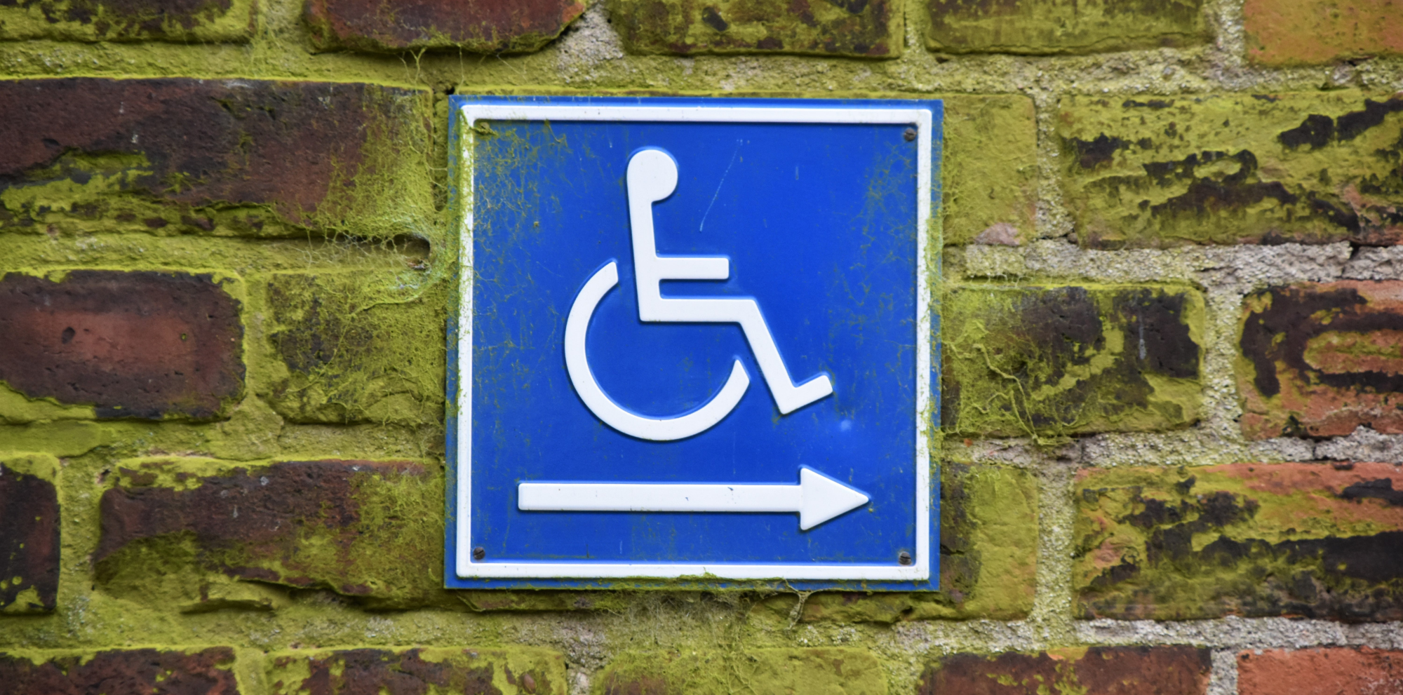
How to Make Your Website More Accessible for People with Disabilities
In the web design industry we often talk about user experience. The premise is that effective design is constantly considering (and meeting) the needs of website visitors. In other words, it’s a matter of form and function.
This can often be achieved by a combination of common sense, user testing and a commitment to analysing and improving performance over the long-term.
However, we don’t very often consider the user experience requirements of people with disabilities. Having worked with the likes of Wheelie Chix, we understand that many of us overcome life’s challenges on a daily basis.
Written By
Dan Partridge

If you are in the retail business, you will have taken various steps to ensure that your premises are accessible to all. This typically involves ensuring that there is suitable wheelchair access, any potential hazards are removed and staff are trained and available to ensure that customers get a great experience when they visit you.
Unfortunately, many businesses forget that their website is just as important as their physical premises.
A recent Mashable article explored this question in more detail, offering 9 ways to make your website more accessible for people with disabilities. Whilst the solutions offered are all very helpful, we were particularly struck by two comments which underline just how important the issue of website accessibility really is:
“This sounds pretty obvious, but understanding the problems people with disabilities face on the web is the key to building an accessible product” Laurence Berry
“If you just want to look at it from a strictly commercial perspective, if sites don’t consider disabled users, they’re missing out on a huge chunk of the market” Sandi Wassmer, Design Expert, registered blind
Making your website more accessible for people with disabilities might sound like a lot of hard work, but the reality is that many of the steps outlined in the article are things that you should be considering doing anyway.
Ensuring that your site is clear, helpful and easy to navigate will help every user to enjoy using your website. Keeping your content as clear, concise and engaging as you can will ensure that you get the message cross to customers. Choosing colour schemes that create a positive first impression and make your text easy-to-read will benefit every reader and help to reduce your bounce rate. Adding alt tags to images will help people using a screen-reader; it will also have a beneficial impact on your SEO performance. Making links as clear and clickable as possible will help every user, particularly those using touchscreen devices.
We’ll be thinking about how we can continue to make our website as accessible as possible. If you have any website design questions – relating to user experience, or anything else for that matter – please don’t hesitate to contact us for more information.
“Everyone Loves Palm Trees” by Keoni Cabral on Flickr (Creative Commons License)

