How to Get the Most Out of Your Ecommerce Photography
Join Ollie Endicott, Digital Designer at Swanky, as he discusses the impact your ecommerce photography can have on your online store’s performance, before sharing some top tips on how to make your imagery best-in-class.
Written By
Ollie Endicott

From communicating your brand values and improving customer experience to showcasing your products at their best, having original, high-quality ecommerce photography is a must for any company selling products online.
With thousands of low cost stock photos at your fingertips, it’s tempting to default to relying solely on stock photography, and overlook the importance of creating your own branded photography for your website. But with image quality proving one of the most influential factors for shoppers when making a purchase, it’s well worth making a priority.
In this article, I’ll explore some of the reasons why prioritising original ecommerce photography is so important for today’s digital brands. I’ll then share 10 ways you can elevate your online store’s visuals, covering things like close-up product shots, aspirational lifestyle photography and personalised imagery.
Reasons to choose real photography over stock photography for your ecommerce store
1. To stand out from the competition
In order to differentiate yourself from your competitors, high-quality, in-house imagery is a must for your ecommerce site. Many brands opt for stock photography, and if you follow suit then you risk your site becoming generic.
Commissioning your own photography and video content will avoid the risk of duplication with other brands, and make your offering more unique. This communicates a higher brand value to your customers and can improve brand perception.
2. To capture your customers’ attention
In an image-rich online culture, customers are accustomed to scrolling through video and image content designed to entice. Websites need to captivate customers as soon as they land on the page, and there are few better ways to do this than through inspiring (and original) images and video content. Without an eye-catching site, users are likely to bounce.
3. To sell more products
90% of customers surveyed by Etsy said that photograph quality influenced their decision to make a purchase – compared to 83% who cited the price.1
Your product pages are your customers’ opportunity to experience your product. With a mixture of high-quality studio photography, video, close-up shots and lifestyle imagery, you can help your customers visualise themselves with your product.
Product images can tell your customer far more than your product description. You can use imagery to highlight product USPs, to portray brand values and to enhance the appeal of each item. Images that jump out of the page are enticing. Modelling the product from a variety of angles and in different settings reassures your customer of the product they are getting.
4. To increase brand loyalty
Your brand imagery is an important way of communicating your brand values and characteristics. Customers will draw an impression of you through the visual branding they see. With your own in-house photography you can fully own how your brand is portrayed visually, through colour palettes, lifestyle photography and styling.
In-house photography helps you to harmonise your branding across all your channels – ecommerce store, marketplaces, POS, email, billboards etc. – to create a seamless multi-channel experience. Customers will quickly come to recognise your unique brand imagery and style, increasing customer loyalty and awareness.
If you have a strong brand image, for example promoting a healthy lifestyle or sustainability, you can visually portray all those elements within your photography.
5. To save time for your marketing teams
One of the great advantages of having your own in-house imagery is the rich stock you’ll have available for your marketing team to use. You can plan your photography shoots with specific size and format requirements in mind, as well as repurpose imagery in different formats to create multiple assets. These can then be pushed out easily across all your channels, with your marketing team confident that they are portraying the brand faithfully, without needing to scroll through stock photos trying to find imagery that fits the bill.
6. To increase traffic from social and search channels
Social media remains a key ingredient in every ecommerce marketing strategy. Having a rich bank of high-quality brand photography to use across your social channels will be sure to boost your appeal and increase traffic towards your ecommerce site. After all, attractive, unique photos and videos are more likely to be clicked on and shared.
Google image search and Pinterest are also important search channels, so be sure to optimise your imagery for SEO to appear high in search results.
7. To target specific audiences
Ecommerce photography helps customers find affinity with a brand. Therefore, if you’re targeting a particular demographic, or looking to attract more of a certain segment, be sure to tailor your onsite imagery to appeal to this group more effectively. Seeing people who look similar to them wearing or using your product will allow your customer to visualise themselves more readily with your products.
It’s much easier to tailor your imagery like this when you have control over your ecommerce photography and can follow your own creative direction.
Best practice for ecommerce photography on your website
1. Get an idea of the type of ecommerce photographs you need
Before you consider hiring an external photographer, start experimenting in-house with creating photo and video content. Just by using your smartphone’s camera, you can start to build a portfolio of lifestyle and portfolio shots. Even if it isn’t perfect, it will give you an idea of how you want your product to look once you professionally photograph it.
At the same time, design a moodboard of images that you like, from competitor sites, social media or stock photos. It can be difficult to know what type of photography you want at first, so this is a great way to solidify how you’d like your products to be portrayed.
2. Define the messaging you want to portray through your imagery
Your ecommerce photography has the power to shape customers’ perception of your brand – and your products. Carefully consider which elements of your brand identity and brand values you want to portray through your imagery and how to do this.
B-Corp mattress brand and Swanky client Naturalmat always includes images of its beds or mattresses within a calm, stylish bedroom design. These shots align with the slow and thoughtful approach that the brand is well-known for. They also create an aspirational lifestyle for customers who are decorating and furnishing their home. The specific lifestyle image below speaks to Naturalmat’s commitment to sustainability, thanks to the soft green colour palette, inclusion of natural materials and view of the outdoors.

Image source: Naturalmat
And in the example below, US footwear brand Allbirds photographs its shoes within a context that evokes fun, movement and travel – all key elements of the company’s identity.
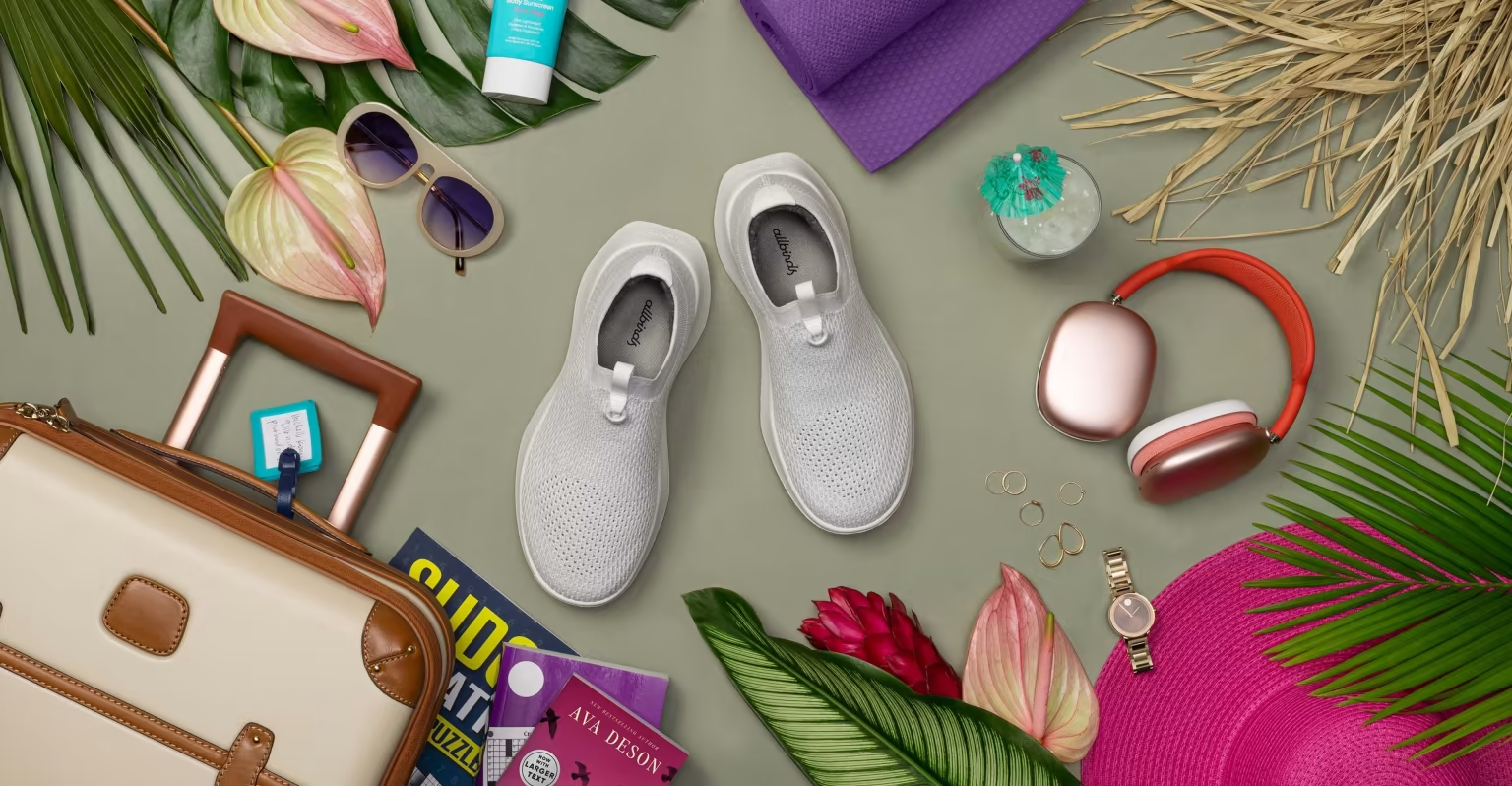
Image source: Allbirds
3. Find an ecommerce photographer that fits your brand
Once you have built a catalogue of images that you like, look for a photographer that has a similar style. Search for photos you like on social platforms and contact the photographers directly to enquire about their services. Consider the aesthetics and tone of their work to be sure it mirrors your brand identity.
4. Consider the context of your imagery
How will your photography appear across your website? Do you have large sections where photos can be displayed, for example, or will you need square imagery for collection pages?
Consider the context of each image. For the homepage, you’re giving an overall impression of the brand with lifestyle imagery. So your hero image on the homepage should tell the user who you are, what you do and what your key USPs are. Collection pages will need images that reflect the whole range, not just one product.
Papier’s online store provides a great example of ecommerce photography done well. The homepage includes a range of photos, showing their products in various contexts that allow the user to gain a broad understanding of the product range.
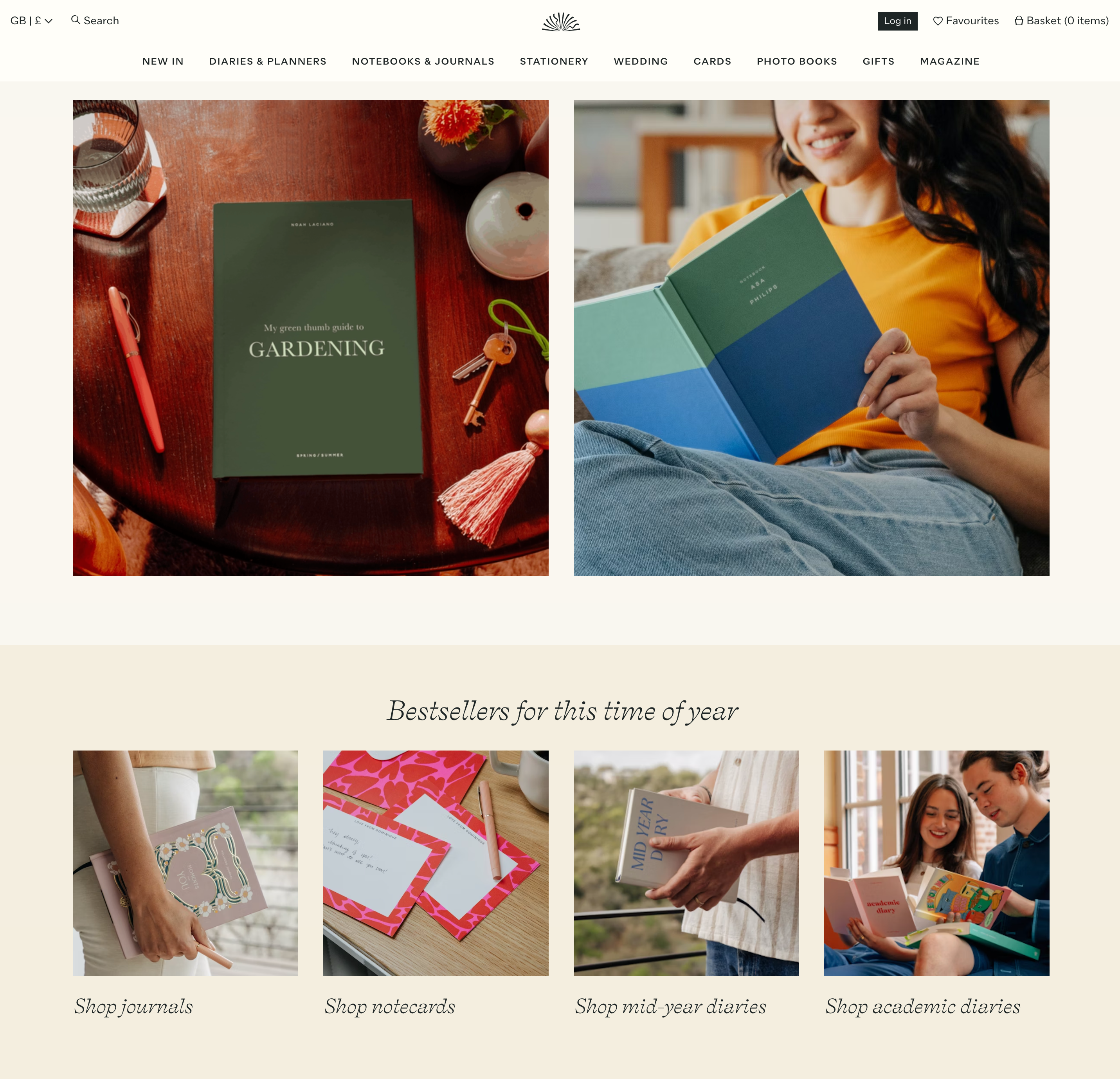
Screenshot from: Papier
5. Master your product photography
Studio shots that put your product centre stage
Since online customers are not able to pick up and interact with your products in the way they would in-store, your product photography is a key part of winning the trust of these digital shoppers.
Product photography consists of studio shots that focus solely on the product, without unnecessary distractions. The aim of these shots is to give your customer as much information about your product as possible, so they can feel confident in their purchase. Be sure to include multiple angles of your product, as well as including any relevant colour or style variations.
You can highlight the characteristics of your product through your choice of background, colouring, models or props, without detracting focus from the main product.
Communicate USPs and function through close-up shots
Your product photography is your opportunity to show off your product. You want to make sure that USPs are clearly communicated, as well as demonstrating different functions of the product. Use close-up shots that focus on details in the design and draw attention to the quality of the materials. This is especially important for high-ticket items where you want to clearly indicate value.
Expedition clothing brand – and Swanky client – Shackleton highlights the key aspects of its high-end products within a dedicated section of the product page, including superior-quality close-ups. In addition, all of its product pages include multiple shots of the products from different angles, on a variety of models to show it in use. The brand has built an aspirational lifestyle around its products, based on the life of the mountaineer Ernest Shackleton, and even its use of colouring in studio shots reflects this rugged, premium feel by evoking vintage, analogue photography.
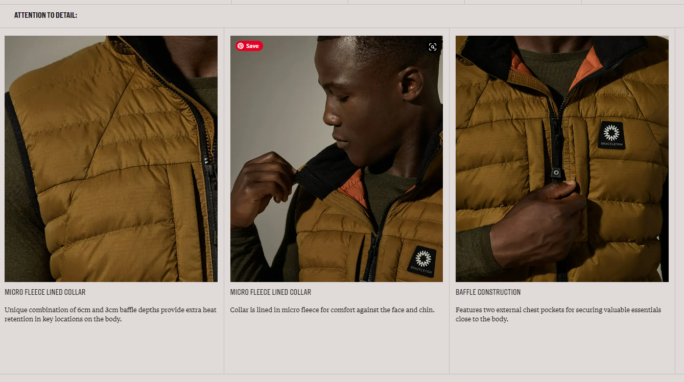
Screenshot from: Shackleton
You can learn more about the stand-out features of Shackleton’s Shopify Plus store in this case study about the ecommerce growth strategy we implemented.
6. Embrace video
Another strength of the Shackleton product pages is their use of video. Video is becoming a must-have for product pages, due to its superior ability to display the product more realistically and help the customer see it come to life.
Video can reassure the customer that the product they are buying is what they expect it will be. On Shackleton’s product pages, the videos have an immersive edge to them, starting as soon as the page loads. They show models putting on and taking off the jackets and using various features such as internal pockets and fastenings.
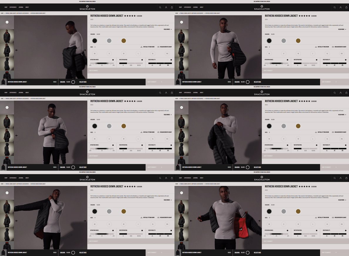
Recording from: Shackleton
7. Use lifestyle imagery to put your products in context
As well as crisp and simple product photography, you’ll want to include lifestyle photography showing your products in context and in use. Lifestyle photography creates a sense of desire, presenting an aspirational lifestyle that the customers could achieve if they own that product. It establishes an emotional connection in a way that simple shots of the product may fall short of.
Consider your products in the environment they are meant to be used, pairing them with other products or props that suggest the kind of experiences your product can offer your customers. For example, if you sell food or beverages, you might stage a full dinner table set-up which includes your product, to capture the fun and lively experience of having dinner with friends and family.
Swanky client Aeris, a German manufacturer of ergonomic chairs, uses video and imagery throughout its website to showcase its products in situ around the home or office.

Image source: Aeris
The models in the videos are seen interacting with the chairs and furniture in a fluid, mobile way during home-working and office meetings. This portrays the core values of the brand – freedom of movement and improved posture – perfectly. As well as being eye-catching and demonstrating the quality of the products, these videos help customers easily understand how they would use these products themselves.
8. Leverage user generated content (UGC) to gain trust
UGC is a type of social proof. It refers to original, unpaid, brand-specific content created by customers. Forms of visual UGC such as photos or video are highly effective, as they show real customers using the real product without a veil of influence from the brand. Indeed, 79% of people say UGC highly impacts their purchasing decisions.2
This type of candid, vernacular photography gains customer trust and reassures users that the product works in the real world. Users can relate to the photos more easily if they are taken by people like them, in settings they recognise.
Incentivise your customers to leave images with their reviews that you can then showcase on your site. HelloFresh leverages UGC on its homepage, with imagery of happy customers using its meal kits and following recipes at home. This adds a fun, family-friendly feel to the store, as the brand seeks to make their meal kits feel accessible and convenient to busy families.
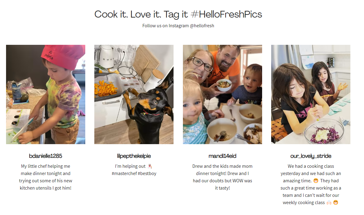
Screenshot from: HelloFresh
Speaking of HelloFresh, find out how we helped this popular meal kit company test a new international market in this case study about building an MVP for selling online in Japan.
9. Post your visuals on social media
Usage of your ecommerce photography extends far beyond your online store. Platforms like Pinterest, Facebook and Instagram still rely heavily on imagery as well as video – not forgetting the king of video content, Tiktok – and are some of the most effective ways to communicate with your customers and build a brand following.
For your social media imagery, don’t be tempted to continually post product photos, as this is unlikely to draw a following. It’s important that you’re adding value to your followers, whether through entertainment or education. Vary the type of content you share in order to grab users’ attention and communicate your unique brand story. Include lifestyle photographs/videos that inspire users by showcasing your products in action, as well as infographics or links to blog posts.
Consider what types of images are likely to be shared easily. Part of the appeal of social media is the ability to interact and share within a wider community. It’s a great place to include UGC from your satisfied customers, to show others in the community real-life examples of consumers using your products and interacting with your brand.
Check out our blog to get tips for selling on Pinterest and strategies for ecommerce marketing on TikTok.
10. Personalise your customer experience through photography
Personalising the digital experience of your customers has become industry standard for ecommerce brands wanting to create a seamless customer experience across all their touchpoints.
Consider offering up personalised imagery to your onsite customers, to make your products seem more relevant to them as individuals. Based on the location of a user’s IP address, you can design your photography to reflect the local seasons or climate, as well as highlighting products that might be currently most relevant. For instance, a user from Australia visiting your site in November will likely be shopping for a summer wardrobe, whilst your UK customers would expect more wintery scenes and products at this time of year.
Once you know more about a customer’s gender or particular interests, you can personalise even further. For personal grooming brand Wilkinson Sword’s ecommerce site, Swanky created two separate storefronts: one for their men’s brand, the other for their women’s brand. As you can see in the images below, the photography and colour scheme for each storefront is entirely tailored towards the target demographic, to appeal more effectively to those shoppers.
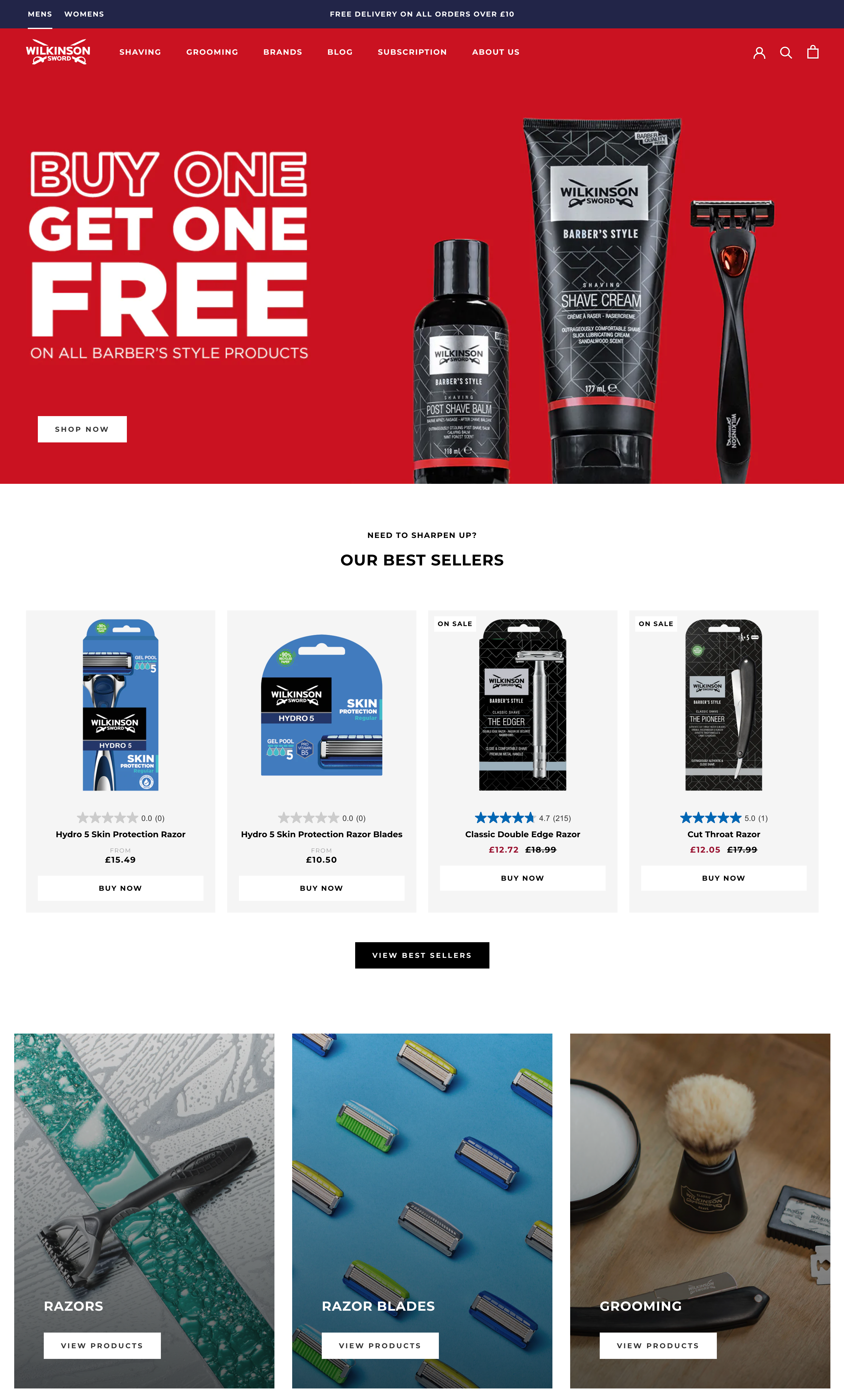
Men’s homepage design. Screenshot from: Wilkinson Sword
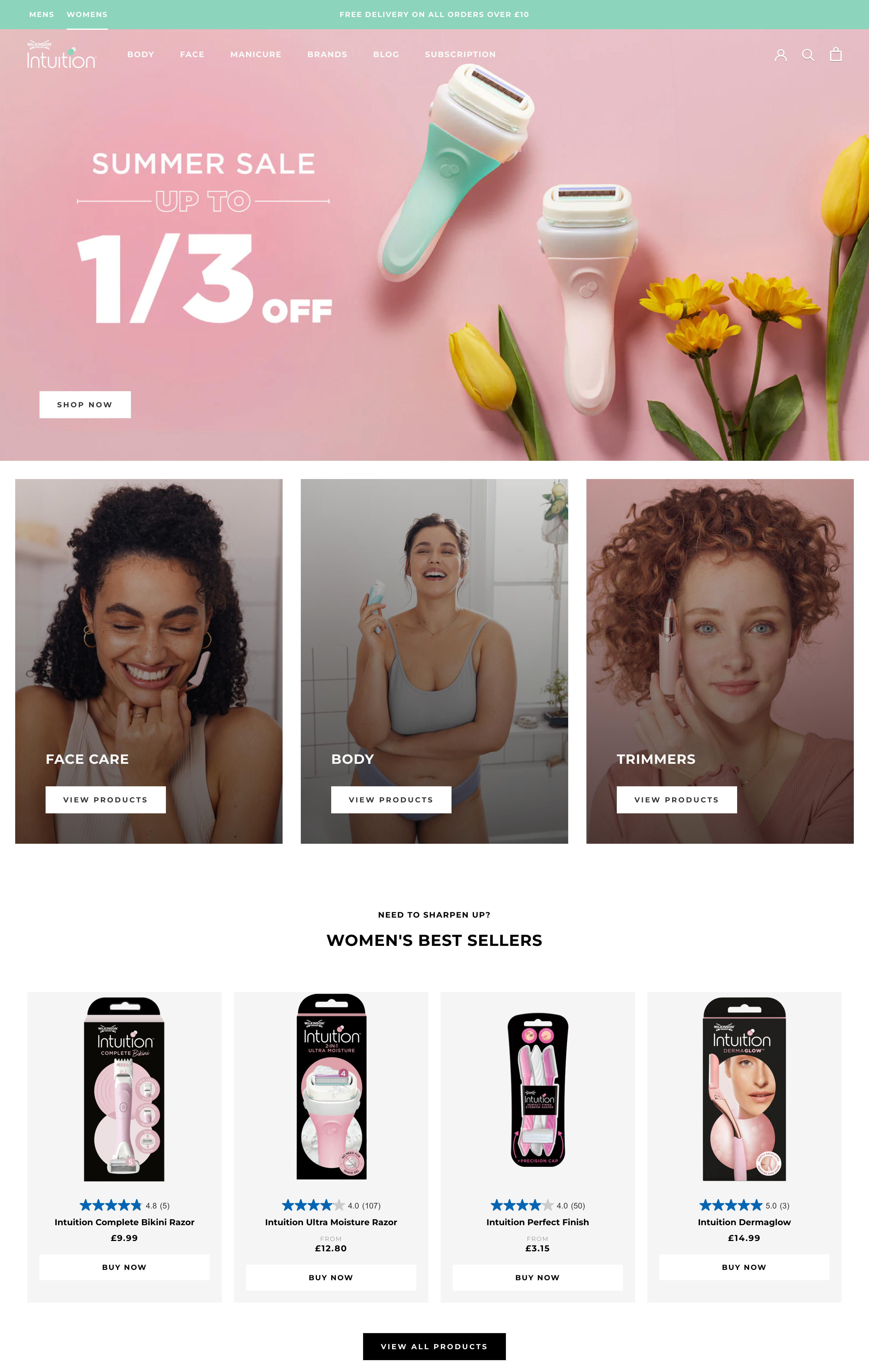
Women’s homepage design. Screenshot from: Wilkinson Sword
Make your ecommerce photography work for you
However tempting it may be to resort to stock photography to fill your ecommerce store, there is no competition for unique and original brand photography.
Use inspirational lifestyle imagery and comprehensive product photography to captivate your audience, communicate your brand values, showcase the intricacies of your products, and build long-lasting relationships with your customers.
Shopify UX & UI design specialists
At Swanky, we are experts in design, branding and marketing, working with Shopify Plus clients from around the globe, across various industries. We know what it takes to design an ecommerce store that not only looks great, but serves up a high-converting customer experience.
If you’d like help improving the UX and UI design of your Shopify Plus store, get in touch with our team and we’d love to help.
For reference:
[1] https://www.etsy.com/seller-handbook/article/why-product-photography-is-important/147451496051
[2] https://www.businesswire.com/news/home/20190220005302/en/Stackla-Survey-Reveals-Disconnect-Between-the-Content-Consumers-Want-What-Marketers-Deliver

