How to Create a High-Converting Subscription Landing Page For Your Ecommerce Store
A clear, concise and compelling subscription landing page is non-negotiable for subscription brands. It’s a dedicated place to showcase your offering to shoppers, build trust in your brand and turn clicks into conversions. Keep reading to learn more about the key ingredients of a successful subscription landing page, with examples from across Swanky’s portfolio.
Written By
Hannah Smiddy
Editor’s note: This article was updated in October 2024.
For consumers, signing up to a subscription can be a big commitment. In order to convert browsers into buyers, you need to shine a light on the unique benefits of your subscription and showcase your brand as a trustworthy retailer.
This is where a carefully crafted subscription landing page comes in.
In this article, we round up nine tried-and-tested strategies to create a successful landing page for your subscription offering. We draw on our experience as a leading Shopify Plus agency for DTC subscription brands, including examples from several of our clients, as well as other successful subscription companies in our key verticals.
9 subscription landing page tips
1. Clearly explain how a subscription works
Be sure to let a prospective customer know exactly how your subscription scheme works so that they feel well-placed to make an informed purchase decision. What can they expect in each delivery? How often will they receive it? How much money will they save by signing up?
Here’s an example from our client Bouclème, global plant-powered hair care brand:

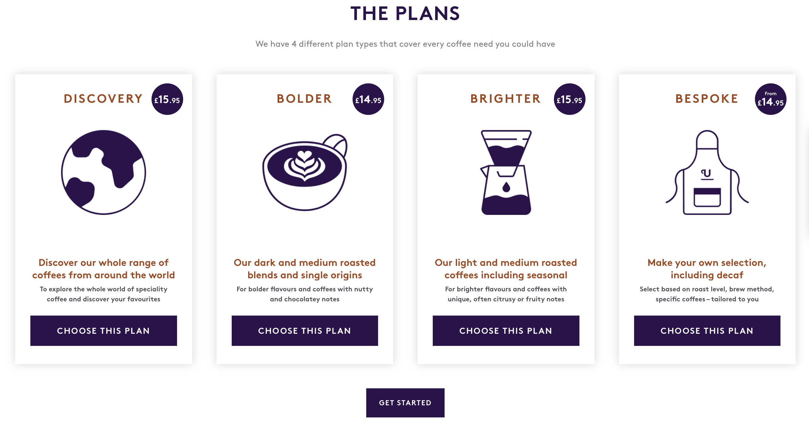
If you offer a range of subscription options, make sure you showcase these on your landing page too. Popular British coffee brand (and Swanky client) Union Hand-Roasted Coffee clearly displays the four different subscription plans available to customers, signalling to shoppers that it can cater for a variety of taste buds.
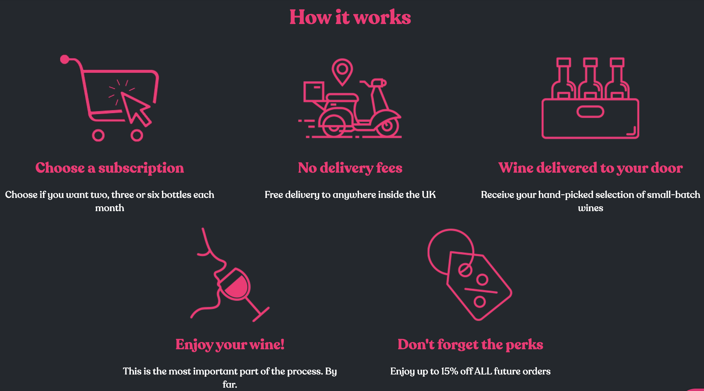
Using iconography on your subscription landing page is a great way to break up lengthier chunks of text and improve comprehension. UK-based wine club Plonk makes it clear exactly how its subscription works, pairing icons with snappy copy to convey key details to potential subscribers. This section also highlights some of the biggest benefits of its offering, including free delivery and ongoing discounts (more on this next).
For more examples of wine producers serving up compelling ecommerce experiences, check out our round-up of 10 DTC wine brands leveraging Shopify and Shopify Plus.
2. Demonstrate subscription benefits clearly and succintly
Now, it’s time to focus on the ‘why’. Think of the key benefits your subscription brings to consumers; things like discounts, subscriber-only perks and convenient doorstep delivery.
These need to be highlighted front and centre on your landing page, ideally above the fold to make an instant impact. Attention spans are short, so you want potential subscribers to take note of any benefits as soon as they land.
As mentioned above, use icons and lists to illustrate the perks of your subscription in a clear, concise and engaging way.
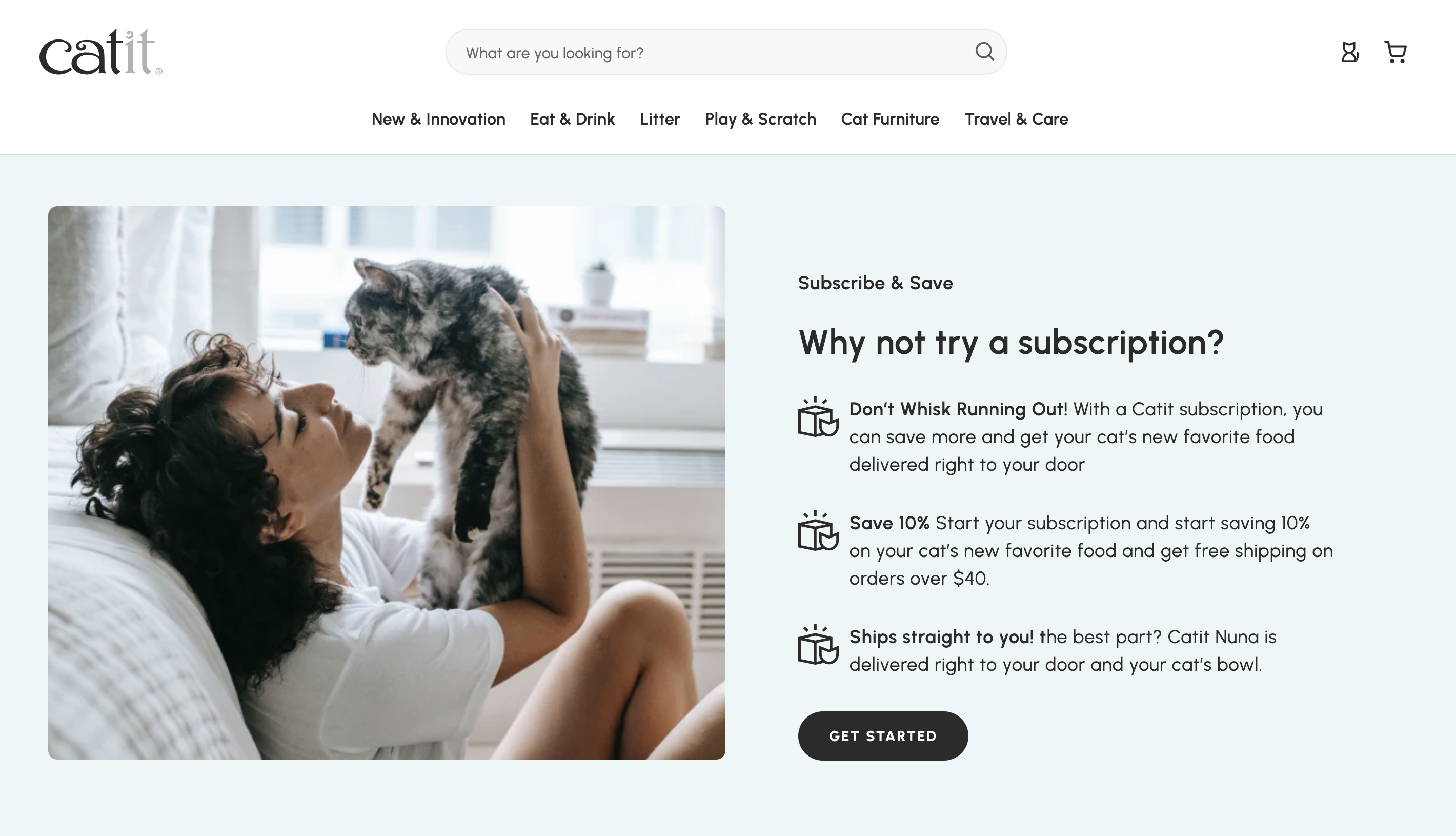
Shopify Plus brand and Swanky client Catit does a great job at showcasing the benefits of its subscribe and save offering in the example below. Punchy copy is teamed with on-brand iconography and an emotive lifestyle image to paint a very appealing picture for consumers.
3. Use high-quality photographs and video to illustrate what subscribers will receive
High-quality, compelling visuals are a core feature of a high-converting subscription landing page. They instantly signal brand credibility, capture attention and increase perceived value.
Photographs and videos also show consumers exactly what they can expect in a subscription box or from a regular replenishment delivery. This helps potential subscribers to envision receiving and using your products themselves.
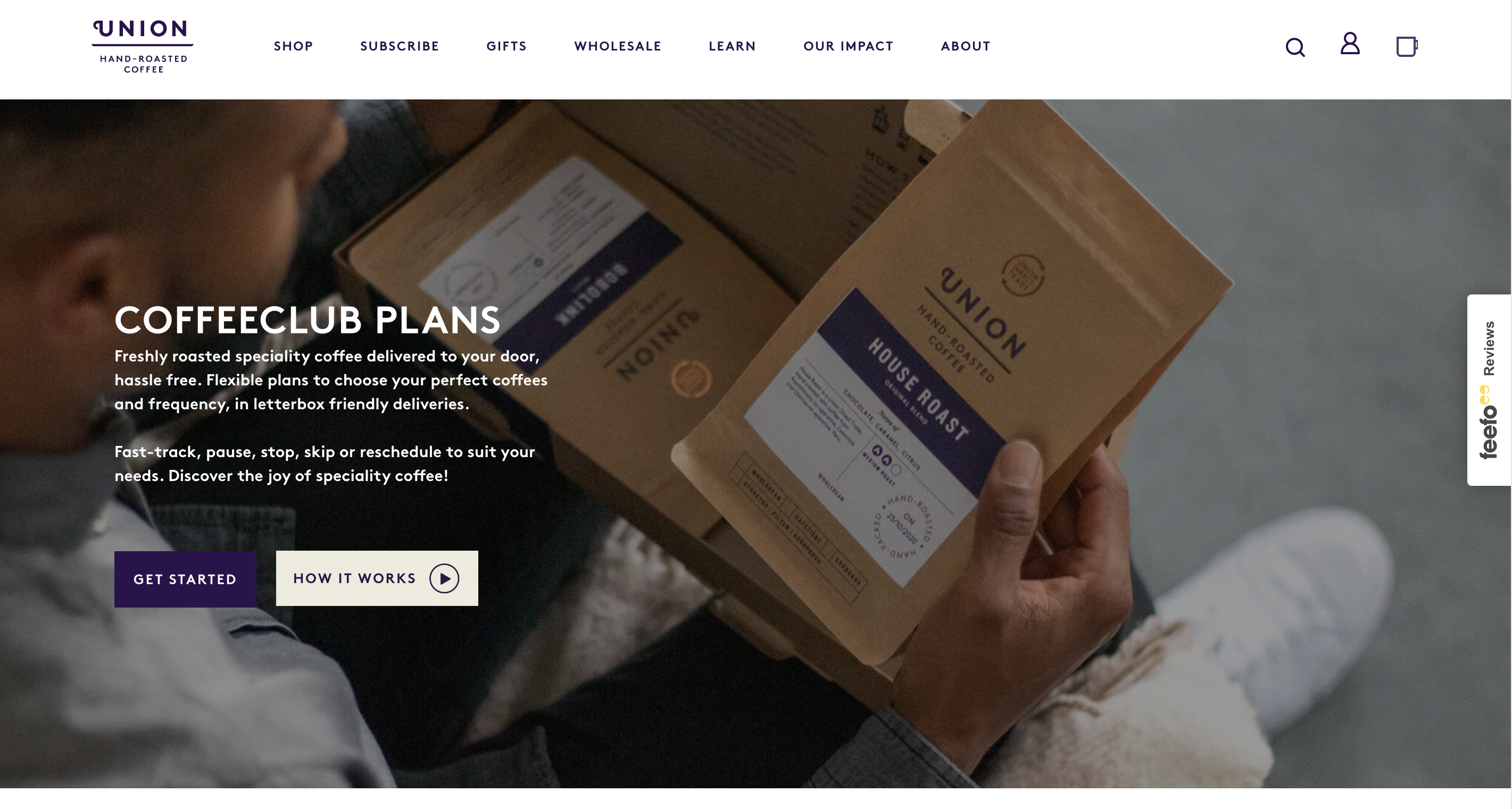
Union Coffee has elevated its “CoffeeClub” landing page with a full-width hero image that shows a customer opening their subscription box. Not only does this lifestyle photograph serve to inform page visitors about the contents of a Union Coffee package, it helps them imagine the unboxing experience and creates a sense of FOMO. The result? A user that wants to learn more about the brand’s subscription plan and scroll further down the page.
Meanwhile, innovative contact lens company daysoft® (for whom Swanky built an award-winning subscription store), teams a “What’s in the box?” content section with a short video to show a lens pack being opened.
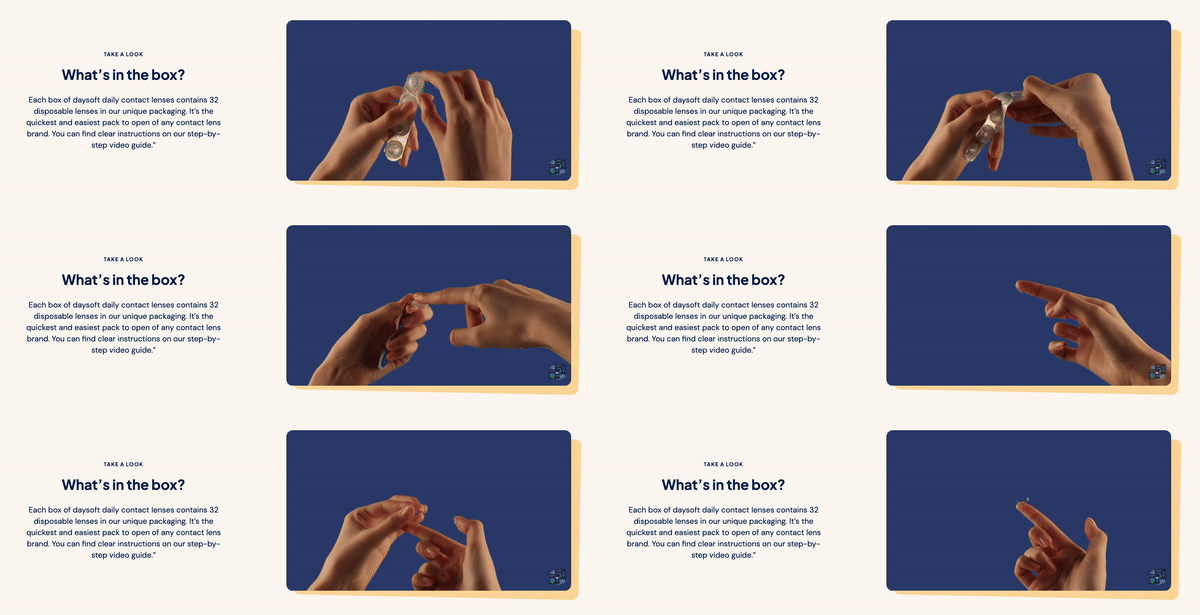
By clearly explaining to potential subscribers exactly what they’ll receive in a box, whilst showing someone physically opening a pack, the brand is catering for consumers’ need for detail whilst promoting the ease and simplicity of its product.
4. Emphasise ease of flexibility and cancellation for subscribers
One thing that shoppers will want to see on your landing page is how easy it is to edit, pause, skip or even cancel a subscription.
Some of these things may sound counterintuitive, but promoting effortless flexibility and cancellation can actually encourage would-be subscribers to take the plunge. It’s reassuring for shoppers to know they’re not going to be tied into a rigid subscription plan that can’t be adapted to their needs. This is especially true if they’re buying consumable products that don’t get used at a blanket rate.
Australian underwear brand Knobby has done just this. Its subscription landing page, emphasises the flexible nature of its subscription scheme with some short and snappy copy that’s sure to put cautious consumers at ease.
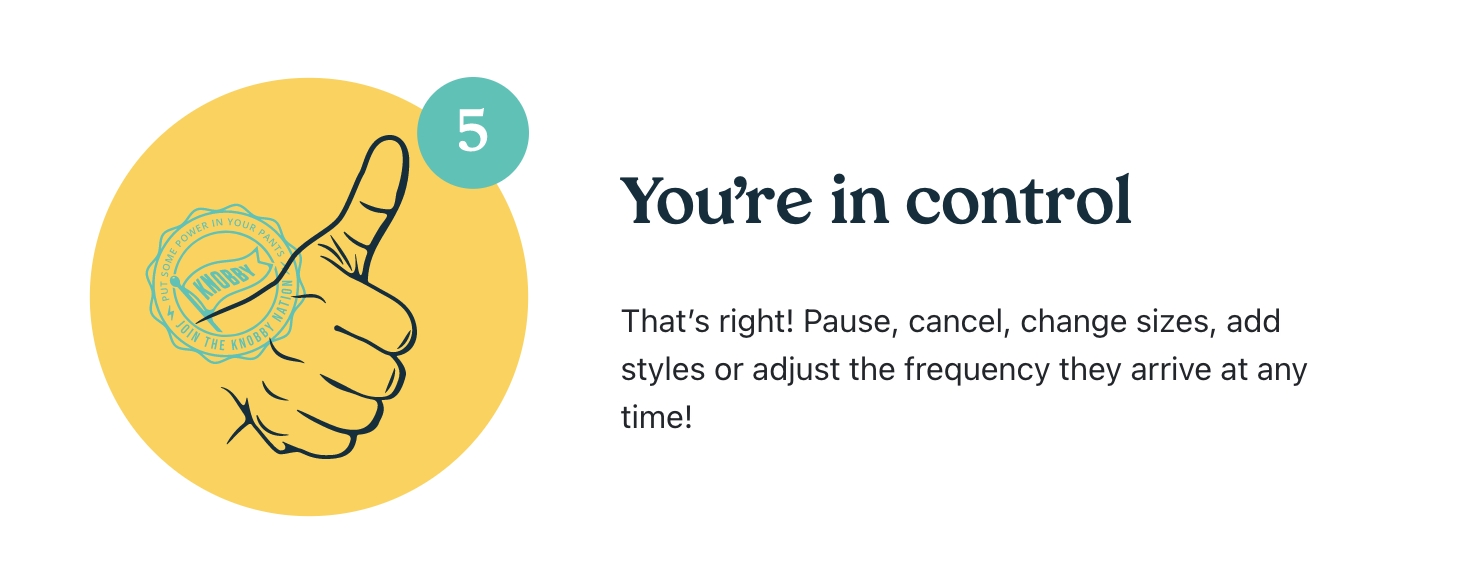
We recently featured Knobby in a round-up of 10 of the best Australian subscription stores – take a look to find out which brands have mastered the subscription model down under.
5. Leverage social proof to reinforce subscription value
No successful subscription landing page is complete without a large dose of social proof. Using things like reviews, ratings and third-party endorsements, you can emphasise the value of your subscription and boost confidence amongst your target audience.
Melbourne-based coffee company Three Thousand Thieves (TTT) is a great example of a brand leveraging customer reviews to help drive conversions on its subscription landing page.
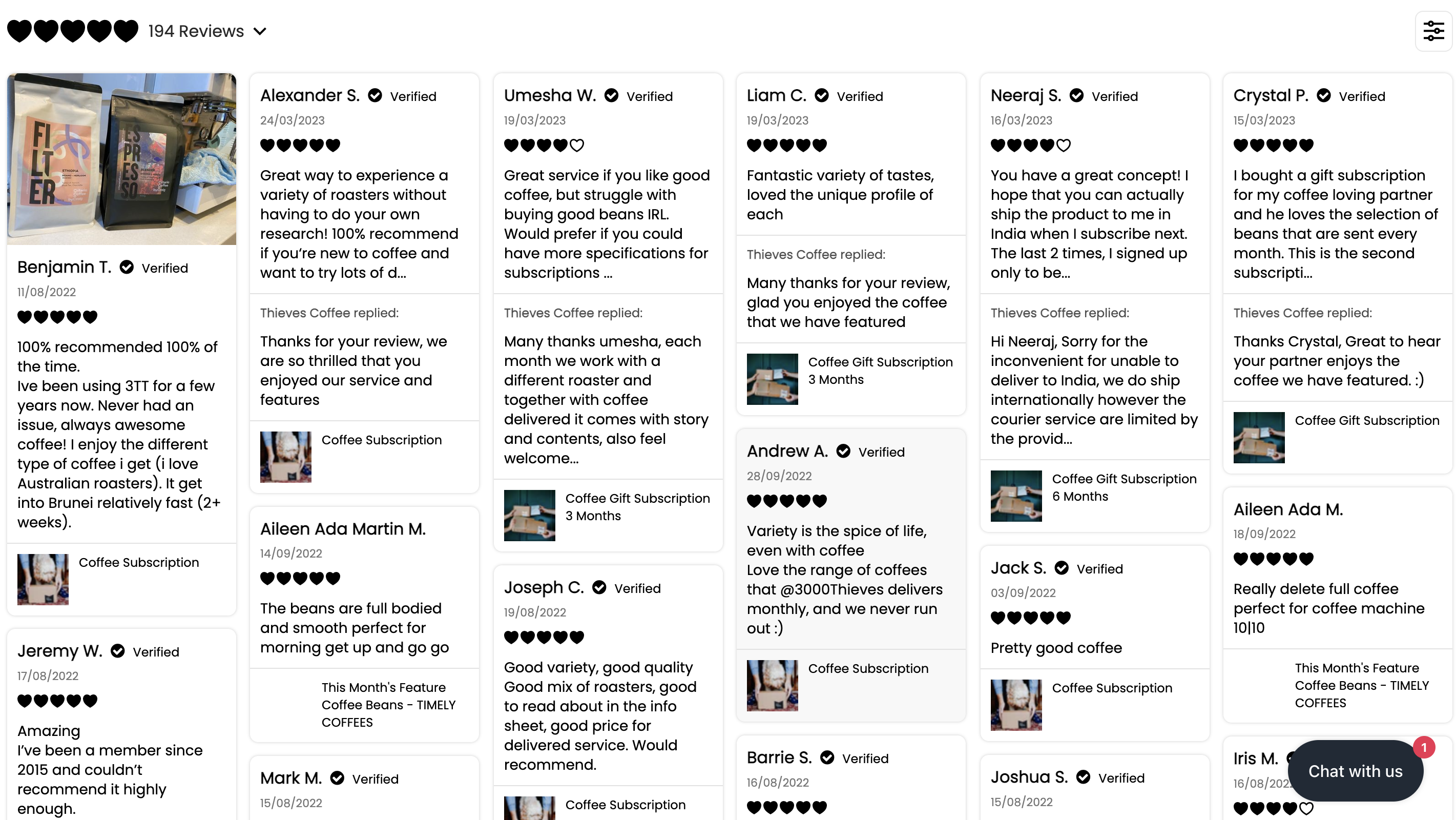
Note that the brand makes an effort to reply to reviews. This demonstrates that TTT prioritises feedback from customers and values their opinions. It also contributes to better relationships with shoppers, which can spark things like repeat purchases and customer advocacy. Read more about the importance of this in our article all about listening to customers.
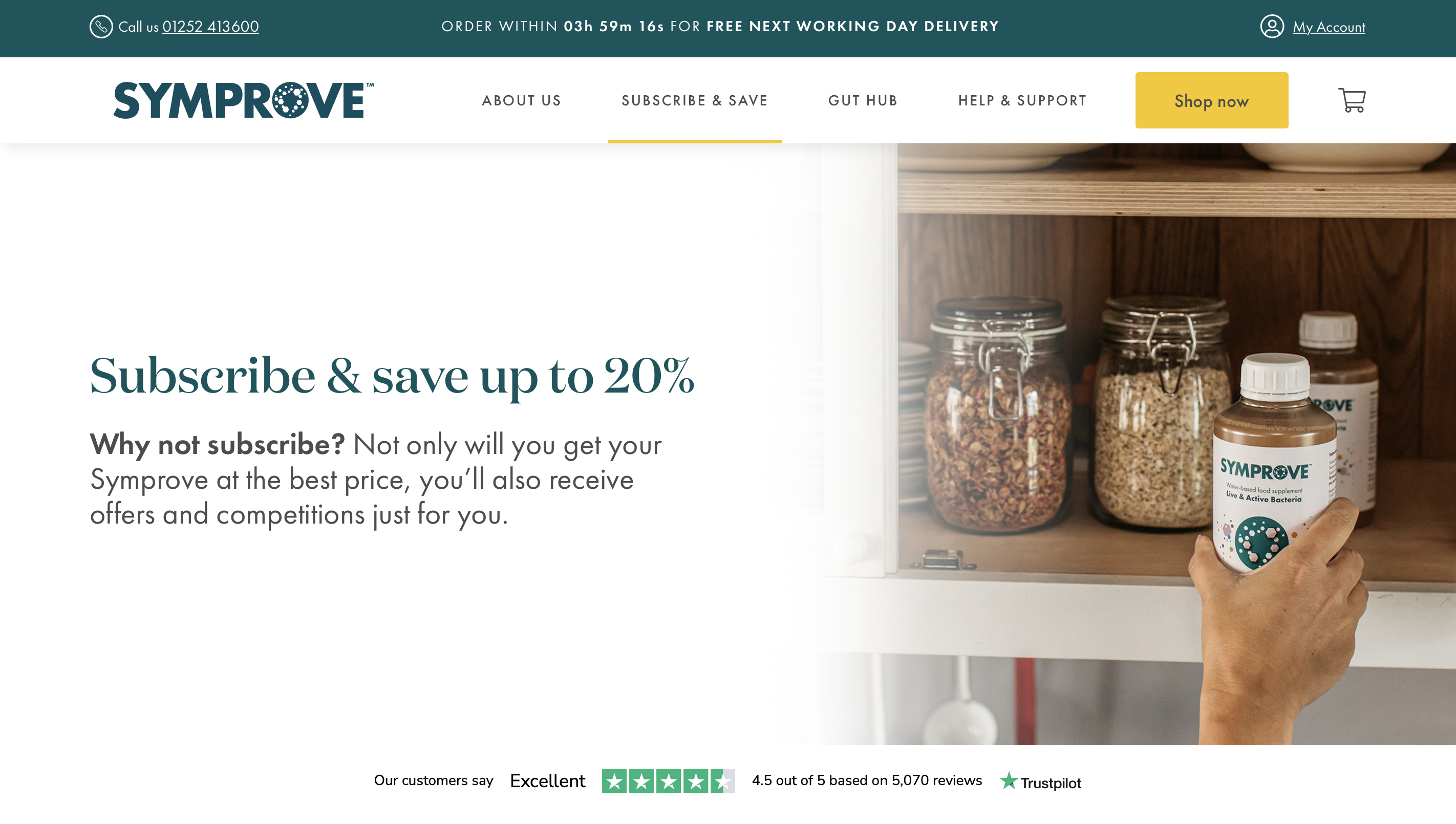
Try placing an element of social proof above the fold on your landing page to start instilling trust in visitors as soon as they arrive. Swanky client Symprove has done exactly this, sharing its Trustpilot rating directly beneath its hero image.
For maximum impact, leverage compelling visual content such as user-generated photos and videos on your landing page. These can be particularly powerful in catching attention and persuading potential subscribers to convert.
If you’re selling a subscription to a health or beauty product, consider displaying “before and after” transformation photos from existing customers. This helps communicate the value of the product much more powerfully than a written review could. We talk a bit more about this in our guide to online beauty store best practices.
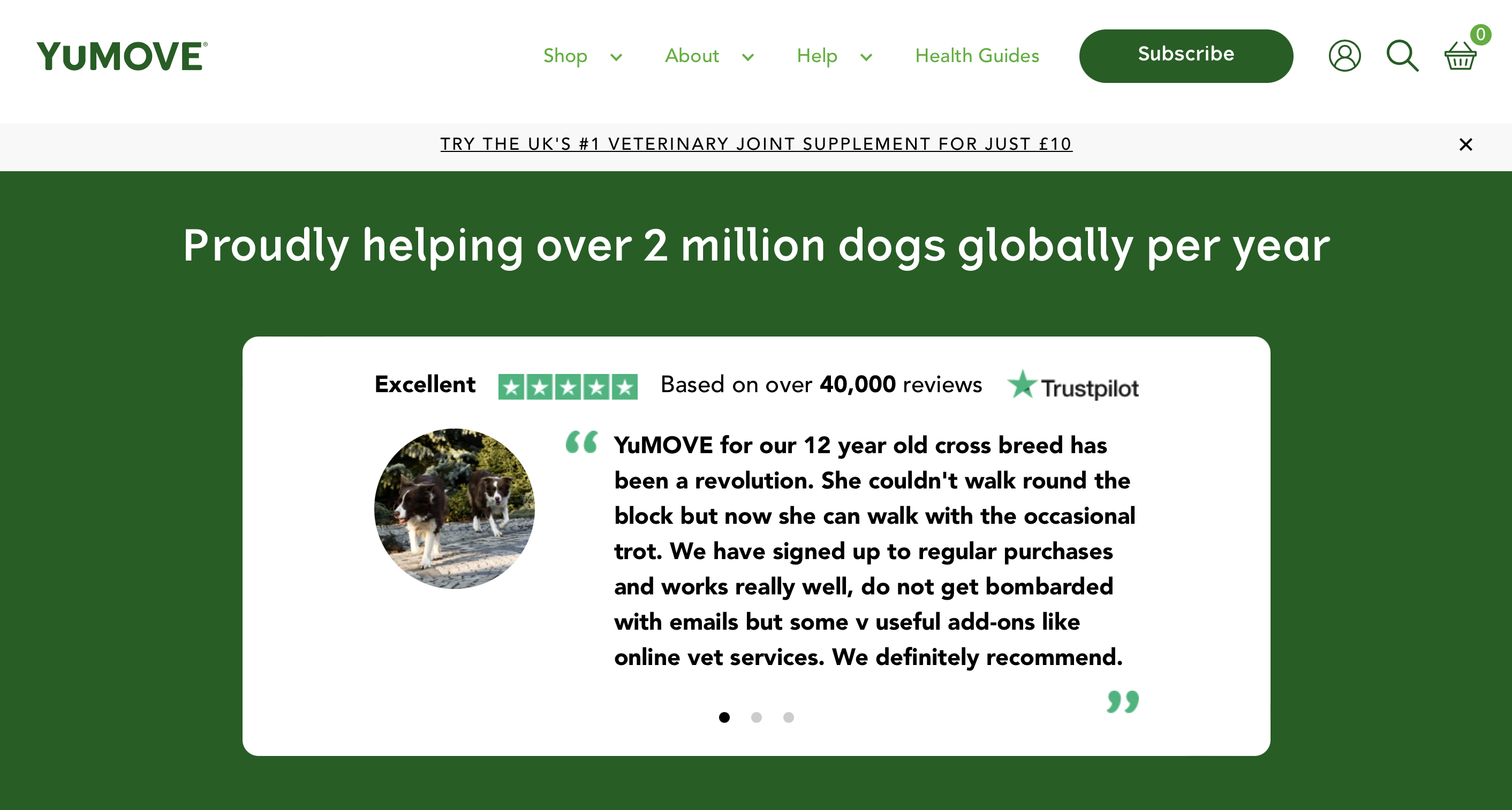
Our long-term client YuMOVE, a leading pet supplements retailer, has elevated its subscription landing page with testimonials from existing subscribers. These showcase the benefits of its products whilst connecting with users on an emotional level. They are positioned underneath a high-impact statement telling visitors how many dogs the brand helps each year.
6. Craft clickable CTAs for your subscription landing page
Guide your visitors along the path to (recurring) purchase with compelling calls to action (CTAs). Here are some tips to keep in mind for creating CTAs that convert:
- Keep button designs simple.
- Use eye-catching, contrasting colours for your CTA buttons (whilst remaining on-brand).
- Ensure the content around your CTA button isn’t distracting users – set it against a backdrop of clean, uncluttered space. Try to create a flow towards your CTAs.
- Position a CTA button above the fold.
- Use short, positive, action-oriented verbs that will resonate with your audience.
- Use the first and second person (i.e. “Start Your Subscription” or “Sign Me Up”).
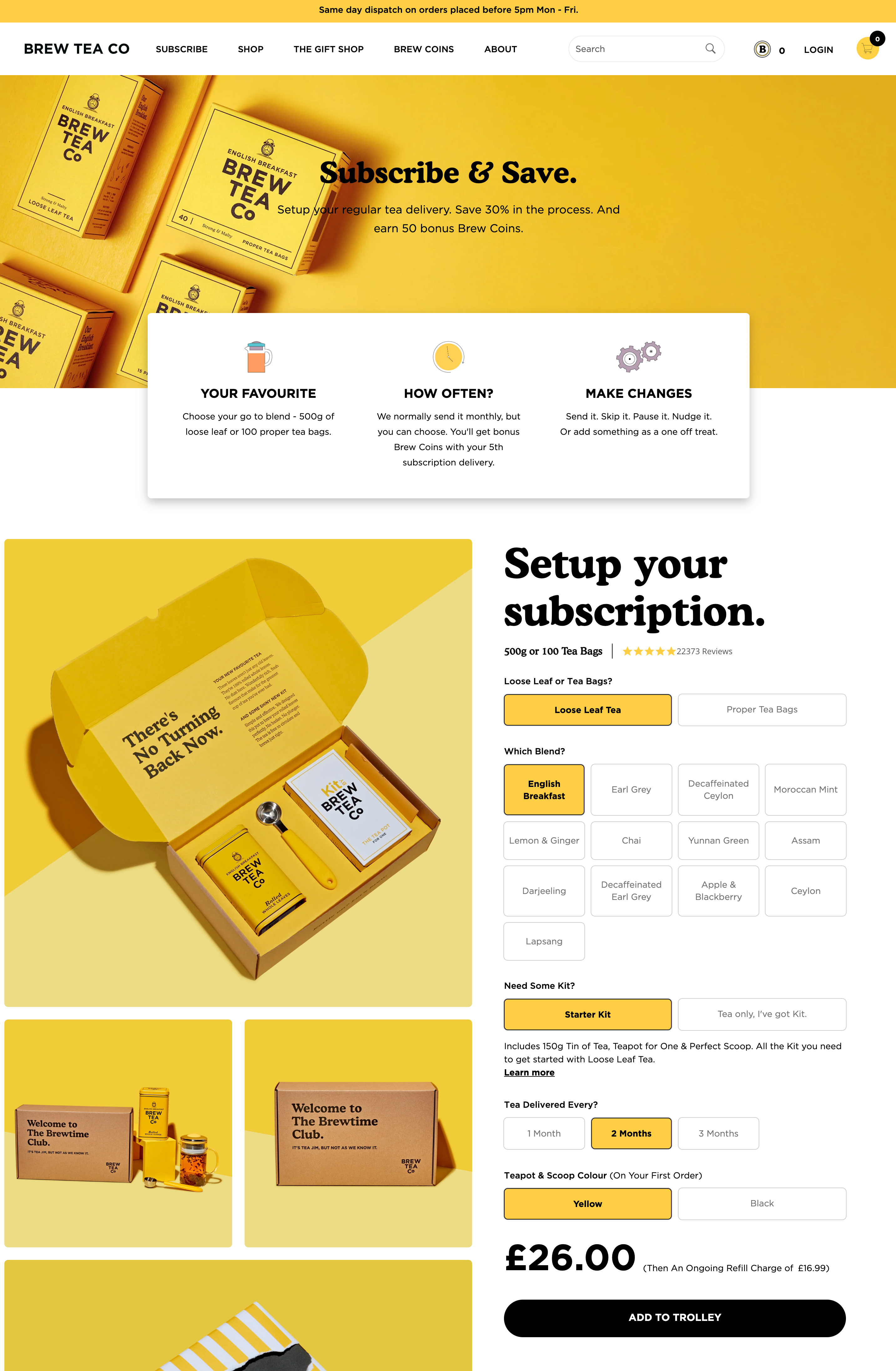
Shopify retailer Brew Tea Co guides users down its subscription landing page towards its “Add to Trolley” CTA button. The black button stands out amongst the others elements on the page, whilst remaining on-brand.
We’ve got plenty more tips in our guide to effective CTAs.
7. Anticipate customer questions
Before signing up to a subscription, consumers will likely have questions around topics like payment and fulfilment. When will their payment be taken? What happens if they’re not at home when their box is delivered? Can their subscription be edited?
The best subscription landing pages will anticipate these questions and provide potential customers with clear answers. This will help to reduce any barriers to purchase and encourage conversions.
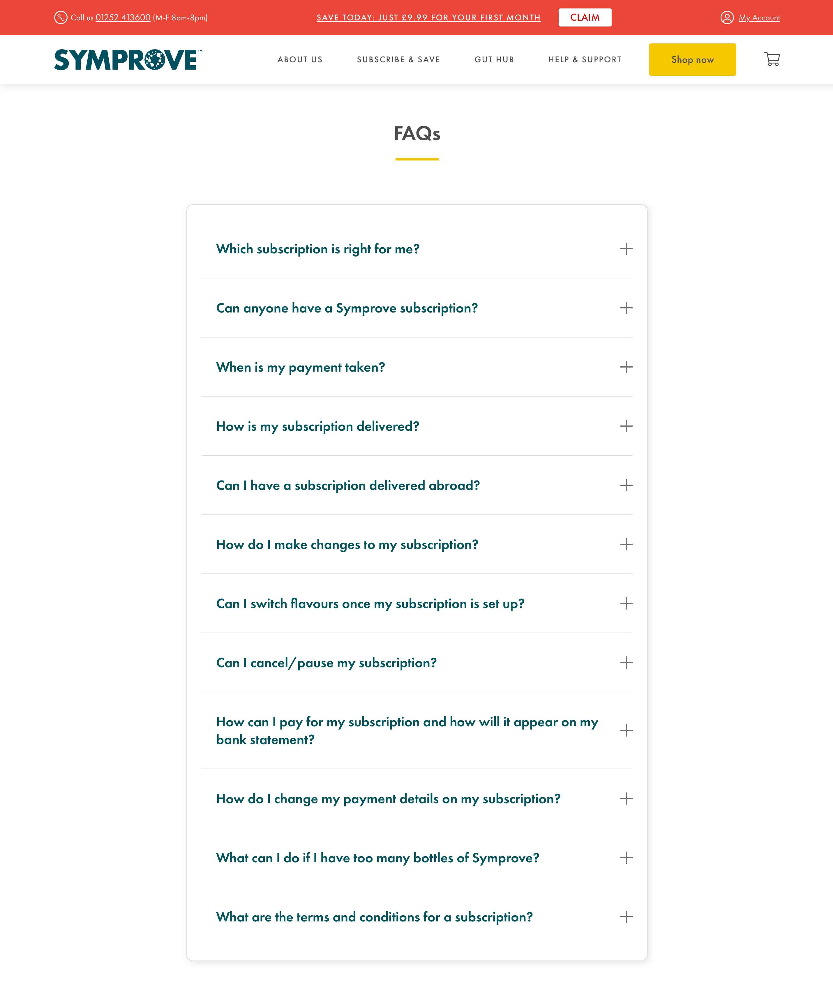
An FAQs section can be an effective way of giving clarity to users and overcoming any common buyer objections, just like the example below from Symprove’s Shopify Plus store. Allowing customers to help themselves with FAQs is an important part of providing excellent customer service.
When deciding on questions to include in an FAQs section, examine your customer support tickets and chat transcripts to identify any common themes from pre-purchase enquiries. You could also invite customers to participate in a survey to find out what sorts of questions they had when considering whether to sign up to your subscription. Read more about the best methods of listening to customers here.
8. Align your landing page with your marketing campaigns
It’s crucial that your subscription landing page aligns with any marketing campaigns that are directing users towards it, like paid search or social ads. Providing a cohesive cross-channel experience like this is important for improving conversion rate.
In practical terms, this means clearly showcasing the benefit, offer or USP that attracted a user’s coveted click in the first place above the fold.
For example, if you have a paid search ad that refers to a discounted first subscription box, make sure this offer is highlighted in a prominent position on your landing page. If a user lands on your site and can’t see any reference to the discount that originally enticed them, you risk them leaving your site and searching for an alternative brand.
9. Keep optimising your subscription landing page
Improving conversions on your subscription landing page should be a continuous process of testing, learning and iterating. There’s no ‘endpoint’ so to speak.
Whether you’re testing different CTA copy on your landing page, the addition of social proof, or the introduction of a new video, it’s important to be led by your data. Avoid making seemingly random changes based on guesswork or intuition.
If you’re new to conversion rate optimisation (CRO), you can get familiar with all the key terms in our article about CRO basics.
Summary: The key features of a subscription landing page
Your subscription landing page is a place to set expectations, build trust and compel action.
To do this successfully, you need to:
- communicate the ‘what’, ‘how’ and ‘why’ clearly;
- leverage high-quality visuals;
- use social proof;
- guide users to the sign-up process with compelling CTAs;
- answer common customer questions;
- ensure your page reflects any marketing campaigns; and
- engage in a test and learn process.
The leading subscription agency for DTC ecommerce brands
Swanky is recognised globally for our custom and complex subscription ecommerce solutions – with particular expertise in the food and drink, petcare, and health and wellness industries. Our clients, which include global household names like HelloFresh, Huel and Wilkinson Sword, trust us to navigate their complex subscription requirements with cutting-edge ecommerce solutions.
From customised subscription portals, to commercially-led CRO programs that drive rapid digital growth for subscription-first brands, our Shopify Plus Experts can unlock your ecommerce potential.
Reach out to our friendly team to find out how we can do just that for your subscription business.

