How to Customise Your Shopify Email Templates Quickly & Efficiently
Join Ben Wallace, Junior Web Developer at Swanky, as he examines the importance of custom email styling for ecommerce brands, before exploring the different options available for creating bespoke Shopify emails.
Written By
Ben Wallace

Email marketing is unrivalled when it comes to its return on investment (ROI). If done well, for every $1 spent, you can expect $36 ROI.1 That figure increases for retail/ecommerce, up to an impressive $45 for every $1 spent.
Your email list gives you a unique opportunity to communicate directly with your most engaged customers. No other marketing method can land you in pole position in a user’s inbox, and more often than not, with a notification to their phones too.
With such an enormous opportunity, email marketing is not a channel you’re going to want to overlook.
To maximise the success of your ecommerce emails, custom styling is key. Creating bespoke Shopify email templates for your brand can give you the edge over your competitors when your emails arrive in customers’ inboxes.
The customisation process can be complex and time-consuming though.
In this article, I’ll walk through some of the core elements of email styling, before examining the customisation options available to Shopify retailers. I’ll also present some reasons why you might want to consider a custom email framework, including increased speed and efficiency.
Core Elements of Email Styling
When sending emails, engaging copy and eye-catching styling is key. But emails are unlike web pages, and require a different kind of attention.
Let’s break down some of the core elements of email styling.
Preheaders
Preheaders follow directly behind the subject line, and serve as a sneak peek into the body of your email. Most email clients, such as Gmail, populate the preheader by looking at the html within the body of your email and identifying the first line of text. This is not always the optimal outcome, and if not properly customised, can be a wasted opportunity.
There are some clever ways you can add your own preheader text whilst keeping the body text the same. If you aren’t confident in editing code though, be sure to make the first instance of text in your email’s body suitable enough to also serve as a preheader.
Body Text
For the main body of your email, keeping your wording warm, with an informal, conversational tone tends to work best – although this will of course depend on your brand, your tone of voice and your audience.
The days of starting an email with the words “Dear Customer” are long gone. Instead, try to personalise emails where you can, leveraging customer information held in Shopify.
Think about the length of your copy too. Most of us live busy lives, and won’t spend more than a few seconds reading an email. As Shakespeare famously said: “Brevity is the soul of wit”. Keep your copy short and to the point.
Consider where you put line breaks – breaking up three sentences with different subject matters can often make it much more readable.
Layout
For layout, a combination of images and text typically works best. Make sure you include your logo in the header, and following that, a 60:40 ratio of images to text is a good balance to aim for.2
Having a clear CTA (call to action) is important in any marketing emails, with a button-styled link often the best way to present this.
Width is another consideration, as anything over 600 pixels won’t fit nicely onto most email clients and will therefore require some horizontal scrolling to see all your content. This could have a damaging impact on conversions.
Accessibility
It’s also important to consider accessibility. Can your email be tabbed through with a keyboard? Does a screen reader correctly inform the user of the point of the email?
It’s a good idea to always include image alt tags, use appropriate HTML and role attributes, and avoid images with baked-in text.
Dark mode is increasingly popular, so be sure to test how your email performs when switched to dark mode. Gmail and most other email clients simply force a full or partial inversion of colours on dark mode, so prepare for this by choosing text and primary colours that work well together, even when inverted.
Swanky’s Lead QA Engineer, Zoe Jarrett, shares more on this topic with this guide about how to make your ecommerce website more accessible.
Personalisation
Last, but by no means least, is a personal touch to your emails. If you want your email to generate a high ROI, make sure the offers, promotions and topics you include in your emails are highly relevant to your customers.
You can personalise your emails by segmenting your customers according to things like gender, location, previous purchases and engagement. With all of your customer data available within Shopify, you have a wealth of ways to personalise your email campaigns.
British personal grooming brand Kent Brushes saw email marketing generate 10% of their total online revenue during a Black Friday Cyber Monday campaign thanks to their segmented approach to email. You can read more about the key aspects of the winning campaign in our email marketing case study.
Out-of-the-Box Email Functionality on Shopify
Out-of-the-box, Shopify offers email flows which brands can use for creating order confirmations, abandoned cart emails, newsletter welcome series, and more. If you’re running a brick-and-mortar store and using Shopify POS, or a B2B store, there are additional email templates available for you to utilise.

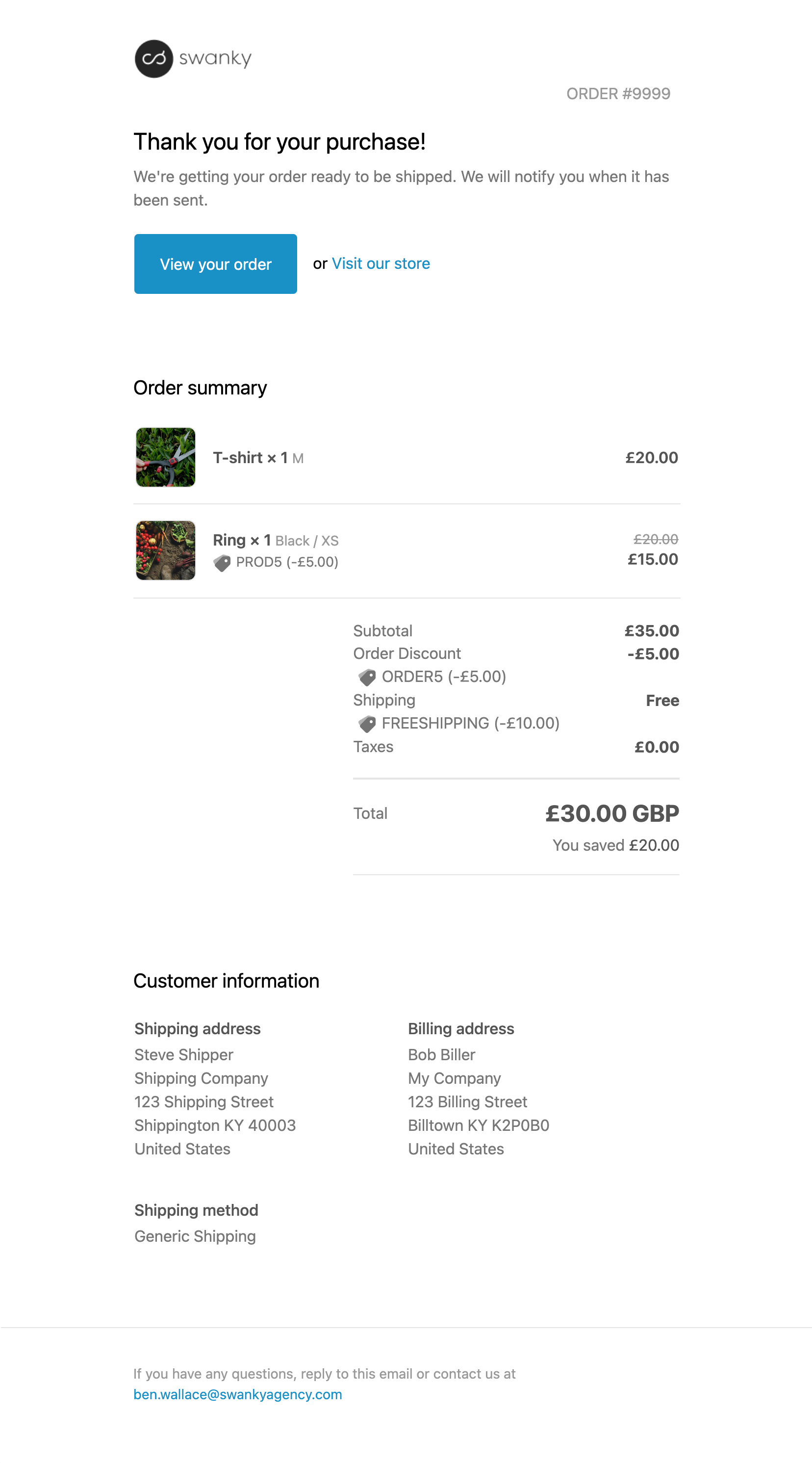
A default Shopify Order Confirmation Email.
These templates are a great way for retailers to automate their email flows and connect with customers.
Shopify offers some customisation options for these email templates, allowing the logo, logo size and a single accent colour to be changed. However, if you’re not experienced in Shopify development, the extent of email customisation available is limited.
A lack of distinctiveness could be a barrier as you look to drive ROI through email marketing. Using similar layouts, fonts, button styles and copy to other Shopify retailers may result in your emails blending in with others, hampering the success of your efforts.
Leveraging Liquid to Create Customised Shopify Emails
With the right tools and development know-how, however, it’s possible to customise your Shopify email templates and create something notably unique from your competitors.
On Shopify, each email template comes integrated with Shopify’s Liquid code, allowing developers to access store properties such as a customer’s name, their purchase total, how many orders they’ve made, whether they have an account with your brand or not, and much more.
This offers you some exciting possibilities for creating bespoke emails that are personalised to each customer and better geared towards grabbing attention in inboxes. For example, you could:
- Inject some personality into an order confirmation email with an ROI-boosting animated GIF.
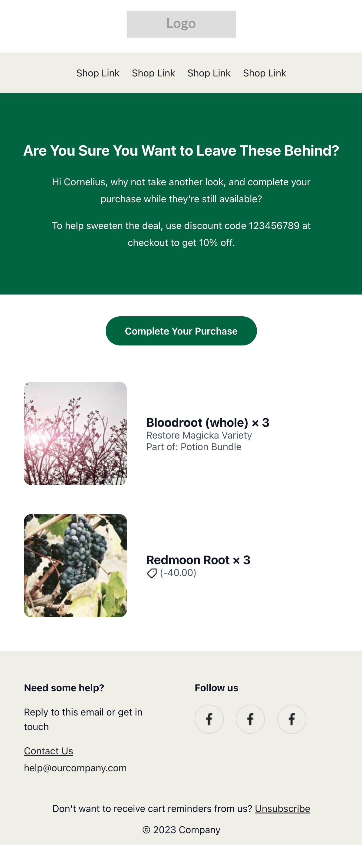
- Offer a custom discount code on an abandoned checkout email.
- Create personal emails by referring to a customer by their first name.
- Change your email copy based on whether the recipient is a returning customer.
- Encourage customers to create an account if they don’t have one already.

An example of an abandoned checkout email with custom discount code.
A Note on Email Client Compatibility When Making Customisations
Styling for modern day browsers is much less restrictive compared to days of old, but this is not the case for emails. Emails require a special approach, with modern CSS properties such as flex and grid not widely supported. Instead, emails must be styled with tables to ensure compatibility for all users, whether they open their email in Microsoft Outlook, Gmail or another email server.
Although not perfect, a well-designed email looks at all popular clients and aims to achieve a consistent look throughout. Shopify’s native emails do a good job in this regard, but if you’re seeking something more bespoke, even tweaking of colours/fonts can result in unexpected changes from one email client to the next.
For example, Microsoft Outlook can require special code in order to obtain consistency with styling as it does not support certain CSS properties such as min-width, max-width and more. We need to write special statements to cover these instances.
There are countless other quirks like this.

An example of Outlook-specific code.
Custom fonts are also limited within email clients, with only a small number of email clients supporting your brand’s unique font.3 Most email clients support a handful of web-safe fonts instead. Therefore, concessions must be made, and looking for a similar, email-safe font that matches your brand’s style is another hurdle that can be confusing and time-consuming.
The Advantages of a Custom Email Framework
Whilst email customisation is important for maximising results, creating bespoke emails can be a time-intensive and often complex process.
This is because the email code is disconnected from the store’s code. It therefore needs to be tested via the Shopify Admin, which requires a rather archaic approach of copying your local code, pasting it within the “Notifications” section and previewing changes.
For example, say you want to change the email address on the footer. The footer exists on every email template, of which there are close to 40, forcing you to copy-paste this small change across all the email templates. This turns what should be a straightforward, five-minute task into a frustrating thirty-minute exercise.
Within our team at Swanky, we’ve been creating top-of-the-range, bespoke Shopify email templates for retailers for many years.
In order to streamline our processes and make bespoke email creation simpler and more cost-effective for the brands we work with, we decided to build our own custom email framework. A custom framework takes care of many annoyances, provides extra functions for us to utilise, and helps to organise our code (and time) better.

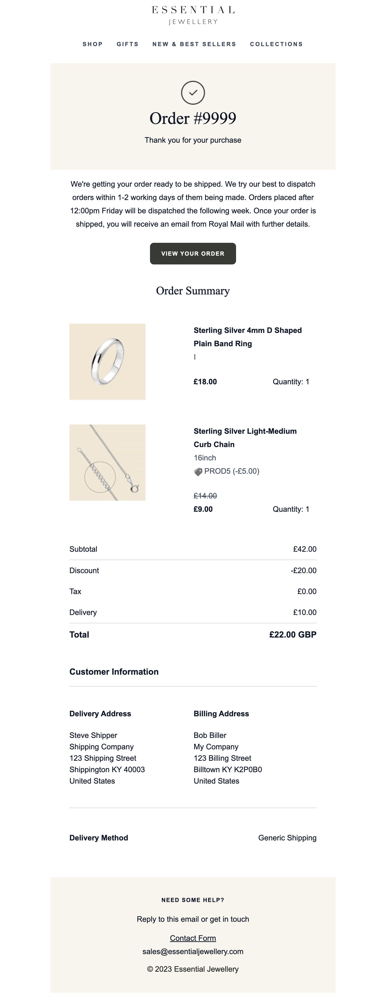
Our custom framework was leveraged to help develop Essential Jewellery’s emails.
Let’s explore some of the advantages of a custom email framework in more detail.
1. Speed & Efficiency
With Swanky’s custom email framework, we have drastically reduced the amount of development time required for custom Shopify email design thanks to rapid customisation of transactional emails.
This can save hours on projects, resulting in better value for money for the brands we work with, and a quicker turnaround on getting stylish Shopify emails to end consumers.
What’s more, less time spent on email development means brands’ budgets are unlocked for other activities.
We’ve also improved our developers’ experience by avoiding the repetition that used to come with developing so many templates.
2. Modularisation
A custom framework can be leveraged to build out components. Components are independent and, most importantly, reusable bits of code which you can apply across all email templates (if and when you choose). This keeps changes consistent and fast.
3. Integration
You can bring in powerful frameworks like Tailwind and React to speed up development.
4. Previews
Certain integrations can allow you to preview changes live on local machines, resulting in a better developer experience, and a polished and tested result for the client.
How to Leverage a Custom Framework for Shopify Email Styling
Here’s a quick guide on how to build and use a custom framework for your Shopify email styling.
1. Choose a Framework
Look into frameworks that are capable of offering the flexibility that you need to suit your development processes. There are many contenders to choose from, such as the new React Email, MJML and Maizzle, which allow for much more flexibility when working within Shopify’s ecosystem.
2. Create a Way to Render Liquid Locally
A drawback of working with Shopify’s notifications is that you must submit them to the admin to view how they look each time. Look for ways to parse Shopify’s Liquid code locally to provide a more accurate preview of the rendered email.
3. Use Components
Whichever framework you decide on, use components. This allows grouping between common sections existing between email templates (like the header and footer) so that all changes remain synchronised between templates. Just one change is required in the component file to affect all instances.
The approach we took at Swanky was to create robust, highly customisable default components, optimising them to work nicely with all popular email clients.
4. Make Use of Variables and Custom Utility Classes
Email frameworks can offer flexibility through the use of variables, and allow integrations with complementary tools. A mixture of these can allow you to set and forget variables that control styling such as primary and secondary base colours or layouts, with changes instantly reflected across all templates. Fonts can also follow this approach. Anywhere that you need to specify key, repeatable data can be a candidate to use a variable instead, and save yourself time.
5. Reduce Copy-Paste Repetition
No one wants to copy-paste each of the 30-40 templates back into Shopify’s admin after every small change. Fortunately, a custom email framework can help you navigate this.
Leverage languages such as Python or JavaScript with frameworks like Puppeteer or Playwright to automate email code submission to Shopify.
Get Support with Custom Shopify Email Development
If you’re looking for an experienced ecommerce agency to help you navigate the creation of custom Shopify email templates, why not reach out to our team to discuss your email development project.
As well as offering support with styling emails, our certified Shopify Plus Experts can provide guidance around creating email content, segmenting your email list and personalising your emails.
For reference:
[1] https://www.litmus.com/blog/infographic-the-roi-of-email-marketing
[2] https://www.emailonacid.com/blog/article/email-marketing/should-i-be-concerned-with-text-and-image-ratio-in-email/#:~:text=Remember%20the%2060%2F40%20rule,(more%20on%20this%20below).
[3] https://www.caniemail.com/features/css-at-font-face/

