10 Simple Conversion Rate Optimisation Techniques: The Beginner’s Guide to Increasing Sales
Conversion rate optimisation, the process of maximising the revenue generated from each visitor to your store, is undoubtedly the foundation of any strong ecommerce strategy.
However, CRO is also a very broad term, affecting every aspect of your website’s design – from its layout and aesthetic to its written content and technical build.
So when it comes to taking steps towards rocketing your revenue and converting more of your website’s browsers into buyers, where should you begin?
Written By
Esther Lowde

Only 22% of modern businesses are satisfied with their current conversion rate, so if you feel that yours is in need of a serious boost, you are definitely not alone.
In fact, we’d wager that most who do say they are satisfied simply don’t yet realise the dramatic impact that raising their conversion rate could have on their company’s profitability.
However, with CRO becoming an increasingly hot topic in the ecommerce world, there is an almost overwhelming amount of information and advice floating around about all of the different – and often quite complex – CRO techniques that are absolutely essential for creating and enacting a strong business growth strategy. With this in mind, it’s no wonder that so many ecommerce store owners are now looking to experts for help.
If you have the initial capital to invest, hiring a good CRO expert is certainly an extremely useful way to increase your company’s sales, with multiple studies demonstrating that CRO is the highest ROI (return on investment) that a business can make.
However, before you seek out external assistance, there are also plenty of simple CRO techniques you can implement yourself which involve simply optimising the content and design of your website as it is – without making any drastic or expensive changes.
Here are some simple steps you can take to create the perfect CRO foundation for your website and set your business up for ecommerce success.
1. Keep your website clean and product-focussed.
A compelling, user-friendly and product-focussed website design has always been at the heart of any strong ecommerce strategy.
In fact, 38% of people say they will leave a website altogether if its design is disorderly and unattractive, and studies show that the average consumer forms an opinion about a company within the first 0.05 seconds (!) of viewing its homepage.
It is therefore crucial that you keep your customers’ focus on your products by choosing a website theme which is uncluttered and free from distractions.
You must also make sure that you use the same shape for each product photo you upload so that your collection page layouts are tidy, choose colours which complement each other well so that your website is easy on the eye and also ensure that your pages are simply and logically laid out so that your store is as easy for your customers to navigate as possible.
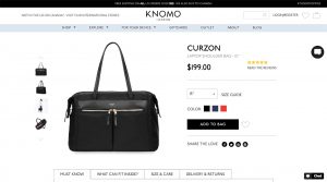
An example of a clean and product-focussed Shopify store page created for luxury bag and accessories brand Knomo by our design team at Swanky.
2. Enhance your website’s speed and performance
Optimising website speed has always been crucial for running a successful ecommerce store. In fact, after crunching the numbers on 12 separate case studies, the Aberdeen Group found that just a 1 second delay in page load time can cause a 7% reduction in conversions.
To begin with, you want to prevent slow-loading pages from driving your customers away by making sure that you are using an ultra-fast theme – such as Turbo – for your store.
Another effective way to combat the problem of slow webpage load times is to reduce the size of your images in order to decrease the total file weight of your store. Typically, we recommend compressing images by at least 30% but sometimes larger files can be downsized by as much as 90%, substantially improving your website’s speed and performance.
One of our favourite Shopify apps for compressing images is Crush.pics. As this app is fully automated, any new product images or promotional material you add to your store will be compressed for you by default.
However, to reduce code weight even further, we recommend running two or more image compression apps on your website simultaneously. For example, Minifier is another great Shopify app to consider installing, as it not only compresses images but also automatically optimises their file names and ALT tags to allow search engines to read them more easily, boosting your ranking on Google.
In addition to these apps, you can also use a website such as TinyPNG.com to compress images online for free before uploading them to your website.
3. Use strong calls to action
The golden rule of CRO is that your store needs to deliver an outstanding and intuitive user experience, helping customers to arrive at the checkout page as quickly and seamlessly as possible.
In the words of Swanky’s Head of Digital Optimisation, Sean Clanchy, “CRO is about removing barriers to purchase. These can be psychological, visual and functional.”
Featuring bold and prominent Add to Cart buttons on both your homepage and your product pages helps to boost conversions significantly as customers have a clear focus and direction for what they need to do next.
However, remember not to overwhelm the user with options. Pick the most important actions you would like the customer to take on that particular page and make them a stand-out feature of the page.
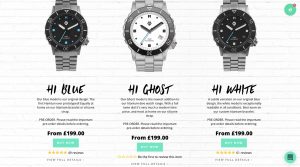
An example of the prominent ‘Buy Now’ buttons that our design team created for luxury store Hamtun Watches.
4. Communicate urgency
Once you have your on-site calls to action clearly in place, take your customer persuasion a step further by creating an atmosphere of urgency around the purchasing of your products.
By making your visitors feel that they are competing with other customers for a highly desirable product, or that this is their last chance to buy an item before it disappears from stock, you generate an immediate desire within them to buy your product then and there – rather than feeling relaxed about the decision and waiting to see if they can find something better elsewhere.
For example, take a look at how these high-converting online ‘fast fashion’ stores create the impression that their products are competitive and in extremely high demand:
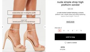
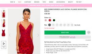
Here, these online clothing stores are letting you know how quickly their products have already been snapped up by customers as well as how many people are currently viewing that very item. They also urge their visitors to hurry up and purchase their products as soon as possible by providing a countdown to when their discounted shipping offer will expire.
These messages of urgency act as catalysts for conversion, speeding up the customer’s decision-making process by heightening the appeal of each product and presenting them as highly sought after goods which are only available in limited supply.
5. Feature customer reviews on your website
Adding customer reviews and testimonials to your ecommerce website is a technique proven to increase the likelihood of your customers making a purchase. In fact, adding reviews to your website has been shown to produce an 18% uplift in sales on average.
Why does featuring reviews on your website have such a strong positive effect on your conversion rate? In short, because hearing what others honestly think about a product increases customer trust in the reliability and transparency of your business. After reading recommendations from others, prospective buyers will feel more confident that they are making an informed purchase from your store.
We recommend Yotpo and Okendo as two of the best apps for integrating customer reviews into your website as they allow customers to rate different aspects of a product – such as the fit, style and quality of a clothing item – and also to upload photo and video reviews, which are even more attention-grabbing.
This powerful user-generated content can also be used as a highly effective marketing tool when you share your happy customers’ reviews on your brand’s social media channels.
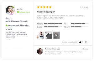
A review written using the Okendo app in which the customer has given feedback on various different aspects of the product and attached both photos and videos of it.
6. Make sure that your store is fully responsive
With sales from mobile devices recently overtaking desktop traffic, having an ecommerce store that is mobile friendly has never been more important.
According to Adobe, 8 in 10 consumers will stop engaging with content that doesn’t display well on their device, so in order to maximise the conversion rate of your store, the look and feel of your website needs to remain consistently impressive no matter where or how it is accessed.
Mobile responsiveness should therefore be a huge consideration when you are picking the perfect theme for your website. Take a look at our guide to the top 15 best free and premium themes for Shopify stores, all of which look beautiful and function perfectly on both desktop and mobile devices.
Even after uploading a fully responsive template to their store, one big mistake that many store owners make is putting all of their core content at the bottom of the page on mobile devices. Customers can be put off if they have to do too much scrolling to find what they’re looking for, so be sure to prioritise all of your key content as high up the page as possible on all devices as part of your overall CRO strategy. If your customers need information to make a buying decision, make sure they find it as quickly as possible!

An example of an ecommerce store which is optimised for display on all devices.
7. Avoid using jargon
Using too many technical terms in an effort to sound clever or impress your website visitors is, in most cases, a recipe for confusing and frustrating your customers.
When they’re browsing online stores to try and find a certain item, people simply want to hear exactly why they should invest in buying your product, and they want to hear it in every-day, colloquial language that they can relate to and understand.
In fact, to illustrate the importance of simplifying your wording, one company found that when they changed the words “Request a quote” to a more conversational “Request pricing” on one of their homepage links, the number of clicks they received to that page increased by over 161%!
To market your products in the most effective way possible and increase the likelihood of conversion, you should therefore highlight each product’s USPs (unique selling points) in the product description using informal and persuasive language and, as always, encourage the customer to take action and make a purchase.
8. Have a prominent search bar and offer advanced search options
As customers who search for products internally on your website are known to convert up to 5 or 6 times higher than the average non-searching website visitor, you need your search function to be very obvious at the top of each page. This will help your high-converting customers – who already have an increased level of purchase intent – to find the specific product that they are looking for quickly and easily at any point in their user journey.
In addition to featuring a prominent search bar at the header of all of your pages, offering advanced search filtering options is another great way to make sure your customers have a smooth journey to purchase and find exactly what they are looking for – without being put off by having to scroll through a seemingly endless list of products.
The benefits of a strong filtering system have been proven as far back as 2013, eConsultancy found that Scottish brand buyakilt.com experienced a 26% increase in their conversion rate (and an incredible 76% boost in their revenue!) after implementing a product filter which allowed customers to shop by product type and pattern.
If you have a slightly larger inventory, it is therefore well worth taking the time to think about which core features your customer base would consider when buying your products – such as size, colour or price – and then create filters for each category, resulting in a more enjoyable user experience for your customers and more sales for you.
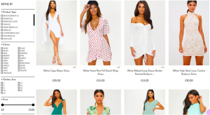
High-converting online women’s fashion store PrettyLittleThing offers a wide range of search filter options in the sidebar of each of their product menus.
9. Make the most of your images
They say a picture is worth a thousand words, and when it comes to conversion rate optimisation, this phrase rings especially true.
For example, featuring photos of happy, smiling people on your website has been shown to positively affect conversion rates as these feel-good images prompt dopamine release and therefore make the user more likely to respond positively when faced with a call to action.
However, don’t forget that – much like the written content of your website – all of your images should serve a clear purpose. Rather than simply looking pretty and distracting your customers from your calls to action, all your store’s photos should be aimed at encouraging users to purchase from your store.
One way of keeping your images product-focussed is by featuring high-quality images of your store’s featured merchandise on your homepage alongside your calls to action.
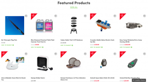
Example of a strong product-focussed section on the homepage of the website that our Swanky design team recently crafted for Newquay Camping Shop.
Another great way of using attractive visuals to encourage customers to place orders is to use apps such as Walls or Shop by Instagram to embed shoppable Instagram feeds into your store, which not only look sleek and attractive but also inspire visitors to purchase items that they may not have previously been planning to.
10. Upsell your products
Upselling is the practice of encouraging customers to purchase product add-ons or items that are similar but more expensive than what they are already ordering, all with the aim of making a larger sale. It’s essentially the ecommerce equivalent of being asked at a fast food drive-through “Would you like fries with that?”
With studies demonstrating that 70-95% of the average company’s revenue comes from upsells and renewals, upselling is clearly well worth your time – especially considering that it will generally cost your business nothing.
Installing an app such as Product Upsell is therefore one of the most simple but highly effective ways of increasing your store’s average order value.
Far from being just another sleazy marketing tactic, making upsells can also lead to greater levels of customer happiness as buyers can find more relevant products that are perfectly suited to their needs and therefore get more value from your business.
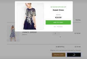
An automated upsell app will help you to optimise your conversion rate effortlessly.
So if the above actions are so easy, why would I need to hire a CRO expert?
Ultimately, there are three core reasons for implementing CRO; to make informed choices about changes to a store, to mitigate risk and to increase revenue.
In order to be sure that the changes you are making are informed and are actually having a positive effect on your business, you need to have an advanced and reliable testing strategy in place, as well as an accurate analytics setup to gauge any performance improvements.
You may have already heard about split testing (or A/B testing). This can be defined as comparing two versions of your website – the existing version of your website and a variant which has been modified slightly – in order to scientifically test which version of your website results in more sales.
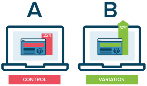
With a CRO programme, you can scientifically test different approaches to resolve the issues outlined above. This will ensure that you adapt your design, navigation and feature set to work perfectly for your specific store, instead of potentially wasting development time implementing best practice advice.
However, data analysis is complex and results are not always as straightforward as they may seem on the surface. At this point, CRO experts are extremely valuable to help you interpret this information and then use it to help you maximise your conversions.
If your store is looking at 60,000 visitors or more per month, we recommend that you begin the process of split testing any front-end changes that you make to your website to make sure none of the changes you’re making are losing you any valuable traffic and conversions.
Hiring a professional as your business begins to grow is therefore an extremely worthwhile service which is almost guaranteed to return your investment tenfold. You simply need to ensure that, before paying for their services, you have done your research to guarantee that your CRO expert is the real deal.
In the meantime, it’s time to get optimising your current website content for ecommerce success!
At Swanky, our expert team are happy to provide a range of professional optimisation services to help you unlock your business’ full ecommerce potential. Please don’t hesitate to get in touch with us if you would like to find out more.

