10 Big Shopify Plus Sports and Health Stores
Shopify Plus is the fastest growing enterprise ecommerce platform on the market. It provides a fully-hosted, multi-channel enterprise solution for high-volume merchants, offering them the freedom to grow, adapt and evolve. Five years on from its launch, it is now powering some of the world’s largest and fastest growing brands.
Written By
Hannah Smiddy

Thanks to its unrivalled scalability and support, Shopify Plus is the trusted ecommerce solution for thousands of enterprise-sized businesses across the globe. We’re taking a look at some of the big names currently hosting their stores on this exciting platform, one industry at a time.
In this article, we’re turning our attention to the booming sports and health industry. Which global sports and health brands have turned to Shopify Plus as their winning ecommerce solution? Let’s take a look at 10 thriving Shopify Plus sports and health stores …
Youfoodz
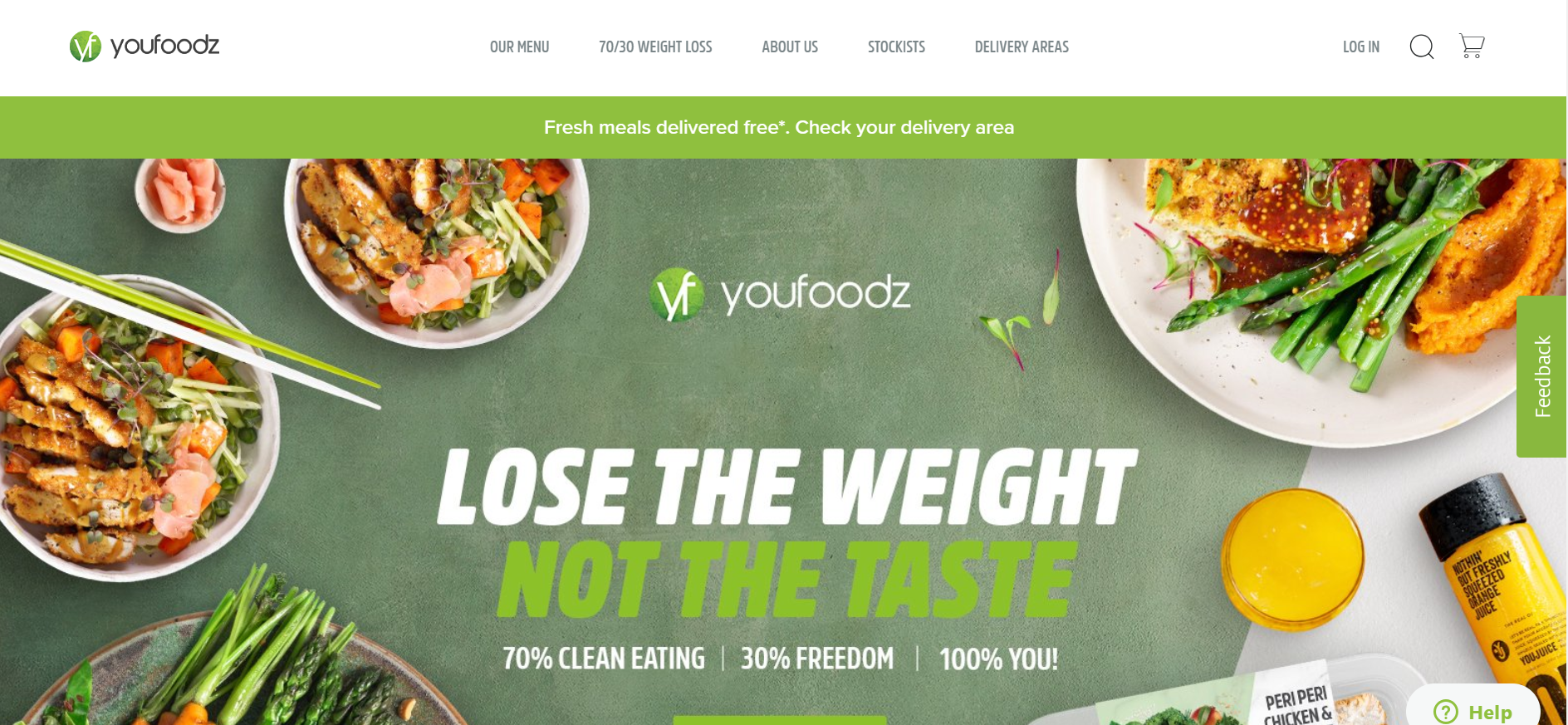
Australian healthy eating brand Youfoodz are committed to ‘making mealtimes great again’ with their innovative home delivery service of fresh and healthy meals. All their ready-to-eat meals are sourced from the best local suppliers and cooked by trained chefs before being delivered straight to your door. Plus, this budding health brand have even launched their own weight loss movement, ‘Youfoodz 70/30’. Members have access to a weekly meal planner, dietician-approved recipes and specially-crafted healthy meals. Youfoodz are growing rapidly in what is an extremely competitive market, with over 450,000 site visits a month on average.
Asking Dan McIvor, Shopify Plus Expert and Founder of Swanky:
“What is Youfoodz gaining from being on Shopify Plus?”
“This is a great ecommerce store that I think provides an all-round positive user experience. Youfoodz make use a of a really neat feature at their checkout, which allows customers to transform their order into a subscription. I’ve not seen this anywhere else. It’s a smart upsell technique that demonstrates the flexibility of Shopify Plus, even within the checkout.”
Asking Matt Giles, Creative Director at Swanky:
“What are the strongest aspects of this ecommerce store’s design?”
“Throughout the Youfoodz store there is fantastic use of imagery to suggest that even though their meals are pre-made and delivered, their presentation can be excellent and full of life. The strong use of green throughout the site helps to deliver key statements within a ‘health’ context, without being overbearing. There’s a good amount of whitespace used to complement the green colours, too. This creates a fresh and professional look.
Their factual pages have been designed beautifully to persuade the user on key USPs around diet and lifestyle. They’ve included example cases of weight loss from users, with good use of user generated imagery to connect with consumers. These case studies feature a well-communicated highlight of how much weight was lost. And by putting the user quotes in italicised capital letters, they are driving home a forward-thinking, action-packed message.
Another strong aspect of Youfoodz’s store design is the great use of animation and movement. This brings their products to life, really helping to promote this healthy, fresh lifestyle.
Finally, it’s also worth mentioning the accessibility of key nutritional information within the collection view. Upon rolling over a product image, the user is presented with key values such as calories, protein, carbs and fats. This means that the nutrition-conscious consumer can quickly choose a product based on their dietary needs. This is a great addition to Youfoodz’s store.”
Asking Sean Clanchy, Digital Strategy and Ecommerce expert:
“How could Youfoodz boost their conversion rate further?”
“Looking at the homepage, I’d recommend better defining the add to cart buttons by using contrasting colours. This is more likely to encourage selection and increase conversions. I’d also suggest moving the social endorsement feature from the base of the homepage to a more visible position. Perhaps prioritising this in the homepage structure would increase customer trust and in turn boost purchase conversion rates.
On Youfoodz’s product pages, the reviews could benefit from some visual enhancement. Currently, they are relatively plain compared to the rest of the bright and vibrant website. Maybe they could consider user-submitted images to help build social proof as well.
Finally, the mobile collection page could be a source of some frustration for users. The entirety of the above-the-fold page is filled with a merchandised sale banner that isn’t immediately obvious as a promotion. This could cause some confusion and annoyance, as on first glance it seems like you haven’t actually reached the collection page. As a result, users have to do more work to reach the products.”
SkinnyMe Tea
Home of the ‘original natural detox tea’, SkinnyMe Tea are on a mission to help people around the globe achieve their health and wellness goals. Launched in Australia by serial start-up entrepreneur Gretta van Riel when she was just 22 years old, this now globally successful healthy drinks brand scaled to sell over 11 million cups of tea worldwide in five years.
Asking Dan McIvor, Shopify Plus Expert and Founder of Swanky:
“What is SkinnyMe Tea gaining from being on Shopify Plus?”
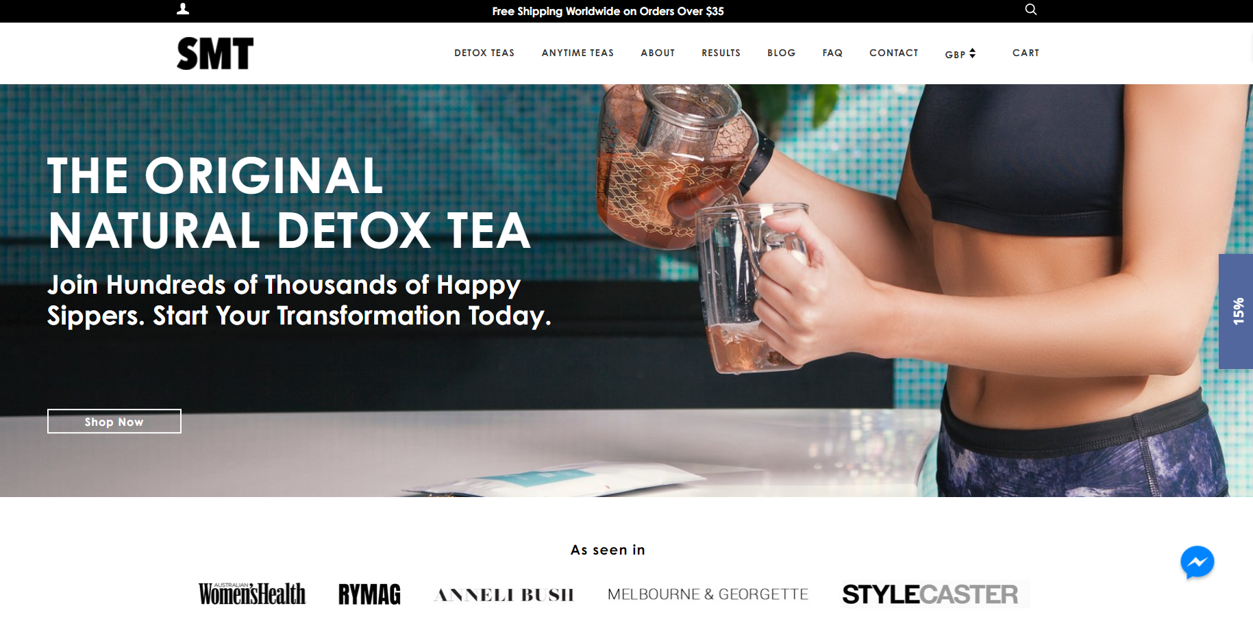
“SkinnyMe Tea make good use of promotion options such as the free shipping banner and ‘as seen in’ sections within their Shopify theme. Shopify’s intuitive theme editor makes it easy for merchants to add and manage sections like this, all without needing to know a line of code.
It’s surprising that this brand doesn’t make use of any subscription functionality. Shopify Plus’ most popular subscription platform is ReCharge, which makes it easy to begin selling products on a recurring basis. The ‘Subscribe & Save’ product page option makes it easy to transform one-time products into tailored monthly subscriptions. This is certainly something SkinnyMe Tea should consider, as their customers are likely to want to purchase their products on a recurring basis, particularly the ‘Anytime Teas’.”
Asking Matt Giles, Creative Director at Swanky:
“What are the strongest aspects of this ecommerce store’s design?”
“Firstly, SkinnyMe Tea clearly have a strong understanding of their two markets (tea for health and tea for enjoyment). They cater for both of these markets on their site, with appealing imagery immediately driving segmentation on the homepage. Not only is this aesthetically pleasing, but it helps direct users through the conversion funnel.
This brand use calming and feminine colours that are geared perfectly towards the female, health-conscious market. Through a mix of these balanced pastel tones and aspirational lifestyle photos, they deliver a clear lifestyle image.”
Asking Sean Clanchy, Digital Strategy and Ecommerce expert:
“How could SkinnyMe Tea boost their conversion rate further?”
“There’s a large amount of choice presented in the SkinnyMe Tea menu. This could overwhelm users and even drive them to find a simpler, more user-friendly store that sells similar products. Therefore, we’d recommend reviewing and refining their menu options.
On their product pages, there are various strategies that may help improve conversion rates. For instance, we would recommend making the add to cart buttons more effective by adding a stronger colour. Also, they could move the customer reviews so they are placed above the fold.
Finally, when it comes to the SkinnyMe Tea cart, distractions could be reducing the conversion funnel flow rate. Users should be focused entirely on completing the checkout process, but instead their cognitive load is increasing because of distracting calls to subscribe.”
Kayla Itsines
One of the most followed Instagram fitness bloggers in the world, personal trainer Kayla Itsines has guided millions of women in their health and fitness journeys. Her fitness empire includes paid ebooks, a stadium tour, best-selling books and her top-selling app, ‘Sweat With Kayla’. She sells workout accessories, recipe guides and more via her Shopify Plus ecommerce store, which receives on average 565,000 visits per month.
Asking Dan McIvor, Shopify Plus Expert and Founder of Swanky:
“What is Kayla Itsines gaining from being on Shopify Plus?”
“Being a popular figure in the fitness industry, it’s not surprising that the Kayla Itsines site receives a large amount of traffic. Shopify Plus has an innate capacity to handle high volumes of site visitors, so this brand can be confident that their store won’t be compromised in busy trading periods.
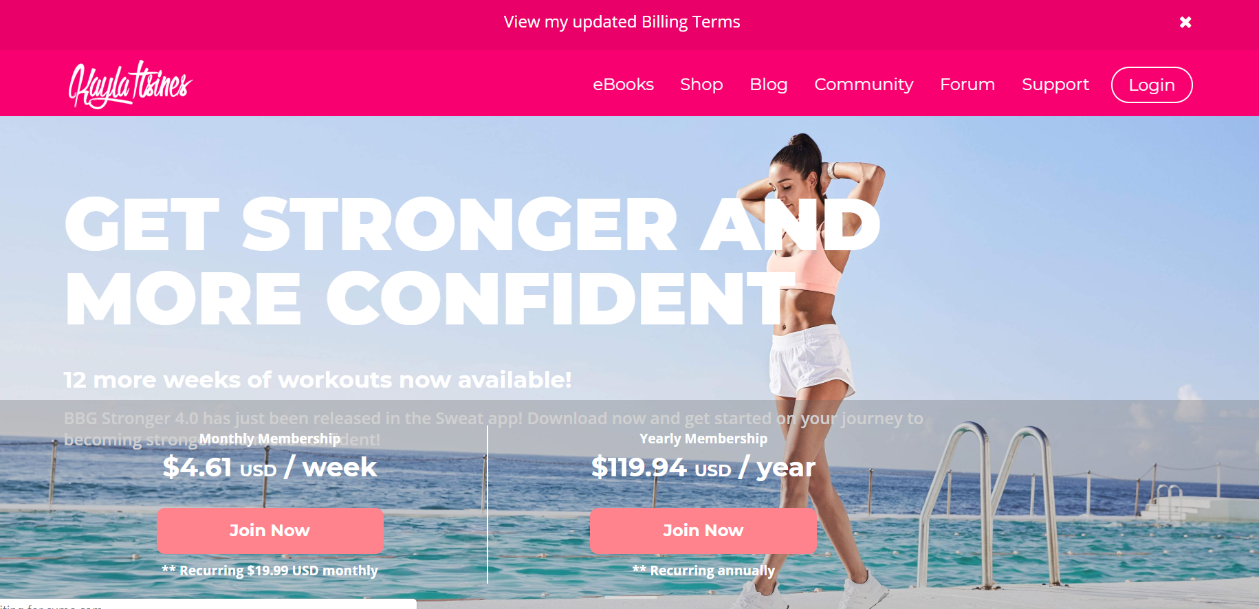
This store has strong, colourful aesthetics geared towards the target demographic. It draws visitors straight into the sign-up flow with clear calls to action.
It’s surprising that they have elected to use an external platform for their subscription service, as Shopify Plus merchants have access to some great functionality for recurring purchasing. It would be interesting to know if their member accounts are also being handled on a separate system. If so, unless they are using Shopify Multipass, customers will have two different accounts to manage (one for the store and one for the subscription). This could be off-putting for users and potentially limit conversions.”
Asking Matt Giles, Creative Director at Swanky:
“What are the strongest aspects of this ecommerce store’s design?”
“The Kayla Itsines store has a bold and feminine design which appeals to the brand’s key demographic. There’s good use of refreshing imagery across the site to emphasise the health benefits associated with Kayla’s products. The clean and cool colours combined with warm pink calls to action are effective at drawing users’ attention.
In addition, the store has a strong review presence to help increase trust. It also includes user generated content from Kayla’s Sweat App on the homepage, which shows real people who are benefitting from the Kayla Itsines experience. This is a powerful marketing tool that is helping to establish the brand’s credibility in a very crowded market.”
Asking Sean Clanchy, Digital Strategy and Ecommerce expert:
“How could Kayla Itsines boost their conversion rate further?”
“Firstly, the use of white text on a light image-based background makes it tricky to distinguish the message on the homepage, therefore reducing its effectiveness.
On the main collection page, there is reference to a product being available in three colours in the header image, but no colour swatches are provided. This would provide shoppers with an immediate reference point and help validate interest more quickly.
Also on the collection page, the top-ranked product is out of stock. This poor merchandising experience could quite easily impact conversion rates by both distracting and frustrating consumers. And, when you click through to the relevant product page, there is no ‘back in stock’ notification or email capture. Consequently, potentially interested customers are left begging.”
Gymshark
Gymshark is a UK-based fitness apparel and accessories brand. Since launching in 2012 in the garage of then 19-year-old Ben Francis, it has rapidly become one of the most recognisable brands in the fitness industry. This sports power-brand turned over £41 million in sales in 2017 alone. Shopify’s POS system has allowed Gymshark to create immersive online-offline customer experiences, whilst Shopify Scripts enables the brand to customise their checkout and surprise loyal customers with free gifts.
Discussing how Shopify Scripts has benefitted Gymshark, Founder Ben Francis said:
“It’s something that would’ve taken a lot of money and weeks to accomplish on Magento. But with Shopify, we can do what we want almost immediately and be confident it’s going to work.”
Asking Dan McIvor, Shopify Plus Expert and Founder of Swanky:
“What is Gymshark gaining from being on Shopify Plus?”
“Firstly, Shopify Plus allows the Gymshark team to implement changes quickly and effectively whenever they please. This is important for a modern brand who are constantly evolving.
Furthermore, Gymshark are making the most of Shopify Plus’ built-in social feeds and social media integrations. With their enormous social media following, Gymshark have catered to their audience by including a shoppable Instagram feed on their homepage.”
Asking Matt Giles, Creative Director at Swanky:
“What are the strongest aspects of this ecommerce store’s design?”
“Gymshark’s store is great at encouraging users to reach the checkout page as quickly as possible. For example, the website gives customers the option to add and remove products to their cart before they even reach the checkout page. All you need to do is hover over an image and click on your size for that product to be added to your basket.
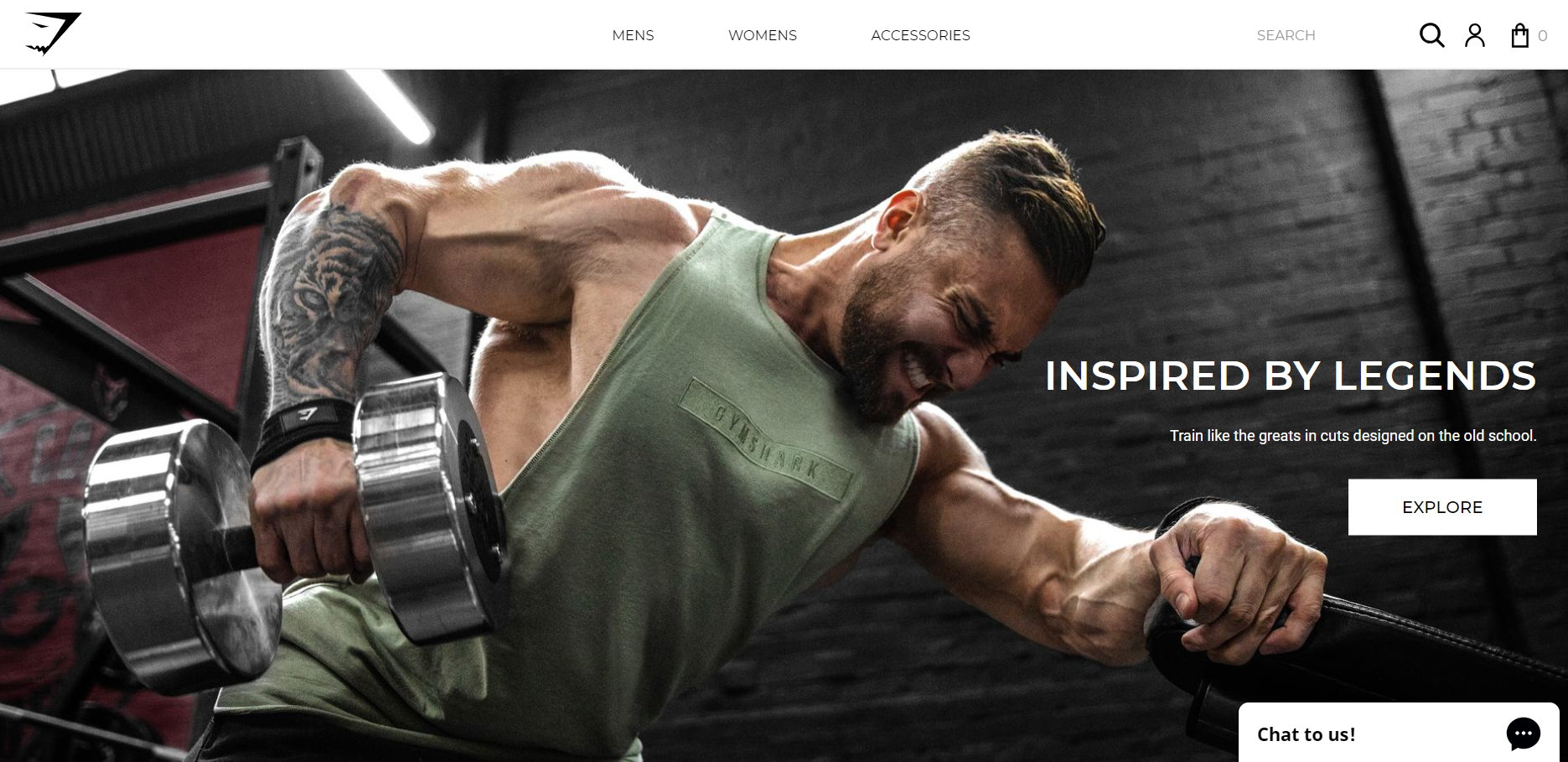
Another strong aspect of Gymshark’s store design is the way it leads with images. It has a clean and simple design, but with plenty of attitude.”
Asking Sean Clanchy, Digital Strategy and Ecommerce expert:
“How could Gymshark boost their conversion rate further?”
“Gymshark could consider promoting their customer reviews more extensively. Social validation is a key driver of conversions. It plays a huge role in influencing shoppers who may be unsure or indecisive. In fact, reviews have been shown to produce an 18% uplift in sales on average.”
Women’s Best
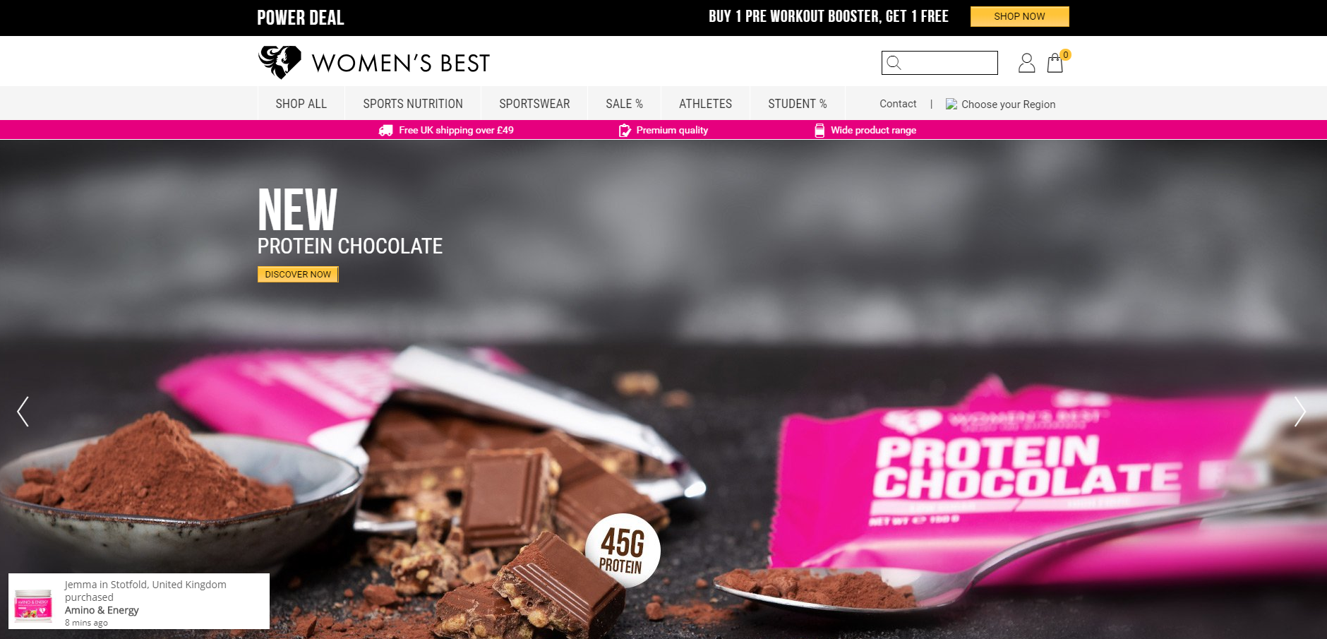
Specialising in sports nutrition and sportswear for women, worldwide success story Women’s Best has made an international name for itself by creating different Shopify Plus storefronts around the globe. They want to be seen as more than just a brand. Instead, they see themselves as a force that empowers women from different cultures, with different journeys and backgrounds. Working in partnership with female athletes from around the world, they have built a huge fitness empire that not only provides products, but educates and inspires. Women’s Best also have a huge presence on Instagram, with targeted accounts for different countries and different categories (e.g. beauty, recipes, reviews).
Asking Dan McIvor, Shopify Plus Expert and Founder of Swanky:
“What is Women’s Best gaining from being on Shopify Plus?”
“Women’s Best have set up a different Shopify store for each country they sell to. As a huge global brand, this means that they are able to completely customise and tailor design, content and inventory, amongst other things, per country. This allows them to target their customers across the world more effectively.
For ecommerce businesses who might not have reached this scale yet, or might consider this as a large admin overhead, Shopify has an out-of-the-box integration with Dynamic Yield which will allow location-based personalisations. You can display country-specific offers and content, all on one single site.”
Asking Matt Giles, Creative Director at Swanky:
“What are the strongest aspects of this ecommerce store’s design?”
“The design of the Women’s Best Shopify Plus store is perfectly geared towards the target demographic. There’s a good contrast of feminine appeal and a sense of aggressive pursuit of goals. For example, the colour usage creates impact and inspires action, whilst also appealing to the key consumer.
Furthermore, the store leads with images of influencers. This lets users know that they’re in the right place and in good company. It also develops a sense of community and trust amongst consumers. Women’s Best are also building trust throughout their store with an ‘As featured in’ bar featuring significant editorial influencers, as well as user generated content on their social wall. Also, the strong presence of customer reviews and social validation is a key way of garnering confidence amongst consumers.”
Asking Sean Clanchy, Digital Strategy and Ecommerce expert:
“How could Women’s Best boost their conversion rate further?”
“The visual menu on the Women’s Best Shopify Plus store displays products with very similar colour schemes and shapes. This makes the navigation process slightly more complex than it has to be. By providing more differentiated products, they could aid navigation and potentially boost conversions.
Also on the homepage, the call to action on one of the sliders is very small. It doesn’t catch the consumer’s eye and so doesn’t push the purchase decision. The product being promoted is under-merchandised in my opinion.
I would also suggest that they are overusing the abandonment slide-out pop up. It triggered four times in the same session whenever I neared the edge of the browser window!”
Bulletproof
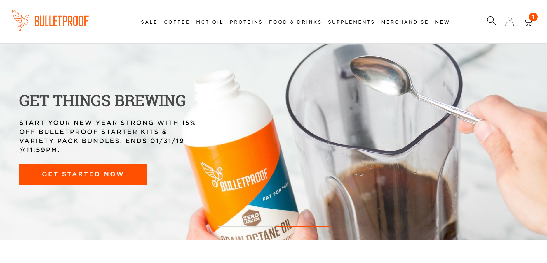
Next up, Bulletproof. On a global mission to help people perform at levels that surpass their expectations, Bulletproof is a huge player in the health and wellness industry. Their vast range of foods, drinks, proteins and supplements attracted over 5 million visitors to the Bulletproof site in January 2019!
Asking Dan McIvor, Shopify Plus Expert and Founder of Swanky:
“What is Bulletproof gaining from being on Shopify Plus?”
“Shopify Plus can handle large traffic volumes with ease. Therefore, it’s perfect for super-popular ecommerce stores like Bulletproof. A site that gets as many monthly visitors as this one is likely to have rather significant spikes in traffic, which Shopify Plus takes in its stride thanks to its unlimited bandwidth and multiple servers across the globe.”
Asking Matt Giles, Creative Director at Swanky:
“What are the strongest aspects of this ecommerce store’s design?”
“One of the strongest aspects of this store’s design is the way the benefits of each product are communicated. Clean, simple, on-brand icons are used on each of the product pages. This is a great way of conveying information to consumers.
Bulletproof’s store features a clean and clear design, with a good combination of colourful lifestyle images and crisp product imagery. High-quality product imagery is vital for building trust with consumers and establishing a reputation as a reliable brand.
Also, when it comes to the design of their mobile site, they have included a prominent search function immediately under the header. This empowers the user straight away, helping to provide a smooth purchasing journey.”
Asking Sean Clanchy, Digital Strategy and Ecommerce expert:
“How could Bulletproof boost their conversion rate further?”
“Firstly, Bulletproof could look to make use of iconography in their mega menus, as currently these are very text-heavy. This would help to highlight the core user journeys and improve navigation. They could also look to simplify the number of options or better categorise their product types within their menus, as currently there are too many options being presented.
The orange branding on every product label blends everything together. The excessive use of orange throughout the store takes away from its visual impact. We know from our own testing programs that strong, visually impactful calls to action result in higher click through and conversion rates.
Whilst they do offer a ‘subscribe and save’ service, there is potential for Bulletproof to make this the default setting on their product pages. This would help to drive subscription purchases, which tends to result in higher customer lifetime value.
The features and benefits of each product are clearly defined on the product pages, with good use of clear, consistent iconography as Matt pointed out. However, these are hidden below the fold. We’d recommend moving these higher up the page where they should have greater influence on users’ buying decisions.”
Campus Protein
Starting out in a US college dorm in 2010, Campus Protein has powered its way to become a multi-million dollar business. After replatforming to Shopify Plus, this affordable supplements brand has doubled conversions year on year. They have also managed to extend far beyond its initial audience of college students.
With nothing but praise for the Shopify Plus platform, Russell Saks, CEO of Campus Protein, said:
“Switching to Shopify Plus was the best decision we ever made. It’s the best ecommerce platform I’ve ever seen.”
Asking Dan McIvor, Shopify Plus Expert and Founder of Swanky:
“What is Campus Protein gaining from being on Shopify Plus?”
“Above all, the scalability of Shopify Plus is a great fit for a fast-growing retailer like Campus Protein. The platform’s scalability is superb. It is perfect for expanding enterprises that are increasing sales and growing their customer base so quickly.
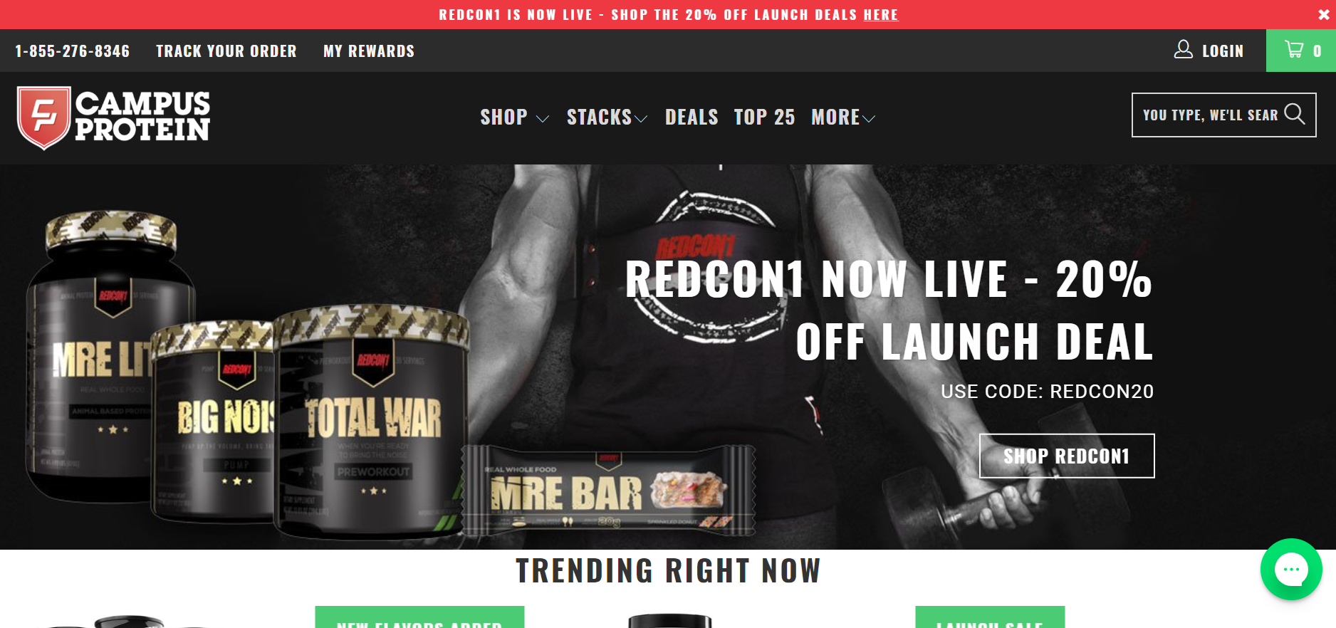
Also, Campus Protein are benefiting from Shopify Plus’ flexibility. For instance, they have been able to add custom messages on their collection pages to communicate things such as new flavours, new products and discounts. Also, they have had the flexibility to create simple, unique pages like their ‘Top 25’ page which can help their brand stand out from the competition.”
Asking Matt Giles, Creative Director at Swanky:
“What are the strongest aspects of this ecommerce store’s design?”
“Campus Protein’s store is all about making big, bold statements that reflect the lifestyle they are selling and appeal to their target market. For instance, the site features big, bold colours and contrasts, with capital letters used for statements and deals.
The mega menus have bold calls to action that offer an impulse-led user journey as an easy option away from a huge choice of product. Similarly, the use of trending and bestselling lists is cleverly used to assist users in selecting from a large product range.
A portion of the homepage is dedicated to user generated content. There’s even an option to add your own photos. This is a great way of encouraging brand engagement through design.”
Asking Sean Clanchy, Digital Strategy and Ecommerce expert:
“How could Campus Protein boost their conversion rate further?”
“On the homepage carousels, Campus Protein use the same lime green colour for all their merchandising overlays, no matter the message they are communicating. We know from our own testing that using distinct overlays and merchandising colours for different benefits helps to breadcrumb the experience. This makes it easier for consumers to identify features and benefits of interest more quickly, consequently reducing cognitive load and speeding up decision-making.
The busy text-based mega menus make the browsing experience on this store more complex than it needs to be. Campus Protein could therefore benefit from reviewing and refining their menu options. Also, they might want to consider incorporating iconography into their mega menu.
Furthermore, the store’s search function isn’t strongly highlighted, even though users who search typically have higher purchase intent and convert more often. They could benefit from using a more distinctive colour for the search bar that really stands out from the black background.”
SweetLegs
Famous for their funky fitness leggings and inspiring body positivity message, Canadian brand SweetLegs broke their holiday records after migrating to Shopify Plus. After a disastrous Black Friday weekend in 2016, the founders decided to make the move from WooCommerce to Shopify Plus. In just a 30-day turnaround, they were migrated, launched and taking orders. In SweetLegs’ first month on Shopify Plus alone, they generated some $2 million in sales!
Speaking of Shopify Plus’ robustness, co-founder Chris Pafiolis said:
“No matter how hard we hammered it, it did not go down.”
Asking Dan McIvor, Shopify Plus Expert and Founder of Swanky:
“What is SweetLegs gaining from being on Shopify Plus?”
“SweetLegs are clearly thriving since migrating to Shopify Plus. The platform offers unlimited bandwidth and a proven track record of scalability. Therefore, this growing sports fashion brand can feel confident that their store is always ready to perform, even during peak shopping periods like Black Friday.
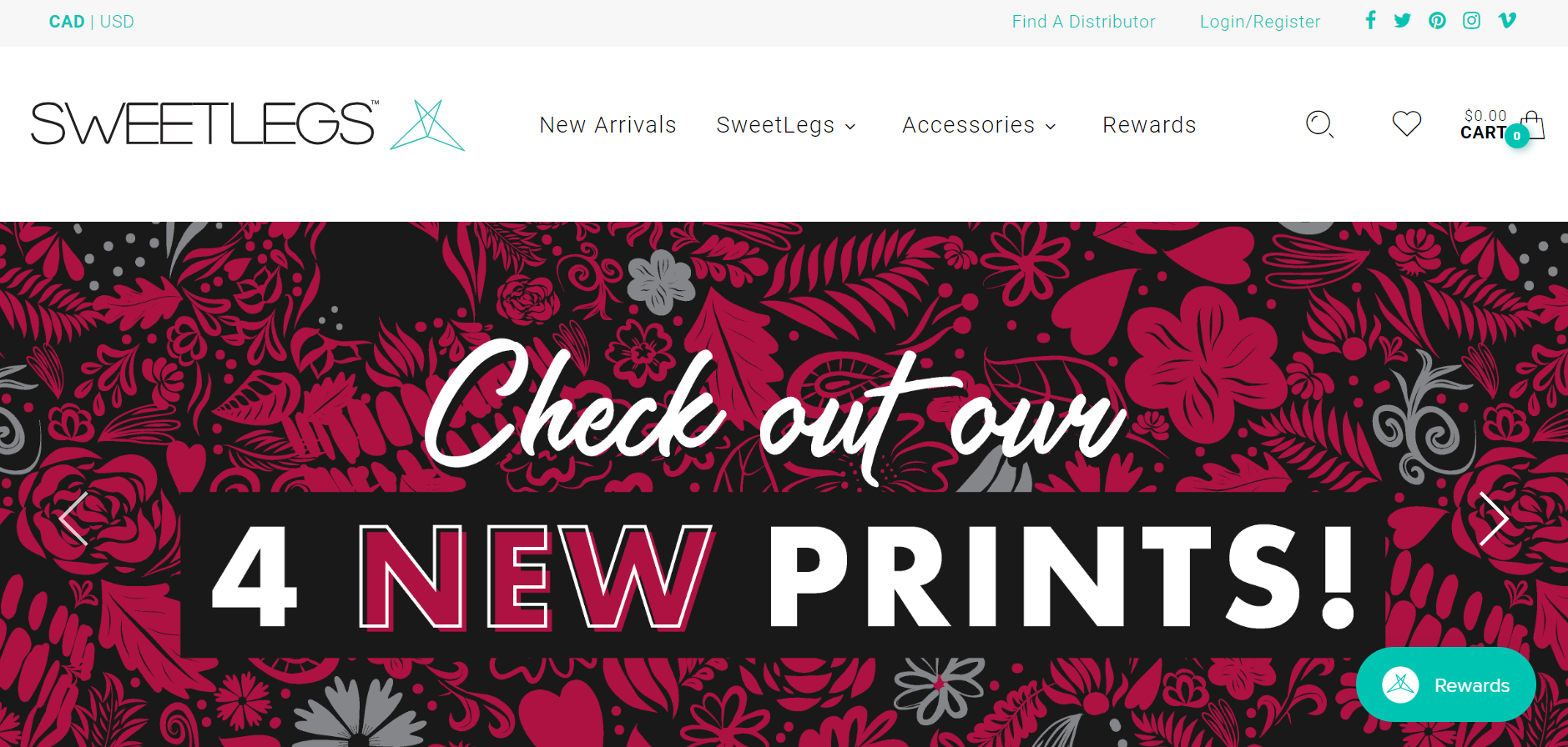
Their rewards program stands out on their homepage, thanks to its simple but attractive presentation. Using a rewards program in this context is a smart move. Customers are likely to make repeat purchases of leggings, so this compelling rewards program could help SweetLegs to increase their profits without losing out to cheaper competitors.”
Asking Matt Giles, Creative Director at Swanky:
“What are the strongest aspects of this ecommerce store’s design?”
“Firstly, the SweetLegs store features good use of whitespace and cool, effective use of black and white so that the turquoise and pink calls to action and sales incentives really stand out. This also allows the colourful product imagery to speak for itself.
Clearly this is a brand that really believes in its core message regarding body confidence. They use this message in bold, punchy statements on their homepage to good effect.
The subtle use of movement on desktop mouseovers creates interest and draws the eye. This dynamic part of the design enhances the user experience by providing multiple product angles and satisfying consumers’ need for enhanced product visuals.
Also, the SweetLegs loyalty scheme is cleverly and consistently weaved into the design of the store. There’s a nice loyalty icon within right hand thumb reach on their mobile site.”
Asking Sean Clanchy, Digital Strategy and Ecommerce expert:
“How could SweetLegs boost their conversion rate further?”
“The homepage collection features five-star-rated products, but doesn’t show a review count. This is something that could reduce consumer trust and negatively impact conversions, as people naturally want to see multi-buyer endorsement of product quality.
This sports fashion brand have a strong sales party business structure. Having said that, the only mention of this is hidden more than two full scrolls below the above-the-fold content on the homepage. There’s also no social validation around this aspect of their brand. There is lots of potential here for including user-generated content, which is a powerful tool for boosting conversion rates.
SweetLegs don’t provide any shipping or returns information above the fold on their product pages. This is another thing that could reduce consumer confidence on this store. As a result, it could restrict new user conversion rates. They could consider prioritising this important information higher up the page so that users can browse with confidence.”
Altitude Sports
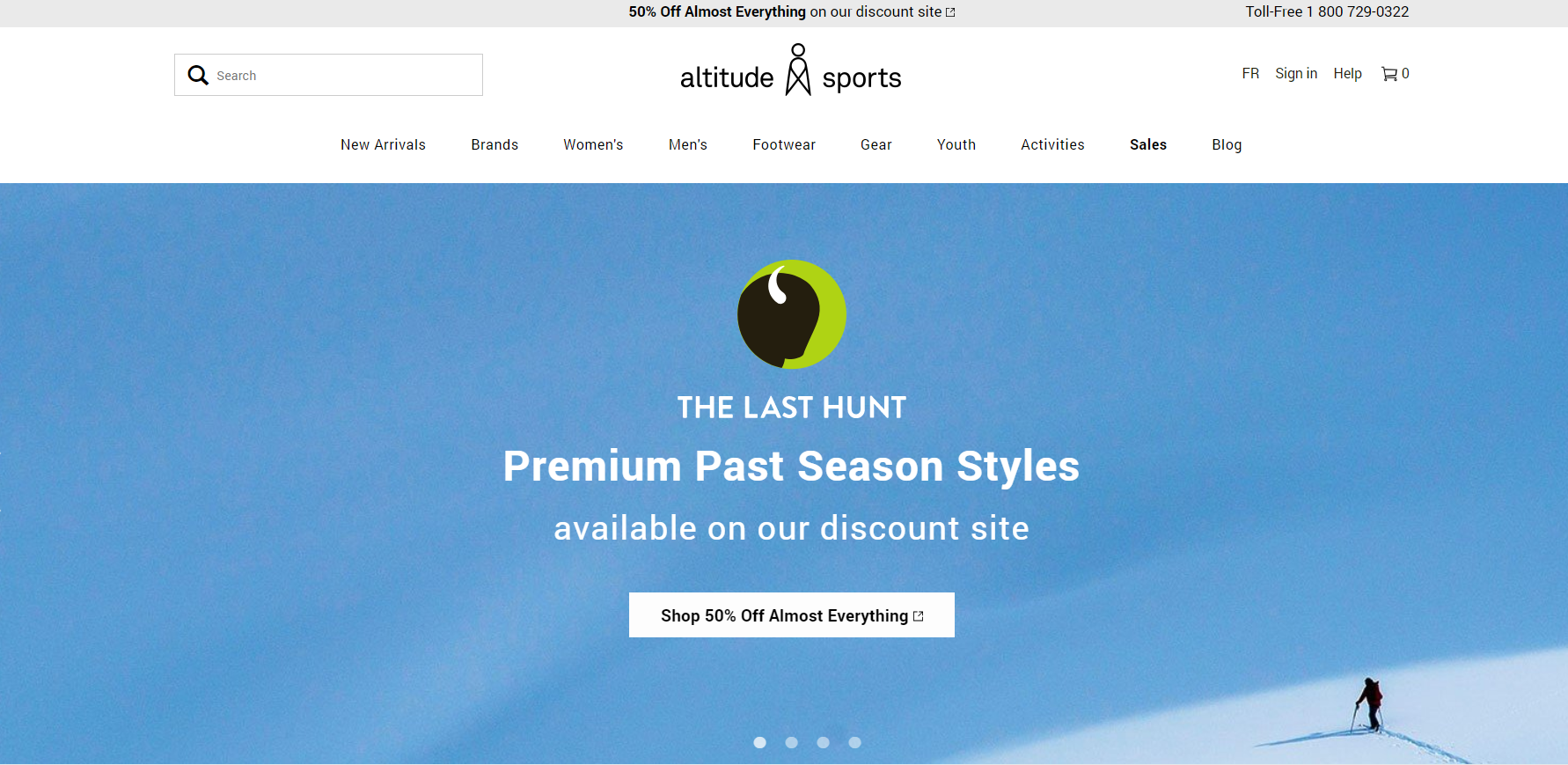
After initially starting out as a bricks-and-mortar store, Altitude Sports became the first online outdoor retailer in Canada. Twenty years on from the launch of its first site, Altitude Sports is now a multi-million dollar ecommerce hub for outdoor sports equipment and clothing. The site received over 2 million site visits in November 2018 alone! As they continue to evolve with technology, this sports brand is making the most of innovative Shopify Plus tools to provide predictive searches and modern visual merchandising features.
Asking Dan McIvor, Shopify Plus Expert and Founder of Swanky:
“What is Altitude Sports gaining from being on Shopify Plus?”
“Altitude Sports have a huge product catalogue which includes a large number of categories. They are thriving in their industry thanks to Shopify Plus’ ability to handle complex product categorisations and quantities like theirs.
It’s good to see that they’re making use of filtering functionality for their large product base. This is simply essential to cater for consumers’ specific needs.
As a large and ambitious retailer, Altitude Sports need to be able to represent the brands that they supply really well. Thankfully, Shopify Plus provides much-needed stability and certainty for enterprises. This means that merchants can add new brands and ranges to their store with confidence.”
Asking Matt Giles, Creative Director at Swanky:
“What are the strongest aspects of this ecommerce store’s design?”
“First of all, the use of cool, clean typography across this site appeals to a broad demographic. This is important for a store such as Altitude Sports which distributes a range of outdoor brands and products for a varied audience.
Brand-loyal browsers can quickly navigate to where they want thanks to the strong browse-by-brand features on both desktop and mobile. This streamlines the user experience for shoppers who know exactly what they’re looking for.
The Altitude Sports store features a nice mixture of product lifestyle shots in fairly clean environments and solid colour backgrounds where the product is allowed to speak for itself, as well as close up imagery of models to bring some personality.”
Asking Sean Clanchy, Digital Strategy and Ecommerce expert:
“How could Altitude Sports boost their conversion rate further?”
“Firstly, the call to action button on the homepage slider is ineffectual. It blends into the light background it has been placed on, rendering it almost impossible to differentiate and act upon.
Also, Altitude Sports could potentially increase conversions on their product pages by communicating the tangible monetary value being saved with discounted products. Currently, they only feature a small percentage discount value at the top-right of product images, with the new price highlighted in red. By not explicitly stating the revenue saving, they are increasing cognitive load. This slows people’s browsing experience and delays their decision-making process.
Whilst it’s important that this store uses filtration for its huge product offering as Dan pointed out, I think that 15 filter categories (each with multiple selections) may offer too much variety and again increase cognitive load. This can delay purchasing decisions and even send users elsewhere in search of a simpler, less demanding store.”
Pure Cycles
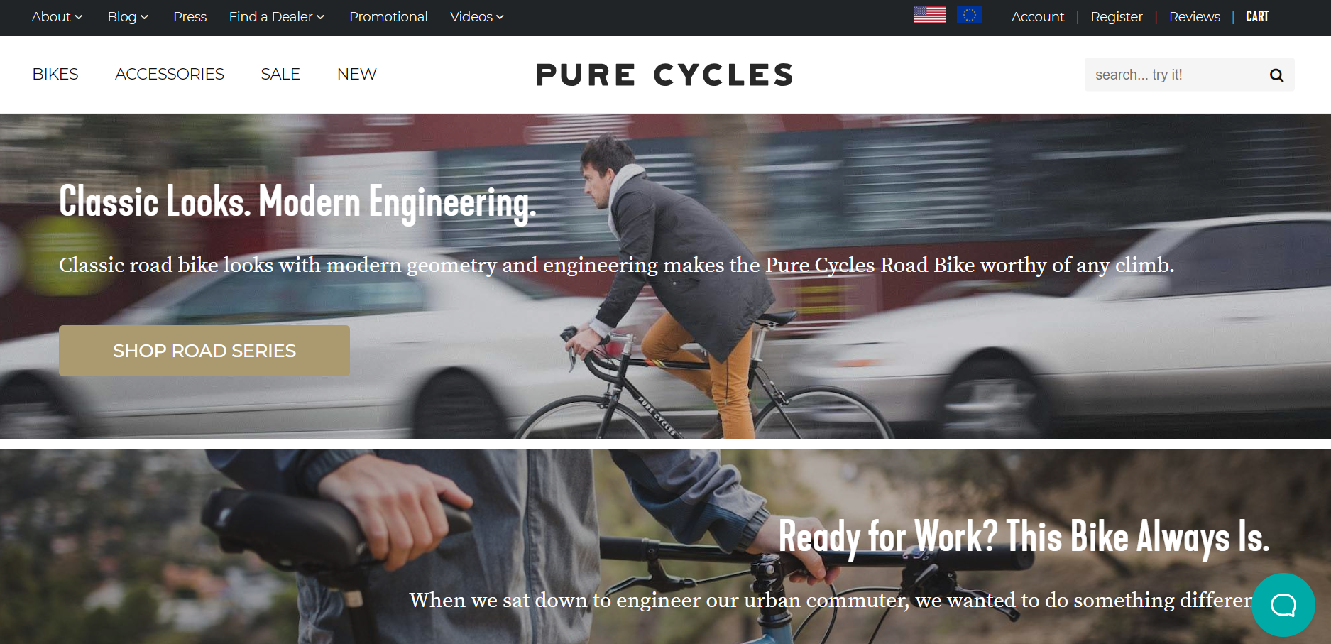
Finally, the last of our featured Shopify Plus sports and health stores, Pure Cycles. A brand on a mission to get more people on bikes, Pure Cycles have been designing, developing and delivering ‘the coolest bikes on the market’ for almost 10 years. Their bikes span a range of disciplines and occasions, combining the key components of affordability and aestheticism. Pure Cycles are known for being the first bicycle company to introduce the glow in the dark bike! They’re also making waves in the Shopify arena by harnessing the power of advanced augmented reality technology to provide consumers with an immersive, empowering shopping experience. Shoppers can rather coolly explore every inch of a product from their smartphone. After eight years in operation, this LA-based sports brand are turning over $6.7 million a year.
Asking Dan McIvor, Shopify Plus Expert and Founder of Swanky:
“What is Pure Cycles gaining from being on Shopify Plus?”
“Much like Altitude Sports, Purce Cycles feature a large number of varied products and brands on their ecommerce store. Being on Shopify Plus gives them the stability they need to confidently implement changes on their site and cultivate positive relationships with brands they supply.
The mega menu is a particularly cool feature of this store upon first look. However, it could prove frustrating for users, as the menu tiles aren’t activated by a rollover as you would expect. I’d be interested to know whether this menu was tested and what improvement they saw as a result. If it hasn’t been tested, although it looks good aesthetically, it might not be helping the overall user experience.”
Asking Matt Giles, Creative Director at Swanky:
“What are the strongest aspects of this ecommerce store’s design?”
“The expansive, broad design of this ecommerce store allows for large, impactful imagery. There’s a great mix of imagery to communicate lifestyle possibilities and the flexibility of Pure Cycles’ products. The clean and refined colour palette of white, black and gold allows their products to speak for themselves, whilst reinforcing the ‘pure’ aspect of the brand.
Also, this store’s product pages present helpful rider measurement guides when you hover over each bike size. This is a cool feature which enhances the user experience.”
Asking Sean Clanchy, Digital Strategy and Ecommerce expert:
“How could Pure Cycles boost their conversion rate further?”
“Firstly, Pure Cycles could benefit from gender segmentation in the immediate menu or in the page content. This would streamline the user experience and immediately take users to bicycles and products that are tailored to them.
The mobile product pages of this store feature a super-cool augmented reality tool for iOS 12 users. However, Pure Cycles could do a much better job at pointing users towards this innovative feature and explaining how it could benefit their decision-making process. At the moment, it feels like a thoroughly under-merchandised gimmick, when in my opinion, it should be a massive marketing tool. Augmented reality is a huge trend for ecommerce stores this year. Thus, Pure Cycles really need to shout about the impressive technology available at users’ fingertips.”
If you’re feeling inspired by these huge Shopify Plus sports and health stores all enjoying successful growth on the platform, why not take a look at our migration services? The Swanky team is one of the oldest and most knowledgeable on Shopify migrations – we really know our stuff. We love to hear from ambitious ecommerce brands looking to make the most out of their online presence. So, if you’d like to find out more, please feel free to get in touch.
And if you’re looking for more examples of big brands using Shopify Plus, check out our recent blog post featuring 10 of the biggest food and drink stores on the platform.

