10 Big Shopify Plus Food and Drink Stores
Shopify Plus offers a fully-hosted, multi-channel enterprise solution for high-volume ecommerce merchants. Five years on from its launch, it is now the fastest growing enterprise ecommerce platform on the market, powering some of the world’s largest and fastest growing brands.
Written By
Hannah Smiddy
Shopify Plus is the trusted ecommerce solution for thousands of enterprise-sized businesses. Here on the Swanky blog, we’re going to be taking a look at some of the biggest ecommerce names hosting their stores on this exciting platform, starting with 10 huge food and drink brands.
With the global food and drink industry worth over $8 trillion, there are some tasty profits to be had. Large and scaling enterprises need a robust ecommerce platform they can trust though. This is where Shopify Plus comes in.
Here are 10 examples of thriving Shopify Plus food and drink stores, complete with some specialist insight from our team of certified Shopify Plus experts.
Nescafé
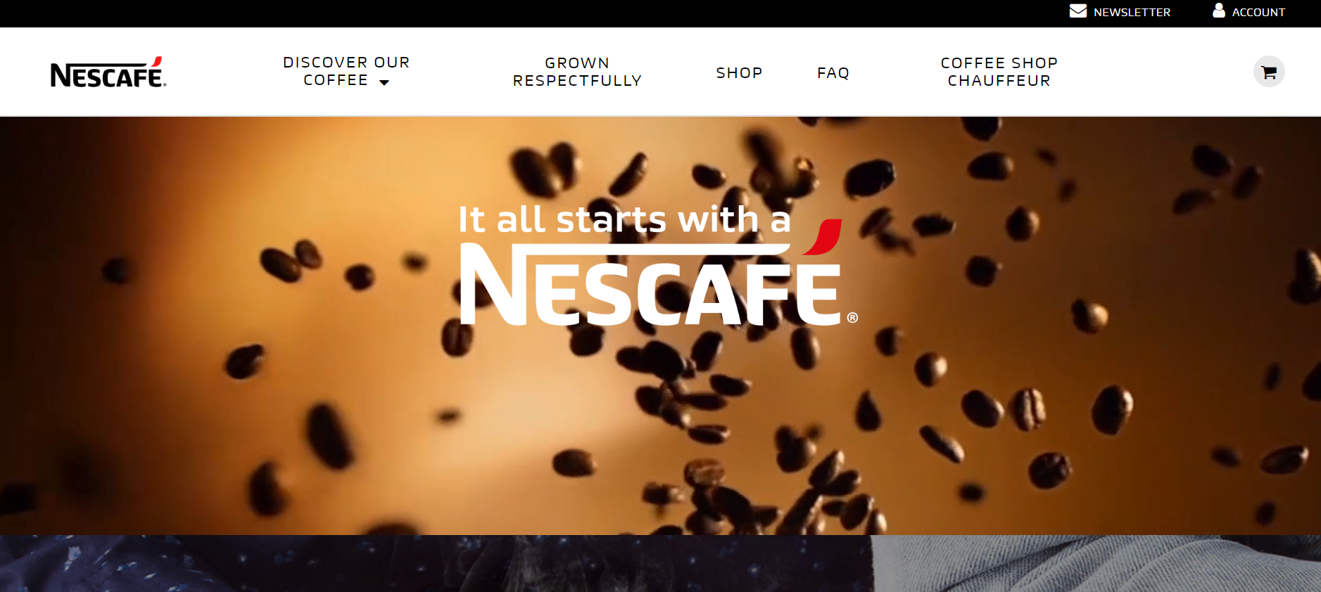
The largest brand in the Nestlé family, Nescafé has a brand turnover of over $9 billion and more than 5,000 products to its name. A truly staggering 5,500 cups of Nescafé coffee are consumed every second. This equates to one-fifth of the coffee served around the world! Their Sweet & Creamy and Gold ranges are available to purchase online through their Shopify Plus-powered store, enabling customers to enjoy a coffee-shop experience at home.
Asking Dan McIvor, Shopify Plus Expert and Founder of Swanky:
“What is Nescafé gaining from being on Shopify Plus?”
“Nescafé’s experience with Shopify Plus is a striking example of the speed at which stores can be created on this platform – as well as the reliability of their results.
Back in 2016, when Nestlé decided that they wanted to market their Nescafé Sweet & Creamy range online, Shopify Plus were given just eight weeks to build out an ecommerce infrastructure from scratch. In the words of Nestlé’s Ecommerce Manager, Arlee Rosenberg, ‘It was almost like we were opening up a brand new shop within Nestlé.’
The results paid off tenfold for Nescafé.”
Read more about this exciting Shopify Plus project and its impressive results here.
Asking Matt Giles, Creative Director at Swanky:
“What are the strongest aspects of this ecommerce store’s design?”
“Nescafé’s ecommerce store is very much video-led. In fact, all of their pages feature large videos. As a result, the user experience is as smooth as the coffee they are trying to sell.
The rapid ‘number of cups of Nescafé enjoyed today’ ticker at the footer of the homepage is also a nice touch, as it demonstrates the popularity of Nescafé’s drinks.
Also, Nescafé’s store is particularly strong when it comes to building trust with the consumer. They place a lot of emphasis on the source of the product. This is a very effective tactic when it comes to generating and maintaining strong customer relationships.”
Asking Sean Clanchy, Digital Strategy and Ecommerce expert:
“How could Nescafé boost their conversion rate further?”
“Nescafé could explore the possibility of a subscription service, as coffee is something that their customers will likely be buying on a regular basis. Subscriptions are a great source of recurring and predictable revenue. They also have the power to strengthen customer loyalty and increase customer lifetime value.
Also, their site is not fully optimised for first-time or one-off shoppers because there is no guest checkout option available. This means that customers may abandon their cart if they do not have the time to complete Nescafé’s sign-up form before making their purchase.”
Budweiser
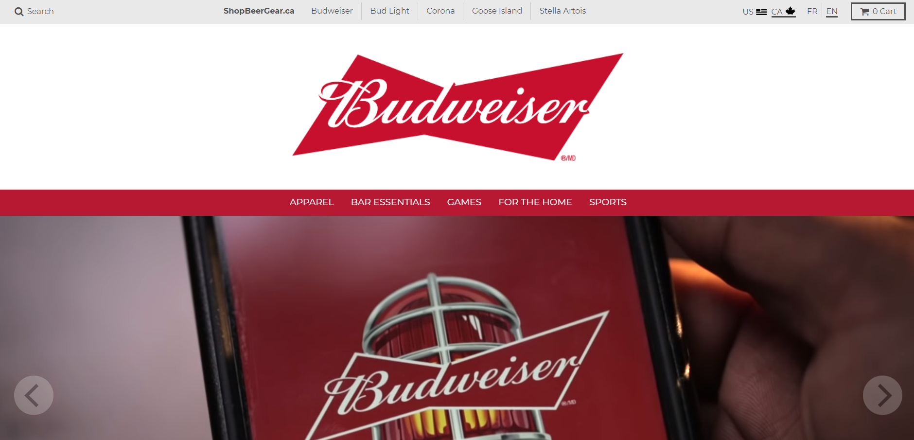
Ranked 25th on Forbes’ ‘World’s Most Valuable Brands 2018’, Budweiser is the no. 4 beer brand in the US. The brand boasts a formidable $11.6 billion in annual revenue. This giant global drinks brand specialise in American-style pale lagers that are available in over 80 markets worldwide. They sell a range of Budweiser merchandise on their Shopify Plus-based ecommerce site.
Asking Dan McIvor, Shopify Plus Expert and Founder of Swanky:
“What is Budweiser gaining from being on Shopify Plus?”
“The Shopify Plus platform makes it easier to manage and customise multiple storefronts at once, which is perfect for Budweiser. It means that each of their trademark drinks (such as Budweiser, Bud Light, Corona and Stella Artois) can have its own customised storefront on the website.”
Asking Matt Giles, Creative Director at Swanky:
“What are the strongest aspects of this ecommerce store’s design?”
“A real highlight of this store is the way that each sub-brand’s homepage features different imagery and colour schemes depending on the ‘vibe’ of the beverage. For example, the Corona imagery is very much focused on a beach theme with pops of blue. Meanwhile, their Stella Artois sub-section features more ‘masculine’ reds and blacks, striking fonts and bold clickable buttons with slogans such as ‘Buy a lady a drink’.
It’s clear that Budweiser have a strong grasp of their different target markets. They have cleverly used their Shopify Plus storefronts to give their customers a different online experience depending on the drink they are searching for.”
Asking Sean Clanchy, Digital Strategy and Ecommerce expert:
“How could Budweiser boost their conversion rate further?”
“By incorporating drop-downs into their product menus, Budweiser could improve their search filtering and also the usability of their store.
The search bar itself (on their default homepage) is not highlighted either. This could be made more prominent in order to help customers navigate to their desired products more quickly.”
Bulletproof
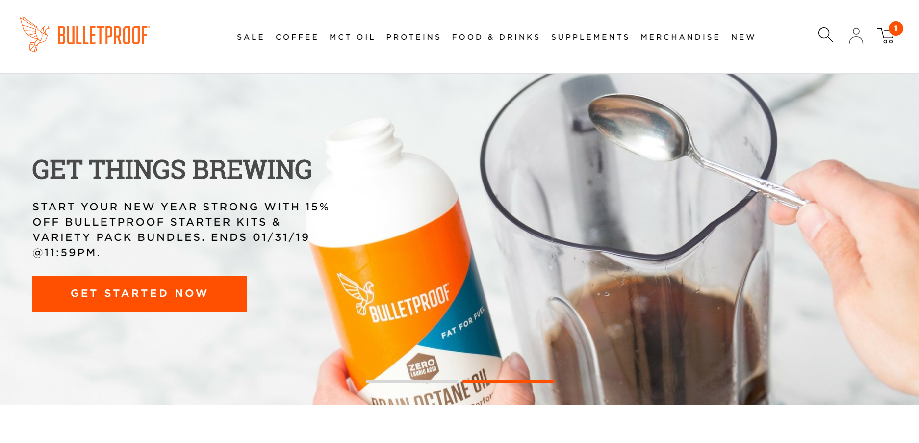
With a staggering 3.25 million visitors to its site every month, Bulletproof is a huge player in the food and drink industry. They are on a mission to help people perform better, think faster and live better with a vast range of high performance foods, drinks and supplements, including their famous collagen-infused protein bars. Shopify Plus handles their high traffic volume with ease, providing a high-power solution for their huge direct-to-consumer operations.
Asking Dan McIvor, Shopify Plus Expert and Founder of Swanky:
“What is Bulletproof gaining from being on Shopify Plus?”
“The main thing that Bulletproof are benefitting from by being on Shopify Plus is its ability to handle large traffic volumes with ease. A site that gets as many monthly visitors as this one is likely to have rather significant spikes in traffic, which Shopify Plus takes in its stride thanks to its unlimited bandwidth and global network of servers.
Interestingly, Bulletproof are using Shopify’s blog functionality to serve podcasts to their audience. This demonstrates that although the blog platform on Shopify Plus is relatively simple, it’s extremely versatile.”
Asking Matt Giles, Creative Director at Swanky:
“What are the strongest aspects of this ecommerce store’s design?”
“Overall, this store features a clean and clear design, with a good combination of colourful lifestyle images and crisp product imagery. High-quality product imagery is vital for building trust with consumers and establishing a reputation as a reliable brand.
The benefits of each product are clearly communicated as well, with good use of iconography to improve the user experience.
On Bulletproof’s mobile site, the design incorporates a prominent search function immediately under the header. This empowers the user straight away, helping provide a smooth purchasing journey.”
Asking Sean Clanchy, Digital Strategy and Ecommerce expert:
“How could Bulletproof boost their conversion rate further?”
“Bulletproof could look to make use of iconography in their mega menus, as currently these are very text-heavy. This would help to highlight the core user journeys and improve navigation.
On the homepage, the only form of social validation is review stars beneath the products. To help build trust between consumers and their brand, Bulletproof could consider featuring a curated social feed of happy product users, with endorsements from reputable health editorials.
Whilst they do offer a ‘subscribe and save’ service, there is potential for Bulletproof to make this the default setting on their product pages. This would help to drive subscription purchases, which tends to result in higher customer lifetime value.
The features and benefits of each product are clearly defined on the product pages, with good use of clear, consistent iconography as Matt pointed out. However, these are hidden below the fold. We’d recommend moving these higher up the page where they should have greater impact.”
Red Bull
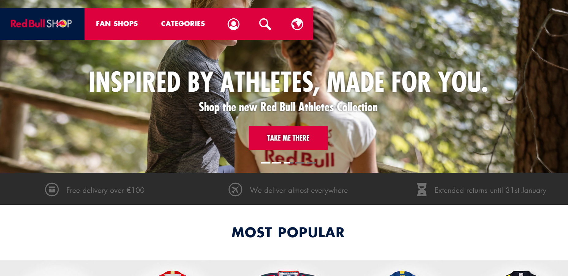
Global energy drink giant Red Bull has the highest market share of any energy drink in the world, with an annual turnover of €6.3 billion. They sell billions of cans worldwide every year (over 6.3 billion in 2017!) and have several lucrative sports sponsorship and endorsement deals. This Austrian brand continue to dominate the industry in a number of international markets. Their Shopify Plus ecommerce store sells a range of official Red Bull clothing, accessories and gifts, with over 400,000 monthly site visits.
Asking Dan McIvor, Shopify Plus Expert and Founder of Swanky:
“What is Red Bull gaining from being on Shopify Plus?”
“Shopify Plus’ global cloud-hosting infrastructure makes all of the stores it hosts highly speed optimised, which is perfect for a brand like Red Bull whose image is based around energy and speed. Its customers are guaranteed the snappy and seamless experience that they have come to expect from the brand.”
Asking Matt Giles, Creative Director at Swanky:
“What are the strongest aspects of this ecommerce store’s design?”
“Red Bull clearly know their market. As a result, their store is very well-branded and delivers a clear lifestyle image geared towards a mostly male demographic. For instance, the font they have used is strikingly masculine and the featured homepage images are largely of men’s merchandise.
Red Bull’s product pages are also extremely product-focused. They draw attention to their product images by using a lot of whitespace around them – a very effective design tactic.”
Asking Sean Clanchy, Digital Strategy and Ecommerce expert:
“How could Red Bull boost their conversion rate further?”
“The store’s categorisation of their search filters could use some improvement, as there appears to be a glitch in the website which suggests random and unrelated words and products when users attempt to filter items on the collection page by size or colour.”
SkinnyMe Tea
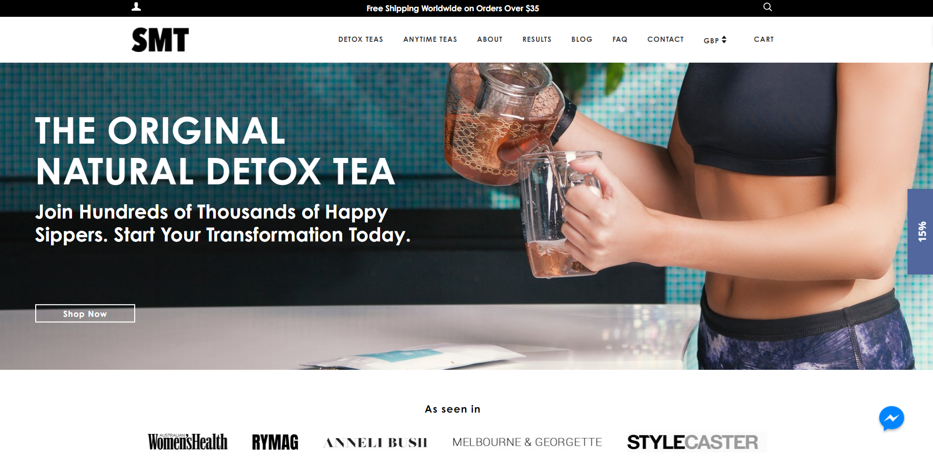
Australian-based ‘teatox’ company SkinnyMe Tea are passionate about helping people achieve their health and wellness goals with all-natural detox teas. Founded by serial start-up entrepreneur Gretta van Riel when she was just 22 years old, this globally successful healthy drinks brand scaled to sell over 11 million cups of tea worldwide in five years. Since winning Shopify’s Build-A-Business competition in 2013, the brand has evolved into a powerful ecommerce enterprise using the Shopify Plus platform.
Asking Dan McIvor, Shopify Plus Expert and Founder of Swanky:
“What is SkinnyMe Tea gaining from being on Shopify Plus?”
“SkinnyMe Tea make good use of promotion options within their Shopify theme. Shopify makes it easy to add and manage sections like this without the need for design and development work.
It’s surprising that this brand doesn’t make use of any subscription functionality. Shopify Plus’ most popular subscription app is ReCharge, which makes it easy to begin selling products on a recurring basis. For larger merchants like SkinnyMe Tea, ReCharge offers a huge amount of customisation functionality to drive tailored subscription experiences.”
Asking Matt Giles, Creative Director at Swanky:
“What are the strongest aspects of this ecommerce store’s design?”
“SkinnyMe Tea’s ecommerce store leads with appealing imagery for both of their markets (tea for health and tea for enjoyment). This drives immediate segmentation and aids users on their buying journey.
The brand are delivering a clear lifestyle image geared perfectly towards their female, health-conscious market. They use balanced, calming and feminine colours alongside aspirational lifestyle photos to achieve this.”
Asking Sean Clanchy, Digital Strategy and Ecommerce expert:
“How could SkinnyMe Tea boost their conversion rate further?”
“SkinnyMe Tea could benefit by reviewing and refining their menu options, as users are presented with a high number of choices in the top menu. The more choices there are, the more likely they are to feel overwhelmed and even leave the site in favour of a simpler, more user-friendly experience.
The highest cost, highest value products are often hidden at the base of SkinnyMe Tea’s collection pages. We would recommend promoting these high value packs at the top of these pages as a way of potentially increasing average order values.
On their product pages, there are various strategies that may help improve conversion rates. For instance, we would recommend making the add to cart buttons more effective by changing the colour to something more impactful, whilst also moving the customer reviews so they are placed above the fold.”
Harris Farm Markets
This 100% family-owned and operated grocery chain are on a mission to reconnect the people of Australia with the joy of food. Harris Farm Markets, Australia’s biggest individual retailer of fruit and vegetables, pride themselves on operating sustainably and maintaining close relationships with local, quality farmers. They sell a range of meats, groceries and meal kits through their online store, even promising same day delivery in some areas.
Speaking of Harris Farm’s success since moving to Shopify Plus, Co-CEO Angus Harris said:
“Our website traffic has increased five times compared to pre-Shopify Plus. Our business is currently growing at a rate of approximately 20% quarterly. We now have 85,000 unique monthly visitors and bring in an average of 900 orders per week.”
Asking Dan McIvor, Shopify Plus Expert and Founder of Swanky:
“What is Harris Farm Markets gaining from being on Shopify Plus?”
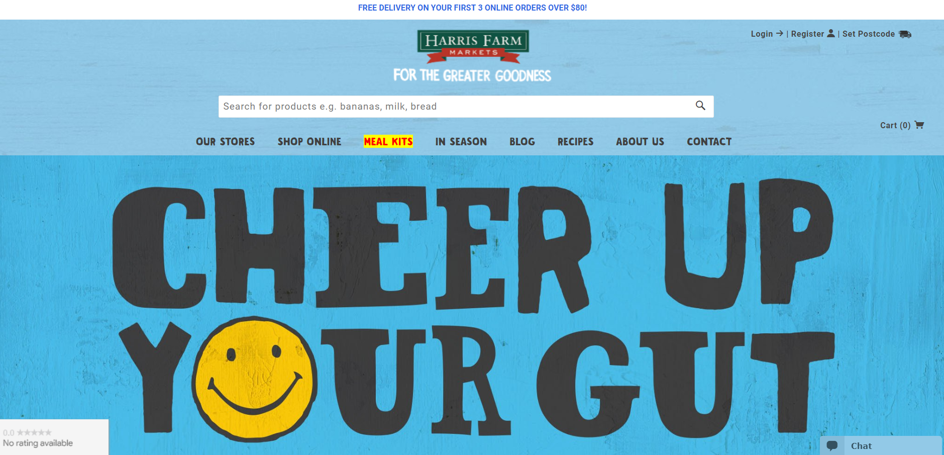
“It’s good to see a store with so much energy, with a mix of large images and animations. However, this makes the homepage feel a bit intense, and might mean that users feel overwhelmed about where to click next. Fortunately, the flexibility of Shopify’s theme editor will allow Harris Farm Markets to rearrange all their homepage elements quickly and easily. This store would make a good candidate for some A/B testing. It would be interesting to test different versions of the homepage element hierarchy to establish which ones result in better engagement.
The Harris Farm blog has the same fun and vibrant feel as the homepage, which will encourage users to read through different articles and really take time to explore what this brand is about. This is great for brand engagement.
In terms of the product pages, the tailored approach Harris Farm has taken for these demonstrates that there are no limits to how unique Shopify Plus product pages can be. The platform offers advanced functionality and flexibility, which is perfect for brands like Harris Farm who are constantly growing and evolving.
Finally, it’s great to see that Harris Farm are upselling additional pantry items such as cooking oil with their meal kits. At first glance, I thought they were offering bottles of wine as upsell items – this would be a really compelling add-on to complement customers’ meals!”
Asking Matt Giles, Creative Director at Swanky:
“What are the strongest aspects of this ecommerce store’s design?”
“The design of Harris Farm’s ecommerce store appeals to an ethical lifestyle through the use of colourful and rustic typeface and imagery. They clearly understand their target consumer, and have chosen design elements to reflect their values as a friendly, sustainable food brand.
Their mission to ‘reconnect people with the natural joy of food’ is reflected in the site’s fun and playful design, complete with hand-drawn-style images.”
Asking Sean Clanchy, Digital Strategy and Ecommerce expert:
“How could Harris Farm Markets boost their conversion rate further?”
“Generally, Harris Farm’s homepage is very busy, with lots of large blocks of content. This could make the customer journey harder, as it increases cognitive load and could mean users miss essential information. As Dan suggested, this is something that can be easily edited using Shopify Plus’ intuitive theme editor.
Also, a full-width mega menu would be far easier for users to navigate. They could consider using icons within a wider mega menu, as this would help to highlight their most profitable product lines.
When it comes to Harris Farm’s mobile site, there is a lot of negative space within the design. There is certainly room to increase the size of the add to cart button, which would help customers reach the next stage of their purchase journey.”
Death Wish Coffee Company
Producers of the ‘world’s strongest coffee’, Death Wish Coffee Company burst into the public eye in 2015 when they won a free 30-second Super Bowl 50 commercial slot. They saw a phenomenal $2,083 of sales a minute in the two hours after the Super Bowl. This is something that their Shopify Plus store was able to handle seamlessly. Since then, this drinks brand has achieved global success, winning over coffee drinkers all round the world. Their ecommerce store sees monthly web traffic of over 665,000 visitors.
Mike Brown, Death Wish founder, has had nothing but praise for Shopify Plus:
“Shopify is absolutely awesome. We swear by Shopify now and wouldn’t be where we are today without it. I can add a product instantly and you don’t have to be an expert coder since Shopify has its own experts to help with the backend if needed.”
Asking Dan McIvor, Shopify Plus Expert and Founder of Swanky:
“What is Death Wish Coffee gaining from being on Shopify Plus?”
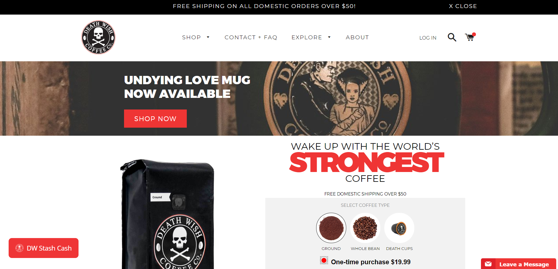
“I really like that they have a product, with purchase form, above the fold on the homepage. We have tested this with some of our clients and it did lead to increased conversion rates, so it’s clear why they are employing this tactic. However, this could potentially be at the cost of long-term brand engagement and customer lifetime value.
The fact that they are using a single store to sell their core product offering alongside merchandise demonstrates just how flexible Shopify Plus is as an ecommerce platform. It offers a wealth of options for growing enterprises, with the freedom for these brands to adapt and evolve with the market.
Death Wish Coffee are also making use of a Shopify Plus-driven wholesale portal, which is a great way for the brand to get their products to distributors without the traditional admin burden. Shopify Plus allows enterprises to widen their reach with its dedicated wholesale channel, allowing effective B2B operation alongside a direct-to-consumer approach.”
Asking Matt Giles, Creative Director at Swanky:
“What are the strongest aspects of this ecommerce store’s design?”
“Death Wish Coffee make a big claim about their ultra-strong coffee, which is reflected in their choice of design elements. The bold typeface and aggressive colouring are combined with clean execution to really make an impact, just like their products.”
Asking Sean Clanchy, Digital Strategy and Ecommerce expert:
“How could Death Wish Coffee boost their conversion rate further?”
“On the homepage, the main call to action button could benefit from being a different colour to the main brand colours. This would help draw attention to this route-to-purchase and potentially increase conversion rates. There are no visual reviews above the fold on the homepage either. Reviews are a great way to drive customer engagement and convince new buyers to try a product for themselves.
The site could be better served by a more visual mega menu as well. The current dropdown menu is quite indistinct – rectifying this could result in quicker navigation for customers.
Finally, the cart doesn’t highlight the main journey to purchase, which could be a problem for conversion. This crucial part of the store would benefit from a more dominant checkout button.”
Jones Soda Co.
Seattle-based drinks company Jones Soda Co. bottles and distributes premium sodas. They are perhaps best known across the market for their weird and wonderful flavours, user-generated label photographs and collectable bottle caps. Following a turbulent stretch for the company (34 straight quarters without a profit!), and with mounting frustrations over their Magento-based ecommerce site, they made the move to Shopify Plus in 2016. Jones Soda is now boasting annual sales of $13.35 million.
Discussing how pleased she was to see Jones Soda replatform to Shopify Plus, Cassie Smith, Jones Soda Ecommerce Manager, said:
“I fell in love with the Shopify app structure. Implementing doesn’t require a big commitment or custom build, so we can experiment a ton and launch almost immediately.”
Asking Dan McIvor, Shopify Plus Expert and Founder of Swanky:
“What is Jones Soda gaining from being on Shopify Plus?”
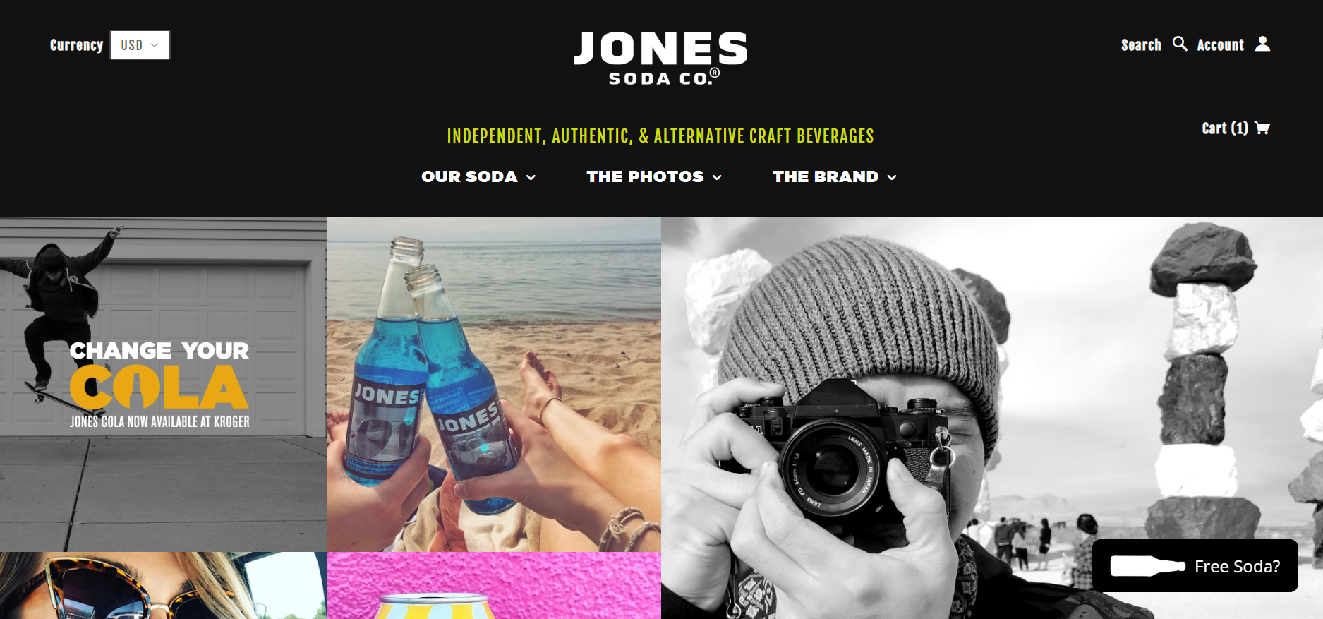
“This is another store that demonstrates how flexible Shopify Plus is an ecommerce platform. It’s an unusual-looking store with an edgy, modern and youthful feel. There’s lots of room for creativity within Shopify Plus, which suits an alternative brand like Jones Soda who clearly want to stand out from the crowd.
At first inspection, it doesn’t even feel like an online shop, but more like a restaurant or magazine homepage. This could be a positive or negative thing depending on Jones’ goals. It is clearly a conscious choice, where they have opted to emphasise their brand story with lifestyle images of their products, rather than immediately pushing customers through the purchase funnel. This may seem counter intuitive, but stronger brand affinity has been proven to increase conversion rates, average order values and lifetime spend.”
Asking Matt Giles, Creative Director at Swanky:
“What are the strongest aspects of this ecommerce store’s design?”
“Jones Soda’s site offers clean, fun and friendly imagery to help connect with consumers. The homepage is very impactful, with a collage-style grid of bold photos and graphics.
The customisation option included on the product pages is very cool as well!”
Asking Sean Clanchy, Digital Strategy and Ecommerce expert:
“How could Jones Soda boost their conversion rate further?”
“Jones Soda could benefit from increasing button size across their site, as well as choosing a more impactful colour for these calls to action. This would really aid with visual navigation and help progress the customer journey.
In terms of the add to cart button on their product pages, its positioning on the left hand side of the screen may be detrimental to conversion success. This is because it conflicts with people’s expectations of the add to cart button traditionally being positioned on the right hand side of their screen.”
The Hummingbird Bakery
Famous for bringing fresh, authentic American cakes and desserts to London, The Hummingbird Bakery has become an iconic brand for those who love to indulge in a sweet treat or two. The first bakery was launched in Notting Hill in early 2004, and now, 15 years on, the brand is enjoying sweet success with a Shopify Plus-based ecommerce store and six further branches.
Asking Dan McIvor, Shopify Plus Expert and Founder of Swanky:
“What is The Hummingbird Bakery gaining from being on Shopify Plus?”
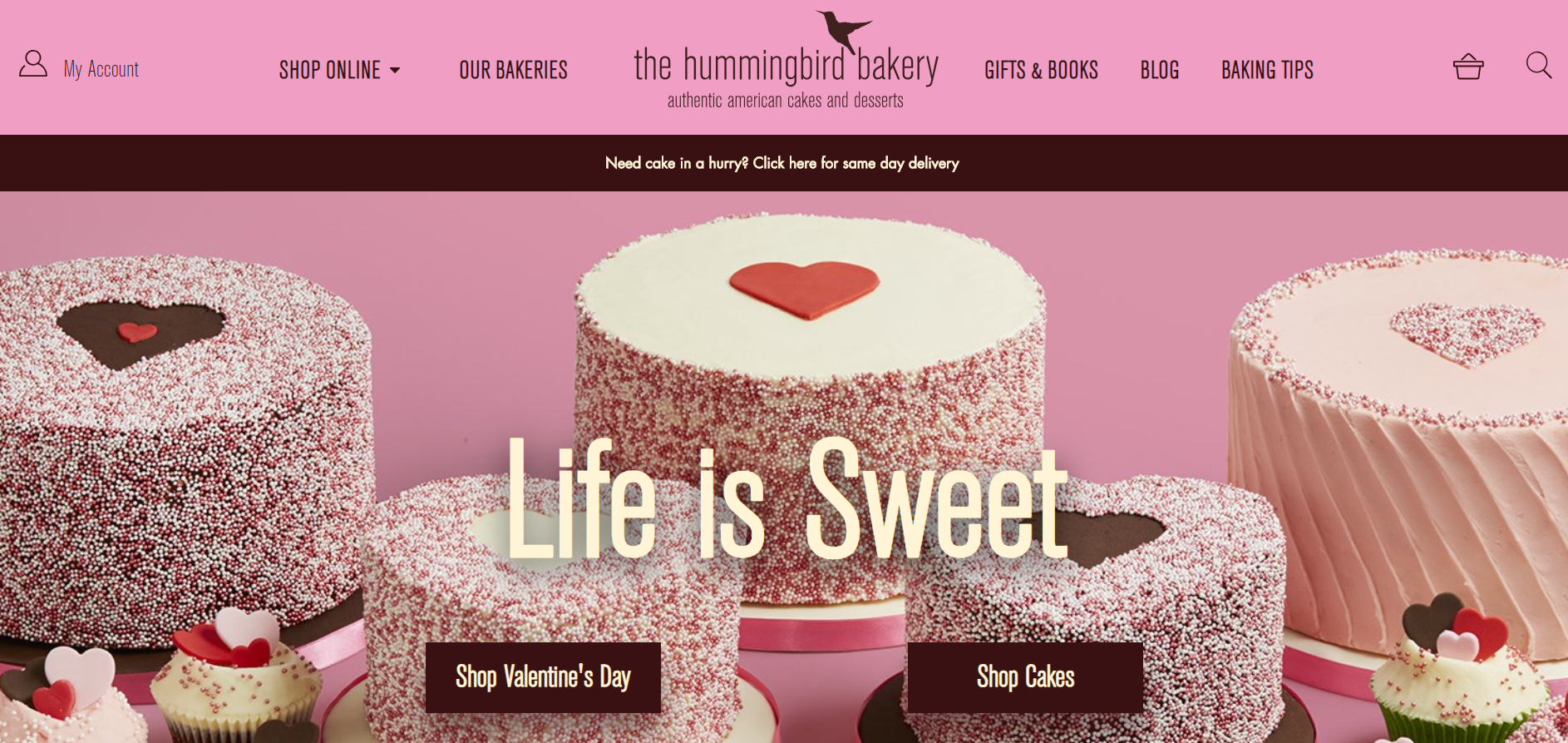
“The Hummingbird Bakery feels like the kind of business that Shopify was originally made for. Simple products and a simple message, but with quirky and unique presentation and functionality that make the site feel like more than the sum of its parts. Nowadays, Shopify Plus can do a whole lot more, but this store feels like a good use of the platform to yield simple but powerful results.”
Asking Matt Giles, Creative Director at Swanky:
“What are the strongest aspects of this ecommerce store’s design?”
“Hummingbird Bakery’s product pages are clean and simple, with good use of iconography to denote cake sizes and servings. The rich colours of the product images contrast well with the use of whitespace, instantly drawing attention to the products.
Furthermore, the store features a very nicely designed ‘Our Customer Favourites’ carousel. This is a great way to showcase top performing products.”
Asking Sean Clanchy, Digital Strategy and Ecommerce expert:
“How could The Hummingbird Bakery boost their conversion rate further?”
“Products are pinned below the fold on this store’s collection pages, which means customers take longer to reach them. We would recommend reducing the amount of content above the fold to better promote the products and streamline the user journey.
We would also advise featuring product reviews on the store. Social proof helps to build trust and endorsement, which is particularly useful for conversion rates on food stores like this one.
Finally, The Hummingbird Bakery could make more use of iconography throughout their desktop and mobile sites. For instance, their dropdown menu is very text-heavy and could benefit from the addition of icons. This would help to aid visual navigation and could contribute to increased conversions.”
Vinebox
‘Life is too short to drink bad wine’, say Vinebox on their Shopify Plus-driven ecommerce store. Premium wine-by-the-glass subscription service Vinebox is the first of its kind. Members can explore a selection of wines which are sent direct to their door. Vinebox pride themselves on their patented fractioning technology which gives their wines a fully-maintained bouquet and flavour profile. In just three years, this San Francisco-based drinks brand are turning over $2 million in revenue.
Asking Dan McIvor, Shopify Plus Expert and Founder of Swanky:
“What is Vinebox gaining from being on Shopify Plus?”
“Shopify Plus has some very neat subscription functionality, and it’s great to see that Vinebox are making the most out of this. They are following the trend of curation-based subscriptions, with a cool survey to create a tailored wine box. Their subscription creation process is the simplest and quickest I’ve seen – this is great for increasing sign up and providing a seamless customer experience.
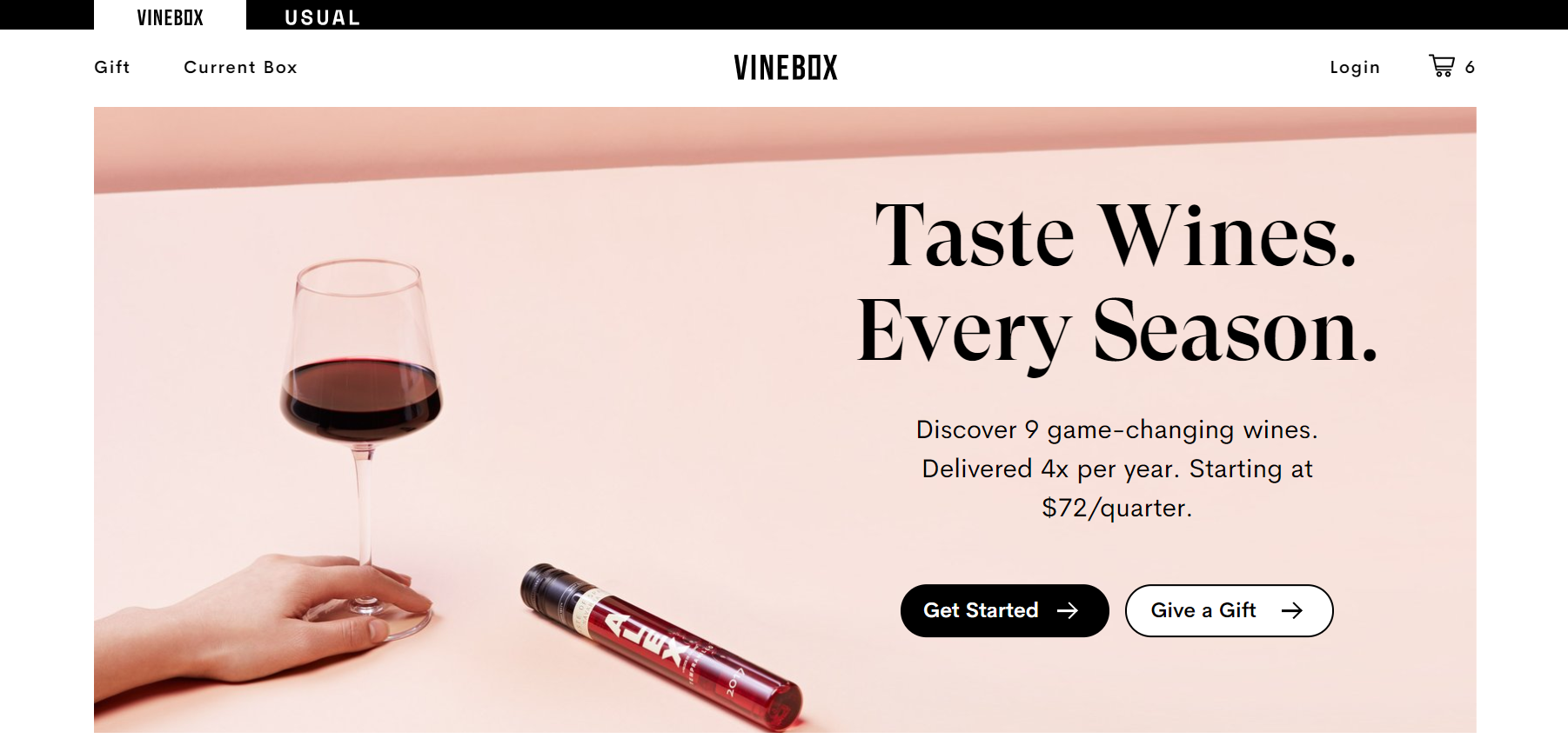
I also really like how the simplicity and clarity of this store’s design makes their offering really clear from the get-go. Visitors immediately know what it is they can expect from Vinebox.”
Asking Matt Giles, Creative Director at Swanky:
“What are the strongest aspects of this ecommerce store’s design?”
“Vinebox have clearly taken into account the different types of people visiting their site. They’ve used their knowledge of their visitor profiles to make some clever design choices, ensuring that their ecommerce store appeals to various consumer needs. They use a strong mix of broadsheet-style serif fonts and sans serif fonts with rounded buttons to communicate an established, intelligent feel to the educated consumer. Meanwhile, the design manages to maintain a balanced, modern and forward-thinking edge, which appeals to those looking for something new to try. Also, their calls to action are either subtly or strongly styled depending on the content, context and consumer level of intent.
The inclusion of social validation in their design is particularly strong. The site features a cute carousel of quotes and reviews from large editorials that are popular amongst the target demographic.”
Asking Sean Clanchy, Digital Strategy and Ecommerce expert:
“How could Vinebox boost their conversion rate further?”
“The Vinebox homepage generally has a good layout that communicates their value proposition and product benefits early on in the user journey, as Dan pointed out. They make good use of a social validation carousel, but they could move this higher up the page to have more of an impact. There’s no standard menu on the homepage either, which could be disconcerting for users who are looking for particular information (especially with no search functionality!).
On the ‘Give a gift’ page, users are offered 6-month and 12-month subscription options, each with different prices. Whilst the best deal has been highlighted with a small green triangle, they could potentially increase conversions by communicating the tangible monetary value being saved with the 12-month option.
Finally, to boost conversions on their Log in/Sign up page, Vinebox could consider adding some content to communicate the value of a user account. Currently this page features a solitary sign up form, so there is plenty of scope to list the benefits of creating a Vinebox account, perhaps with some on-brand iconography.”
Feeling inspired by these thriving Shopify Plus food and drink stores? Want to know more about what Shopify Plus can offer your growing ecommerce store? To find out more about the benefits of migrating your enterprise to Shopify Plus, please feel free to get in touch with our friendly team of experts – we’d love to hear from you!
Over the coming weeks, we’ll be taking a look at some more of the biggest, fastest-growing Shopify Plus stores on the web. Next up, we explore 10 sports and health power-brands who have all chosen Shopify Plus as their winning enterprise ecommerce platform.

