Best Practices For Your Klaviyo Email Design
In this article, our in-house Klaviyo specialist Sarah Hanney shares 11 top tips for creating impactful ecommerce emails that drive clicks and conversions.
Written By
Sarah Hanney

Email is one of the most valuable ways of communicating with your loyal customers. From welcome flows to post-purchase notifications, the emails that land in shoppers’ inboxes can have a significant impact on their perception of, and journey with, your brand.
When it comes to designing your ecommerce emails, there is a lot to take into account. These emails need to communicate your brand story, engaging new and returning customers to build long-term relationships, as well as driving commercial value.
As a certified Klaviyo email marketing agency, Swanky offers Klaviyo email template design as either a one-off service or ongoing package, to help retailers craft emails that communicate their brand in the best possible way.
Here are some top tips we recommend when it comes to best practice for Klaviyo email design, based on our experience leveraging Klaviyo for a range of clients over the past five years.
Klaviyo email design tips
1. Intriguing subject line
The aim of your subject line is to peak your recipients’ interest enough for them to open and read your email. Klaviyo has excellent AI functionality which will help you brainstorm good subject line ideas based on the theme of your email.
Think catchy and concise, offering the recipient something of value that will be worth their time exploring further.
2. Simple, scannable layout
The average time spent reading an email is 9 seconds.1 That doesn’t give you a lot of time to capture your readers’ attention, so you need to make sure your email layout is easy to scan and delivers a clear message.
As a general rule, use a clean, single-column layout with a vertical orientation. Klaviyo allows for a width of 600px, and you should certainly avoid going any wider than 640px.
That said, multi-column layouts can be effective in certain circumstances where the email has more than one call to action (CTA) – for example, newsletters.
3. Attention-grabbing hero area
The hero area is the first visual that people will see when they open your email, giving them a snapshot of what the email is about. Its aim is to grab the recipient’s attention and direct them towards a CTA.
Consider the following tips when designing the hero section of your emails:
- Include your brand logo at the top to allow the reader to identify the brand immediately.
- Make sure your CTA is clear and immediately visible. Favour big, bold typography that will make the purpose of your email obvious from the moment the recipient opens your email.
- Use attention-grabbing imagery to draw the reader into the email, and peak their interest to keep reading.
4. Clear hierarchy
In order to help readers consume email content quickly, you should aim to create visual differences which reinforce the key areas of focus within the email. This includes:
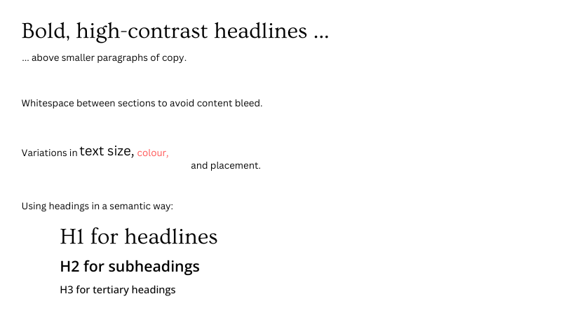
5. Readability
Good readability will help your email subscribers absorb content more intuitively, reducing the cognitive load and making them more likely to respond positively. Key features to consider for readability are:
- Left-aligned copy: This is easier to read since our brains are trained to read left to right. This applies to any body copy that is longer than three lines.
- Line height: Limit line height to 1.5-2 times the size of the text, since this is easier to read than single spacing.
- Font size: Use a minimum font size of 14px so your email readable on mobile. Ideally text should be at least 15-18 px and headers should be around 22 px.
6. Web safe fonts vs web fonts
There are pros and cons to choosing either web fonts or web safe fonts for your email templates. Web fonts are typefaces that are pulled in from a server. As such, they are not available on all operating systems. If your recipient’s email client does not support web fonts, your customer will instead see a fallback web safe font.
Web fonts offer a far wider selection of typefaces, offering you creative freedom and allowing you to remain true to your brand guidelines. Using a more unique font can help you stand out from the crowd compared to other emails in your customers’ inboxes. You can then select a backup web safe font in case your font is not supported.
However, the risk with using web fonts is that your email may not render as planned to your recipients. Web fonts may therefore require more development and testing time.
Opting for a web safe font from the get-go is a less risky approach. You are able to guarantee consistency, and control your design, since you are able to view the design as all of your recipients will, including those who cannot view web fonts.
7. Effective CTAs
Boost the conversion of your primary CTAs in your Klaviyo email design by following these best practices:
- Styling it as a button.
- Making the CTA button a different colour to other design elements.
- Using larger/bolder typography.
- Using about 30-50px whitespace around the CTA button so it doesn’t get lost amongst other design elements.
If you have more than one CTA, ensure your secondary CTA does not compete with the primary one. To style this in a less dominant way you could either:
- include it as an in-text link, styled in a different colour and underlined; or
- if using a button, make it more muted than the primary CTA button – e.g. using a lighter colour, or just a border.
8. Mobile responsive design
Don’t forget that the majority of your customers will be reading your emails from their mobile devices. With this in mind, ensure that your email design works well at any size or orientation.
Be sure to leave enough space between links for users to easily tap the one they choose using their thumb, without accidentally pressing the wrong one.
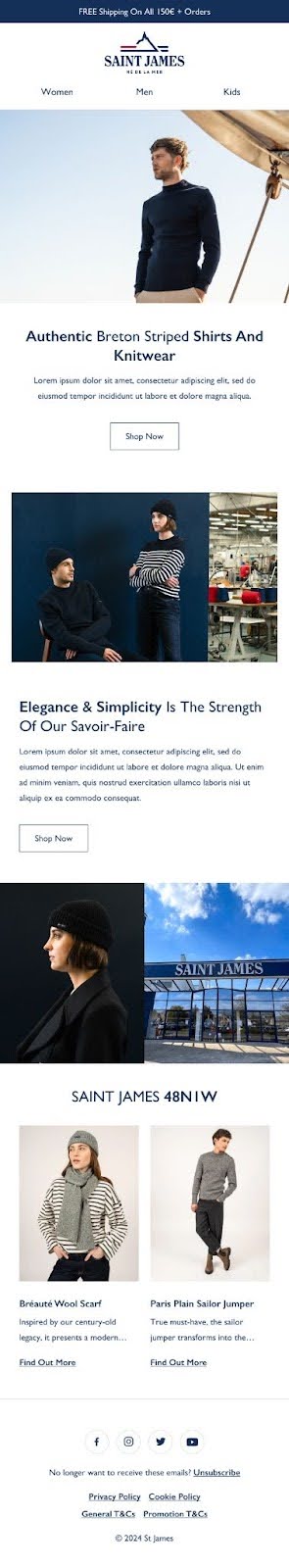
Below is an email template example that Swanky created for fashion brand Saint James. You’ll see slight variations between the mobile and desktop templates, with both displaying a clear brand logo in the header, and the ability for customers to switch between clothing types by a top menu.
Each section of the email includes a carefully chosen image, a clear heading, and an obvious CTA button.

9. Designing for Dark Mode
Dark Mode inverts or darkens the colours that you see on the screen. It reduces eye strain and preserves battery, and as such, it’s becoming increasingly popular amongst device users.
Dark Mode can significantly impact how your email appears, so following these tips will ensure your email is optimised should users have this mode switched on.
- Use transparent backgrounds on your images to ensure they’re displayed properly. Images with background colours can be difficult to see in dark mode.
- Optimise your logo and social icons. If you use dark colours in your logos/icons, add a thin white border around them to improve readability. It won’t show in light mode, but will make it easier to see in dark mode.
- Use text rather than images of text. This will render better in dark mode.
10. Accessibility
Bear in mind the range of readers that will be receiving your emails, and the diverse range of accessibility needs you might need to cater for. Your emails should therefore be easily accessible to have the widest impact.
Best practice for accessible Klaviyo email design is to:
- avoid image-only emails, as the images cannot be converted into audio;
- ensure text stands out against coloured backgrounds – you can use this online contrast checker to check your emails;
- follow readability best practices (see our advice on this above); and
- write clear, concise copy, avoiding jargon.
11. Compliance
Finally, but importantly, don’t forget to include the unsubscribe link to comply with GDPR and other privacy and data protection laws. This is included as standard by Klaviyo in many of their starter templates, and will direct users to an automated unsubscribe page hosted by Klaviyo.
Leveraging templates for consistent email design
The best way to ensure consistency across all your email flows and campaigns is to create email templates and save them in Klaviyo ready for future use.
Email templates are built of modular blocks and sections that can then be selected and adapted as needed to create each individual email design. This saves your team a lot of time instead of creating each email from scratch, and helps your emails be more recognisable to your recipients.
Swanky works with Klaviyo brands to build email templates for automated flows – such as welcome series, cart abandonment or post-purchase – as well as versatile email templates that can be adapted and used for all marketing campaigns and newsletters.
For high-performance apparel brand Shackleton, Swanky created a new email template and introduced the use of an Abandoned Browse flow, and optimised the Abandoned Cart flow for the first time.
The results reflect the importance of carefully crafted email design alongside poignant messaging:
- After 30 days of implementation, the average click rate of the new email template saw a 297% increase.
- In the first three weeks after launch, the Abandoned Browse flow had an open rate of 61%, click rate of 5% and a placed order rate of nearly 6%. These email engagement levels are well above industry averages for the retail sector.
- In the first month, the Abandoned Cart flow generated 51% of the total revenue that the previous flow had made in 10 months.
Need help with your Klaviyo email design?
If you’re looking to improve the quality of your emails, Swanky’s Klaviyo team can help you refine your email flows and templates. Contact our team today to discuss your requirements.
For reference:
[1] https://www.marketingprofs.com/charts/2023/48537/how-much-time-do-people-typically-spend-looking-at-an-email#:~:text=In%20the%20most%20recent%20