Subscription UX Design: 11 Common Mistakes to Avoid
In this article, our Chief Creative Officer, Matt Giles, gives the lowdown on how to create a winning subscription service on Shopify. He shares 11 common subscription UX design mistakes, and how you can avoid falling into these traps.
Written By
Matt Giles

For online retailers, selling your products via subscription is an excellent way to build customer loyalty, boost your revenue and enjoy increased return on your acquisition costs.
It’s also a trend that is increasingly popular among buyers. 81% of UK households were signed up to at least one subscription service by early 2022 – a significant rise from 65% in the previous year.
But how do you go about making the most of this lucrative sales strategy?
For brands wanting to create a successful offering on service on Shopify Plus, we understand the secrets to exceptional subscription UX design.
We’ve worked with subscription brands from a range of industries, each with varying business models. We’ve designed food and beverage subscription sites for brands such as HelloFresh, Huel and Pasta Evangelists, pet subscription stores for the likes of YuMOVE and Catit, and health and wellbeing subscription websites for brands including Symprove and Daysoft.
Read on to learn about 11 of the most common subscription UX mistakes we encounter, and crucially, how you can avoid these and take your brand from strength to strength.
Mistake #1: Not seeking customer feedback before creating your subscription flow
It’s easy to assume that because you know your product best, you also know best how users should engage with your website. However, this won’t necessarily be the way that users want to engage with it.
Don’t miss out on what your customers are saying.
You have a range of ways to collect customer feedback on your UX design, including your existing analytics, heat-mapping tools, on-site surveys, or in-person UX task-based feedback sessions.
We recommend sense-checking your subscription flow at each stage. You may be surprised to discover that customers interact with it differently to how you expected.
Tip: Actively involve users in your subscription UX design process (listening to and acting on feedback).
Mistake #2: Not testing new ideas before putting them in place
If you’re considering offering a subscription service for the first time, it would be a wise idea to test your offering first, to understand what the most effective approach is.
Similarly, if you’re considering making some changes to your existing subscription – whether these are changes to the offering itself or amendments to your sign-up flow or landing page – these should be backed by test data.
Conversion Rate Optimisation (CRO) is the process of continually testing new improvements to your store using a form of split testing, to determine which design element results in the highest conversion rate. If you’re new to CRO, check out our beginners guide to split testing.
Petcare brand YuMOVE saw year-on-year revenue increase by 150% thanks to Swanky’s on-site testing.
As part of this experimentation program, we tested a new homepage format that personalised the hero image according to a customer’s previous purchases. The image featured either a cat or dog, and presented the ‘Subscribe & Save’ and ‘Buy Now’ calls to action (CTAs) side by side.
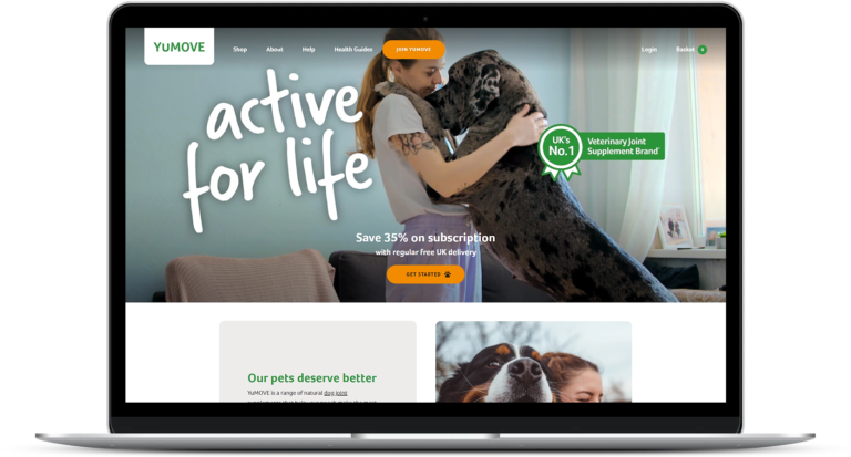
The original homepage design on YuMOVE’s Shopify Plus store.
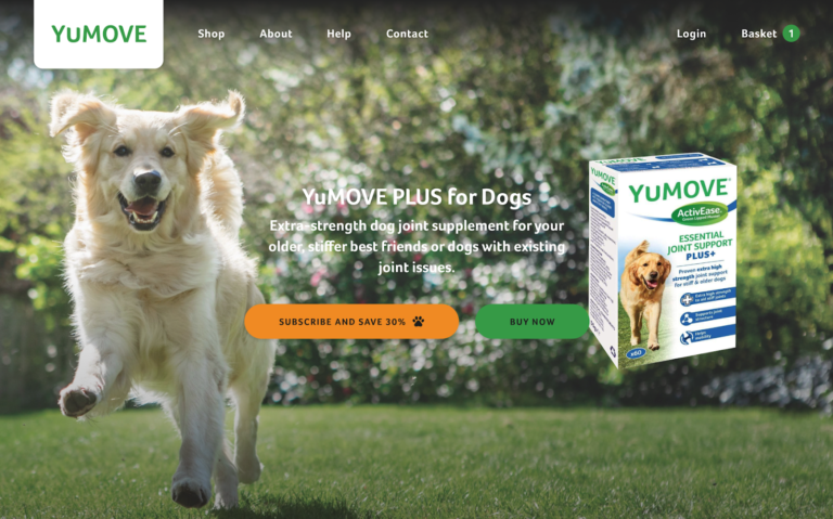

These screenshots show the two variants in our test – one for dog owners and one for cat owners.
This specific test resulted in a 10% increase in purchases.
Tip: Take a prioritised, data-driven approach when implementing new ideas – never rely on your intuition or personal feelings alone.
Mistake #3: Failing to effectively highlight subscription options and their benefits
Subscribed customers mean long-term client relationships with excellent customer lifetime value (plus plenty of other perks that you can read about in our article on the benefits of subscription ecommerce models).
So, you’ll want your UX design to encourage as many users as possible to opt for subscriptions.
If you’re using a toggleable UI, make sure that the two different options – one-time purchase or subscription – are clearly defined. Some websites make the mistake of greying out one of the options, but this can make it appear unavailable, so you want to avoid this approach.
On the other hand, it’s important not to overwhelm the customer with colour. Using too much colour or having conflicting CTAs with similar results can paralyse the user and make it harder for them to pick an option.
When sharing details of subscription options, make the benefits clear, like Daysoft in the example below.
Subscription benefits you could highlight include convenience, flexibility, product discovery and discounts.
Tip: Be distinct enough in your up-sell to subscribe, using elements like colour and iconography.
Mistake #4: Not using tools that allow you to stylise flows or sign-ups according to your brand guidelines
When a user is choosing to subscribe to your brand, it’s likely that they’ve already tried your product and trust you as a brand. So if the subscription flow has a different look and feel to the rest of your site design, this may cause consumers to lose confidence.
Before you choose a subscription solution, check that it will allow you to create the flow in your own brand style, so that the customer feels connected to your brand throughout.
With Recharge’s platform, for example, retailers can customise the CSS styles for their customer portal, checkout and subscription widget, giving each step a bespoke UX design that is consistent with their brand guidelines. This way, the customer knows that they are still on your site and you don’t need to compromise on style.
Tip: Research potential subscription tools thoroughly and look for styling functionality.
Mistake #5: Overloading the customer with information during the subscription process
You may want to give your customer additional information about the product or subscription benefits to help inform their decision. However, take care to avoid distracting the customer from completing the sign-up.
Overloading your customer with information will slow down the process of subscribing, opening up a greater risk of them abandoning the flow before completing it.
Instead of displaying content in full, you could opt for a ‘more info’ accordion, which opens on click, to give the customer access to information if they need it.
Better yet, opt for a tooltip, which gives advice in a very small, simple popup, rather than creating an expanding function that could prove overly distracting.
Tip: Make extra information available upon user discretion, rather than displaying content in full.
Mistake #6: Allowing your customer to order the wrong product or quantity
The last thing you want is your customer to cancel their subscription down the line because they’ve ordered too much product. With this in mind, help your customers to get the best out of your subscriptions by educating them on appropriate quantities.
It’s also worthwhile investing in a subscription platform that gives customers flexibility to skip a month or amend their orders easily via a well designed, user-friendly portal. You can then reassure your customer that they can stay in control of their subscription and amend or cancel it at any time – which is ideal for increasing customer satisfaction and encouraging retention.
We talk more about the importance of flexibility for subscribers in our guide to a successful food and beverage subscription website.
Coffee roasters and Swanky client Union Roasted ensure their customers get the most appropriate product for their needs in just three simple steps. Customers indicate their taste preferences and the equipment they typically use to make their coffee at home – filter or cafetiere, for example – in the first two steps. This means Union Roasted can send them the most appropriate product, without the customer needing to understand the differences between the blends.
In the final step, as customers choose delivery cadence, Union Roasted advise customers of how many cups of coffee each option will give them. The customer can then make an informed decision about how often they schedule their coffee deliveries, without having to estimate it themselves.
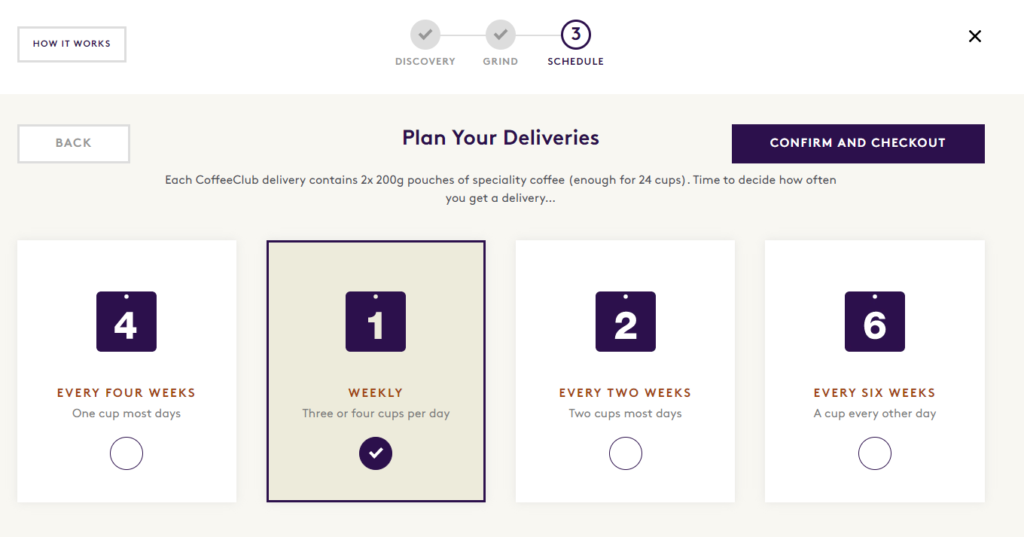

Read more about our work with Union Roasted in this case study about their bespoke ecommerce subscription flow.
Tip: Educate customers and guide them towards the best plan for their personal needs.
Mistake #7: Having an overly complex subscription process
As in the Union Roasted example above, keeping your subscription flow quick and simple will remove any burden from the customer and reduce the risk of cart abandonment.
For more complex subscriptions, be sure to indicate the number of steps left to complete.
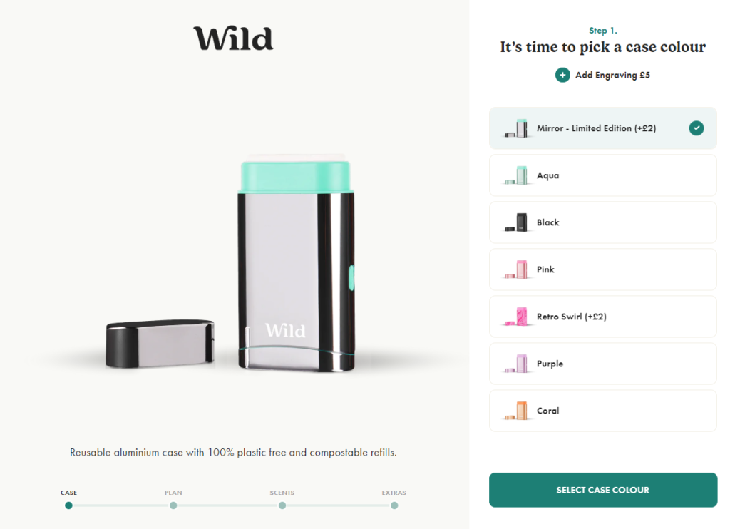
Wild Cosmetics have a progress bar at the bottom of their subscription flow pages, so customers always know at what stage in the process they are at.
CTAs for next steps need to be clear too, to guide customers along the journey.
Here, Wild’s CTA button describes exactly what the customer will do in the next step of the process.
Also, don’t forget to use clearly communicated error states if your customer has not fulfilled the necessary steps to completion, to avoid missing any key information.
Depending on the complexity of your subscription service, you may or may not choose to opt for a multi-screen flow instead of a single page. Remember that your focus is always on creating a customer journey that’s relevant to the complexity of the order process and that will enhance the customer’s experience.
Multi-screen/multi-step flows can be very useful when executed well, since they allow the customer to focus on one important thing at a time, whilst giving you as the merchant the opportunity to create more distinct cross-sell and up-sell moments.
However, when executed poorly – i.e. being too long, with irrelevant sections and a lack of communication around progress – they can be a hindrance to conversion. You want to avoid asking the customer to jump through more hoops than necessary.
Affirm your customer in their journey by giving them feedback as they progress and by personalising the user journey – for example, adding “Oh, you’re going to love that!”.
If you want to guide your user in what amount to order, why not have some logic-based statements around their choice – e.g. “That sounds about right” or “Are you sure that’s enough? You’ll be able to easily amend your subscription if you find it’s not”.
If they’re making good progress through the flow – for example, if they’re building a bundle – use encouraging language like, “That’s great – you’re nearly there! Only one more product to go”.
Tip: Simplify complex subscription processes as much as possible and always indicate user progress.
Mistake #8: Failing to capture contact details before cart abandonment
Cart abandonment happens. Especially with longer flows, customers can get interrupted halfway through completion and fail to progress through the checkout process.
By storing customers’ information, you’ll give them the chance to pick up where they left off at a later date.
Within your first steps, invite them to subscribe to email marketing. This will allow you to follow up with an abandoned cart email that guides them back to complete the form, should they divert from their cart.
You should also look to capture invaluable information about their preferences, should they leave the flow at any point. That way, you’ll be able to remarket more successfully to this customer in the future, sending them targeted product recommendations or promotions, for example.
Pet brand YuMOVE start their subscription process by first capturing contact details, and then recording details about the customer’s pet.
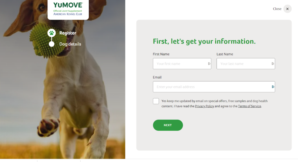
Tip: Gather contact information along the way so customers can return at a later date to complete their purchase.
Mistake #9: Having a static user journey which is not personalised to the individual
Personalisation is a must these days when it comes to marketing, and this is just as true of your subscription flow.
As soon as you capture customer information at each stage of the subscription flow, you can use it throughout the rest of the flow and at future touchpoints to increase your customers’ affinity to your brand.
Other benefits of personalisation include elevated average order value and increased customer lifetime value.
If there is a particular niche of your subscription offering that applies to a customer, customise your UX accordingly. For example, if they have a particular size and breed of dog that they are buying for, why not show them pictures of dogs of similar sizes and breeds in the next steps?
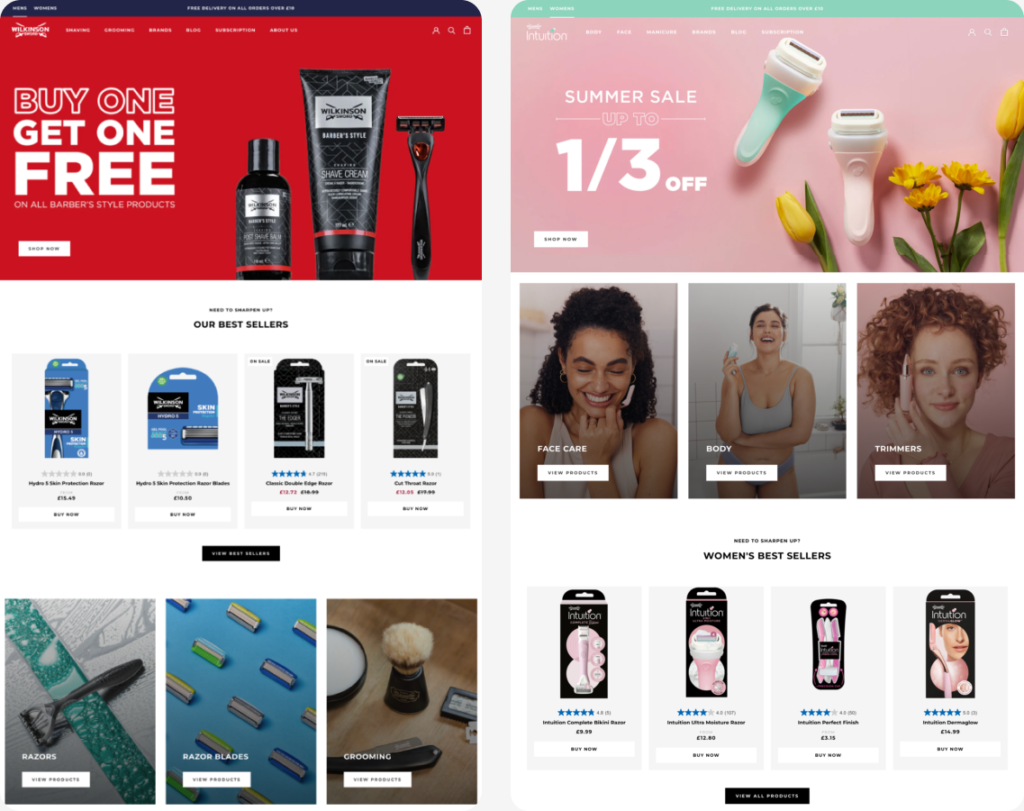
We recently created two separate designs for Wilkinson Sword’s Shopify Plus store to reflect their male and female collections. Once customers select a certain product, they will be served the website in the most suitable format for all subsequent visits. Find out how we achieved this in our Wilkinson Sword case study.
Tip: Collect customer data to tailor the customer experience.
Mistake #10: Neglecting to include other brand USPs at the point of checkout
Even once the customer has begun to move through your subscription sign-up flow, it’s a mistake to assume the job of selling your brand is done.
Encourage your customer to complete their purchase by highlighting your USPs throughout the checkout process, particularly if they increase the perceived value of subscribing.
You could talk about your sustainability impact, for example, or introduce loyalty program benefits.
Offering one-off gifts for signing up to a subscription is a great way to increase perceived value for money.
Communicate the offer quickly and clearly so you don’t let it distract the user. After all, it won’t be the main reason why they continue to buy from you, but it’s a great extra pull to get them over the line.
When nutrition brand and Swanky client Huel launched their subscription offer in 2017, they offered a free t-shirt and shaker to all their new subscription customers. Not only did this have a great impact on their conversion rates, it also had the additional benefit of getting their customers to promote the brand by wearing their branded items. Huel now has a whole product range for clothing and shakers in addition to their core products.
Tip: Highlight USPs to increase perceived value and brand affinity.
Mistake #11: Missing the opportunity to upsell
Once your customer becomes a subscriber, you’ll be building a long-term relationship with them. Since you know that you have a customer who loves your brand, why not improve their customer lifetime value further by upselling add-ons to their subscriptions.
For inspiration, look to Australian brand LiquorLoot who offer their gin subscription customers the option to add a tonic pairing to each of their gin deliveries, for a small additional cost.
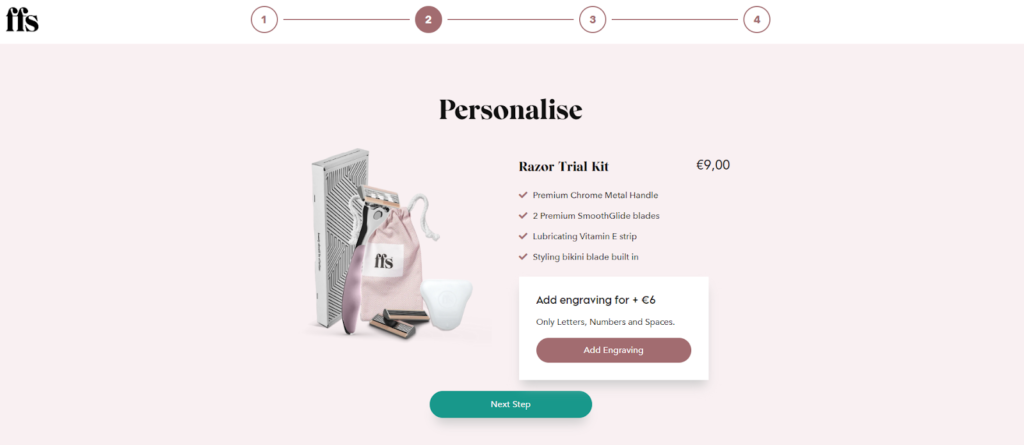
Meanwhile, subscription shaving brand FFS have a flexible subscription process where customers can add one-off items to their regular subscriptions. Customers also have the chance to personalise their razor when they first order it, for an additional cost.
Tip: Offer one time add-ons to subscription flows.
Intelligent UX design for subscription brands
Are you looking to introduce a subscription element to your business, or to optimise your existing offering?
As a leading authority on DTC subscriptions in the global Shopify Plus ecosystem, we leverage our UX design expertise and optimisation services to create subscription ecommerce stores that compel sign-ups, reduce churn and maximise subscriber lifetime value.
Get in touch today to find out more about Swanky’s services for subscription on Shopify Plus.