Case Study: A New Shopify Plus Store to Accelerate RC Geeks’ Online Growth
Get the lowdown on RC Geeks’ migration from OpenCart to Shopify Plus, including how we optimised their product pages, built a new spare parts hub and implemented a future-proofed tech stack.
Written By
Hannah Smiddy

Since their launch in 2007, RC Geeks has become a leading online retailer of remote control products and accessories throughout the UK and Europe. From cars and drones, to nerf blasters and e-scooters, this brand stocks the coolest gadgets and gizmos on the market.
Migrating from OpenCart to Shopify Plus brought a number of benefits for RC Geeks, including:
- A 14% increase in conversion rate.
- 70% more transactions on their store.
- A 43% increase in the number of daily site visits.
- A 22% increase in session duration.
In this migration case study, we’ll find out what challenges RC Geeks were facing on their previous platform and why they chose Shopify Plus as their new ecommerce destination. We’ll also explore the swanky new features we implemented to improve user experience and accelerate their online growth.
The challenge
Having hosted their site on online store management system OpenCart for over seven years, the RC Geeks team were on the lookout for a faster, more flexible ecommerce platform that wouldn’t cost them valuable hours in admin time.
The solution? Shopify Plus.
Known for its speedy response and load times, it serves up a slick online experience that keeps customers coming back for more.
Its intuitive interface also makes it extremely easy to use, with merchants able to implement basic store changes with just a few simple clicks.
As well as a user-friendly backend, Shopify Plus’ built-in automation features such as Flow and Launchpad save merchants serious time by automating monotonous tasks and streamlining workflows. This means merchants can spend more time focusing on building their brand and delighting their customers – perfect for RC Geeks!
How Swanky helped
Swanky’s team of migration experts migrated the RC Geeks store from OpenCart to Shopify Plus, with their shiny new store launching in February 2020.
We implemented a number of swanky site features to improve user experience, some of which we’ll take a look at below.
Merchandised blog
After spotting an opportunity to monetise the RC Geeks blog, we designed, developed and implemented a product merchandising feature for articles. This highlights any products discussed in a blog post, with a photo of the item and pricing details.
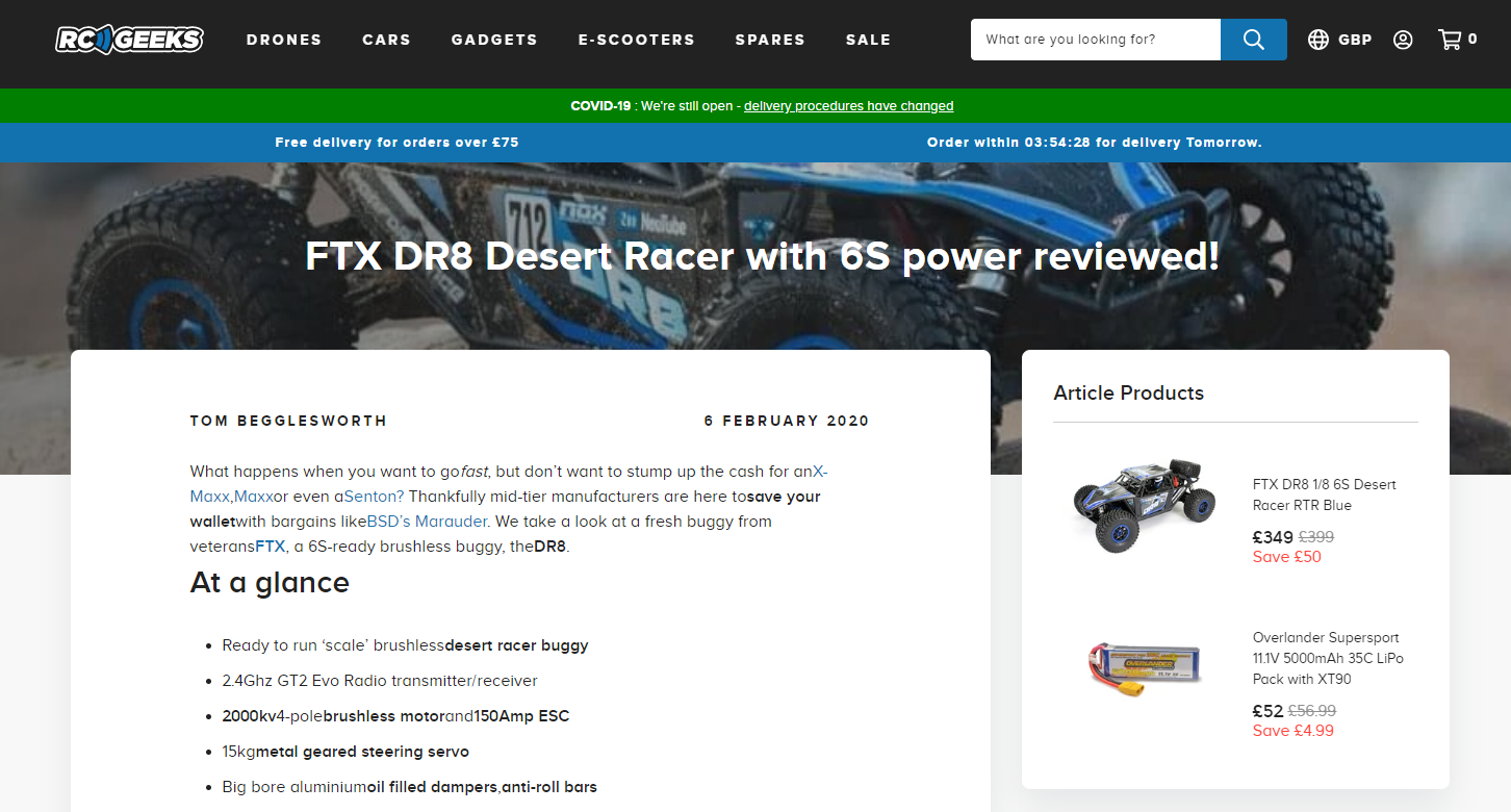
An example of one of RC Geeks’ merchandised blog articles.
Users can click through directly to the relevant product page, allowing them to quickly and easily find out more information.
Interestingly, analysis of data from the three months post-launch compared with the same time period the year before shows that for users who visited the RC Geeks blog, conversion rate increased by 118% and the number of transactions being made doubled. These users generated 19% more revenue, too!
New spare parts hub
RC Geeks stock a range of spares to counter the inevitable wear and tear of remote control products. To simplify the spares purchasing process (which can be somewhat confusing with so many makes and models to choose from!), our team designed and built a spare parts hub for the RC Geeks site.
In just three simple steps, users can find the part they need. Once a manufacturer and model have been selected, shoppers are presented with all the spare parts available for that particular item.
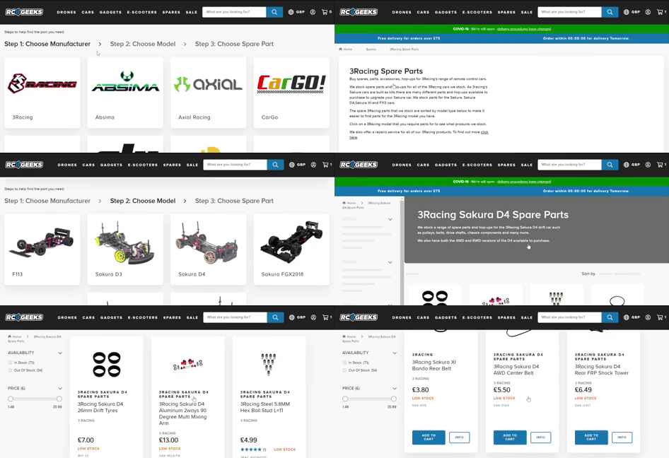
The three simple steps to purchasing spare parts: manufacturer > model > part.
This collection page can be filtered and sorted according to the users’ needs, allowing for a smooth route to checkout.
Spares can be added to cart directly from the collection page as well, making it easy for customers to add multiple spares without moving back and forth between pages.
Bespoke product page development
The lifeblood of an online store, product pages can make or break an ecommerce brand. Whilst confusing, crowded, poorly presented product pages can frustrate customers and drive them to the competition, beautifully crafted pages that are easy to navigate will do wonders for your reputation and revenue.
“UX-led product pages are particularly important when you have a large and complex product offering like RC Geeks,” says Sam Wilkinson, UX Designer at Swanky.
“For this project, a key design consideration was how we could effectively communicate a large amount of product information to users who may not be familiar with remote control gadgets. We also had to work out how best to present all the add-ons and extras that need to be purchased with each product, like batteries and chargers. It was a challenging project, but it’s great to hear about the positive results generated since the new site went live!”
Let’s take a look at how we created UX-led product pages that help convert browsers into buyers.
Improved product page navigation
First of all, a sticky bar with in-page navigation and an Add To Cart call to action appears at the top of the page once a user has scrolled down past the fixed CTA element and navigation tabs, like so:
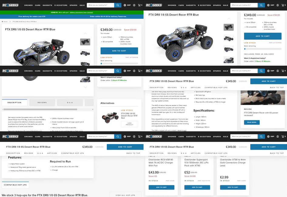
To save users scrolling all the way back to the top of the page to read reviews or add the item to their cart, they can navigate around the product page using the sticky CTA bar.
This aids navigation around the detailed product pages, allowing users to find the information they’re looking for quickly.
Product bundle deals
Product bundles provide multiple complementary products at a discount. The perceived value of a product bundle deal not only excites shoppers, it encourages them to make a larger purchase of multiple items, rather than smaller individual buys, thereby significantly increasing average order value.
‘Combo deals’ are highlighted across RC Geeks’ product pages. These bundles usually include the product and compatible accessories (like battery packs or spare parts), providing a discount when purchased together.
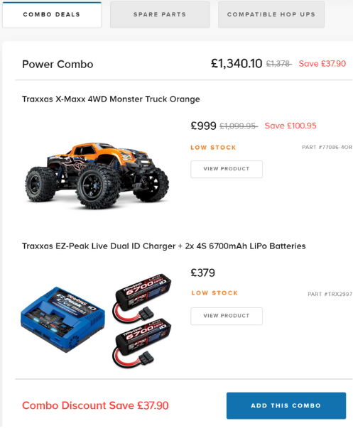
An example of one of the product bundle deals on the RC Geeks store. Shoppers can save nearly £40 if they purchase the battery pack along with the monster truck.
The monetary saving associated with the bundle is emphasised in red, standing out from the white background and blue calls to action.
Allowing users to add a combo to their cart directly from the product page makes for a streamlined experience, adding to customer satisfaction levels!
Cross-selling compatible hop-ups
Also on the product pages is a new solution to display compatible hop-ups (relevant add-ons and upgrade accessories).
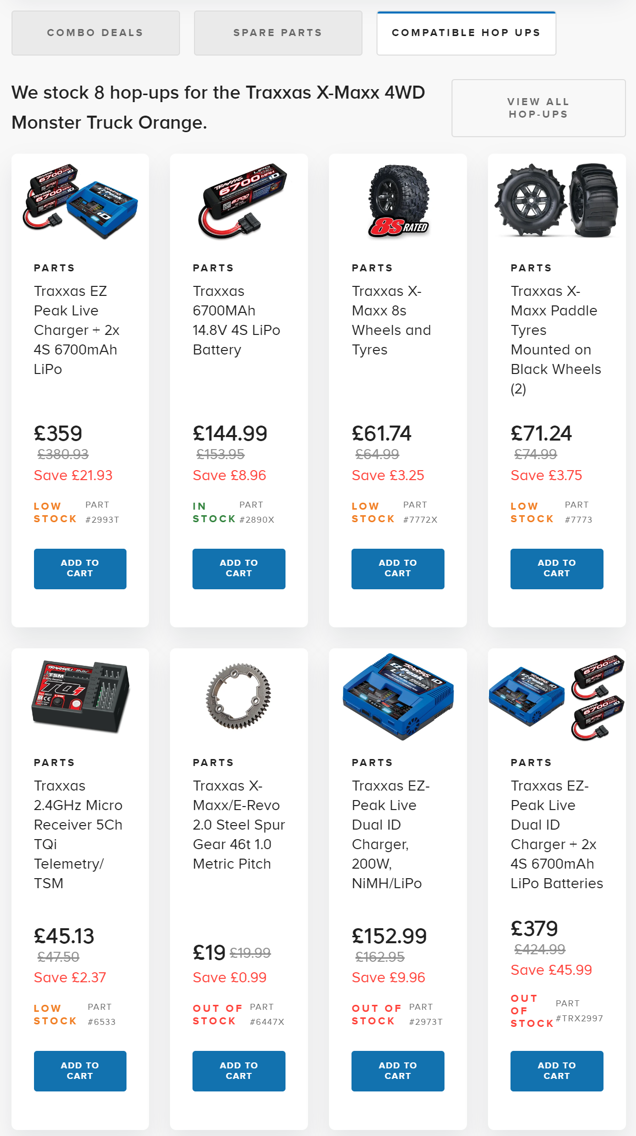
Displaying compatible hop-ups on the product page is a great way to boost cart size and average order value!
With an option to add items straight to cart, this is a quick and easy way for shoppers to browse and select add-ons without having to leave the page.
Showcasing products related to the item a customer is currently looking at can make a huge difference to their purchase. It’s a great cross-selling tactic that boosts average order value and revenue per user. This strategy can also improve shopper confidence and increase conversion rate by demonstrating a retailer’s ability to satisfy multiple needs.
Tech stack consultation
Backed by years of ecommerce experience and insights from a host of successful projects, we consulted with RC Geeks on a new tech stack that would help fast-track their online growth.
For their marketing automation needs, we recommended and implemented Swanky favourite Klaviyo. This popular customer engagement solution enables brands to build high-quality customer relationships across all of their owned marketing channels, driving revenue at scale.
Next up, RC Geeks were after a tool to capture and display customer reviews. Swanky recommended Okendo, which is used by over a thousand Shopify retailers to showcase customer experiences on their ecommerce stores. Displaying reviews is vital for building trust, increasing shopper confidence and compelling buying action (and boosting conversions, of course!).
When it came to on-site search, we recommended Searchanise, one of our go-to search saviours thanks to its impressive list of advanced features and economical price tag! With its error tolerance, custom merchandising rules and personalised search suggestions, Searchanise enables merchants to provide a streamlined, intuitive search experience, capitalising on searchers’ strong buying intent.
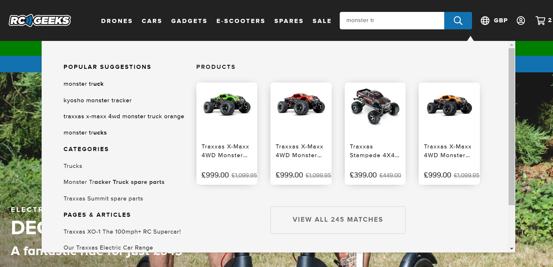
Products, categories and content pages are all suggested when a user starts typing in the search bar.
Results
Analysis of key ecommerce and behavioural metrics from the 90 days after launch compared with the same time period in 2019 reveals that:
- Conversion rate on the RC Geeks store improved by 14%.
- The number of daily transactions on the site increased by 70%.
- There was a 43% increase in the number of users visiting the site each day.
- People are spending longer on the site, with a 22% increase in average session duration.
- Post-launch, users coming to the site via email are more likely to convert, with conversion rate having gone up by 39%.
- There was an 80% increase in transactions by users coming through organic search.
- Users coming to the site via social media channels are now more likely to purchase, with a 52% increase in conversion rate.
- For referred traffic, conversion rate has gone up by 475%, revenue has increased by 492% and revenue per user has gone up by 553%!
Migrate to Shopify Plus with Swanky
Want your brand to enjoy the benefits of boundary-busting ecommerce platform Shopify Plus? Talk to our team today to find out how we could help you make the switch, and what it could do for your business. We have a decade of experience replatforming sites from Magento, WooCommerce and other complex systems.
And why not take a look at our must-have migration bundle, complete with downloadable ebook, on-demand webinar and plenty of replatforming success stories to get you inspired!

