Case Study: How Rebranding and Replatforming Helped PishPoshBaby Achieve an Instant 68% Conversion Rate Uplift
Thanks to the ecommerce replatforming expertise of our Australian team, US baby brand PishPoshBaby now has a fast and flexible Shopify Plus store, complete with swanky new branding and integrated loyalty program. Keep reading to get the lowdown on the project and its fantastic initial impact on conversion and revenue!
Written By
Catherine Lambert

Brand overview
Born in 2011, New Jersey-based retailer PishPoshBaby is on a mission to offer the largest choice of baby products on the internet. The company has curated a collection of top brands from around the world, offering baby gear to suit a range of lifestyles and budgets.
This is a brand that understands how it feels to be a new parent buying their first infant stroller or car seat. They put customer service first and pride themselves on their product knowledge and industry expertise. A dedicated team of baby gear experts is on hand to assist anxious parents in making those important decisions, whether in-store and online.
The challenge
After struggling with a legacy Yahoo Commerce site that was difficult to manage, PishPoshBaby were looking to replatform. The old site was self-hosted and was prone to crashing, so reliability was a priority for them in choosing a new platform.
Having been on their old platform for so long with no real standardisation in place for product data, PishPosh were in need of serious data clean-up and an updated information architecture bible to ensure they didn’t move their old problems to their new platform.
As well as replatforming, PishPoshBaby were looking for a fresh new look for their brand. Having initially instructed a branding agency to create their new logo and brand colours with limited success, mid-project they engaged Swanky to carry out the rebrand alongside the new website design and build.
The solution
By migrating to Shopify Plus, PishPoshBaby could benefit from a more flexible, cloud-based platform that integrates with a wide range of modern apps including Gorgias and LoyaltyLion, among others.
With Swanky’s help, PishPoshBaby now have:
- A modern, user-friendly Shopify Plus store that is mobile optimised.
- Fresh new branding including logo, colours and fonts.
- A loyalty program to encourage customer retention and referrals.
Replatforming: A UX-led Shopify Plus store
To inform the design of the new store, Swanky’s team did a full audience analysis, mapped existing user journeys and reviewed competitor websites to establish benchmark features and expectations. We always prioritise user experience when designing a new site. By understanding customer needs and behaviours, we can create a seamless customer journey that leads to more, and higher value, conversions.
We found that many of PishPoshBaby’s customers access the site via mobile, so therefore prioritised building the new website with a mobile friendly design. It’s now easy to browse and purchase on mobile, and this has already seen a boost in mobile user conversion rates (more on this later!).
Another priority for the new store was to improve search. Many customers in this market do a lot of research before coming to the point of purchase. So, with such a vast product range available on PishPoshBaby, having a responsive search function is key to customers finding the product they want, and quickly. PishPosh used AI-powered search and discovery tool Algolia for their new search function. Users can search by brand or by product type, with an attractive dropdown menu making it easy to navigate the products.
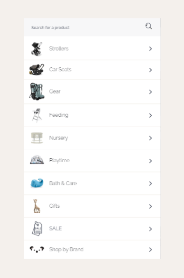
Effective product filtering is equally important for the customers who don’t yet know the product they want. The Algolia filtering system is detailed, so users can filter down to the exact requirements they are looking for, if they already know details about the child they are buying for. For these customers, we’ve also featured best selling products, so they can find products that they can trust, without needing extensive knowledge of the products themselves.
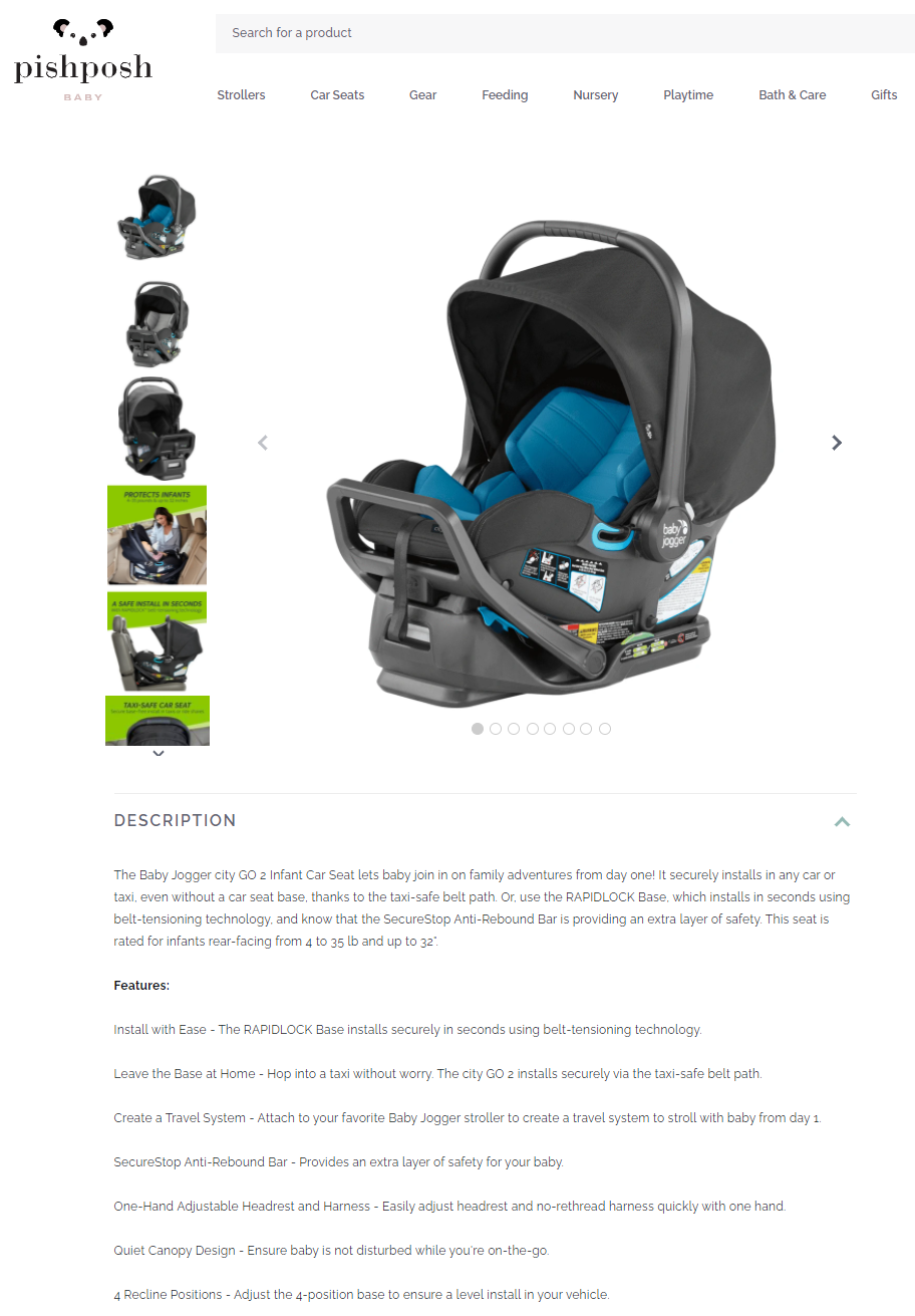
Product information is a selling point for many of PishPosh’s customers, since new and expectant parents are anxious to make safe and informed purchases. We maintained the video content from the old site, including things like guides and product features, as our website analysis found that these were valuable to users. Plus, products like car seats and strollers include detailed product descriptions to reassure parents of the product benefits.
Finally, seamless customer service is important for building trust among new customers, so PishPoshBaby have incorporated Gorgias as their digital customer service desk. This user-friendly app allows customers to easily track orders, return products or make enquiries. The app integrates into PishPosh’s ecommerce tech stack, offering a seamless service to customers whilst also saving the brand time in processing customer enquiries.
Rebranding: A swanky new look
Swanky’s design team took on the rebrand of PishPoshBaby, creating a new logo and colour scheme for all their marketing assets both online and offline.
PishPoshBaby wanted a logo that was cute, to reflect their product range as a baby-centred brand. They also requested an image with a clear, bold outline, to make it easier to incorporate into other assets in future.
We designed an animated logo, drawing on a much loved Aussie animal for inspiration. This cute, quirky logo features a koala with blinking eyes – a great way to draw attention. The theme is continued in the animated banner on the homepage, with moving text bubbles creating an eye-catching first impression.
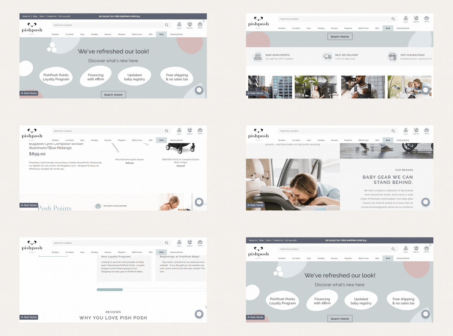
For the colour scheme, we chose muted pink and green in order to give the brand an elegance whilst retaining a sense of cuteness. Similarly, the refined sans-serif font used across the new website was chosen for its elegance and simplicity.
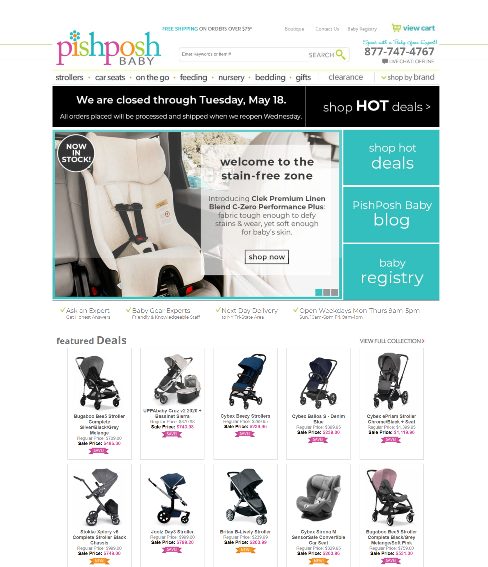
This snapshot of the homepage from PishPosh’s Yahoo Commerce site shows just how much has changed with the rebrand! Prior to the redesign, their site was rather dated and cluttered, with lots of bold colours and very little white space.
Now, the homepage is much more modern and inviting, with plenty of aesthetic appeal. The beautiful design, combined with the subtle colour palette and engaging lifestyle imagery, provides a welcoming point of entry for visitors.
Retention: An integrated loyalty program
With the cost of customer acquisition rising steadily, retaining long term customer relationships is a valuable goal for ecommerce brands. Loyalty programs, such as the one we’ve incorporated into the PishPoshBaby site with LoyaltyLion, are an increasingly popular way to improve customer retention.
With the loyalty program, customers can earn Posh Points on every purchase, and these points can then be converted into vouchers towards future products. There are various other ways to earn ‘Posh Points’, including referring a friend and liking PishPoshBaby on social media. Providing incentives for customers to market your brand amongst their networks is a great tactic for building your customer base without the costly acquisition fees!
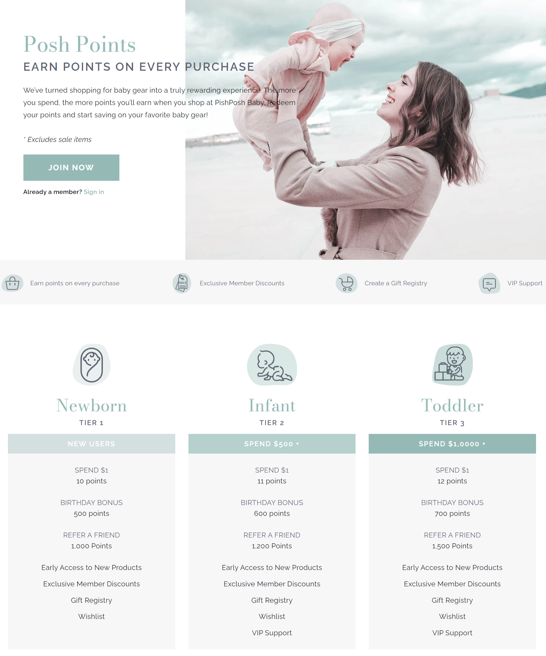
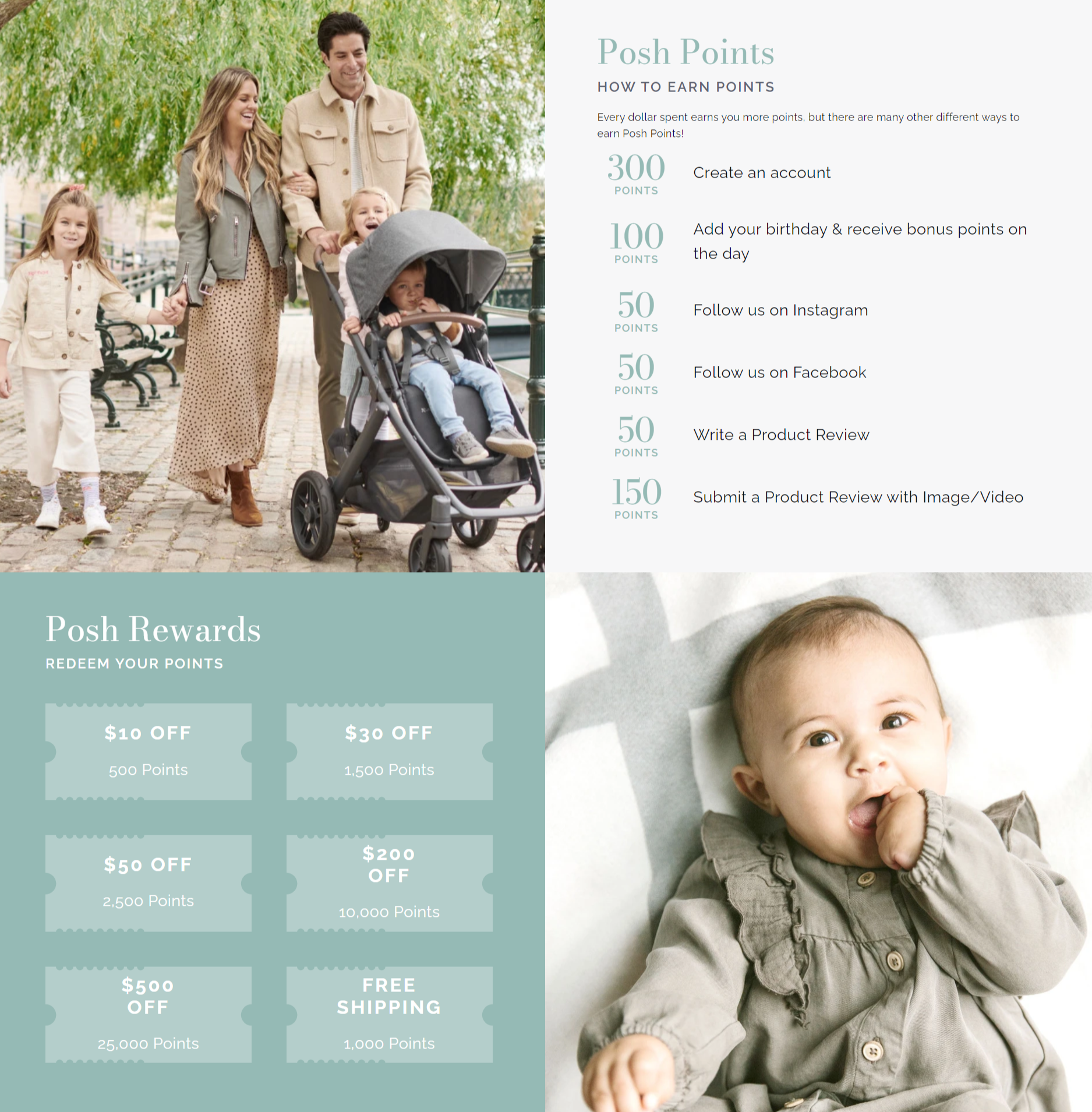
Members also enjoy exclusive discounts, a faster checkout service and the ability to set up a gift registry. The baby gift registry allows expecting couples to select a wish list of items for their baby and share these with friends and family who are looking to buy them a gift. Not only is this a handy feature for the parents, it’s also a great way to introduce new users to the site, as friends and family come onto the site to access the wishlist.
The results
Less than two weeks after launch, the refreshed site is already showing signs of having an astounding impact. In fact, the first two days post-launch were PishPosh’s best days of the year to date in terms of revenue!
Conversion rates have so far improved by 68% and average order value (AOV) has increased by 41%.
In particular, the new site has seen great improvements with mobile users, thanks to increased mobile responsiveness. AOV has doubled among mobile users, and conversion rate has increased by 70% on this device.
It’s early days, but these are fantastic initial results following an ecommerce replatforming project. And since PishPoshBaby are still in the process of scaling up their advertising post-migration, we are yet to see the full impact.
Your ecommerce replatforming experts
When it comes to ecommerce replatforming, you’re in safe hands with us. We know Shopify Plus migrations inside and out. As certified platform experts, we’ve got years of experience migrating complex sites and driving rapid growth, and have helped numerous US and Canadian brands to make the move. But don’t just take our word for it, check out the results in our replatforming case studies!
To find out how we could help unlock your ecommerce potential, contact us today.

